


What if one of the most meaningful messages you ever receive… is written by a version of you that no longer exists?
That question became Dear Future my submission for the #Base44Challenge.
We save photos.
We save messages.
We save memories.
But we rarely preserve who we were in that exact moment what we were thinking, hoping for, afraid of, or becoming.
So I designed a digital time capsule where your words don’t just get stored.
They wait for you.
With Dear Future, you can:
✦ Write a letter to your future self or someone else
✦ Add memories and images
✦ Choose the exact future date it should return
✦ Personalize your capsule with colours and seals
✦ Seal it so it can’t be read or edited before its opening date
✦ Watch the countdown inside your personal archive
✦ Return later and experience the letter as something preserved not just another notification
But the biggest design challenge wasn’t creating a way to send a letter later.
It was designing the wait.
As a Senior Product & UI/UX Designer, I wanted every interaction to support that idea.
The archive.
The physical capsule metaphor.
The vintage television.
The sealing ritual.
The countdown.
The responsive mobile experience.
None of them are there just for decoration. Together, they turn anticipation into part of the product.
I designed the UX, visual system, interaction language, responsive experience, storytelling, and complete product flow then built and shipped the working experience with @Base44.
This project reminded me why I love product design:
A good interface helps someone complete a task.
A meaningful experience makes them feel something while doing it.
Dear Future Words outlive the moment.
Experience the project ↓
Dear future capsule (https://dear-future-capsule-app.base44.app)
Would you write something for yourself five years from now?
48
37
3.4K
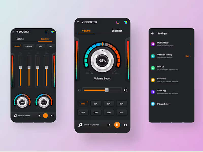
V-Booster – Volume Booster App UI/UX Design
Project Overview
V-Booster is a mobile audio utility app designed to enhance the listening experience through volume boosting and equalizer controls, balancing visual appeal with usability.
Problem
Many audio booster apps suffer from cluttered layouts and confusing controls, making sound adjustments frustrating for users.
Solution
I designed a clean, high-contrast interface focused on clarity, intuitive interaction, and real-time feedback to simplify audio control.
Tools
Figma | UI Design | Interaction Design
1
1
101
Project Description
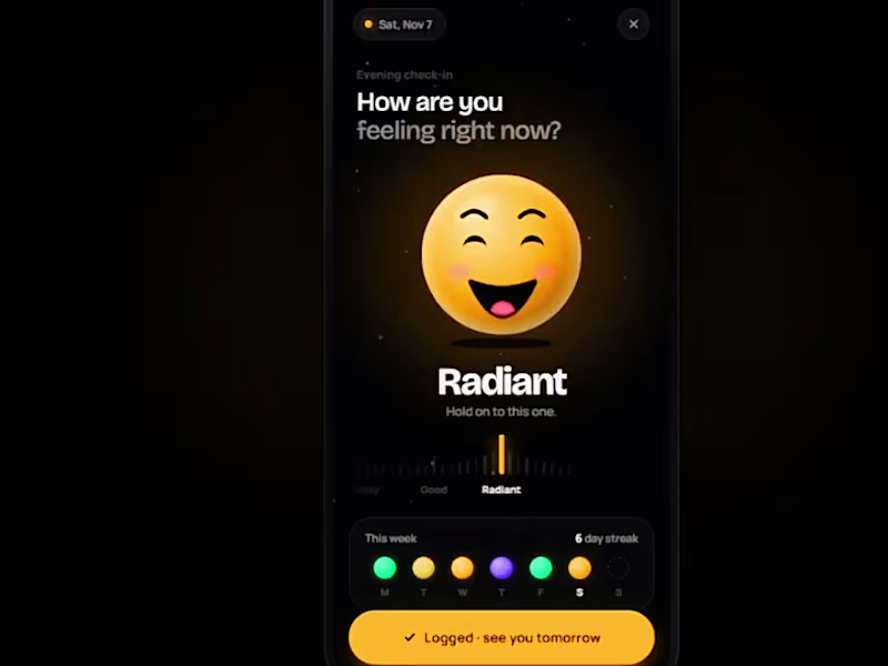
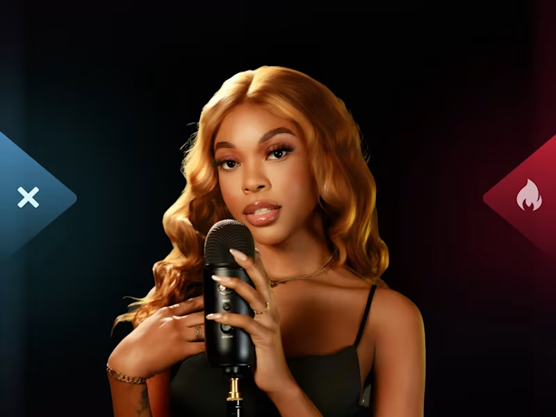
TWEEDL is a gamified music discovery mobile app designed to break industry nepotism by empowering listeners to curate rising talent. Transitioning from an outdated web tool, the mobile experience introduces interactive 30-second preview cards, animated swipe voting mechanics, and audience challenges. Built as an investor-grade prototype, the platform establishes dynamic community leaderboards and verified artist journeys to drive listener retention and showcase genuine market traction.
Overview
A US social music venture needed to translate a slow desktop web presence into a vibrant, gamified mobile application prototype to secure investor capital.
Objective
Overhaul visual branding, lower creator drop-off, and build a high-engagement discovery feed capable of validating community traction.
Action
Audited legacy workflows, crafted gesture-driven discovery swipe loops, designed community leaderboard challenges, and ran multi-round internal usability testing.
Results
Voting completion rates increased from 62 percent to 95 percent, while artist upload success rose from 48 percent to 92 percent in validation testing.
0
133