Sign Up
Filters
2
Projects
People
Shuaib Nuruddin
Pretoria, South Africa
AI Automation | Make.com & Airtable Certified | Python Dev
5.0
Rating
5
Followers
Follow
Message
1
RAG-based Customer Support Chatbot Development
1
14
1
Blog Auto-Sharing System for Transportation Business
1
15
2
Invoice Correction Automation for Plumbing and HVAC
2
13
1
AI-Powered Client Intake Automation
1
8
Python
(1)
Follow
Message
Thabo Mailula
Pretoria, South Africa
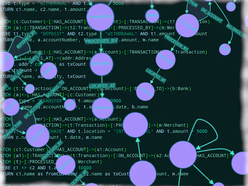
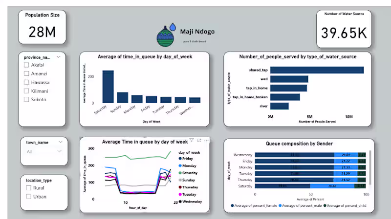
Data Analyst: SQL, Python & Power BI for actionable insights
New to Contra
Follow
Message
0
Maji Ndogo Water Project – Part 2 | Data Analysis & Insights In Part 2 of the Maji Ndogo Water Project, I focused on cleaning and analyzing employee and water source data to understand access, detect patterns, and prioritize interventions. Key Activities: Employee Data Cleaning – Standardized emails, converted to lowercase, and updated phone numbers. Employee Performance – Counted visits per employee and identified top surveyors. Water Source Distribution – Analyzed records by town and province, calculated rural percentages, and total people served. Water Source Usage – Calculated average and total users per source type. Prioritizing Repairs – Ranked water sources by people served to guide repair priorities. This workflow highlights water access, employee activity, and priority areas for intervention.
0
3
0
Customer & Marketing Insights Dashboard | Power BI Project This Power BI project analyzes customer behavior, sales performance, promotions, and product cross-sell opportunities using sample data. The dashboard provides interactive insights in four areas: KPI Scorecards – New customers, repeat purchase rate, average basket size, and customer lifetime value (CLV). Promotion Effectiveness – Revenue trends and comparison charts showing how discounts impact sales and profit. Product Affinity / Cross-Sell – Heatmaps reveal commonly purchased product combinations. Customer Retention & Cohorts – Tracks returning customers and retention patterns.
0
3
0
Workflow Explanation – Part 1 Here’s what I did in this first part of the Maji Ndogo Water Project: 1.Understand the Data First, I looked at the types of water sources in the dataset: rivers, wells, shared taps, home taps, and broken taps. I noted which sources are generally safe versus which are high risk. This step helped me know what “normal” data should look like. 2.Identify Anomalies in Queue Times I checked for visits where people waited more than 8 hours (500 minutes). This flagged water sources that may have access problems or data errors. 3.Check Water Quality Records for Invalid Revisits I focused on records with perfect water quality scores (10) but multiple visits. According to the survey rules, only shared taps should have multiple visits. This step identified invalid or duplicated records in the database.
0
2
0
Maji_ndos_powerbi_dashboard_part1 This dashboard looks at how communities in the Maji Ndos project access water. The focus is on population size, water source availability, and how people actually use those sources during the week. What’s in the report Cards for total population and number of water sources Slicers for province, town, and location type Bar charts showing average queue time by weekday and people served by water source type Line chart for queue-time trends across the week Stacked chart showing women, men, and children in daily queues How it was built Cleaned and shaped the data in Power Query Linked population, water source, and usage tables Created measures for totals, counts, and average queue times Designed visuals that highlight patterns without overwhelming the reader
0
16
Python
(1)
Follow
Message
Kobus van der Merwe
Centurion, South Africa
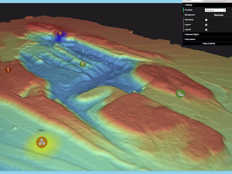
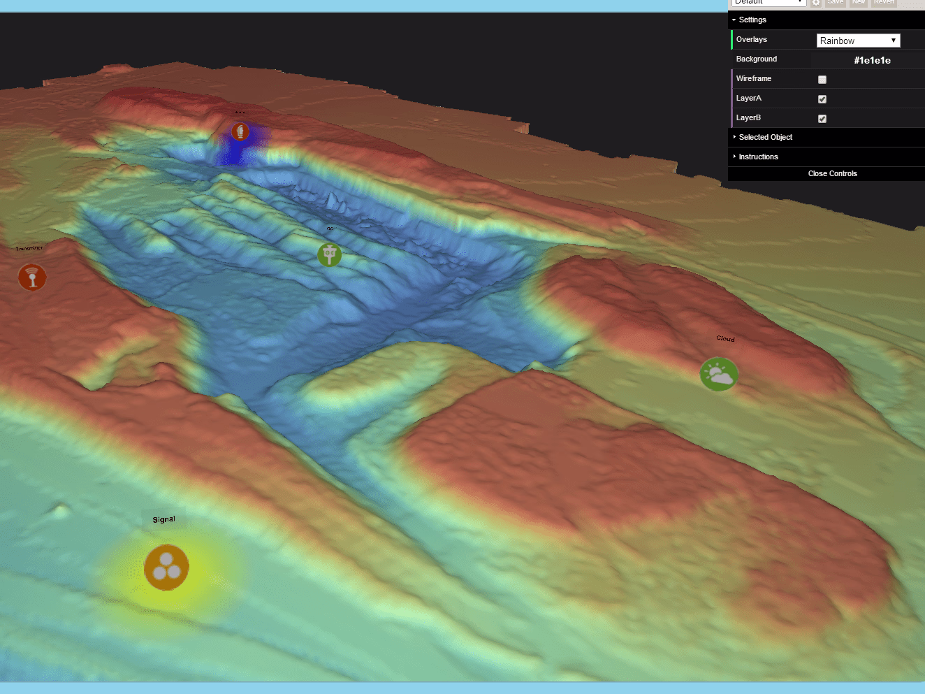
Expert Software Engineer | 25 Years Experience
Follow
Message
0
Fraud Detection
0
11
0
3D Interactive Terrain Rendering
0
12
0
Openshift Platform Engineering
0
13
View more →
Python
(1)
Follow
Message
Explore people