The creative team behind growing agencies.


The creative team behind growing agencies.
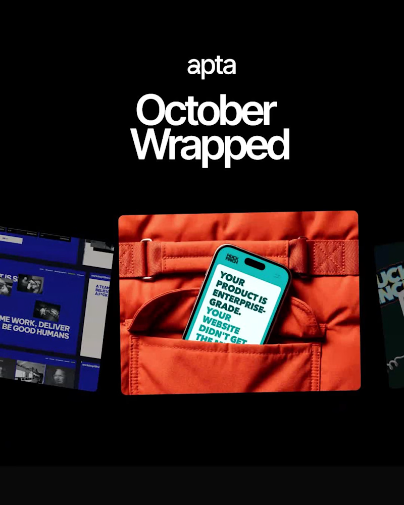
October wrapped: 3 launches, 77 deliverables, 48 videos and 17 clients. Maybe our best month yet, and November is already moving.
2
1
87
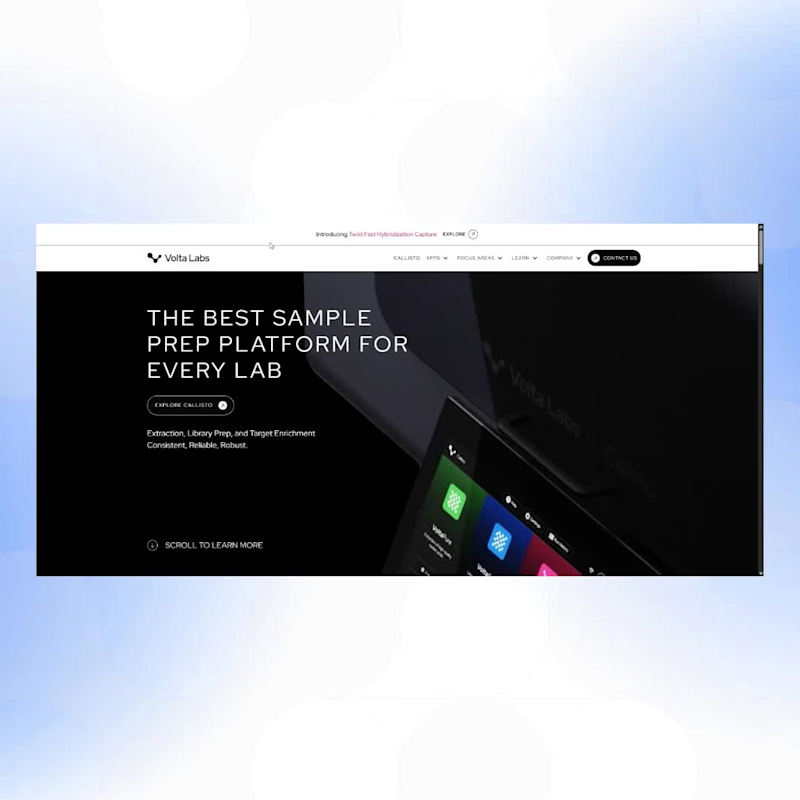
We designed and built Volta Labs' site in Webflow. One decision shaped most of the build.
Their resource library holds seven different kinds of content: tech notes, app notes, posters, webinars, videos, news and blogs.
We built seven separate Webflow collections. One collection with a category field would have been faster to set up and easier to maintain — we went the other way on purpose.
Volta Labs sells to genomics scientists. For that audience, the difference between an app note and a tech note isn't a tag. It's the difference between useful and useless.
Collapse them into a single bucket and you've handed the reader the sorting your CMS should have done.
What you're watching is what that buys: every type findable on its own terms.
The cost is real — seven structures to maintain instead of one. It's the right trade when your visitors know more about the subject than you ever will.
Full case study 👉 apta.agency/case-studies/voltalabs (https://apta.agency/case-studies/voltalabs)
3
202

A visual system built for Evergreen, a modern family office.
The brand needed to sit institutional before anything else. Every design decision had to feel earned. Clarity, discipline, confidence for a category that runs on trust.
Evergreen brings income-focused investing, private-market access, and advanced tax strategy to entrepreneurs and high earners.
Check the full case on Behance 👉 behance.net/gallery/253491851/Evegreen-Income-Plataform
2
173


Framer Designer for Studios, Brands & Culture
Framer Designer for Studios, Brands & Culture

Your design partner for real results


Design Engineer – UX/UI, Front-End , Framer and Webflow
Design Engineer – UX/UI, Front-End , Framer and Webflow


Creative UX/UI Designer solving problems
Creative UX/UI Designer solving problems


Product Designer
Product Designer


View more →

Visual, Brand & Web Designer

One of the most renowned Brazilian criminal lawyers, Antonio Diego da Costa, entrusted me with the redesign of the sales page for his mentorship, “Advocacy Formula.”
In this project, we reformulated and refined the visual identity of the old page and reinforced the Ruler and Outlaw archetypes, with the goal of professionalizing the product’s image and the perception of value that the lead has when reading the sales page.
2
1
238

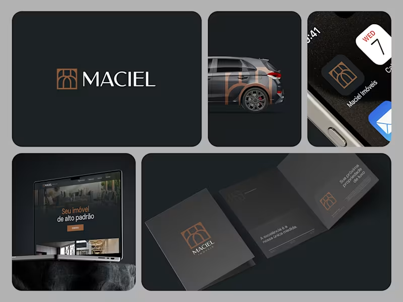
Maciel Imóveis is a real estate company founded by a couple in Torres, a coastal city in southern Brazil, focused on high-end residential properties.
The challenge was to create a visual identity that reflected the elegance and exclusivity of the properties they represent while establishing a distinctive presence within a competitive local real estate market.
The identity was built around a refined and sophisticated visual language, designed to communicate trust, quality, and a premium positioning to an audience with high purchasing power.
Rather than following the visual conventions commonly found among real estate agencies in the region, the project aimed to create a more distinctive and contemporary brand presence — one that could feel at home in the high-end real estate market of Torres.
0
123

Curious by nature and craft enthusiast.
Curious by nature and craft enthusiast.