Freelancers in Pontianak
Sign Up
Post a job
Sign Up
Log In
Filters
1
Projects
People
Design Yow
pro
Pontianak, Indonesia
Your SaaS Buddy.
2x
Hired
5.0
Rating
22
Followers
Follow
Message
Your SaaS Buddy.
2
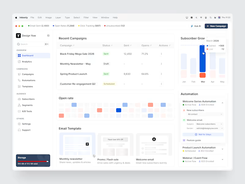
Email marketing becomes more effective when campaign performance is easy to understand. This Email Marketing Dashboard was designed to help teams manage campaigns, monitor performance, and understand audience engagement from one centralized workspace. Built with clear data visualization and intuitive workflows to support more efficient marketing decisions. 📩 Open for new design collaborations.
2
136
1
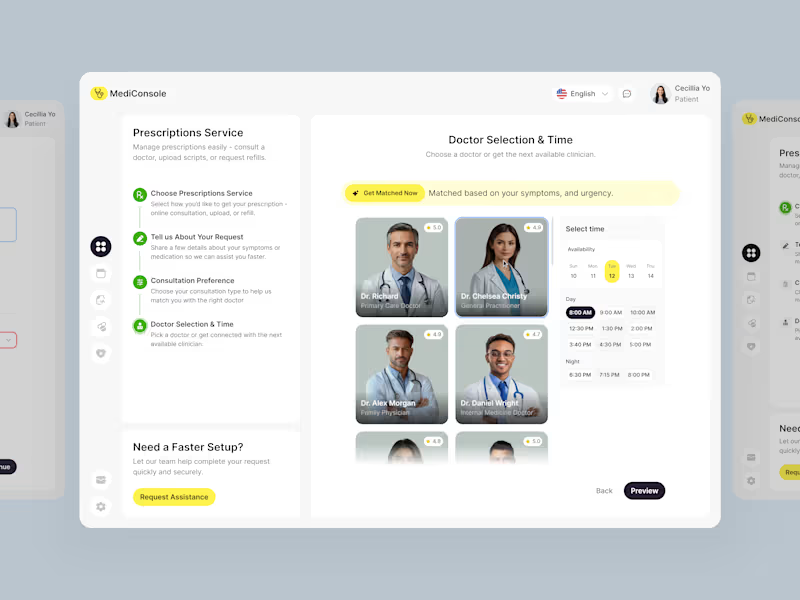
Digital Prescription Service for Healthcare
1
3
1
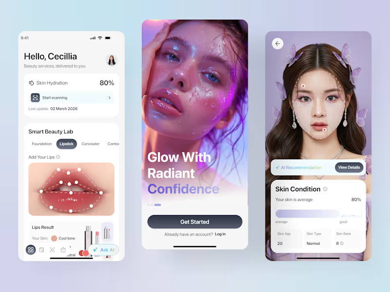
Personalized beauty starts with understanding your skin. This AI-Powered Beauty Mobile App was designed to help users analyze their skin, discover personalized care recommendations, and monitor their skin journey from one intuitive experience. Built with AI-powered insights, simple interactions, and a clean visual approach to make personalized skincare more accessible and engaging. 📩 Open for new design collaborations.
2
1
147
2
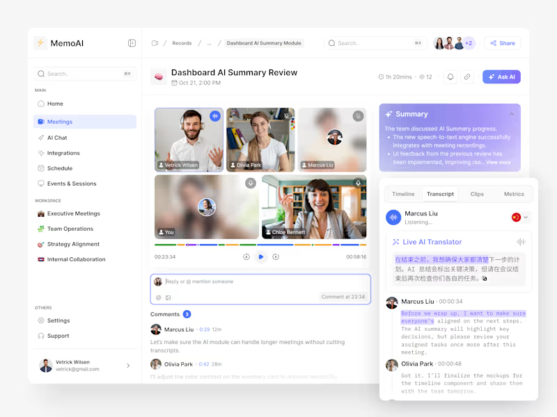
Meetings become more valuable when important information doesn’t get lost. MemoAI is an AI-powered meeting dashboard designed to help teams capture conversations, generate summaries, and organize key takeaways and action items in one workspace. Built with a clean interface and AI-driven workflows to make post-meeting follow-ups faster and more organized. 📩 Open for new design collaborations.
1
2
150
Follow
Message
Muhammad Aswin Sigit
Pontianak, Indonesia
Full Stack Developer
New to Contra
Follow
Message
Full Stack Developer
1
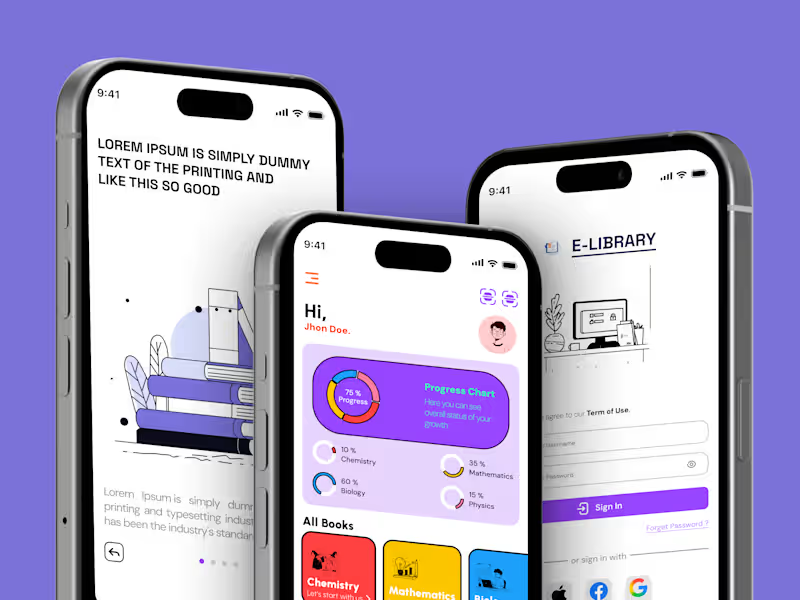
Designing Engaging Digital Reading & Study Experiences for Students 📚📱 A mobile UI/UX concept focused on digital libraries, gamified study progress, and personalized reading exploration. The goal was to create a modern, vibrant, and intuitive learning experience that turns daily reading into an engaging habit through clear visual hierarchy and effortless navigation. Key Highlights: • Visual Hierarchy & Dashboard Analytics: A dynamic progress chart and subject-wise completion rings (Chemistry, Mathematics, Biology, Physics) on the home screen to keep learners motivated and track growth at a glance. • Curated Content Discovery: High-contrast, modular category cards for core academic subjects alongside personalized hobby shelves (Music, Movies) for leisurely reading. • Frictionless Navigation & Quick Actions: Streamlined onboarding and authentication flow with social sign-on, paired with a floating barcode/QR scanner button for physical book checkouts. 🛠️ Tools & Workflow: Figma, Auto-Layout, Component Variants, Mobile Design System Available for new mobile UI/UX and digital product design projects! Let’s build something impactful together.
1
1.8K
1
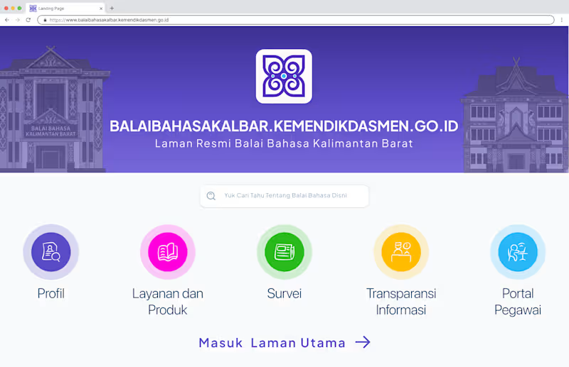
Designed and engineered the official web portal for Balai Bahasa Kalimantan Barat, focused on improving public accessibility, service transparency, and internal employee workflows. • Public Service Directory: Intuitive access to organizational profiles, digital publications, dynamic surveys, and official information requests. • Modern Front-End: Sliced and developed responsive layouts using Vue.js and Tailwind CSS, integrated seamlessly with Inertia.js for single-page app speed. • Robust Back-End: Powered by Laravel & MySQL to handle dynamic survey configurations, data management, and secure multi-role internal access. • Production Deployment: Configured on government institutional servers with optimized security and reliable uptime. 🛠️ Tech Stack & Tools: Figma, Vue.js, Inertia.js, Tailwind CSS, Laravel, MySQL 🌐 Live Website: balaibahasakalbar.kemendikdasmen.go.id (http://balaibahasakalbar.kemendikdasmen.go.id) Looking to build accessible web portals, enterprise systems, or custom full-stack solutions? Let’s connect on Contra!
1
1.8K
1
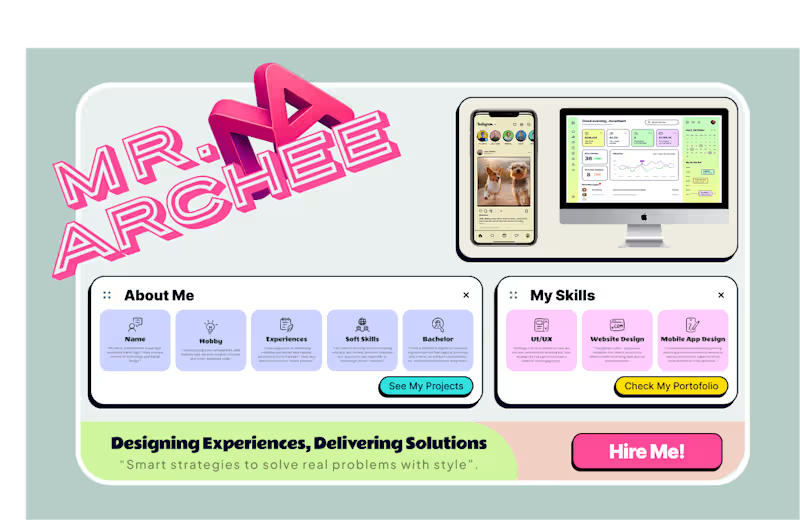
Designing Experiences, Delivering Solutions 🚀 "Smart strategies to solve real problems with style." Here’s a playful and structured personal identity showcase featuring a blend of modern UI/UX design, mobile app layouts, and web application interfaces. What I Bring to the Table: • End-to-End Product Design: From wireframing and user research to high-fidelity interactive prototypes. • Developer-Ready Interfaces: Clean component architecture, auto-layout mastery, and design systems designed for flawless frontend handoff. • Multi-Platform: Tailored layouts for iOS, Android, and responsive web platforms. 📬 Open for freelance contracts, full product redesigns, and design systems creation. Let's connect!
1
1.7K
1
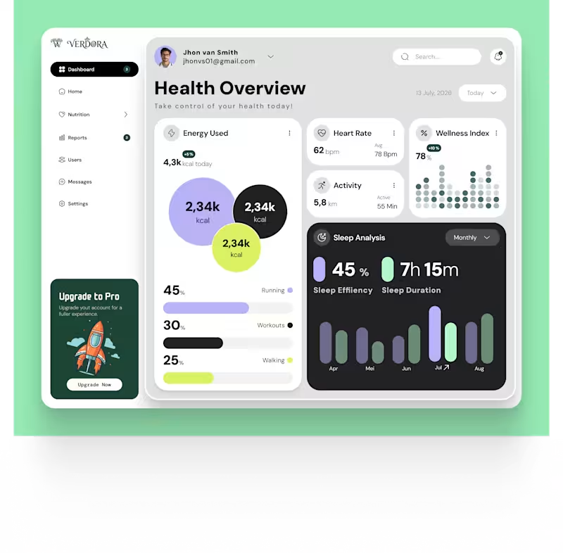
Simplifying Complex Health Metrics into Intuitive Data Visualizations 📈✨ Presenting Verdora, a comprehensive health & wellness overview dashboard tailored for personal tracking and daily health monitoring. Design Focus: • At-a-Glance Insights: Modular card architecture displaying energy consumption, heart rate, daily activity, and sleep analysis seamlessly. • Data Clarity: Thoughtful color palettes and modern chart visualizations to make dense metrics readable and actionable. • Responsive & Scalable: Structured design system built with clean grid systems, ready for seamless front-end implementation. 🛠️ Role & Tools: UI/UX Design, Data Visualization, Figma Looking to build a sleek SaaS dashboard or web app? Send me a message or let’s collaborate on Contra!
1
1.5K
Follow
Message
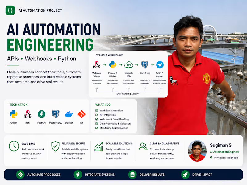
sugiman S
Pontianak, Indonesia
AI Automation Engineer | APIs, Webhooks, Python
New to Contra
Follow
Message
AI Automation Engineer | APIs, Webhooks, Python
0
AI automation engineering showcase demonstrating a practical workflow pattern using APIs, webhooks, Python, validation, logging, and reliable integrations. Designed to turn repetitive processes into traceable, maintainable automation with error handling and human oversight.
0
26
0
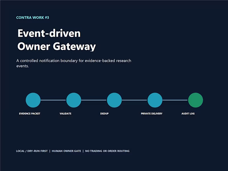
I built this owner gateway to handle event-driven notifications in a more controlled way. Incoming events are validated, checked for duplicates, and logged before they are routed to the appropriate notification path. I also kept the Telegram and n8n integration behind a clear boundary so the workflow stays easier to review, test, and control. The focus here is reliability and traceability — making sure an event is handled once, important actions can be audited, and automation does not bypass human oversight.
0
38
0
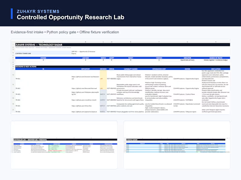
I built this research lab to help me evaluate new tools and technical opportunities without jumping straight into adoption. Each candidate goes through a simple process: record the source, review what it could be useful for, check the risks and constraints, and keep evidence for the decision. I also built a small Python policy gate and offline test fixtures so some checks can be repeated without relying on live services. The goal is simple: experiment freely, but keep important decisions traceable and under human control.
0
47
0
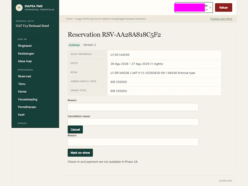
I built this operational workflow as part of INAPRA PMS, a system designed around the everyday work of running a small hospitality property. This example follows the flow from a confirmed reservation through housekeeping operations and folio handling, with an operational audit trail to make important actions easier to trace. I developed and tested this in a local UAT environment using fictional hotel data. My focus was not just making the screens work, but making the workflow clear, dependable, and practical for day-to-day operations.
0
48
Follow
Message
Silvanus Santo
Pontianak, Indonesia
UI/UX Designer | Building Product & Emotion Interfaces
New to Contra
Follow
Message
UI/UX Designer | Building Product & Emotion Interfaces
0
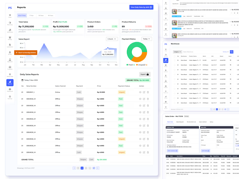
I redesign POS system product. A point-of-sale system shouldn't feel like filing taxes. The original design was rigid, cold, and built for the system. not the person using it. I design the entire experience from the ground up, loosening the layout, improving product visibility, and adding features that actually support how a cashier thinks and works.
0
107
0
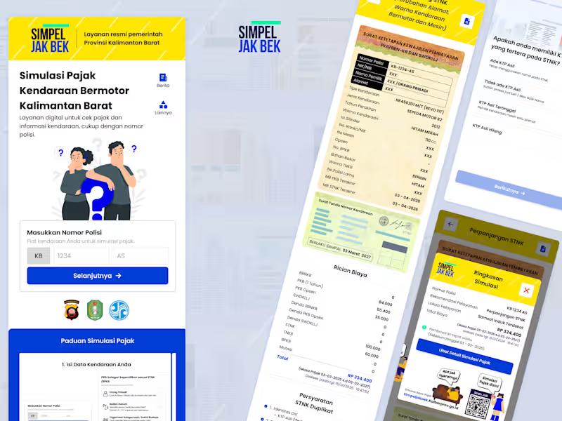
Simpel Jak Bek (Tax Website) A redesign of the SimpelJakBek website, optimized for a mobile-first experience to simplify vehicle tax payments. The project focused on improving information hierarchy, visual consistency, and creating a clearer, more intuitive user journey.
0
68
1
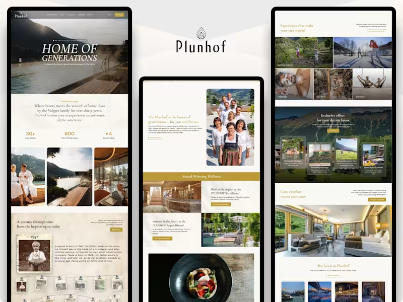
Plunhof Hotel Website Redesign Concept
1
103
0
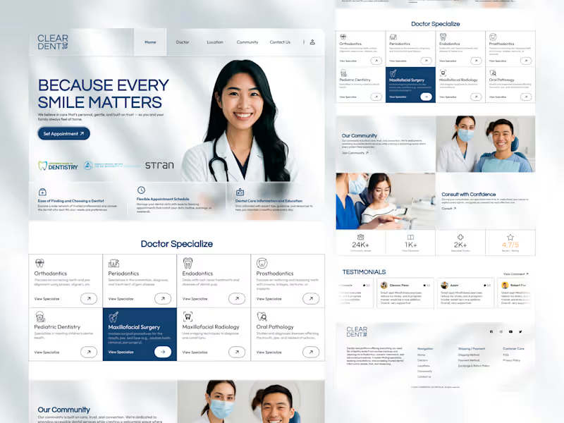
ClearDent Website A concept website designed for a modern dental clinic. The project focused on improving service discovery, appointment booking, and information accessibility through a clean, responsive, and user-centred interface.
0
68
Follow
Message
Allam Rachman
Pontianak, Indonesia
a passionate web designer who loves learning new things.
Follow
Message
a passionate web designer who loves learning new things.
0
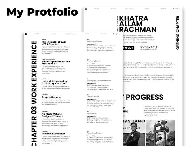
My Portfolio
0
9
0
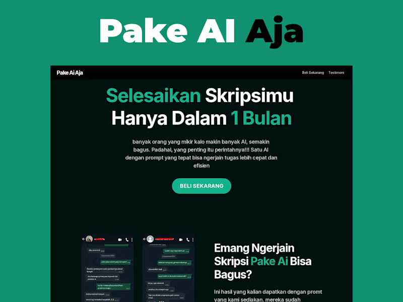
Pake AI Aja
0
4
0
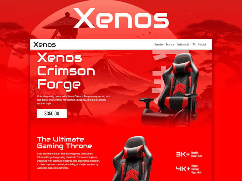
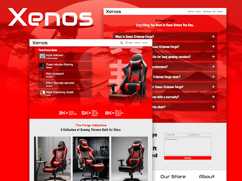
Xenos -Single Product Landing Page
0
5
0
Xenos -Samurai style gaming templatea
0
9
Follow
Message
Cherry Veronica
Pontianak, Indonesia
Creative Strategist | AI-Concept & Creative Direction
25
Followers
Follow
Message
Creative Strategist | AI-Concept & Creative Direction

3
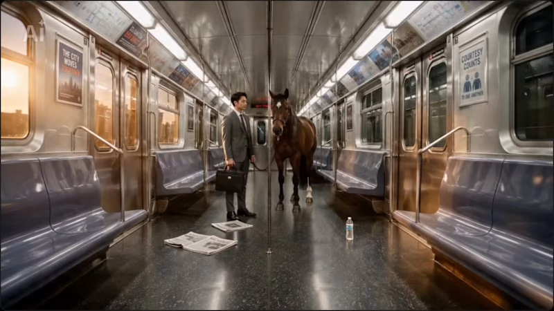
One of my non-submitted CapCut challenge experiments 🎬✨ I actually like keeping little experiments like this because every weird detail teaches me what to control better next time. And ngl… the overall quality came out kinda good 👀 BUT… There are two tiny inconsistencies hiding in this video 🤏🏻 I know exactly where they are now, but I definitely didn’t catch both on the first watch fr hahaha. Can you spot them before I tell you? 👀 Need a hint? 🧐 Drop your guess below 👇🍒 #AIVideo
2
3
100
1
Made 3 AI videos for a Contra × CapCut challenge. Submitted exactly 0. Very on brand 😂 Anywayyy… instead of letting them die quietly in my folder, I’m posting them here. This one is “We Envy Each Other.” 💅🏻💄 I’m not an AI-video expert and I’m definitely not trying to become an AI-tool encyclopedia. I’m a creative strategist who gets a little too excited when a weird idea in my head can suddenly become something you can actually see. That’s the part of AI I love. It shortens the distance between: “wait… I have an idea” and “okay look at this 👀” But the tool is still the tool. The interesting part is the human stuff behind it, the observation, taste, story, emotion, judgment… all the tiny decisions that make something feel like something. So lowkey this is also my hello to the creative people here 🫶 Tell me where this works — and where it loses you. Story? pacing? visuals? ending? Don’t be too polite. I actually want the notes 📝 ✨ #AIVideo #CreativeStrategy #CapCut #SeedanceChallenge
1
81
4
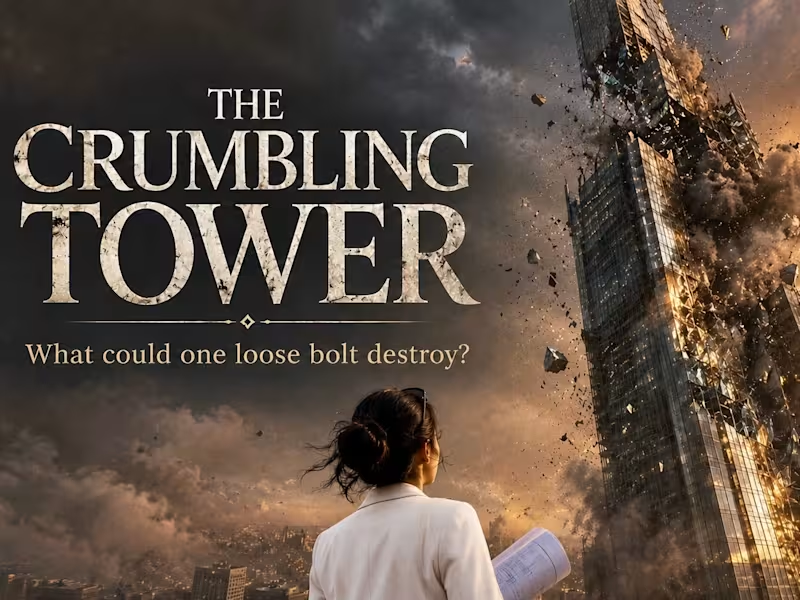
THE CRUMBLING TOWER 🔩🏗️ What could one loose bolt destroy? The Crumbling Tower is a 30-second continuous cinematic AI film created in CapCut Seedance 2.5 using 9 visual references and a time-coded prompt. The concept began with a simple commercial storytelling question: how do you make something as ordinary and easy to overlook as a bolt feel emotionally important? The film starts with a massive skyscraper that appears almost indestructible. One loose bolt triggers a crack, then a full structural collapse. As the destruction resolves, the scale suddenly changes and reveals the truth: the tower is only a miniature model on a wooden desk, watched by two laughing boys and their mother. The twist reframes the bolt from a small industrial component into a symbol of safety, trust, responsibility, and the small connections that protect what matters most. Because every small connection matters. Creative approach I used a contrast between large-scale destruction and an intimate family reveal to make the message understandable without directly explaining it. The goal was to create a commercial-style story where the product idea is felt through consequence and emotion rather than exposition. Workflow: Research → concept development → story structure → 9 visual references → time-coded prompt → test generations → identify continuity failures → refine character and object guidance → final Seedance 2.5 generation. The reference set was designed to control the tower, loose bolt, spreading crack, collapse, debris, the two boys, the architect/mother identity, and the final family hug. I also used continuity rules to keep the architect identity, the boys’ faces and clothing, the miniature tower scale, lighting, and cinematic style consistent throughout the single generated sequence. The final film was generated as one continuous 30-second take in Seedance 2.5 at 16:9, 720p, then exported through CapCut. Created for the @Contra HQ × @CapCut Seedance 2.5 Challenge. Supporting links: LinkedIn post: https://lnkd.in/p/gmUv9v8j (https://lnkd.in/p/gmUv9v8j)YouTube final film: https://youtu.be/tpfVFY1xt_E (https://youtu.be/tpfVFY1xt_E)Project walkthrough: https://youtu.be/AclKucOST-8 #contraseedancechallenge #CapCutCPP #Seedance25 #AIVideo
1
4
512
2
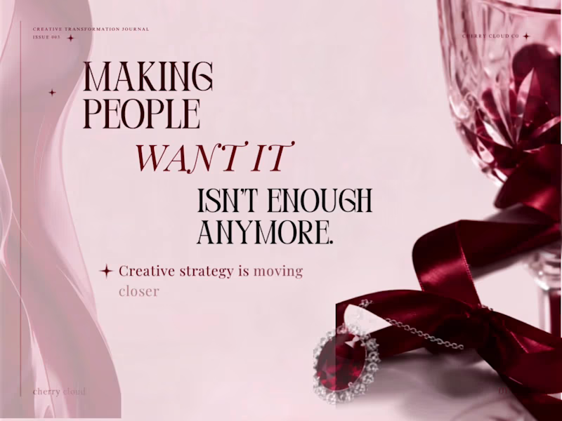
Creative Transformation Journal - Issue 003 ( Instagram carousel )
2
131
Follow
Message
Cornelius Venti
Pontianak, Indonesia
Frontend Developer
Follow
Message
Frontend Developer
0
Interactive portfolio
0
13
0
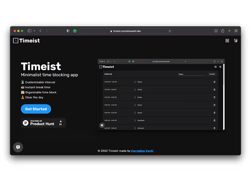
Timeist
0
7
0
Satumarket
0
6
View more →
Follow
Message
Jacky Felix
Pontianak, Indonesia
Graphic Designer
Follow
Message
Graphic Designer
0
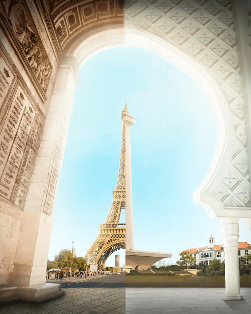
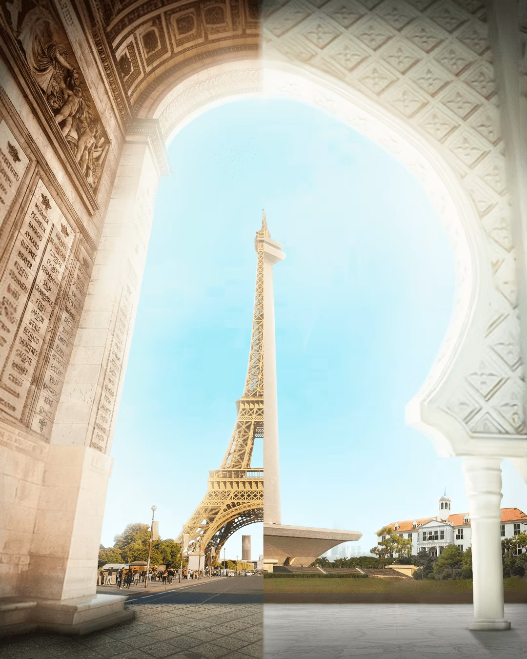
Digital Imaging / Key Visual Design
0
16
0
Graphic Design Freelancer
0
24
0
PT Papasari - Social Media & Website
0
25
View more →
Follow
Message
Explore people