Brand Design Projects in Pays de la Loire
Brand Design Projects in Pays de la Loire
Sign Up
Post a job
Sign Up
Log In
Filters
2
Projects
People
Message
85
Drice Roland
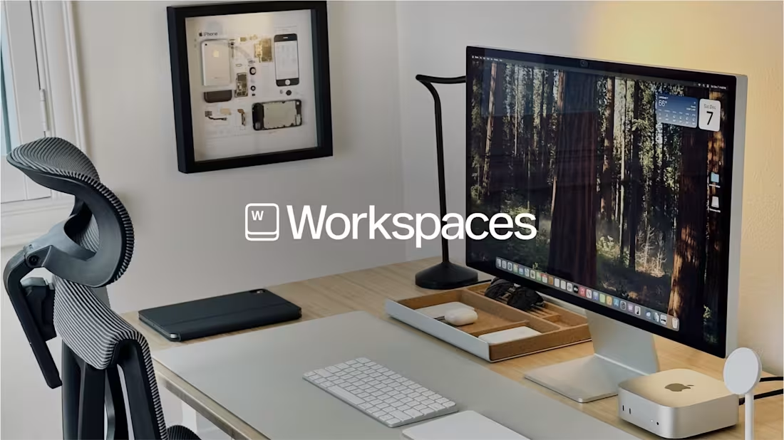
Brand Identity Design for Workspaces.xyz
85
1.9K
Message
1
Maëlie Lusson
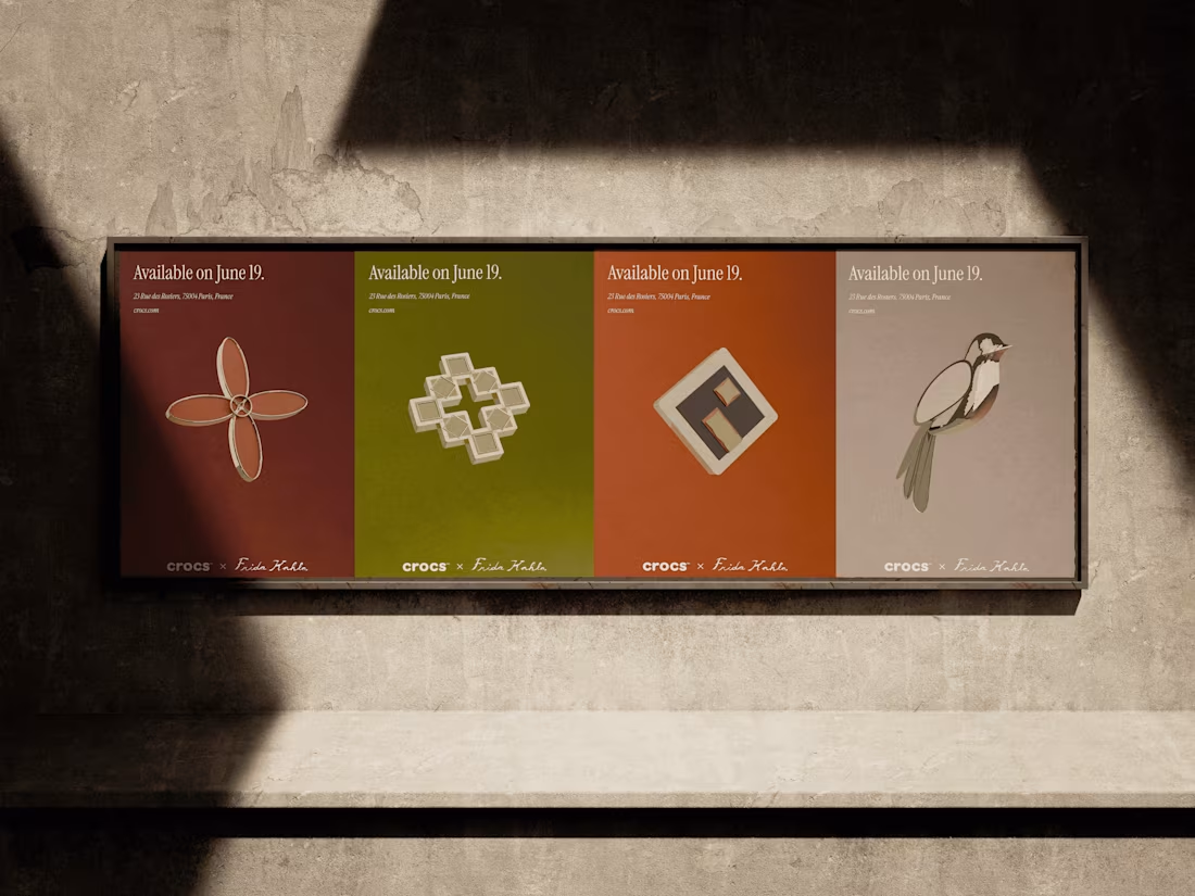
Crocs x Frida Kahlo
1
8
Message
3
Julie Péronne
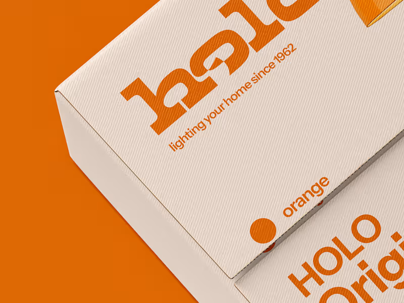
Holo | Retro Lamp Branding
3
10
Message
1
Paul Raimbault
Motion Design for Savee
1
15
Message
0
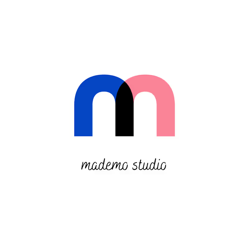
mademo studio
pro
New visual identity for Mademo Studio. A new M built from simple geometric forms, overlap and movement. The idea was to create a symbol that feels structured but alive — somewhere between Bauhaus geometry, collaboration and play. The overlapping shapes suggest connection, dialogue and the way different disciplines meet inside the studio. Art direction · Visual identity · Logo design Mademo Studio
0
37
Message
0
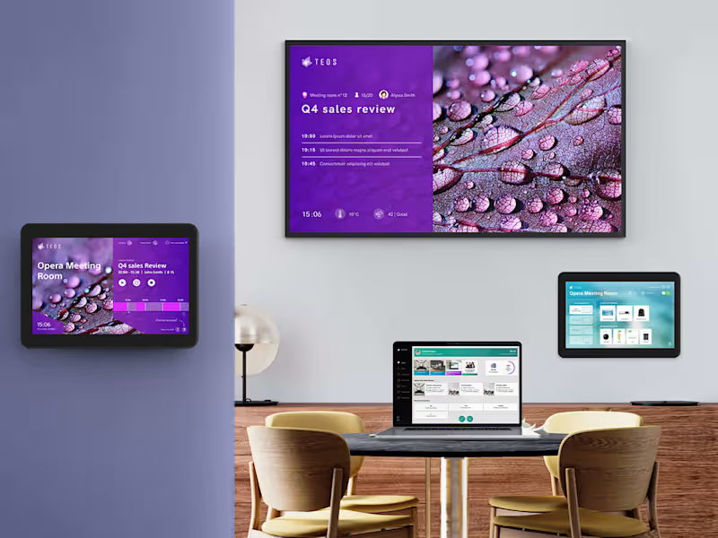
Chloé Mwenge
Sony TEOS
0
41
Message
21
Mahana Snow
pro
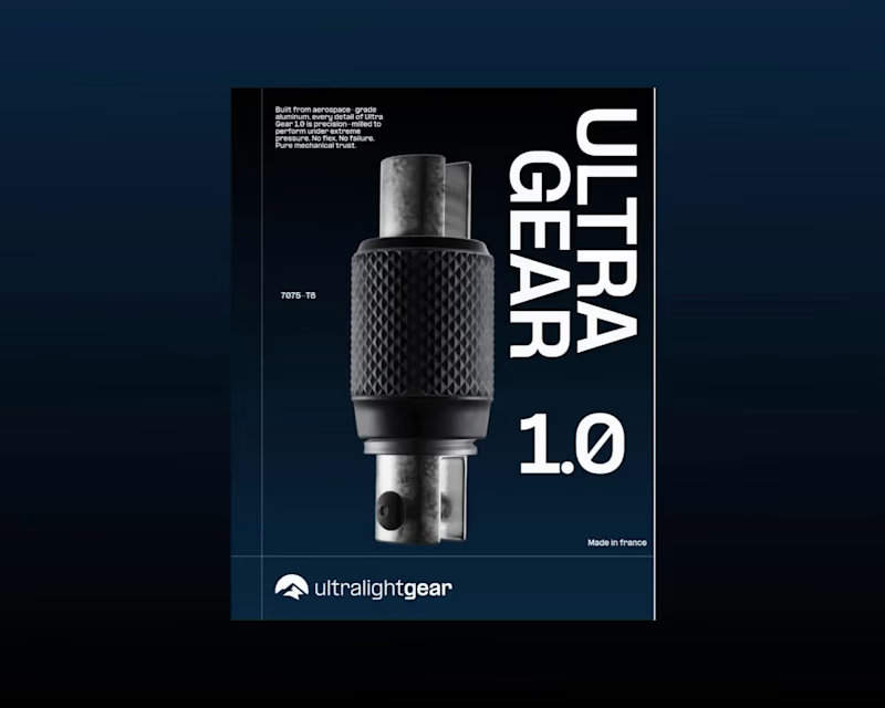
I’ve just finished and submitted my entry for the @webflow (https://www.instagram.com/webflow/) × @contra (https://www.instagram.com/contra/) Challenge. ⠀ Built in Webflow, this concept explores the balance between engineering and emotion. ⠀ Because every project is a test of alignment between what we imagine and what we make real. ⠀ Ultra Gear 1.0 and the Webflow Challenge remind me why I create: to turn precision into emotion, and structure into story. [ Live Site (https://ultra-gear.webflow.io/) ]
5
21
339
Message
0
Paul Lafourcade
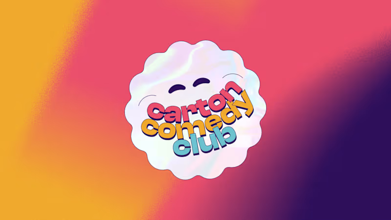
Playful Brand Design - Carton Comedy Club
0
4
Message
0
armand Ngambi
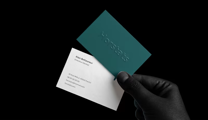
horstats :: Behance
0
8
Message
0
Bastien Dauvé
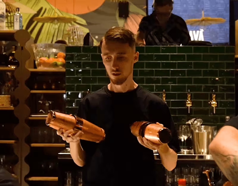
Restaurants video teaser
0
8
Message
0
Ilyas MOSBAH
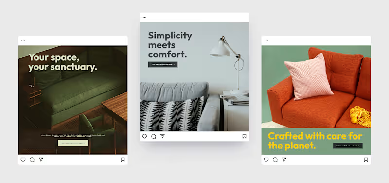
Studio Zenith | Ad Designs
0
9
Message
0
Emma Brossaud
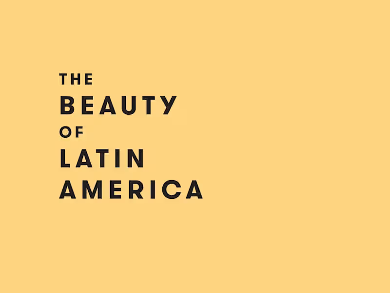
The Beauty of Latin America
0
7
Message
63
Drice Roland
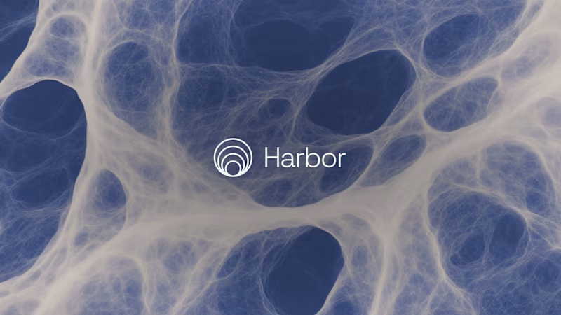
Harbor — Brand & Logo Design
63
1.1K
Message
7
Julie Péronne
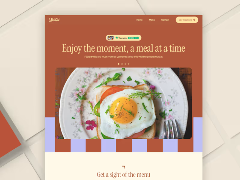
Gaze | Restaurant Branding + Hero Section
7
20
Message
3
Maëlie Lusson
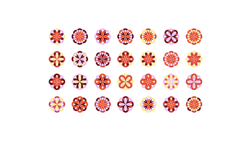
playing with patterns. 🎛️
2
3
219
Message
1
mademo studio
pro
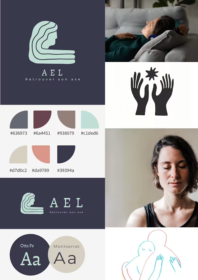
AEL is a visual identity developed for a practitioner working in soft healing and holistic support. The brand was built around the idea of retrouver son axe — returning to one’s center. The challenge was to create an identity that could feel calm, grounded, and emotionally safe without becoming clinical or overly spiritual. Instead of using familiar wellness tropes, the visual direction focuses on presence, silence, and reconnection through a symbolic logo, a restrained color system, and spacious composition. The final identity includes: logo system color palette typography pairing moodboard vertical and horizontal lockups AEL is designed to feel quiet, human, and steady — a brand that supports rather than performs.
1
227
Explore projects