Projects using Adobe Illustrator in PabnaProjects using Adobe Illustrator in PabnaLuxury Brand Identity System for a Premium Event Planning Business
PROJECT DESCRIPTION:
Mynt Events is a premium event planning business built around moments that matter — proposals, curated celebrations, and experiences where every detail is considered and nothing is left to chance. The founder came to me with a business that had already outgrown its brand. The work was operating at a premium level. The identity wasn't communicating that yet.
The brief was clear: build a complete brand identity system that positions Mynt Events as the obvious choice for clients who already know what they want and are deciding who to trust with it.
The Strategic Starting Point
Every decision in this project started with a single question: what does a client need to feel the moment they encounter this brand for the first time?
For Mynt Events, that feeling needed to be confidence. Trust. The quiet certainty that this is a business that handles things properly — that the moment they're planning will be in the right hands.
That emotional target shaped every mark, every color choice, and every surface application that followed.
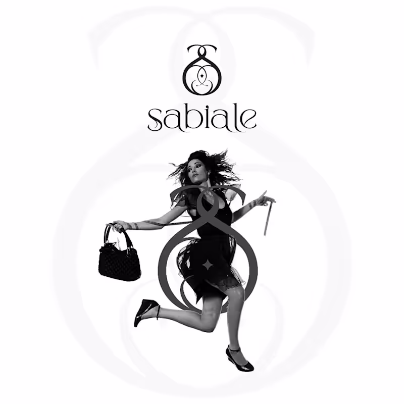
The Logo
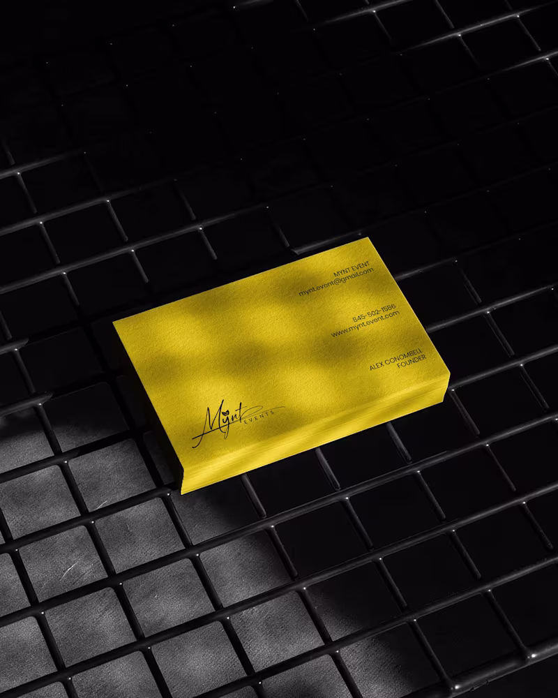
The primary mark is a signature script logo with a leaf detail structurally embedded within the letterforms. The script was chosen deliberately — in the events industry, clients are trusting you with moments that cannot be redone. A signature communicates personal commitment. It feels authored, not assembled.
The leaf element does secondary brand work quietly. It signals organic intention, care, and attention to detail without requiring explanation or a separate icon.
The underline sweep grounds the composition and gives it the horizontal confidence it needs to hold across wide-format surfaces — packaging lids, signage panels, and environmental applications where a floating mark would lose presence.
A monogram M was developed as a secondary mark for applications where the full signature loses legibility at small scale — product labels, cap patches, and interior packaging details.
The Palette
Gold and black. Not chosen for trend. Chosen for emotional function.
Gold carries warmth, occasion, and perceived value — the feeling of something worth celebrating. Black carries authority, precision, and restraint — the feeling of a business that delivers without drama. Together they position Mynt Events exactly where it needs to sit: celebratory but controlled, personal but professional.
The palette was tested across matte, gloss, foil, backlit, and fabric applications to confirm it held integrity across every surface in the system without compensation or adjustment.
The Full Identity System
Every deliverable was designed as part of a single coherent brand expression — not a collection of individual design tasks, but a system where every piece reinforces every other piece:
— Primary signature logo and monogram secondary mark
— Full brand palette and typography hierarchy
— Premium gold foil business card
— Luxury magnetic gift box with full interior branding
— Ring box and product packaging application
— Branded tote bag
— Apparel — t-shirt and structured cap with patch application
— Backlit environmental signage panel
— Digital UI and mobile wallpaper application
The Result
A brand identity system that closes the gap between what Mynt Events delivers and what a client sees before they ever make contact. The brand now works at a proposal ring box and a storefront signage panel simultaneously — with the same presence, the same authority, and the same unmistakable identity at every scale.
That's not styling. That's positioning. And positioning is what turns a great business into the obvious choice.
SERVICES INCLUDED IN THIS PROJECT:
Brand Strategy, Logo Design, Visual Identity System, Monogram Design, Business Card Design, Luxury Packaging Design, Gift Box Design, Apparel Design, Environmental Signage Design, Digital UI Application, Brand Collateral Design, Full Brand System
KEYWORDS:
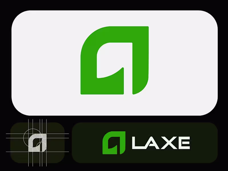
Luxury Event Brand Identity, Signature Logo Design, Event Planner Branding, Gold Brand Identity, Script Logo Design, Visual Identity System, Custom Logo Design, Brand Identity Designer, Luxury Logo Design, Event Brand Design, Handcrafted Logo Design, Premium Brand Identity, Calligraphy Logo Design, Brand Mockup Design, Logo Design Concept, Black And Gold Branding, Event Planner Logo, Signature Brand Identity, Full Brand System, Brand Strategy Design Laxe – Modern Minimalist Logo for an Axe & Tool Brand
Crafted a bold yet refined logo for Laxe, a premium axe and outdoor tool brand. The abstract mark combines a strong "L" with a subtle blade-like curve, symbolizing precision, power, and craftsmanship.Clean geometric construction, balanced proportions, and a vibrant yet sophisticated green palette make it versatile across packaging, apparel, digital, and physical products.
Focused on minimalism with just enough edge to feel tool-ready.Explored multiple color directions (deep green, red, inverted) before landing on this crisp light-background version for maximum adaptability.
What do you think? ready for the workshop or still needs more bite?
Ready to dominate?
👉 Say goodbye Unmemorable Logo, Branding, Social Media Post & Packaging Design Hello to memorable and Recognisable design!🌟
📩 Available for new projects Signature Brand Identity System for a Photography Business
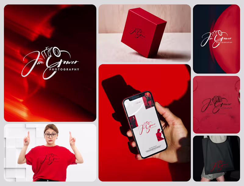
PROJECT DESCRIPTION:
Jim Gower is a professional photographer who needed more than a logo. He needed a complete brand identity that could represent his work at every level — from a business card handed to a client after a shoot to a lightbox sign above a studio entrance.
The brief was clear: build something that feels personal, premium, and immediately recognizable as belonging to one person and one vision.
The Approach
Every decision in this project started with strategy before it touched aesthetics. Who is Jim Gower to his ideal client? What feeling should someone walk away with after their first encounter with his brand? What does premium mean in the photography space right now — and how do you stand apart from it without alienating it?
The answers shaped everything that followed.
The Work
The primary logo is a signature script with the camera body structurally integrated into the letterforms — the "G" in Gower becomes the lens housing, making the mark read as both a name and a profession without requiring a separate icon. The script carries energy and movement, referencing the intuitive, fast-moving nature of working photographers.
The crimson brand palette was selected for emotional weight — confident, warm, and saturated enough to hold presence across both physical and digital surfaces without compromise.
The full system was then applied and stress-tested across every client touchpoint:
— Primary and secondary logo variations
— Brand color palette and typography system
— Business card design
— Premium gift box packaging
— Tote bag and apparel
— Digital UI mockup for web and mobile
— Environmental signage and lightbox application
The Result
A brand identity system that positions Jim Gower not as a photographer with a logo, but as a brand with a presence — one that commands attention, communicates quality instantly, and scales from a phone screen to a storefront without losing a single point of its power.
SERVICES INCLUDED IN THIS PROJECT:
Brand Strategy, Logo Design, Visual Identity System, Brand Collateral Design, Packaging Design, Apparel Mockup, Digital UI Application, Environmental Signage Mockup
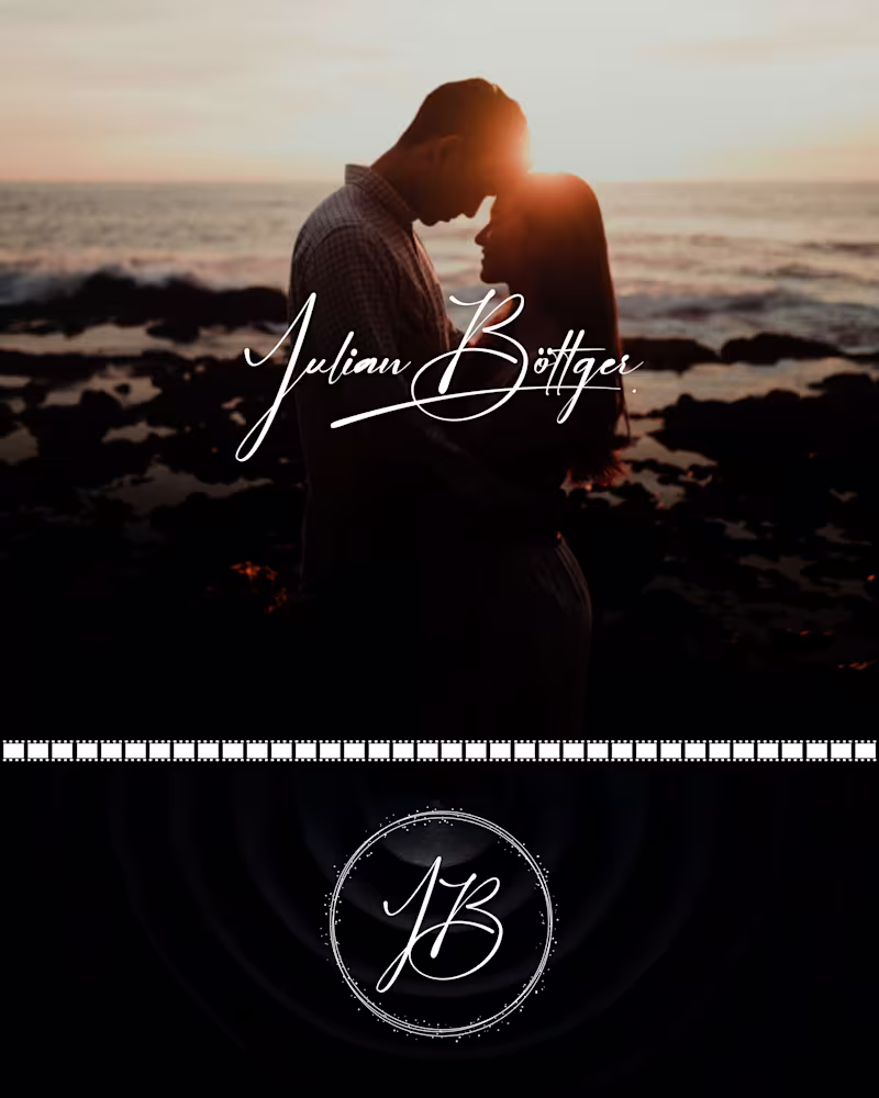
Photography Logo Design, Signature Logo Design, Brand Identity System, Photographer Branding, Script Logo Design, Visual Identity Design, Custom Logo Design, Brand Identity Designer, Logo Design Process, Creative Brand Design, Handcrafted Logo Design, Photography Brand Kit, Premium Brand Identity, Calligraphy Logo Design, Brand Mockup Design, Logo Design Concept, Red Brand Identity, Photographer Visual Identity, Brand Strategy Design, Full Brand System Julian Böttger — Full Brand Identity for a Wedding & Portrait Photographer
A photographer's work lives and dies by first impressions. Julian's images were exceptional. His brand wasn't keeping up.
We built a complete visual identity from the ground up — designed to feel personal, timeless, and scalable across every surface it would ever touch.
What was delivered:
→ Custom hand-lettered signature logotype (primary mark)
→ Monogram seal (JB) for watermarks, merch, and secondary use
→ Business card system — black and white versions
→ Studio signage mockup
→ Apparel (t-shirt + tote bag)
→ Stationery and print collateral
→ Film-strip and overlay assets for video content
The brief was clear: no templates, no stock fonts, nothing generic. Every element was drawn or crafted specifically for this brand.
The identity now works at every scale — from a coffee mug to a 6-foot sign — and across every context, from dark editorial photography to bright lifestyle imagery.
Available for similar projects. Inquire to discuss scope and timeline.
Brand Identity, Logo Design, Visual Identity, Graphic Design, Photography, Creative Services, Wedding Industry, Brand Guidelines, Print Design, Merch Design