
UX/UI Designer | Framer Developer | AI, Low-Code


UX/UI Designer | Framer Developer | AI, Low-Code
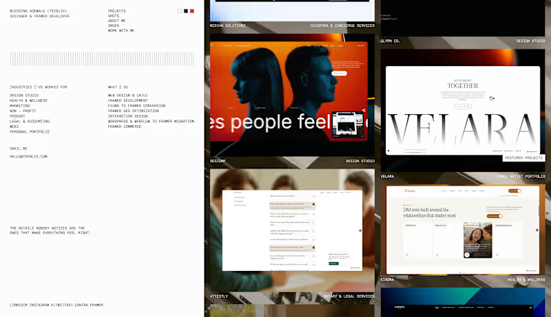
Same me. New corner of the internet.
Portfolio rebuilt from scratch. New work, new structure, finally where I want it to be.
teeblix.com (http://teeblix.com)
2
3
306
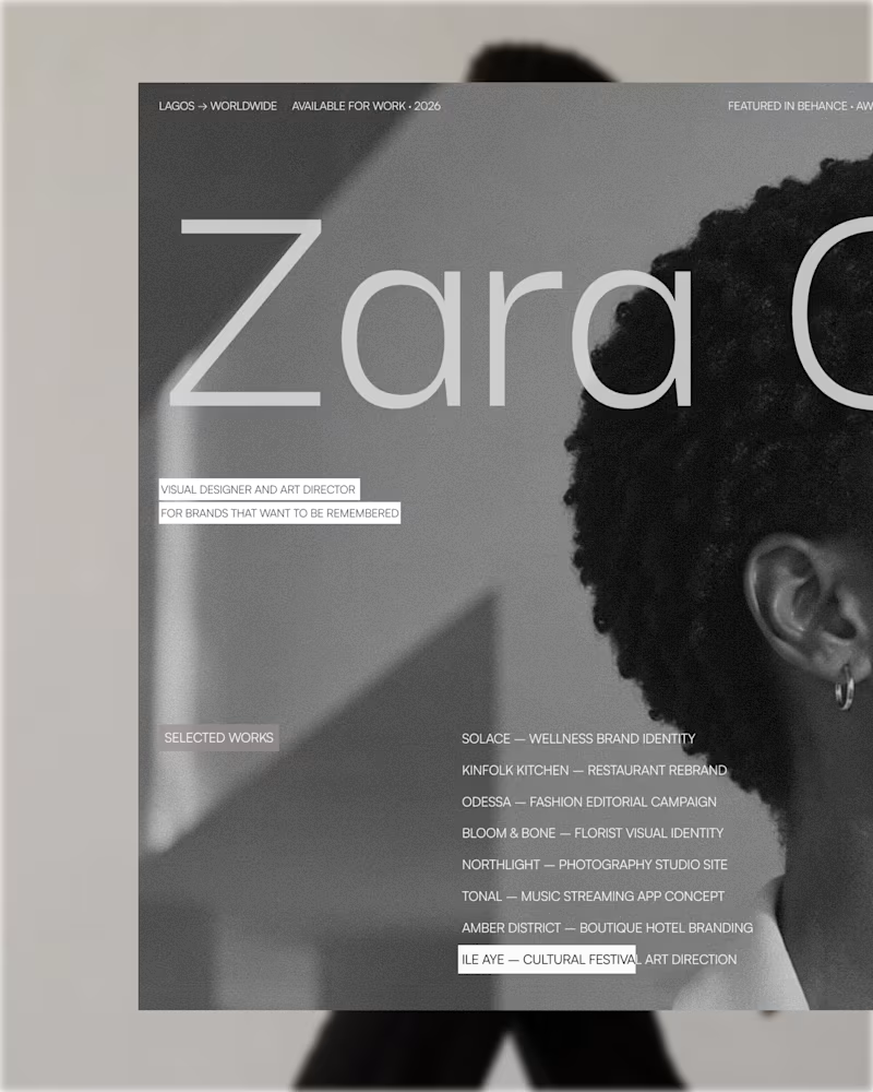
Hero section exploration for "Zara" designed and built with Framer.
I am Blessing Adewale, also known as Teeblix. I am a digital product designer and Framer developer.
Have a project? I'd like to hear.
Cal link: https://cal.com/blessing-adewale-iuyo9d/discovery-call
2
2
283
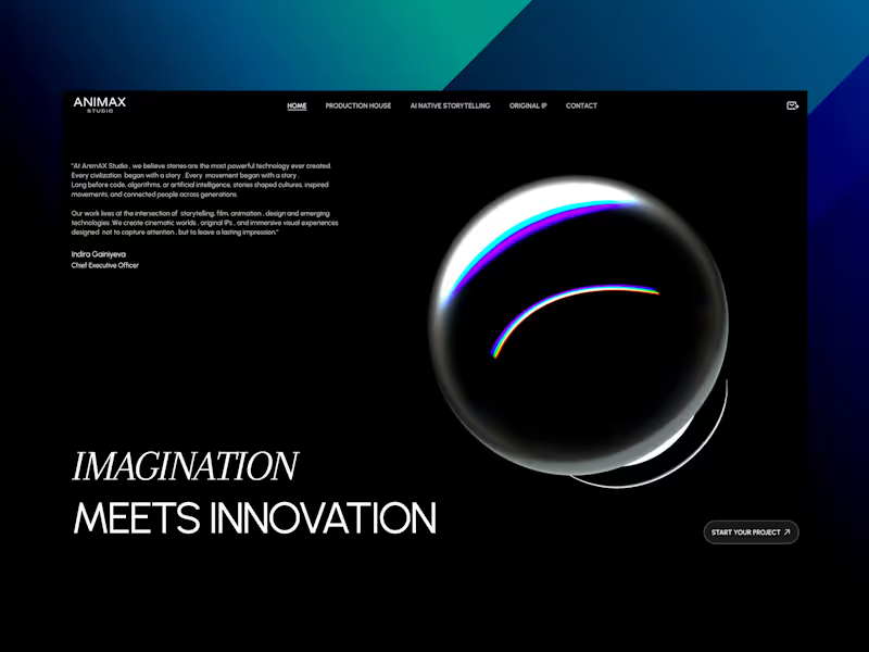

The homepage for my new Framer template, Patina is done. It is built for estate sale companies and fine auction houses. I picked this niche on purpose.
The homepage covers everything these businesses actually need. Upcoming auctions, past results with prices, services for sellers, and a clear path to request an appraisal.
More as I progress ⏳
2
3
349

Product Designer for B2B SaaS & AI Products

Product Designer for B2B SaaS & AI Products
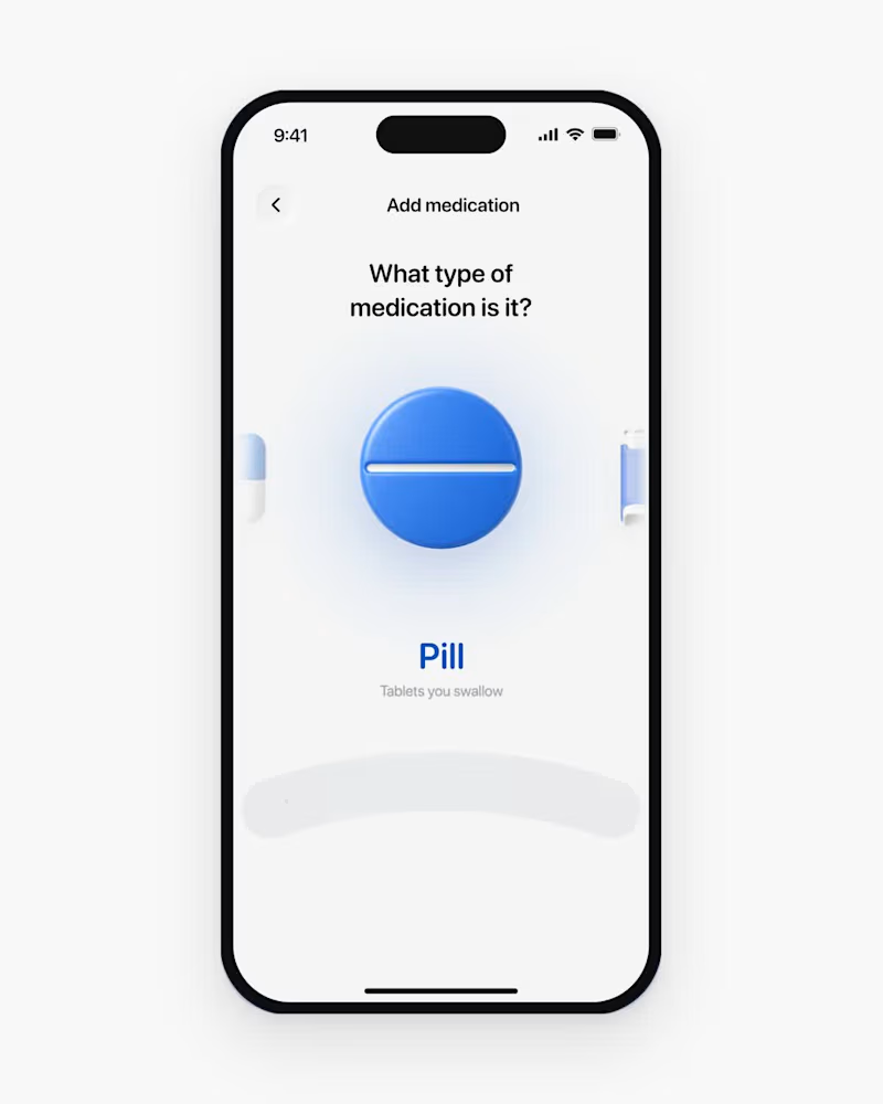
The experience is in the details. ✨
A few interaction design explorations from my recent projects.
I’m available for new product design projects this November. If you’re building a new product or looking to improve an existing one, let’s talk.
https://cal.com/wuraola/30mins-meeting
4
5
680
I took this dashboard beyond static UI by adding motion and interaction to the experience.
I used Claude to assist with the animation, guiding the process through clear instructions, iterations, and adjustments to achieve the interactions I had in mind.
The tool supported the execution, but the direction came from me.
4
185

I build high-converting sites in WordPress, Webflow & Framer
- $5k+
- Earned
- 3x
- Hired
- 4.4
- Rating
- 68
- Followers
I build high-converting sites in WordPress, Webflow & Framer

Built a complete multi-vendor luxury fashion marketplace for BRANDI, a Saudi Arabian client targeting the Arabic-speaking market. This sophisticated e-commerce platform generated 5,000+ Saudi Riyal revenue and onboarded 20+ independent vendors within the first 4-6 weeks, achieving outstanding 92-96% scores across Performance, SEO, Best Practices, and Accessibility.
Check it out (https://contra.com/p/AXmrkeMR-luxury-fashion-marketplace-development-for-brandi)
1
243


Product designer (Web & Mobile App Designer)
- 1x
- Hired
- 5.0
- Rating
- 35
- Followers
Product designer (Web & Mobile App Designer)

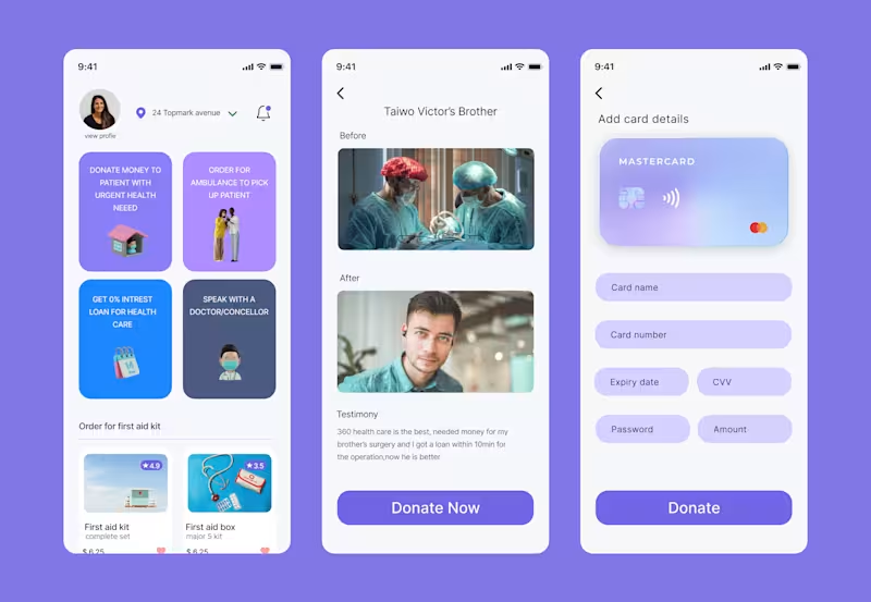
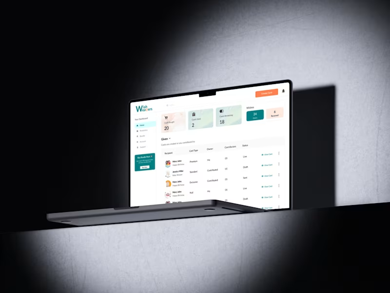

Passionate Product & UI/UX Designer
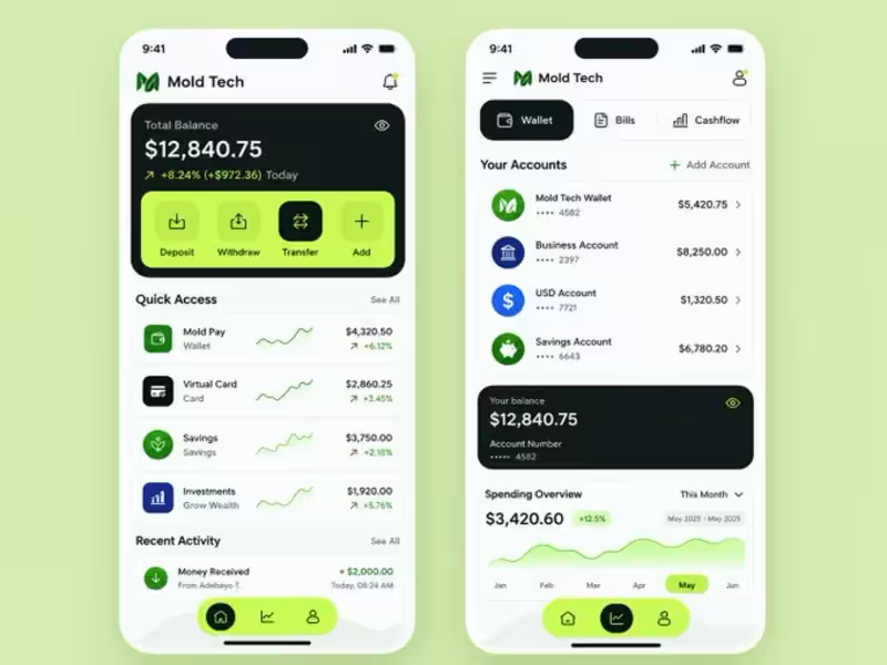
Exploring a fresh direction for Mold Tech
A clean, modern fintech dashboard focused on simplicity, functionality, and a bold visual identity.
Designed to make managing money feel effortless.
What do you think?
#UIUXDesign (https://x.com/hashtag/UIUXDesign?src=hashtag_click) #FintechDesign (https://x.com/hashtag/FintechDesign?src=hashtag_click) #MobileAppDesign (https://x.com/hashtag/MobileAppDesign?src=hashtag_click) #MoldTech (https://x.com/hashtag/MoldTech?src=hashtag_click)
1
52
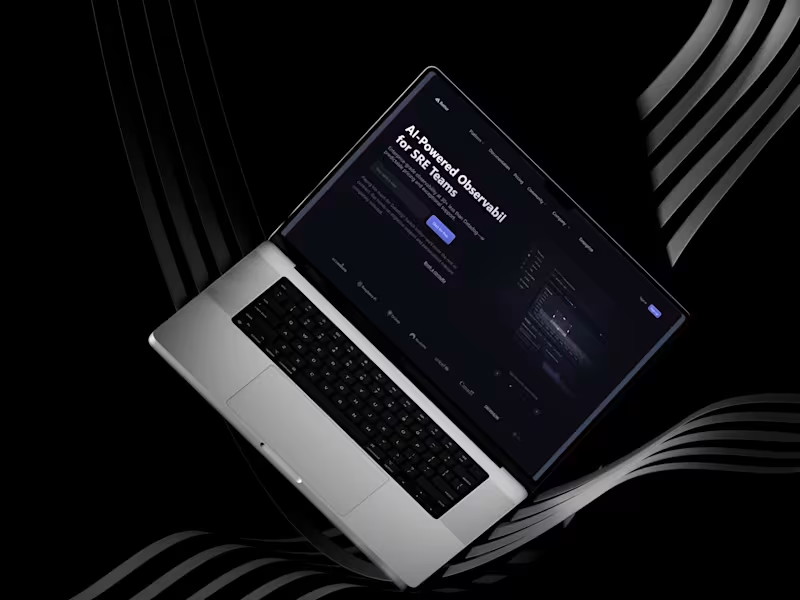
AI-Powered SRE SaaS Landing Page Design
Designed a high-converting, developer-focused landing page tailored for AI-powered observability and SRE (Site Reliability Engineering) teams.
The Challenge:
Building trust and communicating complex technical infrastructure solutions to a sophisticated audience requires a precise balance of authority, clarity, and visual appeal.
The Solution:
Dark-Mode Aesthetic: Leveraged a sleek, high-tech dark background with subtle neon/purple accents to instantly resonate with developers and technical buyers.
Clear Information Architecture: Structured the layout to guide visitors smoothly from a strong hero value proposition down to key metrics, feature breakdowns, code previews, pricing, and social proof.
Conversion-Focused Layout: Strategically placed call-to-action (CTA) buttons throughout the long-scroll layout to maximize conversion touchpoints.
1
55

🏠 HOMII – Roofing Company Landing Page Hero Concept
First impressions matter, especially for service-based businesses.
For this concept, I designed a modern hero section for HOMII, a roofing company focused on quality craftsmanship and durable roofing solutions.
Design Goals
Create a bold and trustworthy first impression.
Establish a clear visual hierarchy.
Use strong typography to communicate the core message.
Highlight the primary call-to-action for better conversions.
Balance aesthetics with usability.
Every element—from the navigation to the CTA—was designed to guide users naturally toward taking action while reinforcing the brand's professionalism.
I'm always looking to refine my craft, so feedback is welcome.
Tools: Figma
#ProductDesign #UIDesign #UXDesign #WebDesign #LandingPage #Figma #DesignPortfolio #UIUX
1
84
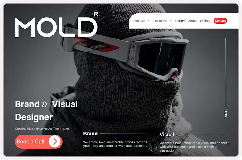
MOLD® — Brand & Visual Designer Portfolio Concept
Project Overview
MOLD® is a premium portfolio website concept designed for a Brand & Visual Designer. The goal was to create a bold, memorable digital presence that immediately captures attention while showcasing creativity, professionalism, and expertise.
Inspired by editorial layouts and luxury branding, the design combines striking imagery, oversized typography, and strategic use of whitespace to create an immersive first impression.
The Challenge
Many designer portfolios struggle to stand out in a crowded digital landscape. The challenge was to create a homepage that:
Establishes a strong personal brand
Communicates expertise within seconds
Creates an emotional connection with visitors
Encourages potential clients to take action
Balances creativity with usability
Design Approach
This concept focuses on delivering a premium visual experience while maintaining a clear user journey.
Key design decisions include:
✨ Oversized typography for strong brand presence
✨ Editorial-inspired layout structure
✨ High-impact hero imagery
✨ Strategic use of contrast and whitespace
✨ Clear call-to-action placement
✨ Modern portfolio aesthetics
Services Highlighted
Brand Design
Creating memorable brand identities that tell compelling stories and connect with audiences.
Visual Design
Designing impactful visual experiences that strengthen brand perception and leave lasting impressions.
Design Highlights
✔ Premium portfolio homepage
✔ Bold visual storytelling
✔ Strong typography hierarchy
✔ Conversion-focused CTA design
✔ Personal branding approach
✔ Modern and responsive-ready layout
Tools Used
Figma
Auto Layout
Design Systems
Responsive Design Principles
Visual Identity Design
What I Learned
This project reinforced the importance of balancing aesthetics with strategy. A successful portfolio isn't just about showcasing work—it's about communicating value, building trust, and creating opportunities for collaboration.
Looking for a Brand & Visual Designer?
I help businesses, startups, and personal brands create bold identities and digital experiences that stand out and drive results.
Let's build something memorable together.
1
84

Professional freelancer
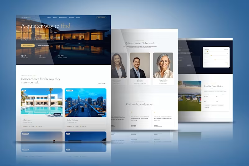
This project involved designing a website for Maison Noir, a private real estate platform focused on curated, handpicked residences for discerning clients. The homepage opens with a striking dusk photograph of a modern villa paired with the line "A quieter way to find home," immediately setting a tone of quiet luxury rather than typical high volume real estate marketing. Trust is built early through a simple stats bar showing total value sold, countries covered, and private clients served. The listings section presents featured residences like Villa Serena in Malibu and a Skyline Penthouse in Tribeca with clean pricing, bed and bath counts, and square footage, while an advisor section introduces the team behind each region with a calm, editorial photography style. Client testimonials are framed as "kind words, quietly earned," reinforcing the discreet, relationship driven positioning of the brand. A supporting mortgage calculator and neighborhood insight page round out the experience with practical tools alongside the aspirational content. Typography leans on an elegant serif paired with warm gold accents against deep navy and clean white sections, giving the whole site a restrained, high end feel throughout.
4
6
613
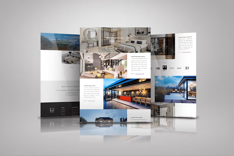

Ui designer
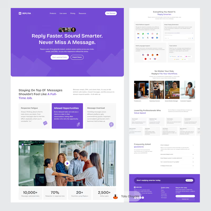
Ever missed a message and thought, “I’ll reply later”… then forgot?
That’s the problem Replyra solves.
I designed a landing page for Replyra an AI assistant that helps you reply faster, sound better, and stay consistent across conversations.
1
123
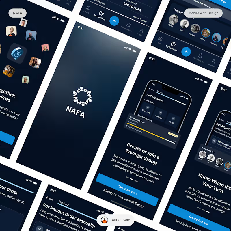
Following up on the NAFA light mode shared earlier, here’s a look at the dark mode experience.
The focus here was on maintaining clarity, reducing visual strain, and creating a more immersive interface without losing usability.
Curious to hear which direction you prefer—light or dark?
1
126
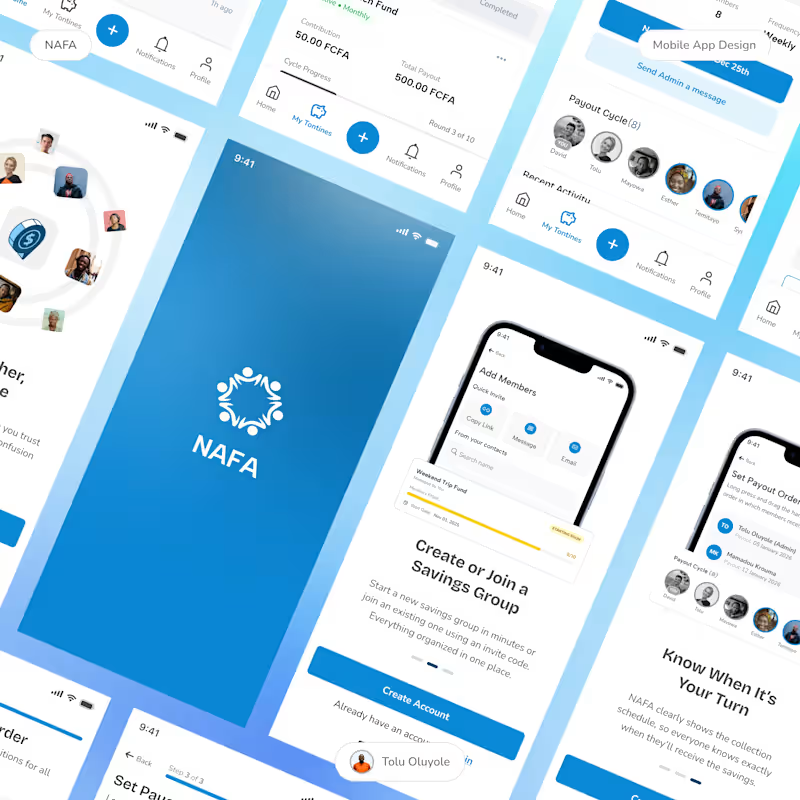
NAFA is a product concept designed to modernize group savings systems commonly used across many communities.
The goal:
• Improve trust through transparency
• Simplify contribution tracking
• Create a seamless user experience
Here are some mobile screens from the project.
#uidesigns (https://www.linkedin.com/search/results/all/?keywords=%23uidesigns&origin=HASH_TAG_FROM_FEED) #mobileapp (https://www.linkedin.com/search/results/all/?keywords=%23mobileapp&origin=HASH_TAG_FROM_FEED) #groupsavings (https://www.linkedin.com/search/results/all/?keywords=%23groupsavings&origin=HASH_TAG_FROM_FEED)
2
163
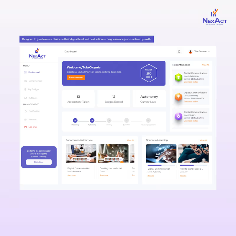
A closer look inside the NEXACT web application.
The interface is only the surface — beneath it is a structured system for assessment and level-based progression.
#productdesign
(https://www.instagram.com/explore/tags/productdesign/)#uxdesign
(https://www.instagram.com/explore/tags/uxdesign/)#uiux
(https://www.instagram.com/explore/tags/uiux/)#EdTech
(https://www.instagram.com/explore/tags/edtech/)#techinnovation
(https://www.instagram.com/explore/tags/techinnovation/)#buildinpublic (https://www.instagram.com/explore/tags/buildinpublic/)
2
1
134

UI/UX Designer Helping Startups Build Scalable Products.
- 5.0
- Rating
- 43
- Followers
UI/UX Designer Helping Startups Build Scalable Products.
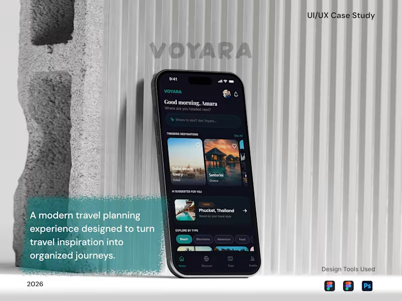

This is the first time I will participate in a contra challenge. I designed a website called Culture Pulse and it is an interactive social mood tracker that transforms how we explore trends, emotions, and collective experiences online.
You can check it out here:
https://stamp-ebony-56540011.figma.site/
I love the result, all thanks to Figma Make
2
179

