Projects in OsunProjects in OsunAurelis Estates is a premium real estate experience combining luxury editorial design, sophisticated frontend engineering, and an AI-assisted development workflow.
Built with React, the platform pairs cinematic visuals with GSAP animations, Lenis smooth scrolling, Framer Motion interactions, and Three.js effects. Functional experiences include dynamic property filtering, curated international markets, interactive mapping, inquiry flows, and a real-time mortgage calculator.
AI coding tools were integrated throughout the development lifecycle to accelerate implementation, debugging, refactoring, codebase analysis, testing, and iteration, while architecture, UX direction, technical decisions, and quality control remained developer-led.
The result is a responsive, accessible, and production-ready web experience that demonstrates strong frontend engineering alongside the ability to effectively direct modern AI development tools from concept through final implementation. Beauty & Cosmetics E-commerce Website
Overview
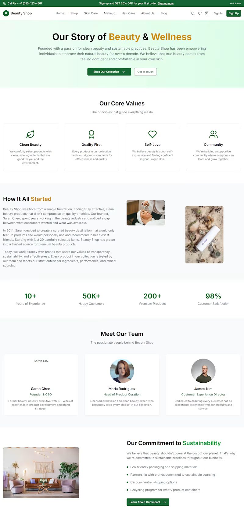
I designed and developed a modern e-commerce experience for a beauty and cosmetics brand, focused on creating a clean shopping journey while making products, categories, promotions, and offers easy to discover.
The Goal
The goal was to create a premium-looking online beauty store that feels trustworthy, visually engaging, and easy to navigate — while giving customers a clear path from discovering a product to shopping.
What I Built
Modern beauty-focused homepage
Product discovery and category navigation
Best-selling product section
Product cards with ratings, pricing, discounts, and CTAs
Skincare, makeup, hair care, fragrance, nail care, and body care categories
Promotional and seasonal offer sections
Featured deals and discount sections
Responsive e-commerce layout
Clear shopping CTAs throughout the experience
Newsletter and customer-focused footer sections
My Approach
I focused on combining strong visual hierarchy with a simple shopping experience. Products and promotions are given enough visual space to stand out, while the navigation and category structure make it easy for customers to explore the store.
The design also uses promotional sections strategically to draw attention to discounts and featured collections without making the interface feel cluttered.
Result
The final result is a polished beauty e-commerce interface that brings together product discovery, promotional content, categories, and shopping actions in one cohesive experience.
Live website: https://dam-beta.vercel.app/
Tools & Skills
Web Design · E-commerce · UI/UX Design · Responsive Design · Frontend Development · Vercel Absolutely. Here’s a ~1,200-character version written to make store owners stop, think, and keep reading.
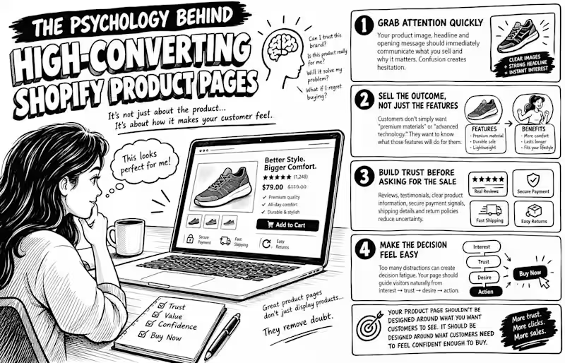
The Psychology Behind High-Converting Shopify Product Pages
Why do some Shopify product pages make you want to click “Buy Now”, while others make you leave, even when the product is good?
It’s not always about price. It’s psychology.
Before customers buy, their brains are quietly asking: Can I trust this brand? Is this product really for me? Will it solve my problem? What happens if I regret buying it?
A high-converting product page answers these questions before the customer has to ask.
1. Grab attention quickly.
Your product image, headline, and opening message should immediately communicate what you sell and why it matters. Confusion creates hesitation.
2. Sell the outcome, not just the features.
Customers don’t simply want “premium materials” or “advanced technology.” They want to know what those features will do for them.
3. Build trust before asking for the sale.
Reviews, testimonials, clear product information, secure payment signals, shipping details, and return policies reduce uncertainty.
4. Make the decision feel easy.
Too many distractions can create decision fatigue. Your page should guide visitors naturally from interest → trust → desire → action.
And here’s the biggest mistake:
Your product page shouldn’t be designed around what you want customers to see.
It should be designed around what customers need to feel confident enough to buy.
Because great product pages don’t just display products.
They remove doubt.
If you want, I can also turn this into a 1400 × 900 black-and-white comic/sketch illustration concept that visually explains the psychology behind the post.