Projects in Nuenen
Projects in Nuenen
Sign Up
Post a job
Sign Up
Log In
Filters
1
Projects
People
Message
39
Lucia Diaz
pro
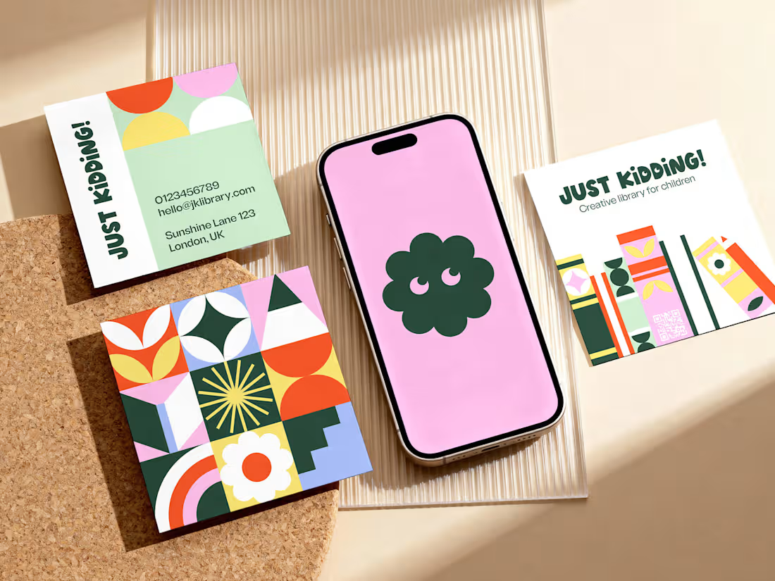
JUST KIDDING! | Brand Identity & Collateral
39
545
Message
0
Kai Rennenberg
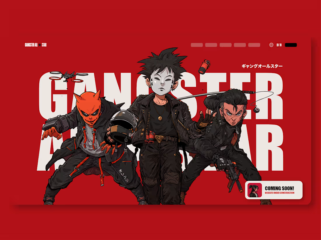
Gangster All Star - Rebrand
0
15
Message
2
Niels Wiersma
pro
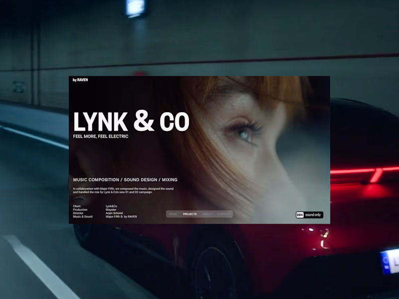
by RAVEN - Web Design & Development
2
14
Message
0
Cecilia Lopez
Notion workflow consulting for entrepreneur's new project
0
15
Message
0
Abigail French
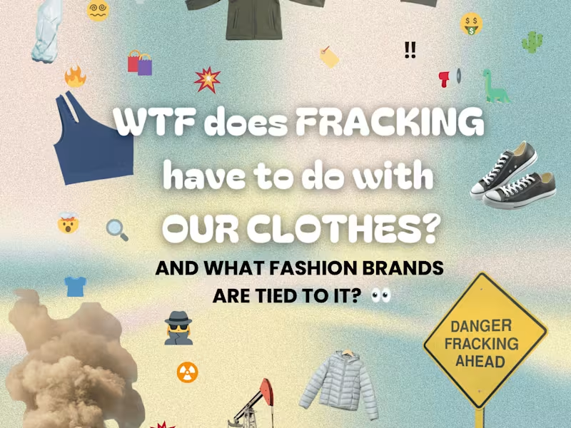
Informative Instagram Carousel | Sustainable Fashion
0
25
Message
0
Chris Hoo
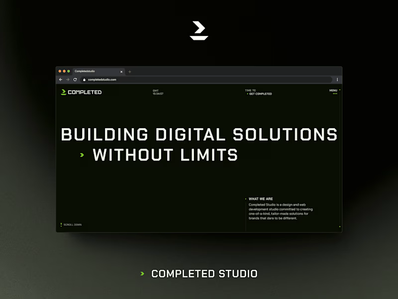
Completed Studio
0
18
Message
0
Veronika
Infinity
0
10
Message
0
Rick Hermanus Antonius de Klein
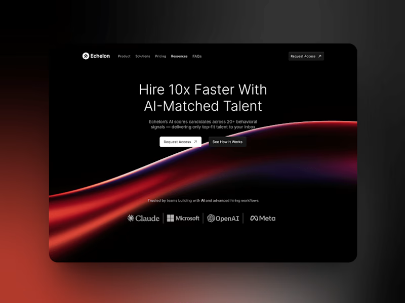
Echelon - AI-Matched Talent Platform
0
9
Message
0
Timo Meijs
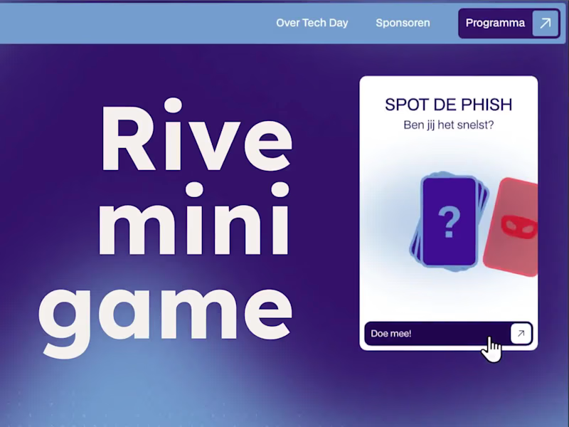
Digital Days | Educative Mini-Game
0
13
Message
1
Michelle de Haas
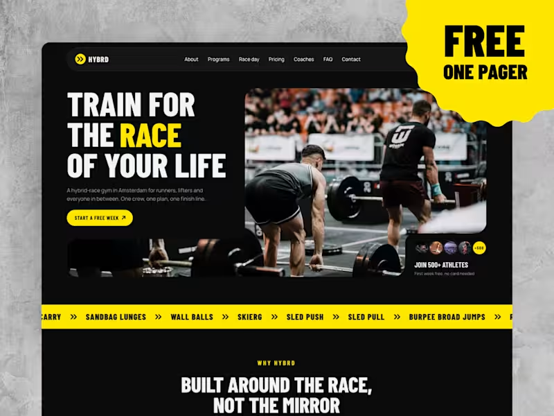
HYBRD Lite is live, and it's free! A one-page site for Hyrox and hybrid race gyms, built from the homepage of HYBRD Race Gym. It has a hero, programs with a lightbox for each class, race day stations, pricing, coaches, FAQ, a location section and a contact form. It works on desktop, tablet and phone. Remix it, swap in your own photos and prices, and your gym has a site today. Need more pages? The full HYBRD Race Gym has 15 pages, four CMS collections and a weekly timetable that builds itself. Check it out: https://hybrdlite.framer.website/
2
1
20
Message
0
Michiel Burgess
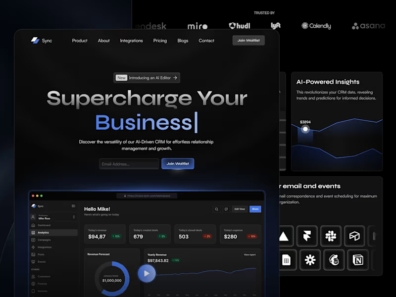
Sync SaaS CRM - Framer Template
0
26
Message
0
jimmy faro
AI Landing Page Studio — Concept
0
3
Message
0
Thomas van der Heiden
Various 3D Projects
0
6
Message
1
Arkadiusz Staniek
pro
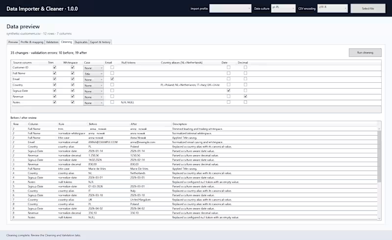
New portfolio project: Data Importer & Cleaner v1.0.1 Messy spreadsheets are easy to clean. Cleaning them safely, reproducibly and without losing track of what changed is the harder problem. I built a Windows desktop application that turns inconsistent CSV and Excel files into validated, cleaned and reusable datasets through a complete reviewable workflow: Import → Profile → Map → Validate → Clean → Deduplicate → Review → Export Built with C#, .NET 10, WPF, EF Core and SQLite. Engineering highlights: → immutable source data → before/after transformation evidence → separate validation and cleaning engines → deterministic duplicate detection → CSV, XLSX and SQLite export → 63 automated tests → zero-warning Release build → 50,000-row pipeline completed in 2.853 seconds → CI, coverage gates and automated release verification The complete project, documentation and Windows release are available on GitHub: https://github.com/Staniek-Tech-NL/data-importer-cleaner #dotnet #csharp #wpf #dataprocessing #softwareengineering
1
62
Message
1
Get Sparked Studio
ProFusion is a high-end padel clinic concept that positions sport as a strategic instrument for professional growth. Operating at the intersection of athletic performance and business development, ProFusion designs curated padel experiences for technology-driven organizations, with a deliberate focus on collaboration, leadership and connection across hierarchical levels. Strategic Foundation and Brand Essence At its core, ProFusion is built on the belief that sustainable performance is never purely individual. In both sport and business, excellence emerges through alignment, trust and shared strategy. The brand name itself reflects this philosophy: a fusion of professional ambition and collective energy, translating the dynamics of padel into a business-relevant context. Rather than positioning its clinics as recreational off-sites, ProFusion frames them as transformative environments. Participants are temporarily removed from the rigidity of the office setting and immersed in an experience where anticipation, communication and adaptability become tangible. The clinics are designed to strengthen interpersonal dynamics, stimulate strategic thinking and ultimately enable teams to perform at a higher level together. Target Audience ProFusion primarily addresses organizations within the technology sector, where innovation, speed and collaboration are essential to success. The clinics are intentionally structured around mixed seniority participation: each company is represented by both junior and senior professionals. This dual-level approach serves a strategic purpose. Juniors bring fresh perspectives, agility and curiosity, while seniors contribute experience, decision-making authority and long-term vision. Through shared physical activity and informal interaction, traditional hierarchies soften, enabling authentic dialogue and mutual understanding. Value Proposition and Key Differentiators ProFusion distinguishes itself through a carefully curated, high-end experience that extends beyond the court. Key brand pillars include: Premium padel clinics with a strong focus on quality and professionalism Structured networking moments that facilitate meaningful B2B connections Thought-provoking speakers who bridge sport and business strategy A deliberate mix of junior and senior participants to stimulate cross-level interaction Together, these elements position ProFusion as both a learning environment and a networking platform, where performance, play and professional development converge. Market Analysis and Positioning An exploratory analysis of existing padel clubs, clinics and related events revealed a highly saturated visual landscape. Most competitors rely on literal, illustrative identities featuring direct representations of padel rackets and balls. While functional, these identities often appear dated, interchangeable and lacking in professional credibility. Given padel’s rapid growth and contemporary appeal, this visual conservatism presents a clear opportunity. For ProFusion, the strategic choice was to avoid illustrative clichés and instead develop a refined, abstract visual language that aligns with the expectations of a corporate, technology-oriented audience. Concept Development and Moodboard Phase As part of the brand strategy process, a dedicated moodboard phase was conducted to align vision and expectations. Two distinct stylistic directions were presented to the founders. The first explored a more abstract interpretation of connection and play, while the second maintained a clearer reference to padel without resorting to literal imagery. This phase functioned not only as a visual exploration, but also as a strategic dialogue. It created space to articulate preferences, boundaries and long-term ambition. Ultimately, the founders selected the direction that subtly references padel while preserving a strong sense of professionalism and clarity. Logo Design & Symbolism The Costa del Son logo is constructed from four conceptual pillars: Spain, festival culture, Gaudí and chique refinement. Typography and illustration merge into a single system, with custom-drawn letterforms reinforcing the handcrafted quality of the identity. Visual elements within the logo include a semi-circular form referencing a Spanish fan or the sun; a flowing underline that represents music and festival movement; a salamander or dragon symbolising Gaudí’s architectural motifs; and a typographic ligature that conveys elegance and cohesion. The logo system was delivered in three variations: a primary illustrated logo, a secondary wordmark and a tertiary sticker-style version for flexible application. Graphic Language and Structure The final visual identity is highly graphic and built from fundamental geometric shapes. Both the wordmark and symbol are derived from circles and modular forms inspired by the ball and racket, abstracted to avoid direct illustration. The coming together of four forms symbolizes the dynamics of padel as well as collaboration, exchange and shared momentum. Network structures and directional elements are integrated throughout the system to prevent visual stagnation and to reflect speed, interaction and progression. The colour palette reinforces the balance between professionalism and energy. Deep, grounded tones establish authority and trust, while vibrant accents inject movement and vitality. Together, they mirror the dual nature of ProFusion: strategic and composed, yet dynamic and competitive. Each colour is contributing to a hierarchy that supports both clarity and contrast across applications. Typography plays a central role in reinforcing coherence and tone. The primary typeface is rooted in geometric construction, closely aligning with the modular logic of the logo. Its balanced proportions and open forms ensure legibility across both digital and print contexts, making it highly suitable for body text and functional communication. The secondary typeface introduces a refined layer of character. Its bold, geometric, rounded structure, creates a controlled sense of playfulness without compromising professionalism. This typeface is primarily deployed in headlines and accent elements, reinforcing distinction and hierarchy within the visual system. The logo is composed of four circular forms arranged in a square configuration. Each circle is extended with a triangular element, abstractly referencing padel rackets while simultaneously symbolizing interaction and convergence. The use of multiple colours within the symbol reinforces diversity, collaboration and movement. Within the wordmark, several typographic interventions add conceptual depth. The modified tail of the letter P subtly resembles a speech bubble, referencing dialogue and networking. The adapted F introduces curved segments that emphasize speed and flow. The vivid green dot on the I stands apart from the otherwise restrained wordmark, functioning as a visual metaphor for the ball and a focal point within the composition. Brand Extensions and Applications To ensure consistency and scalability, the identity was extended across a comprehensive range of assets. These include graphic patterns, modular visual elements, social media templates, flags, branded cups and custom padel rackets. Each application reinforces the core system while allowing for variation and adaptability across physical and digital touch points. Outcome The ProFusion brand identity translates an abstract strategic concept into a coherent visual system. By avoiding literal sports symbolism and focusing instead on structure, rhythm and interaction, the identity positions ProFusion as a credible, future-oriented platform for professional connection through sport.
1
44
Message
2
Pravin Baldaniya
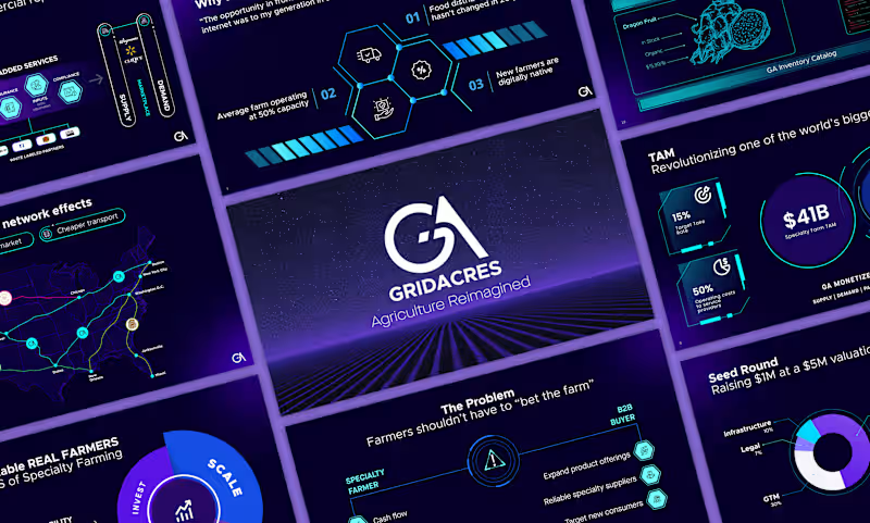
Good morning LinkedIn fam 👋 Hope your day’s off to a strong start! Here’s a peek at one of my recent presentation designs, built fully in Figma slides. I don’t “make” my clients better. They already are. I just help their stories look as remarkable as they truly are. 💡✨ What do you think?
1
2
88
Explore projects