
I solve business problems through design that works
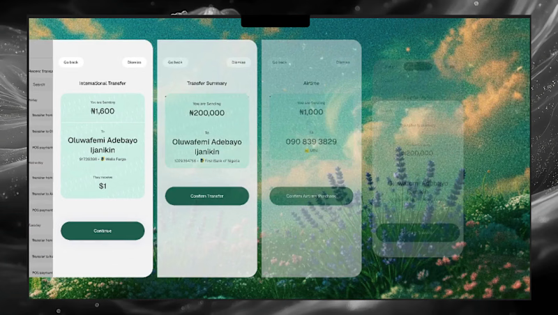
I will be posting more about Avid in the coming weeks. Its a Fintech product imagined for users who do not have a built up mental model of how to navigate digital products
You see ~90% of designs/products we consider intuitive are simply building on previous exposure to digital products and the internet at large. Give that "Intuitive" product to an individual who does not have this previous exposure and watch it all break apart.
You will find yourself explaining EVERY. SINGLE. THING
When designing AVID, this was the problem I sought to solve not just to cater to these users but to provide support for every user during their low confidence moments where they need to be super careful, where their errors are costly
But for now, here is a motion teaser. Designed in Figma Motion by yours truly, Oluwatobi Adetunji, a product designer for Sports, Fintech, Crypto, Web3 and AI systems
0
32


Product Designer
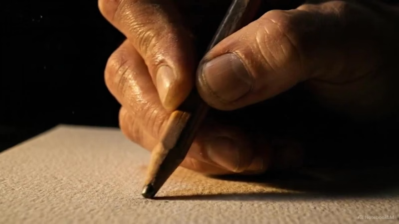
Every person I know who creates for a living has asked themselves the same question in the last two years.
They just haven't said it to anyone.
This video is for them.
Watch till the end.
#AI #Design #Creativity #TheThreshold
0
50
https://ofego.design
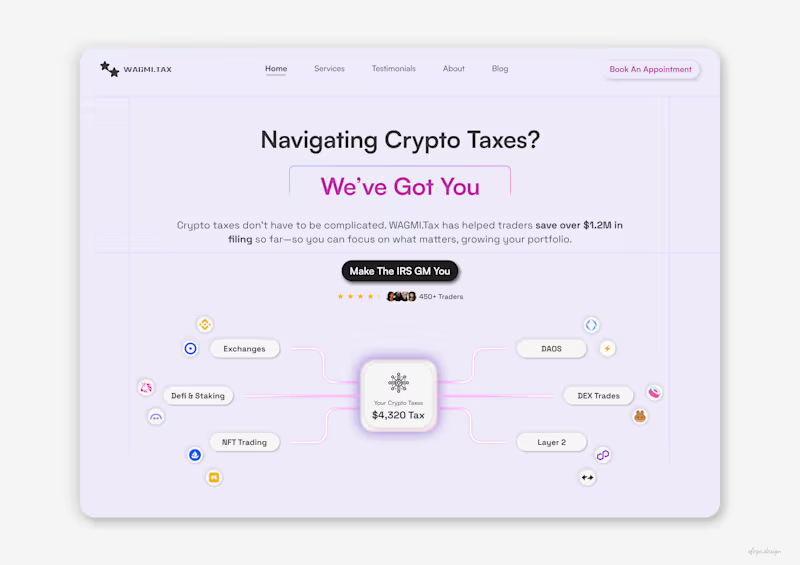
(https://ofego.design)AI is making it easier to design. It’s not making great design easier.
I’ve been designing digital products for a few years now, and AI has become a big part of my workflow. It helps me move faster and explore ideas much quicker.
But I still believe product designers matter.
Taste matters.
Knowing what looks good, what feels right, and how to turn an idea into something people actually want to use is still incredibly valuable.
If you've got a project that needs a designer, a permanent role, or contract work, my DMs are open.
Or book a call with me: https://calendly.com/ofego/30min
0
21
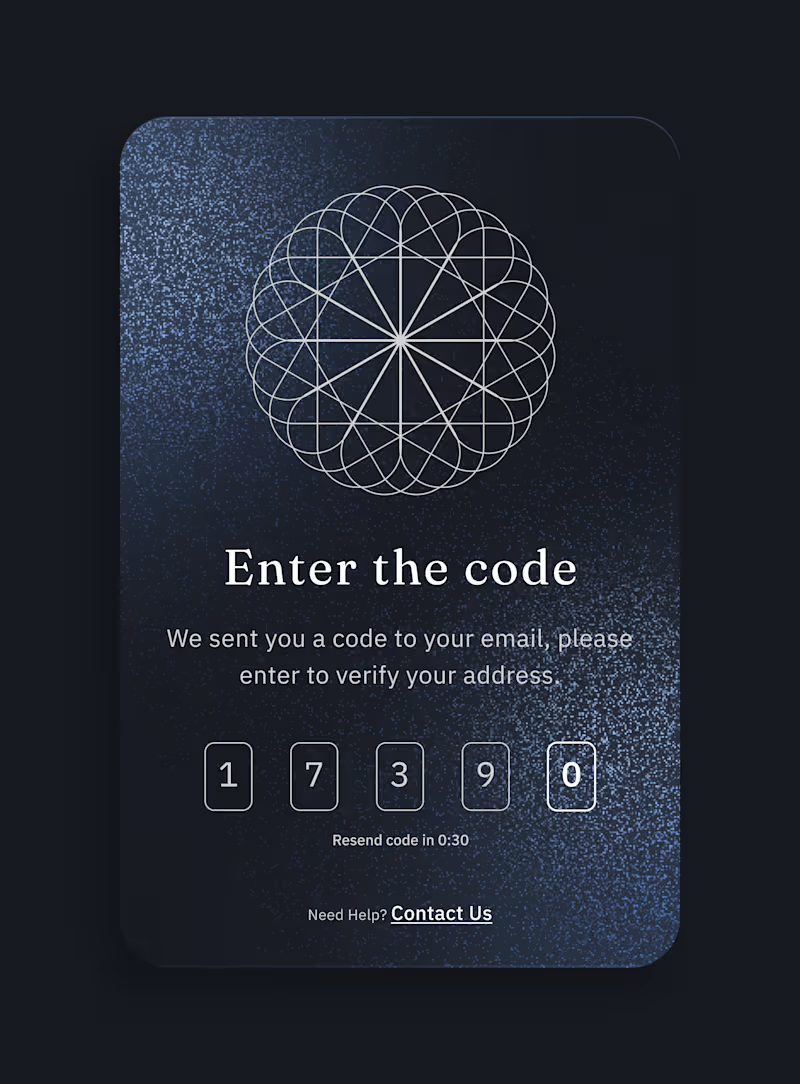
You paid to acquire that user.
They quit at a 6-digit code.
Verification is the most expensive screen in your product, and most teams ship it in an afternoon.
Here's how the money leaks:
The code takes 40 seconds to land. No resend. No timer. No sign that anything is happening.
So the user switches to their inbox, gets pulled into something else, and never comes back.
You already spent the CAC. The intent was there. You had them.
Gone, on a screen nobody owned.
Three decisions that mattered:
→ Make the wait visible. A resend timer says the system is working. Silence says it's broken.
→ Treat it like a real screen. If verification looks like an afterthought, people assume the product is one too.
→ Make state obvious. Which field is live, what an error looks like, what to do when the code never arrives.
None of that is hard. It just gets skipped, because verification isn't seen as a "real feature."
If you're losing more than 15% between signup and verified, it isn't your users.
It's the screen.
Founders and growth leads — where does your funnel actually leak? Signup, verification, or first session?
Tell me below and I'll tell you what I'd look at first.
2
87
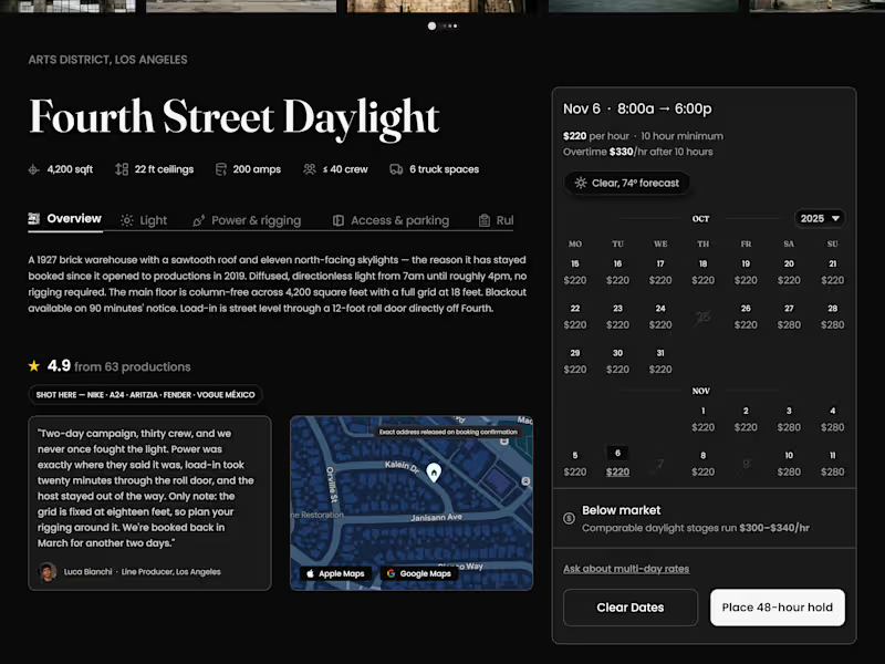
Scout — Location Booking for Film Production
Most marketplace listings show square footage, price, and a star
rating. None of that tells a line producer whether they can actually
shoot there.
So this one leads with the numbers that decide the booking: 200 amps,
22 ft ceilings, ≤40 crew, 6 truck spaces, grid height, load-in access.
A location fails on power or truck parking long before anyone argues
about the rate.
Decisions worth naming:
— "Place 48-hour hold" instead of "Book now." Production doesn't book,
it holds. The button had to match how the industry actually works.
— North light and golden hour surfaced on the hero, because those are
the first two questions a DP asks about a daylight stage.
— Exact address withheld until booking confirmation, matching how
location owners really operate.
— Reviews written by crew, with the caveat left in — "the grid is
fixed at eighteen feet, so plan your rigging around it." A review
with a limitation in it reads as real. One without never does.
— Rate benchmarked against comparable stages, so the price arrives as
context instead of a number the user has to go research.
— Photo set ordered to answer scouting questions in sequence:
interior, exterior, rigging, blank wall, street approach.
The visual work is the easy half. The research is what makes a
listing page usable by the person who has to sign for it.
Marketplace product design · booking flow · dark mode interface ·
film & production tools · web app design · UX research
Available for product design work — permanent or contract, remote.
1
89

Experienced Web Developer with Eye for Detail
Experienced Web Developer with Eye for Detail


Graphic Designer
Graphic Designer


