
Klaviyo Email Marketing for Ecommerce Brands
- $•••••
- Earned
- 2x
- Hired
- 14
- Followers
Klaviyo Email Marketing for Ecommerce Brands

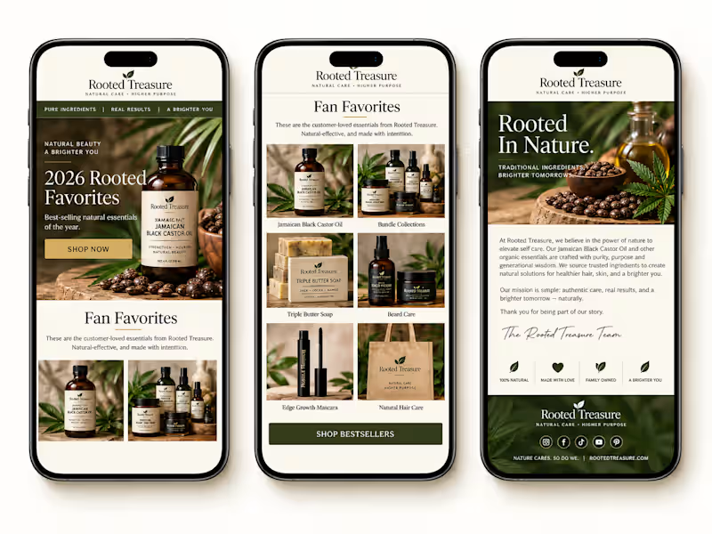

Would you like something like this for your supplement or fitness brand too?
A clean, high-converting promo design that instantly grabs attention, builds trust, and makes people want to try your products.
Feels like a premium fitness brand ad, but it’s designed strategically to help increase clicks, engagement, and sales.
I can create layouts like this with strong branding, product highlights, discount sections, and persuasive copy that actually connects with customers.
👉 Perfect for supplement brands, gym products, wellness stores, and fitness campaigns.
👉 Helps your products look more professional and trustworthy online.
👉 Makes your brand stand out instead of looking like every other generic fitness page.
👉 And definitely gives customers a stronger reason to stop scrolling and buy.
1
296

Title High-Converting Beauty Email Design for E-commerce Brand (Éclaté)
The Challenge The client needed an email design that looked premium and trustworthy while clearly communicating multiple offers without overwhelming users. The design also had to perform seamlessly on mobile devices, where most users interact with email campaigns.
The existing design lacked structure, had weak call-to-action visibility, and did not effectively guide users toward making a purchase.
The Strategy Rather than focusing only on aesthetics, the approach was centered on performance and usability:
Establish a strong visual hierarchy to guide users from headline to offer to call-to-action
Design for conversion by placing buttons where users naturally engage
Use a mobile-first layout to ensure optimal experience across devices
Present products in a clean and organized way to reduce clutter and increase appeal
Add-to-Cart Section A strategic upsell section was included to increase average order value. Suggested products are paired with pricing and clear call-to-action buttons.
Trust Elements Trust-building components such as clean beauty icons, free shipping, and return guarantees were included to reinforce credibility and reduce purchase hesitation.
Why This Works This design is built for performance, not just appearance. It aligns with user behavior by supporting fast scanning and decision-making. Call-to-action buttons are highly visible and strategically placed throughout the layout.
The modular structure allows the design to be reused and adapted for different campaigns, while the overall layout reflects real buyer psychology.
Expected Results
Improved click-through rate (CTR)
Increased product engagement
Better mobile user experience
Higher conversion rates from email traffic
Tools Used Figma (UI/UX Design)
1
299


Social Media Designer & Content Creator | Reels, Growth


Direct Response Copywriter and Email Marketer
Direct Response Copywriter and Email Marketer


View more →

Outstanding Service: Web Dev & Social Media Management 100%
Outstanding Service: Web Dev & Social Media Management 100%


Social Media Marketer, Video Editor & Virtual Assistant.
Social Media Marketer, Video Editor & Virtual Assistant.


Landing Page design using Figma and Replo

Effective listicle pages do more than promote a product.
They create a buying journey.
By educating visitors, addressing objections, reinforcing trust with social proof, and placing CTAs strategically, they help turn interest into confident purchasing decisions.
This is one I recently built in replo
1
52

Traffic brings potential customers to your PDP.
The Buy Box determines what happens next.
An effective Buy Box presents the right information at the right time, answers common questions, and gives customers the confidence to take the next step.
Small improvements here can lead to meaningful gains in conversions.
0
49
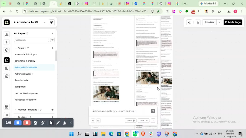
Just wrapped up an advertorial page in Replo.
The goal wasn’t simply to make the page look good, it was to create a journey that educates visitors, builds trust, creates desire, and naturally leads them toward the product.
Every section was structured with conversion in mind, from the initial hook to the final CTA.
Because great design gets attention.
But the right structure turns attention into action.
1
25

I recently built this mobile first advertorial in Replo.
Today's customers rarely make a purchase the moment they land on a page.
They need context. They need trust. They need a compelling reason to believe your product is the right solution.
A well crafted advertorial bridges that gap by educating, addressing objections, and guiding visitors toward a confident purchase.
1
47