Copywriting Projects in Netherlands
Copywriting Projects in Netherlands
Sign Up
Post a job
Sign Up
Log In
Filters
2
Projects
People
Message
11
Nicko Agnote
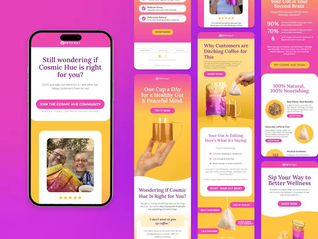
Email Marketing Design | Figma Design | Email Marketing
11
75
Message
3
Stephanie | Marketing & Course Launch Strategist
max
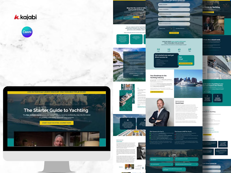
Digital Transformation for David Seal's Yacht Broker Course
3
50
Message
0
David Pukha
High-Converting Brand, Copy & Landing Page for QuikMedia
0
16
Message
1
Eva Alkemade
Dutch SEO Copywriter
1
9
Message
0
Vlad Hategan
pro
Wintermads | Social Media Marketing
0
13
Message
1
Bibian Berkhout
Email Designs Through Canva.
1
14
Message
0
Jacob Clark
Swapfiets - The Paris Olympics Campaign
0
16
Message
1
Derya Kaya
Acazia Clinics
1
8
Message
0
Sandra Longmore
E-Work Based Learning
0
11
Message
1
Klaas Lieuwes
pro
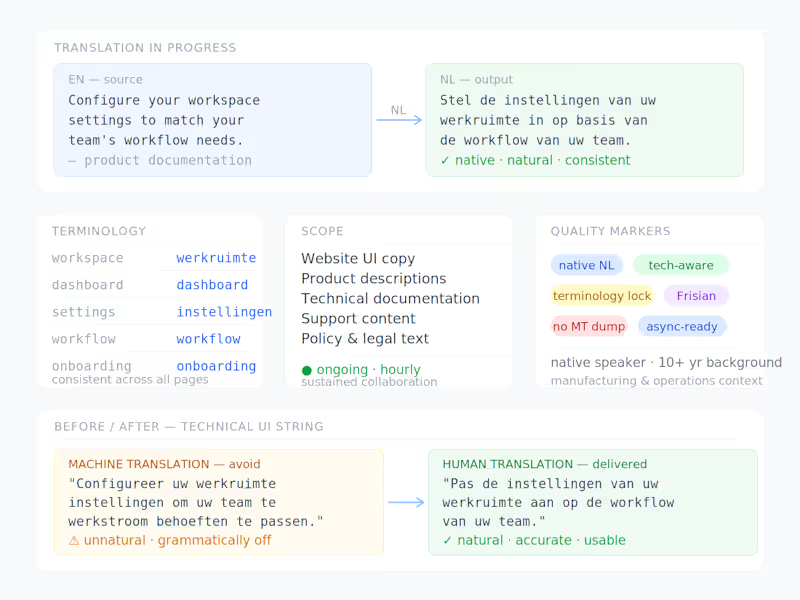
Dutch Website Translation & Technical Content Translating website copy, product descriptions, and technical documentation from English into Dutch for an international client operating in the technology sector. The work requires more than language skills alone — understanding the underlying product, its technical context, and the target audience is essential to producing translations that are accurate, natural, and usable. Generic machine output doesn't cut it here; the client needs a native speaker who can think along. What this project covers: Website UI copy and product pages Technical documentation and support content Ongoing collaboration on an hourly basis — not a one-off, but a sustained working relationship Good fit for clients who need: Native Dutch, not translated Dutch Someone who understands what they're translating, not just the words Reliable turnaround and consistent terminology across deliverables Hourly — ongoing availability.
1
55
Message
0
jimmy faro
UGC Ad Script Concepts — Gaming Safety App
0
4
Message
0
Zlatina Decheva
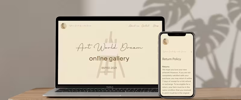
Web Interface Design (UI) & Copywriting "A complete concept of minimalist UI design and soulful copywriting for digital art platforms." I designed the complete visual user interface (UI) and crafted the editorial web copywriting for the online platform "Art World Dream". The objective was to create a serene, luxury digital environment where imagery and language harmonize seamlessly to tell a profound story. Design & Copywriting skills applied in this project: User Interface (UI) & Branding: Designing an elegant interface concept rooted in warm earth tones and soft contrasts that radiate premium luxury and tranquility. Layered Digital Layout: Subtly integrating a soft, transparent background illustration behind crisp, modern typography. Storytelling & Copywriting: Writing poetic, fluid, and immersive web copy that translates the raw emotion behind art and connects deeply with the visitor. Typographic Balance: A harmonious combination of a refined handwritten script typeface for the brand name and a clean, timeless typeface for functional text and content. Elevating Your Digital Presence Are you looking for a versatile designer who not only crafts a high-end, user-friendly interface with a soul, but also takes complete charge of your brand's storytelling and text creation? I will translate your vision into an elegant and complete digital design. Let's create an unforgettable online experience together.
0
72
Message
1
Get Sparked Studio
Acknowledge ICT is a forward-thinking technology partner known for its innovative digital solutions and human-centred approach. As the company entered a new phase marked by a complete rebranding, they sought a compelling way to introduce their renewed identity to the market. To support this transition, I was commissioned to design and animate a series of brand-reveal assets tailored for their digital launch. Project scope The initial brief focused on creating animation concepts to highlight the evolution of the brand, while emphasizing Acknowledge ICT's core pillars. Produced in three formats suitable for multiple digital platforms. These variations ensured flexibility across social feeds, stories, and widescreen displays. Concept Development Concept 1. Transition From Old to New The first animation concept visualised the transformation by showing the old logo seamlessly evolving into the new. This narrative underscored the continuity of the brand while signalling progress and refinement. After the transition, each organisational pillar was showcased through dynamic motion, forming a strong introduction to the renewed brand identity. Concept 2. Immediate Brand Confidence The second concept adopted a more direct approach. It focuses on the new logo and brand mark, immediately establishing the updated brand presence. Sequential highlights of the core pillars follow, supported by a strong motion system that reinforced attention and remembrance. Visual Style & Motion System The visual style of the animations is grounded in the newly developed brand identity, matching to the updated colour palette, typography, and geometric forms defined in the brand documentation. At the client’s request, the visual system should aim to elevate beyond what is presented in the new brand manual, adding more dynamism, depth, and visual impact appropriate for a brand-reveal moment. A central element in this elevation is the use of the brandmark; internally known as the “Ackie.” Within the animation, the Ackie moves fluidly through the composition, at times even in a therefore created 3D form, leaving behind a recognizable visual trail. This motion reinforces the brand’s technical expertise while generating a sense of momentum and transformation. Because a brand reveal must instantly capture attention, the animation is designed to make an impact within the first three seconds. The introduction is concise and direct, immediately drawing the viewer in before transitioning into smoother, fully eased movements of the Ackie and the supporting pillars. All shapes follow a motion system rooted in fluidity, precision, and digital finesse; reflecting both the renewed visual identity and the technological strength of Acknowledge ICT. Emotion & Motion Language The emotional tone of the animation was designed to reflect the inherently digital nature of Acknowledge ICT. Movements are fast, smooth, and deliberately catchy; mirroring the efficiency, agility, and technical sharpness of the services the company provides. The motion system leverages clean accelerations, decisive transitions, and rhythmic visual pacing to create an energetic yet coherent flow. By developing the brand mark into a refined 3D asset, the animations gain depth and dimensionality. One recurring sequence features the signature brand shape sweeping dynamically over the previous logo, giving rise to the new mark in a fluid, almost swoosh-like gesture. This not only symbolises progression but also maximises the forward thinking mindset of the brand. Sound Design Alongside the visuals, I developed the full sound design to enhance the impact of the brand reveal. The audio direction aligns with the highly digital character of Acknowledge ICT: sharp glitches, rapid electronic textures, and impactful transitions support the sensation of technological precision. The composition remains intentionally bold and bombastic, appropriate for announcing something monumental and new. To reinforce brand recognition, a custom outro jingle was created. Its melody is built from tonal “bleeps” shaped around the phonetic sound of “Á”, the first audible element in the brand name ''Acknowledge''. This sonic signature introduces a memorable, ownable sound identity, ensuring continuity across future communication touchpoints. Formats & Deliverables Each concept was delivered in the three required formats: 1080×1350, 1080×1920, and 1920×1080 pixels. Optimised for performance across Instagram, Snapchat, LinkedIn, and widescreen channels. This ensured a cohesive brand reveal across every touchpoint, regardless of device or platform. Outcome The final animations offered Acknowledge ICT a polished and compelling launch asset for their rebranding. By pairing strategic storytelling with refined motion design, the brand reveal successfully communicated both continuity and evolution, positioning Acknowledge ICT as a confident, modern leader within the ICT landscape.
1
60
Message
1
Emmanuel Sule
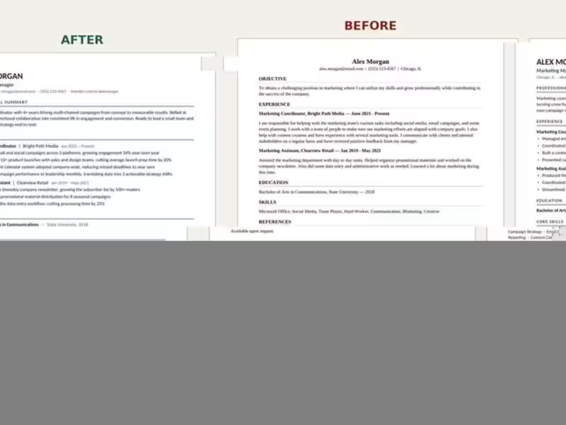
This project involved transforming a healthcare operations résumé from a basic, task-focused document into a strong executive-level presentation. I strengthened the candidate’s positioning, reorganized the experience section, added relevant ATS keywords, and highlighted measurable results, including oversight of eight clinics, a $11.2 million operating portfolio, and a 32% EBITDA margin. All personal, employer, and location details were anonymized to protect the client’s privacy.
1
96
Message
1
mike kungu mwaniki
Writing website content, articles, and blog posts Creating social media posts and marketing copy Researching and producing well-structured, informative content Adapting tone and style to match your brand or audience
1
39
Message
0
Laura Petrescu
The real Parisian charm
0
32
Explore projects