Brand & UI/UX Designer — Design + Web Development
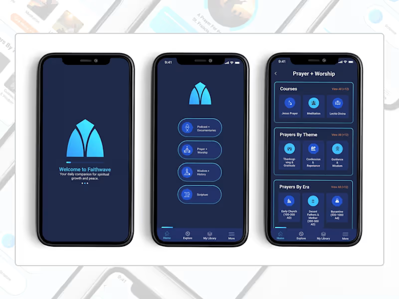
A full UI concept for FaithWave, a faith-based app designed to help users explore and deepen their Christian faith through meaningful learning, prayer, and customizable worship experiences. I designed three key screens—Home, Prayer & Worship, and a Customizable Item Page—that together demonstrate the app's core user journey.
The Home screen features four main content sections (Podcasts, Prayer & Worship, Wisdom & History, Scripture) with a clean, intuitive bottom navigation. The Prayer & Worship page organizes a rich library of prayers by theme, era, courses, and meditations, making spiritual content easily discoverable. The Customizable Item page allows users to personalize their prayer experience by selecting narrator voices, background sounds, and volume controls—creating a deeply personal and immersive devotional experience.
The design uses a calming blue gradient inspired by the brand's logo (cyan to deep blue), with thoughtful typography and ample whitespace to create a serene, focused atmosphere for prayer and reflection.
0
223
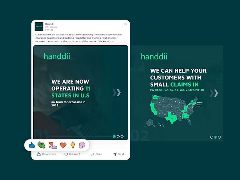
A LinkedIn carousel post designed for handdii, a company expanding across 11 U.S. states. The goal was to visually communicate their growth and service areas while maintaining their brand identity—using their signature green (#00FF99), supporting colors, and a clean, modern layout.
I incorporated the 2-letter state abbreviations (CA, TX, OH, GA, etc.) into the design, creating a map-like visual that immediately conveys the company's reach. The carousel structure allowed me to present the key message—operating in 11 states with more expansion coming—across multiple slides, keeping each one clean, scannable, and on-brand. The design uses bold typography, consistent spacing, and a professional tone suitable for LinkedIn's audience, without relying on the logo since the post was published from the company page.
1
191
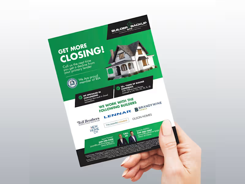
A trade-show flyer designed for Builder Backup Mortgage, a brokerage that provides financing solutions when a builder's in-house lender can't close the deal. The goal was to create an eye-catching, professional 8.5" x 11" flyer that communicates a clear, powerful message: "We help builders sell more homes."
The design focuses on credibility and urgency—featuring a client list, key selling points, and clear contact information—while maintaining a clean, structured layout suitable for both print and PDF distribution. I used bold typography, a refined color palette, and strategic visual hierarchy to direct attention to the builder's core benefit: increasing sales and closings. The refreshed design incorporates the client's new logo and retains the required disclaimer and contact details, ensuring compliance while elevating the overall brand presence.
1
181


Brand Strategist & Identity Designer for Property Developers
- 11
- Followers
Brand Strategist & Identity Designer for Property Developers
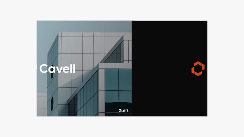
Cavell | Brand Identity Design for UK Property Development
Modern, confident, and built for what’s next.
Cavell is a UK-based real estate and property development company focused on creating high-quality commercial spaces for businesses and organisations.
At Dizift Studio, we developed a modern visual identity that reflects Cavell’s focus on architecture, business growth, and long-term value.
The identity combines a distinctive geometric brandmark, clean typography, and a bold orange-and-black color palette to create a professional and recognisable presence.
What We Designed:
→ Custom geometric logo and brandmark
→ Primary and secondary color palette
→ Typography system
→ Brand identity guidelines
→ Business stationery
→ Signage and environmental branding
→ Marketing and promotional applications
Every element was designed to work together, creating a consistent identity across digital and physical touchpoints.
Brand Message: Built for What Next.
Creative Direction: Modern, Minimal, Architectural, Professional.
2
1
26
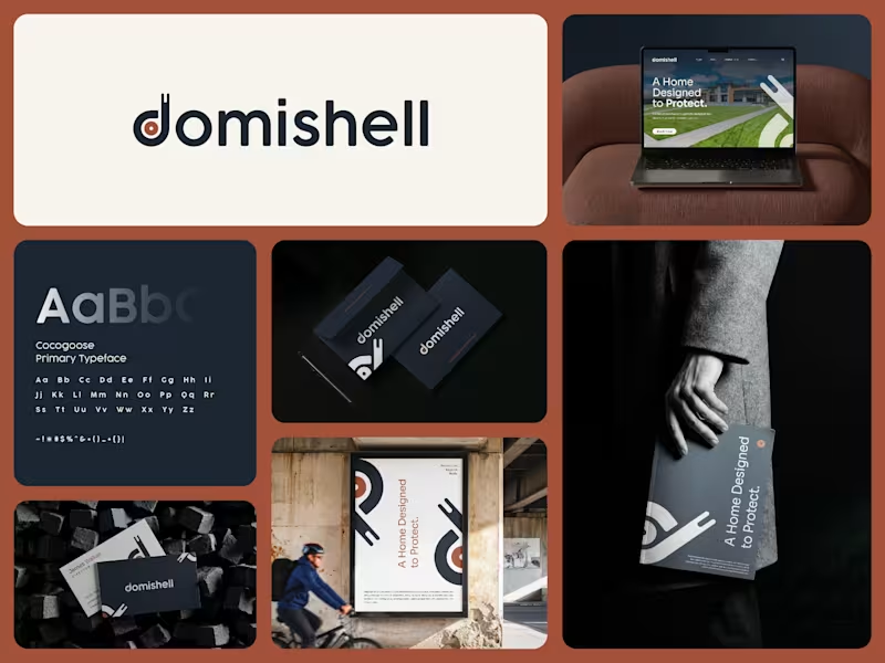
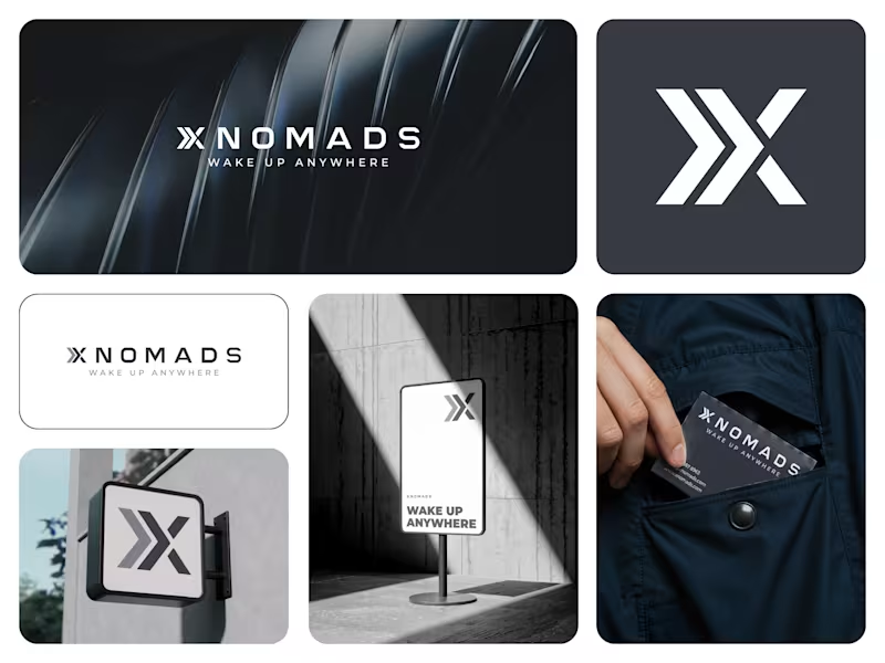
Rejected, but not forgotten. 👀
This was an unused identity direction created during our exploration for XNOMAD.
Bold symbol.
Strong movement.
Simple application.
It didn’t become the final identity, but that doesn’t mean the idea has to disappear.
Would you have picked this direction?
The concept is now available for purchase and can be adapted for a new brand.
#LogoDesign #BrandIdentity #UnusedLogo #BrandDesign #LogoDesigner
2
119


Graphic Designer
Graphic Designer


I am a professional Brand Designer, I do all kind of Design
- 22
- Followers
I am a professional Brand Designer, I do all kind of Design
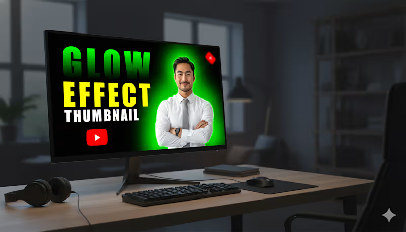
This YouTube thumbnail is designed to be highly eye-catching and is focused on demonstrating a "Glow Effect.
Subject: A smiling, professionally dressed man (in a white shirt and grey tie) is positioned prominently on the right side.
Glow Effect: A vibrant, bright green glow radiates from behind the man, creating a strong contrast against the black background. This immediately draws attention and illustrates the "Glow Effect" mentioned in the text.
Background: The background is a solid black, which maximizes the impact and visibility of the glow and the text.
Text Hierarchy: The text is large and uses high-contrast colors to stand out:
"GLOW" is in a neon green/yellow-green gradient, directly matching the glow effect.
"EFFECT" is in a bold, solid yellow.
"THUMBNAIL" is in white text, slightly smaller, defining the subject matter.
1
90
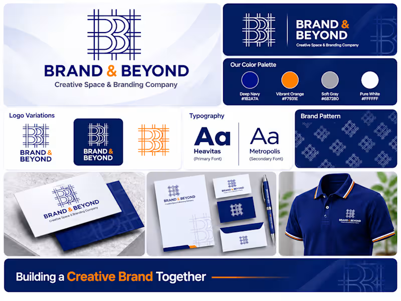
BRAND & BEYOND — SaaS Brand Identity & Digital Branding
Project Overview
BRAND & BEYOND is a conceptual SaaS branding project created to demonstrate how a modern technology business can build a strong, consistent, and professional brand presence.
The project explores a complete visual identity system that connects digital product experiences with corporate branding.
My Creative Approach
The visual direction combines a sophisticated navy blue, energetic orange, and minimal white palette to communicate innovation, trust, and forward-thinking technology.
Project Deliverables
Logo Design & Brand Identity
Brand Color System
Typography Selection
SaaS Dashboard UI Concept
Mobile App Branding
Application Icon Design
Corporate Stationery
Business Collateral
Complete Brand Presentation
Creative Direction
Modern. Minimal. Professional. Scalable.
The goal was to create a recognizable brand experience that works consistently across digital interfaces and physical brand touchpoints.
Brand Identity Design | SaaS Branding | Technology Branding | Visual Identity | Digital Product Branding
Looking for a professional brand identity for your startup or SaaS business?
Let's collaborate and bring your brand vision to life.
Search Keywords:
SaaS Brand Identity, Technology Branding, Startup Branding, Logo Design, Digital Branding, Visual Identity, Corporate Identity, UI Branding, Brand Presentation
1
28
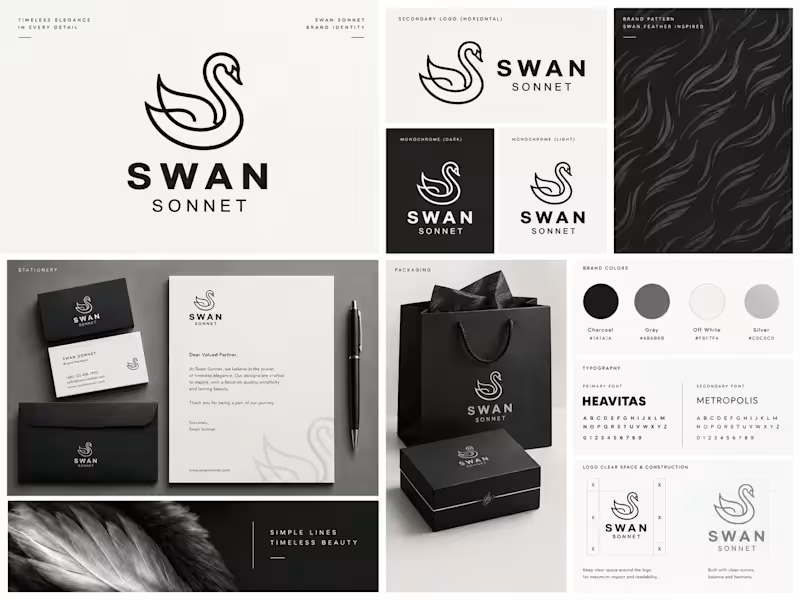
SWAN SONNET | Brand Identity & Visual Design
A refined brand identity concept combining a swan-inspired logo, minimalist typography, muted natural tones, and cohesive brand applications.
SWAN SONNET is a conceptual visual identity project centered on elegance, simplicity, and timeless design.
The creative direction brings together a distinctive swan symbol, modern typography, and a carefully curated palette of charcoal, sage green, soft gray, and warm off-white.
The project explores how a consistent identity can translate across different visual touchpoints, from logo variations and brand guidelines to stationery and packaging.
Project Deliverables:
Primary and secondary logo system
Icon and monogram variations
Typography and color palette
Brand pattern and graphic elements
Stationery and packaging concepts
Brand presentation and mockups
Design Focus:
Brand Identity · Logo Design · Visual Systems · Packaging Design · Art Direction
Creative Statement:
Grace in every detail.
Brand Identity, Logo Design, Branding, Graphic Design, Visual Identity, Packaging Design, Typography, Art Direction, Brand Guidelines, Creative Direction
1
61

UX/UI Designer for Digital Products
UX/UI Designer for Digital Products


Unique designs for your brand
Unique designs for your brand


View more →

Shopify, CRO, GoHighLevel Automation & Landing Page Expert


Shopify, CRO, GoHighLevel Automation & Landing Page Expert


Graphic Design, UI UX Design, (Webflow & Framer) Website
New to Contra
Graphic Design, UI UX Design, (Webflow & Framer) Website