
Brand & Packaging Designer for Luxury, Beauty & Wellness
- 21
- Followers
Brand & Packaging Designer for Luxury, Beauty & Wellness
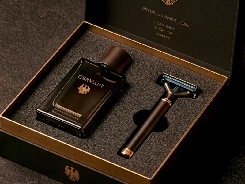
Germany - Precision Shaving Foam
Inspired by German precision, innovation, and performance.
The formula combines chamomile and calendula, ingredients long associated with soothing care and botanical science.
The palette is restrained and sophisticated, balancing crisp neutrals with subtle botanical accents.
The bottle design is geometric and functional, emphasizing precision, quality, and timeless engineering.
A concept where efficiency meets refined skincare.
#skincarebranding #packagingdesign #brandingdesign #germany #beautydesign #WorldCupDesign
2
3
408
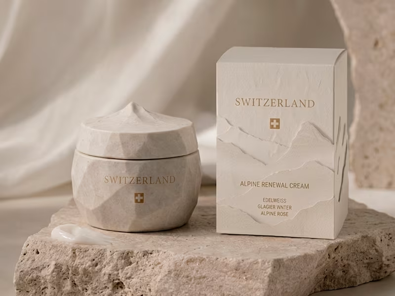
Switzerland - Alpine Renewal Cream
Inspired by the purity and serenity of the Swiss Alps.
The formula combines edelweiss, glacier water, and alpine rose, ingredients chosen for their association with resilience, freshness, and high-altitude botanicals.
The palette is bright and understated, blending soft whites, cool blues, and delicate floral tones.
The bottle design is minimal and refined, reflecting precision, luxury, and timeless elegance.
A concept rooted in purity, performance, and Alpine beauty.
#beautybranding #packagingdesign #brandingdesign #luxurybeauty #switzerland #WorldCupDesign
2
257
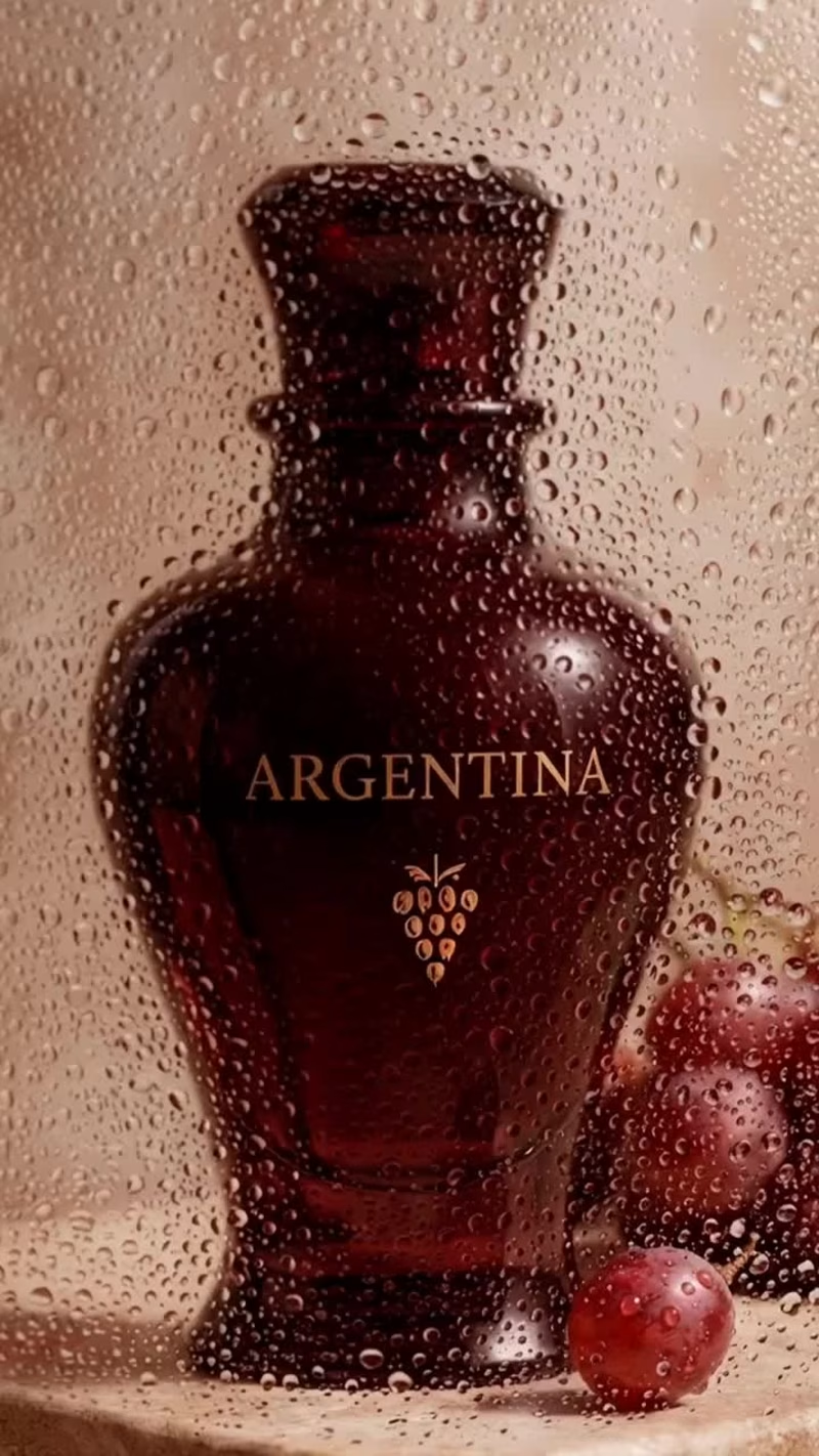
Argentina - Lip Tint
Inspired by Argentina's richness, elegance, and expressive character.
The formula combines Malbec grape, rosehip, and Patagonian berry, celebrating ingredients deeply connected to the country's landscapes and traditions.
The palette explores rich berry tones and soft neutrals, inspired by vineyards, sunsets, and Patagonia's natural beauty.
The bottle design is sleek and refined, balancing sophistication with a bold, contemporary identity.
A concept rooted in color, culture, and confidence.
#beautybranding #packagingdesign #brandingdesign #makeupdesign #argentina #WorldCupDesign
2
178
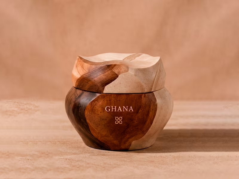
Ghana - Shea Body Butter Cream
Inspired by Ghana's rich natural resources and centuries of skincare tradition.
The formula blends shea butter, baobab, and cocoa, ingredients celebrated for their nourishing benefits and deep cultural heritage.
The palette is warm and earthy, reflecting cocoa tones, golden shea, and the richness of African landscapes.
The packaging is bold yet elegant, designed to communicate comfort, authenticity, and premium care.
A concept built around nourishment, heritage, and natural beauty.
#beautybranding #packagingdesign #brandingdesign #ghana #bodycare #WorldCupDesign
2
4
179

Branding and creative creator
Branding and creative creator

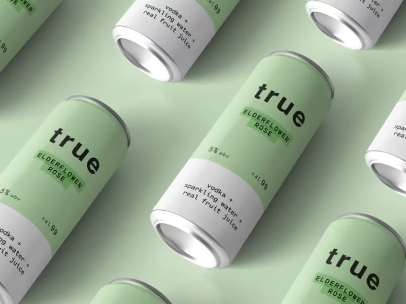
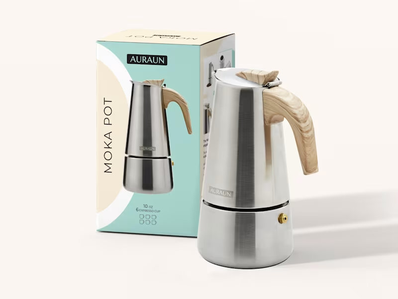


Brand Identity Designer | Strategy, Logo & Visual Systems
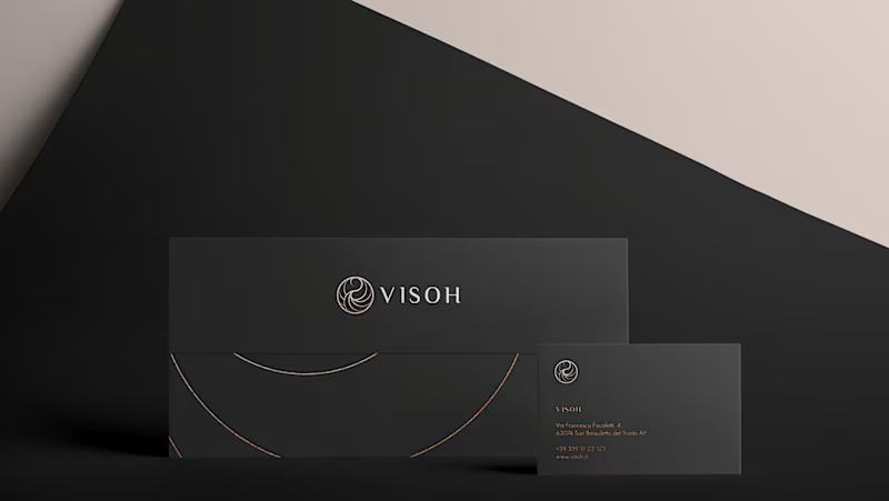
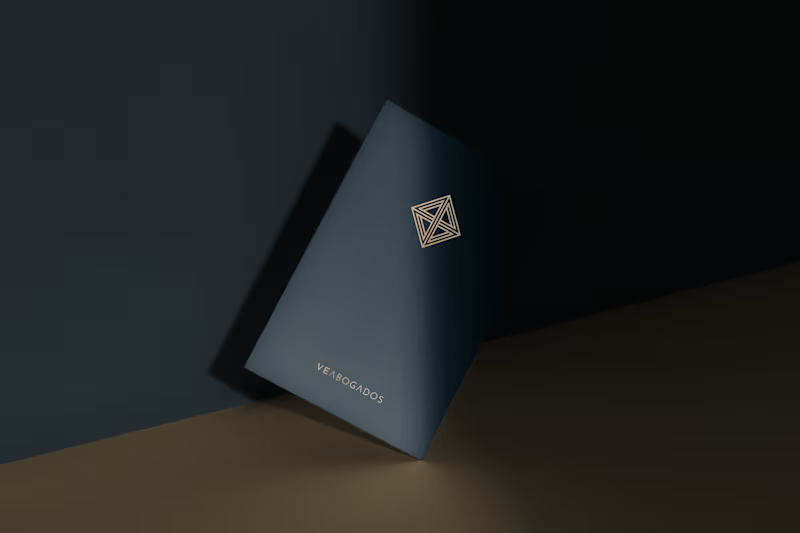
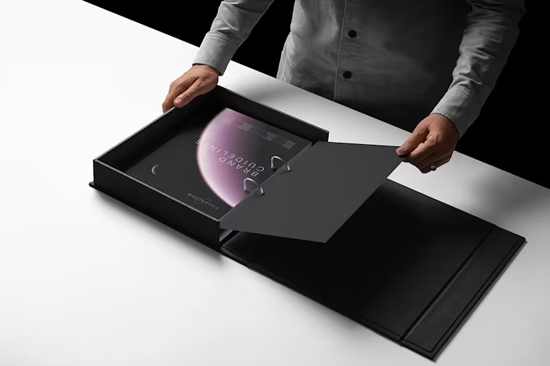
Fillerkosm Brand Identity
Fillerkosm is a brand identity project built at the intersection of science, beauty and precision.
The creative process started from the meaning behind the name itself: Fillerkosm combines the world of aesthetic medicine with kosmos, the Greek idea of order and harmony. From there, I explored visual references connected to chemistry, space and refined beauty, with the goal of creating an identity that could feel technical, authoritative and premium without becoming cold or overly clinical.
The logo was developed as a direct extension of this concept. Two elliptical forms move through the wordmark like planetary orbits, while the circular elements at their extremities also suggest a molecular structure. The result creates a deliberate duality between the scientific precision of aesthetic medicine and the broader idea of harmony, balance and universal beauty.
Rather than designing a logo in isolation, the objective was to build a coherent visual language capable of expressing reliability, innovation and elegance across every brand touchpoint.
14
15
1.5K
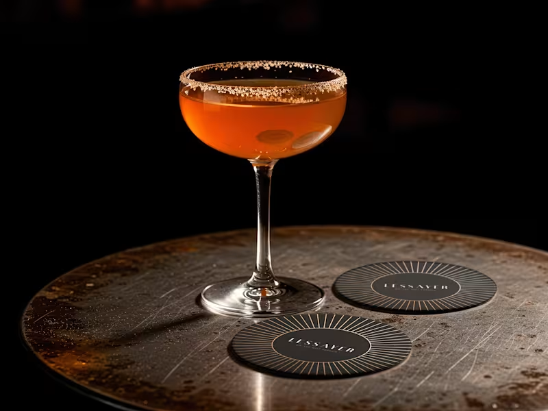
Lessayer
Where Belle Époque elegance meets contemporary minimalism.
The identity started with a simple challenge: how can a luxury pastry brand feel refined and timeless without relying on predictable visual codes?
The answer became a single geometric symbol combining three ideas a crown, a sliced cake, and a subtle reference to the New Zealand sun.
One mark. Three meanings. One distinctive identity.
Here’s a first look at the logo construction and stationery system.
Full case study coming tomorrow.
16
21
963

brand, visual, motion, type, ui&ux, graphic, photography, 3D
- 10
- Followers
brand, visual, motion, type, ui&ux, graphic, photography, 3D


Bold & Colorful Brand Designer
Bold & Colorful Brand Designer


