Building fun interactions and impactful strategies.
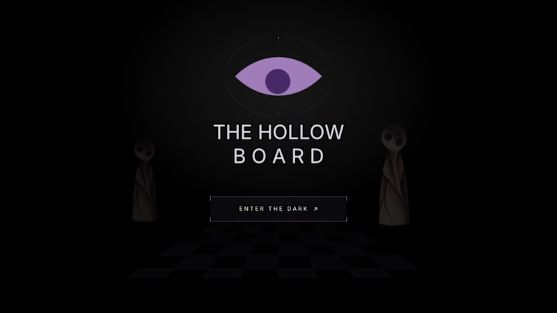
Three eyes. One fading light. And a doorway that may never be reached.
Welcome to The Hollow Board, an atmospheric horror puzzle where every move comes at a cost.
The rules are simple. Move forward. Watch where you step. And whatever you do, don't trust the darkness.
Your light is running out, but you have three eyes to spare. Open one to see what the shadows conceal, or save it for the ghosts that stand in your way. Every choice is a gamble, and every sacrifice brings you closer to escape. Or something far worse.
Built using Rive CLI, Luau scripting, data binding, and GPU Canvas, the game combines strategic movement, shifting visibility, eerie encounters, and trap-specific death animations.
The doorway is waiting. The question is, what will you have left when you reach it?
Dare to play? 👁️
🎮 https://the-hollow-board-0cuv77.rive.to/
@rive_app #rivehalloweenchallenge
1
2
201

Jugnu is an inclusive clay-play concept designed for neurotypical and neurodivergent children.
The project explored how a product could make creative play more engaging, tactile, and inclusive through its sensory experience. Inspired by the firefly, or jugnu, the brand represents the light and individuality within every child. The clay itself glows in the dark, adding an element of surprise and playfulness to the experience while reinforcing this idea of finding and expressing the light within.
I developed the brand identity, kit materials, packaging, and brand photography, with the packaging designed to transform into an interactive board game, giving it a second life as part of the play experience.
Designed across: Branding · Packaging · Visual Identity · Product Experience · Photography
A project where I fell in love with brand identity design. JUGNU has a piece of my heart.
7
14
1.5K

Challenged myself to create a Brand Identity in a single day.
Presenting Legacy works.
Legacy Works is a brand identity concept for an antique furniture store, built around the idea of bringing heritage and craftsmanship into a more bold, contemporary visual language.
Rather than leaning into the typical browns and earthy tones associated with antique furniture, I explored a sharper palette of charcoal, warm beige and red. The custom wordmark draws directly from the forms of antique furniture, with the “L” inspired by the curved leg of a vintage piece.
2
240

Poké : Branding & Visual Identity
Poké was my first self-initiated branding project, developed from a brief I found on Designer Briefs back in 2023. Not bad for a first branding project, considering I drew the illustration using a mousepad and sheer determination haha.
I played with the typography to turn the letters themselves into visual elements, using the shapes of a poké bowl and chopsticks to build the logo and create a playful, recognizable identity.
My Process
I started by exploring the visual world of poké culture- fresh seafood, tropical elements, the ocean, and playful food imagery. From there, I developed a colour palette inspired by tropical foliage, fresh fish, sea and waves, and tropical florals. I then built a supporting illustration system around these ideas using hand-drawn elements like fish, shells, flowers, lemons, and coconuts.
2
294

AI-first Product Designer
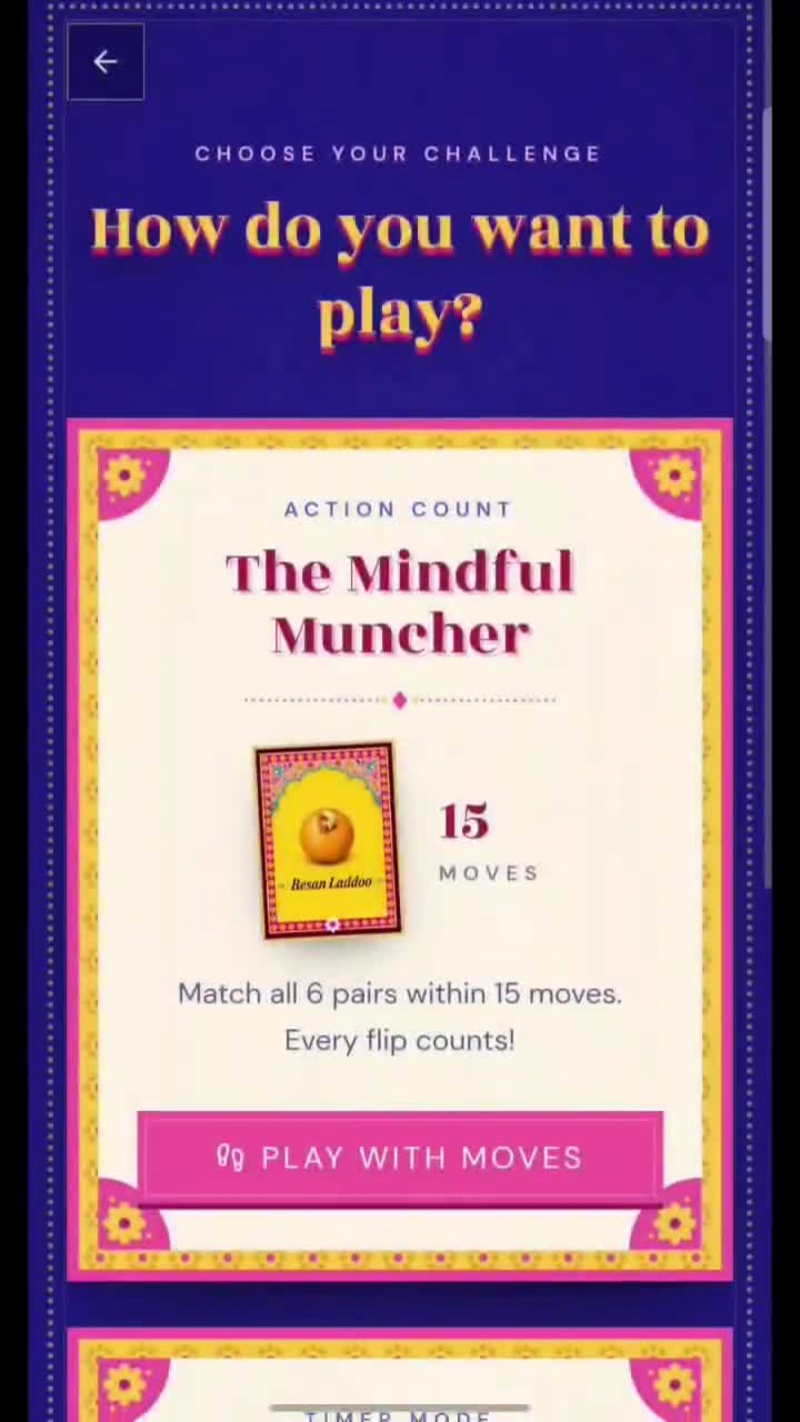
What if your Diwali faral came with a little competition?
We all love our chakli, kaju katli, and the whole faral gang. So I thought, why not turn these familiar Diwali treats into a fun little game?
Introducing फराळ Faral 🪔
A Diwali-themed memory game where you:
🃏 Flip cards and match your favourite faral.
⚡ Test your memory and quick reflexes.
🏆 Get your very own faral personality badge.
😈 And if you lose? Well, there's a fun little Diwali dare waiting for you!
But here's the fun part: you can challenge your friends with a dare and see if they can beat your score.
Because what's a game if you can't make your friends play it too? 😂
Give it a try: https://faral.vercel.app/
(https://faral.vercel.app/)And don't forget to share a screenshot of your result in the comments. I want to see who's the ultimate Faral champion!
0
16
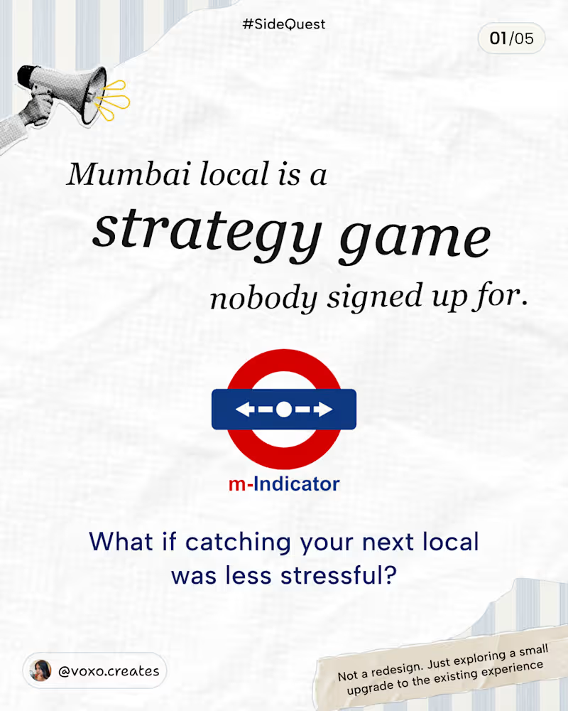
A few weeks ago, I was at Thane station, trying to figure out which train I can catch to CSMT… and let’s just say, it involved a LOT of mental maths.💀
That got me thinking about a couple of small UX improvements I’d love to see in M-Indicator.
This is not a redesign or revamp of M-Indicator! I just wanted to explore how a few small changes could make the existing experience a little easier.
• Clearer train statuses so you know whether you can still board.
• A Next trains toggle that’s easier to access.
• A destination filter you can change anytime.
I’ve tried to account for as many edge cases as I could think of. If I’ve missed any, feel free to share!
What do you think of these improvements? 👀
1
1
44
A little website concept I wanted to try 👀
Just an idea I had and a Figma file to see where it could go.
Played around with the layout, visuals, interactions and overall vibe until it started feeling like a real product.
#Sidequest #UIDesign #WebDesign #Figma #UXDesign #ProductDesign #DesignConcept #DesignExploration #UIInspiration
0
36
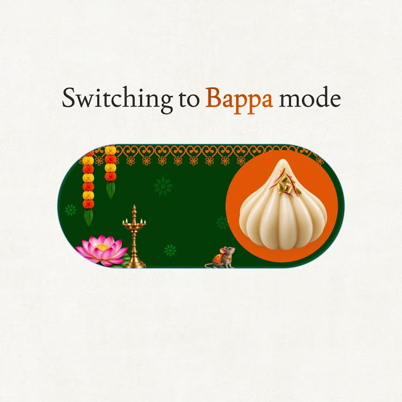
Ganesh Chaturthi = Bappa Mode ON ✨
A little @Figma motion experiment inspired by that festive feeling when everything just switches to Bappa mode.
Less stress. More modaks.
Ganpati Bappa Morya ❤️
#BappaMode (https://www.linkedin.com/search/results/all/?keywords=%23bappamode&origin=HASH_TAG_FROM_FEED) hashtag#GaneshChaturthi (https://www.linkedin.com/search/results/all/?keywords=%23ganeshchaturthi&origin=HASH_TAG_FROM_FEED) hashtag#FigmaMotion (https://www.linkedin.com/search/results/all/?keywords=%23figmamotion&origin=HASH_TAG_FROM_FEED) hashtag#MotionDesign (https://www.linkedin.com/search/results/all/?keywords=%23motiondesign&origin=HASH_TAG_FROM_FEED) hashtag#DesignExperiment (https://www.linkedin.com/search/results/all/?keywords=%23designexperiment&origin=HASH_TAG_FROM_FEED)
0
66

Motion Designer with Character & Flair ✨
Motion Designer with Character & Flair ✨


Holistic Product Designer crafting exceptional experiences
Holistic Product Designer crafting exceptional experiences


View more →

Efficient AI & Web Dev with Creative Flair
Efficient AI & Web Dev with Creative Flair


Crafting Unique Logos, Brands & Digital Artwork Masterpieces
Crafting Unique Logos, Brands & Digital Artwork Masterpieces


View more →

Modern web developer helping brands grow online.

Modern web developer helping brands grow online.
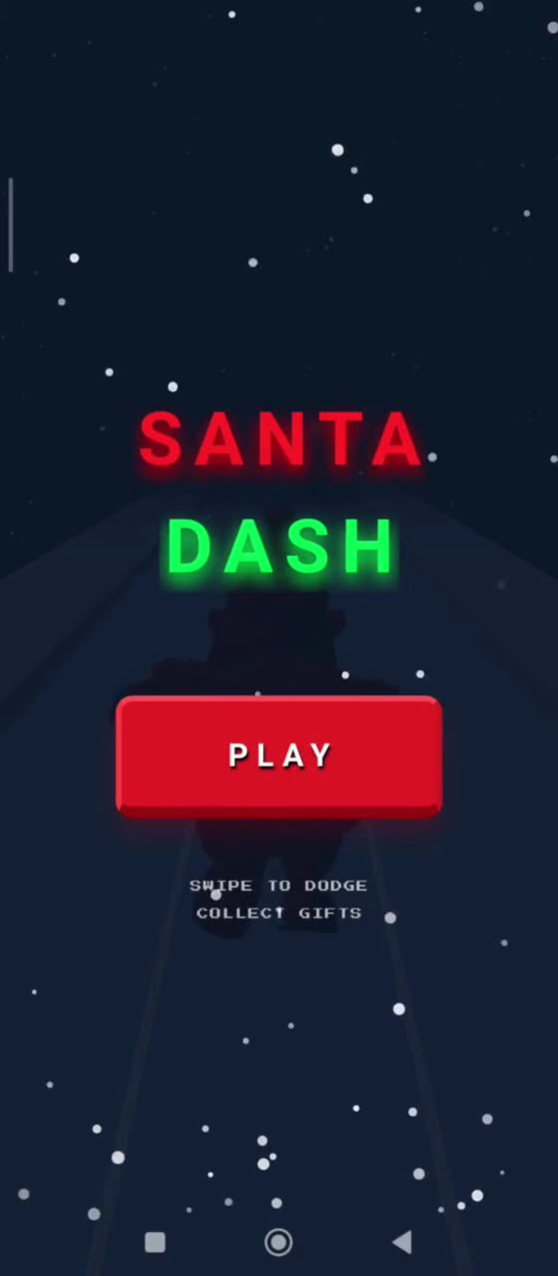
🎄🎮 SANTA DASH — SAVE THE HOLIDAYS
⚠️ Warning: this gets addictive.
Built a 3D holiday endless runner where you help Santa collect gifts, dodge trees, and swipe smoothly through snowy lanes.
No fluff.
Just run → dodge → collect → repeat.
👉 Play now:
https://santa-dash.rork.app/
Built with @Rork
Music by @Suno
Logo by @Lovart AI
One more run. Then another. ❄️🏃♂️🎅
@Rork @Suno @Lovart AI @Contra
1
8
462
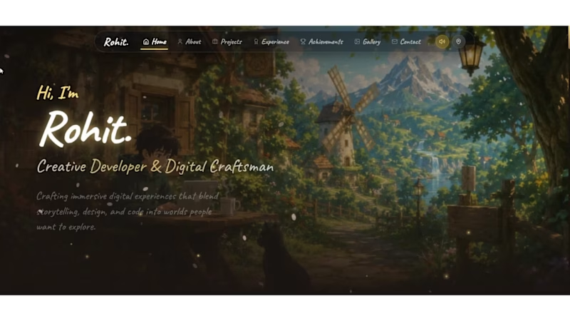
Built an immersive fantasy portfolio where every section becomes part of a living world instead of another webpage.
Designed the entire experience in @flowstep_ai using Flowstep + MCP (Antigravity).
Connected Flowstep MCP with Antigravity, then iterated directly on the canvas using prompts—refining layouts, components, navigation, interactions, and the design system without rebuilding screens from scratch.
Created reusable design tokens, cinematic UI, glass navigation, parchment components, handcrafted cards, and a consistent visual language across every scene.
Once the prototype was finalized, I replicated the entire Flowstep canvas into a Next.js application and polished interactions with modern animation libraries before deploying.
The workflow:
🌿 Idea → Prompt Flowstep
🎨 Refine with MCP (Antigravity)
🧩 Build reusable design system
🖼 Iterate every screen on the canvas
⚛ Replicate to Next.js
▲ Deploy on Vercel
🏡 9 connected fantasy scenes
✨ 1 immersive portfolio
Project link : https://portfolio-6asf.vercel.app/
flowstep link : https://app.flowstep.ai/file?activeFileId=dd5c563d-33a1-4b37-8b24-3669efac9652
1
214
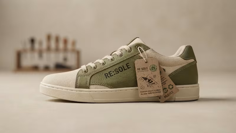
Human by Design isn't about using less AI—it's about knowing when not to listen to it.
For this challenge, I created RE:SOLE, a fictional sustainable sneaker brand built around one simple idea:
"Repair, Don't Replace."
Instead of designing another perfect sneaker, I wanted to tell the story of a shoe that becomes more valuable with every scratch, crease, and repair.
My Workflow
Built the brand identity using Envato AI as the creative starting point.
Used Envato assets for inspiration and visual direction.
Created a custom typeface pairing to give the brand its own timeless personality.
Iterated through multiple concepts before choosing the final direction.
Designed the campaign visuals and cinematic product storytelling around authenticity rather than perfection.
My Human by Design Moment
AI consistently generated spotless, flawless sneakers because it assumed perfection sells.
I made a different creative decision.
I intentionally added visible wear, repaired stitching, faded textures, and handcrafted imperfections because they communicate something AI couldn't understand on its own: memories have value.
That single decision transformed the campaign from a product advertisement into a story about craftsmanship, sustainability, and emotional connection.
Tagline:
"Scars aren't flaws. They're memories."
2
3
362

Built Wonder Grove School, a modern, immersive school website designed in Squarespace
The goal was to create a website that feels welcoming, playful, and premium while remaining easy for parents and students to navigate. I focused on combining clean layouts with engaging interactions to create an experience that feels alive rather than static.
What I used
✨ Finish Layer Block Animations for smooth scrolling interactions
🎨 Block Transforms to create dynamic layouts and visual depth
🔤 Custom Font Uploads for a unique brand identity
📚 Stacks to build responsive, flexible content sections across devices
The result is a modern school website that balances creativity, accessibility, and usability while showcasing how Squarespace can be used for professional, highly customized web experiences.
Huge thanks to Squarespace for introducing Finish Layer—it makes advanced design possible without writing custom code.
website : https://cat-dog-nm5j.squarespace.com/
password : wonder
4
8
544

A freelance software engineer for Website development.
A freelance software engineer for Website development.