Freelancers using Glyphs in Metropolitan City of Rome
Freelancers using Glyphs in Metropolitan City of Rome
Sign Up
Post a job
Sign Up
Log In
Filters
2
Projects
People
Pietro Ansideri
Metropolitan City of Rome, Italy
🖋️ Bespoke Brand Identities & Lettering 🎨
Follow
Message
🖋️ Bespoke Brand Identities & Lettering 🎨
0
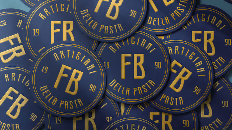
Francobolli - Brand Identity
0
8
0
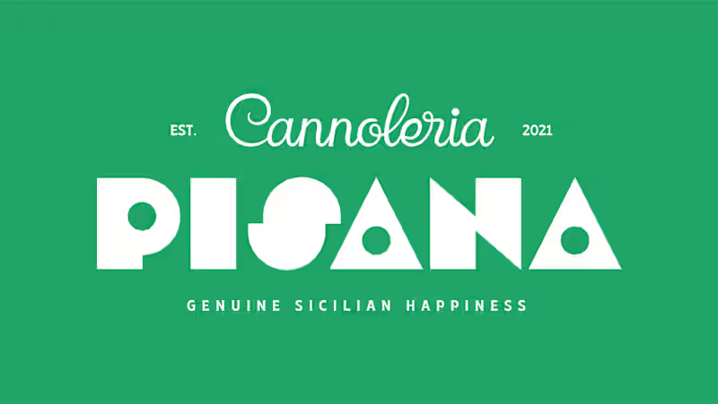
Pisana - Cannoleria Branding
0
6
0
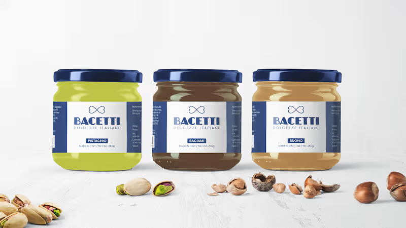
Bacetti - Italian Spreads
0
8
0
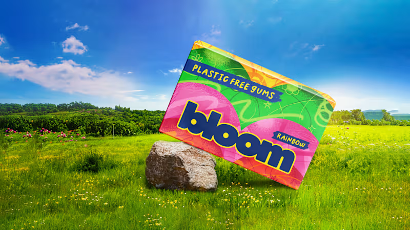
Bloom - Plastic Free Gums
0
7
Glyphs
(3)
Follow
Message
Dumitru Gornet
pro
Italy
Branding Expert. Custom Typography. Logo and Visual Identity
Follow
Message
Branding Expert. Custom Typography. Logo and Visual Identity
1
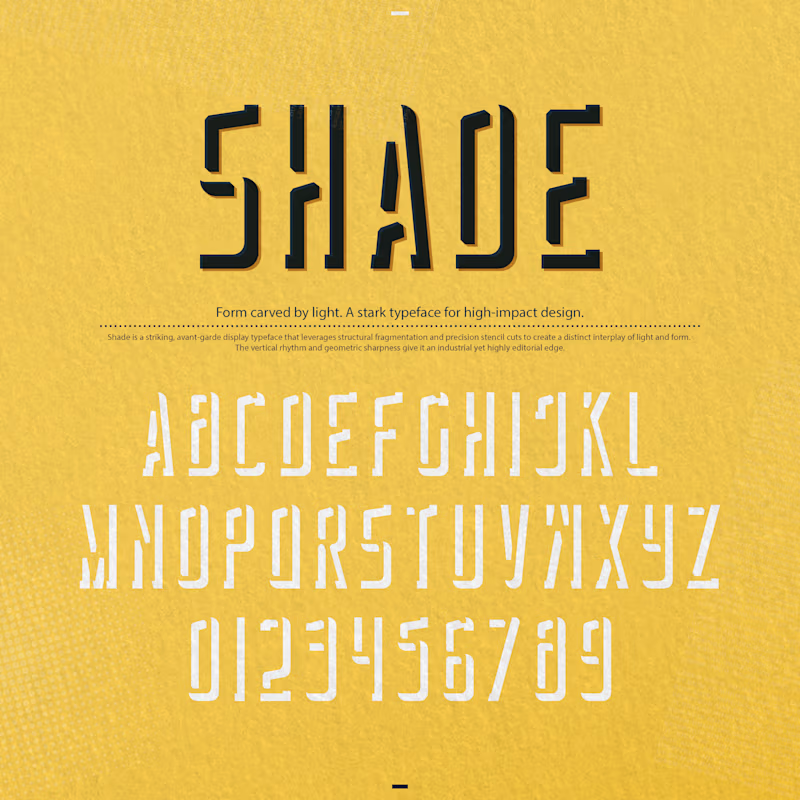
"Shade" is a striking, avant-garde display typeface that leverages structural fragmentation and precision stencil cuts to create a distinct interplay of light and form. The vertical rhythm and geometric sharpness give it an industrial yet highly editorial edge. You are spot on—it is exceptional for posters, but its unique mechanics make it a powerhouse across several high-impact applications 💯 Posters & Exhibition Graphics: In large-scale formats, the fragmented stencil cuts and tall proportions transform text into a graphic texture, making it command attention from a distance. Editorial Design & Cover Art: It shines in cultural, art, and architectural magazines where headlines need conceptual depth rather than standard neutral typography. Avant-Garde & Cultural Brand Identities: Perfect for music festivals, contemporary art galleries, independent fashion labels, or design studios looking for a stark, memorable voice. Structural Packaging: For limited-edition product boxes or sleek, minimal outer packaging where the typography itself acts as the primary visual asset. It avoids generic display tropes by using negative space as an active architectural element. How do you see yourself deploying it first—print, digital, or a specific brand identity? 🔥
1
239
0
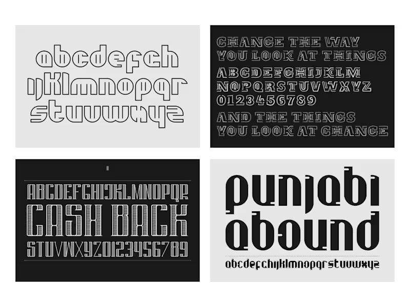
A Collection of Custom Fonts and Typography Design
0
116
2
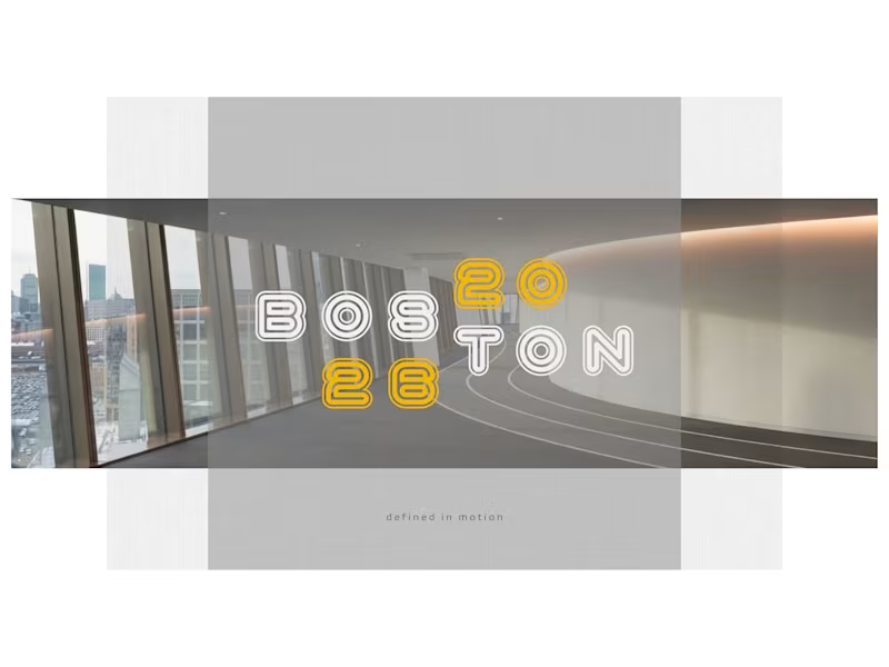
Boston 2026 isn't just about a single game, a final score, or chasing a trophy. It’s a breathing movement born from the energy of the city's arenas, streets, and fields. It is an exploration of human grit, collective rhythm, and dedication, capturing the raw heartbeat of athletes moving as one synchronized force. At its core, this project strips away the commercial noise ))) of modern sports to focus on the physical discipline, the quiet hours of training behind closed doors, and the emotional weight of moments that define a career. Every play tells a story, and every competitor carries a hidden narrative of sacrifice and ambition. We are documenting a monumental human milestone from the ground up, piece by piece. What drives someone to push past their absolute limits when the pressure builds? 🥇 Drop your thoughts or creative interpretations in the comments.
2
2
120
4
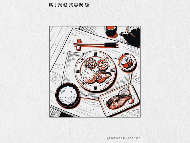
There’s a quiet kind of discipline in a traditional Japanese kitchen. Everything has a place, every line has a reason, and raw elements turn into a ritual. 🇯🇵 The KINQKONQ mystery takes a turn toward that warmth today—moving away from cold geometry and onto a wooden table set with ceramic plates and steam rising from fresh food. 🍜 This chapter is all about exploring how a visual identity and a brand can carry real cultural memory. At the end of the day, a great logo or a unique piece of custom typography is only as good as the story behind it. We're building this whole world from the ground up, piece by piece. The table is set, but the real meaning is still hidden. What kind of story do you think this kitchen is telling? Drop your thoughts or design feedback in the comments—let's talk. 😘
3
4
260
Glyphs
(2)
Follow
Message
Explore people