The network for creativity
Join 1.25M professional creatives like you
Connect with clients, get discovered, and run your business 100% commission-free
Creatives on Contra have earned over $150M and we are just getting started
Back to feedPost

There’s a quiet kind of discipline in a traditional Japanese kitchen. Everything has a place, every line has a reason, and raw elements turn into a ritual. 🇯🇵
The KINQKONQ mystery takes a turn toward that warmth today—moving away from cold geometry and onto a wooden table set with ceramic plates and steam rising from fresh food. 🍜 This chapter is all about exploring how a visual identity and a brand can carry real cultural memory.
At the end of the day, a great logo or a unique piece of custom typography is only as good as the story behind it. We're building this whole world from the ground up, piece by piece.
The table is set, but the real meaning is still hidden. What kind of story do you think this kitchen is telling? Drop your thoughts or design feedback in the comments—let's talk. 😘
Brand DesignvisualidentityminimalistdesignBrand StrategyAdobe IllustratorAdobe SuiteCorelDrawLogo Design


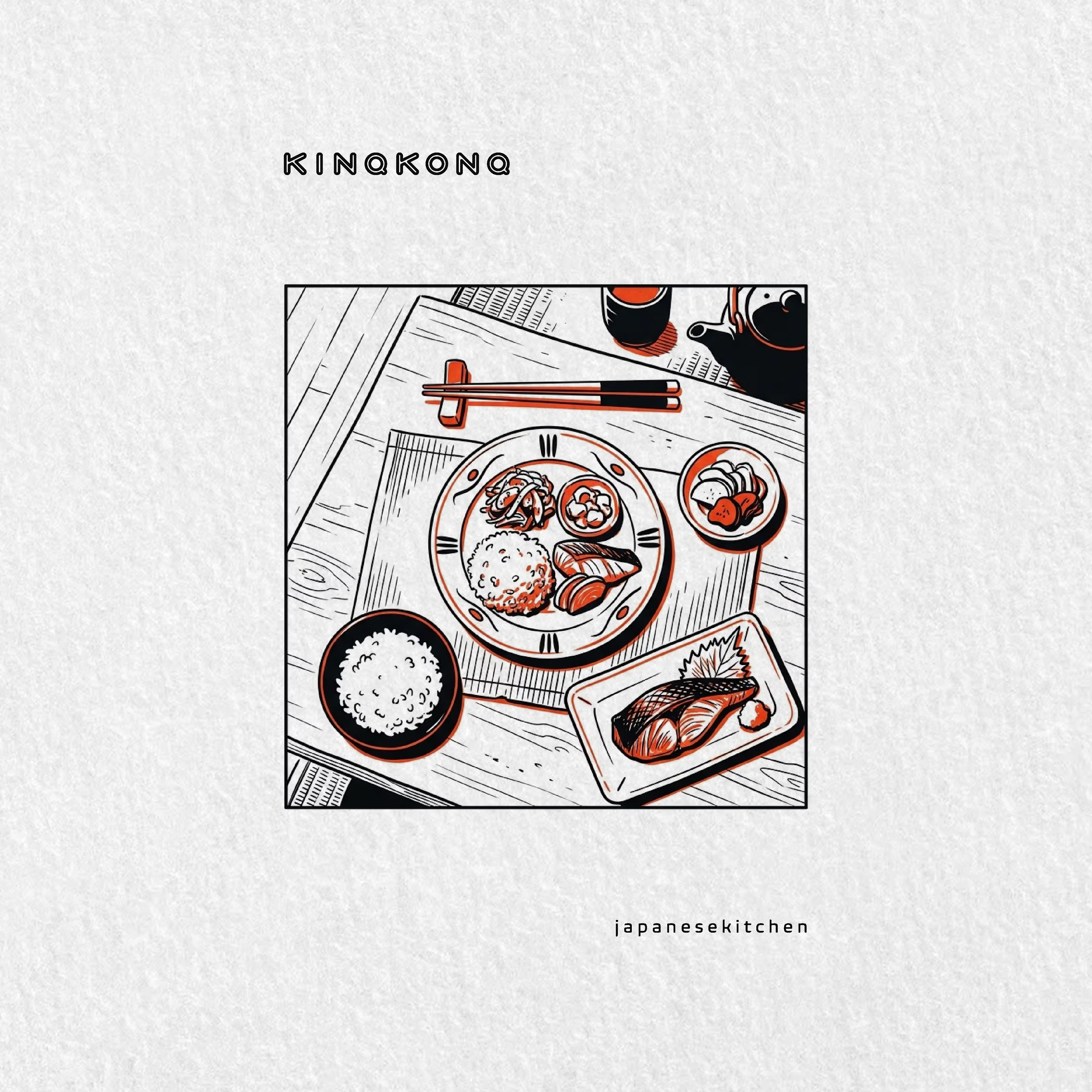

Reads to me like a record of a meal rather than an invitation to one — the overhead line drawing is the posture of someone documenting a table, not selling a dish, which suits the ritual idea better than a photograph would. The trade-off is that line art doesn't do appetite, so...
You've hit on the exact tension we're playing with, Artur. If the line art refuses to pander to appetite, it forces you to look at the structure instead of the food. 🍱 🤷🏽 But tell me—when the appetite isn't manufactured by a juicy photograph, what is it that actually makes...

The network for creativity
Join 1.25M professional creatives like you
Connect with clients, get discovered, and run your business 100% commission-free
Creatives on Contra have earned over $150M and we are just getting started











Related posts

A flower that inflates arrives in the mail.
Next month, a phone made of shell.
STILL LIFE SERVICE. Case study dropping soon.
Which object earns your shelf? Reply below.
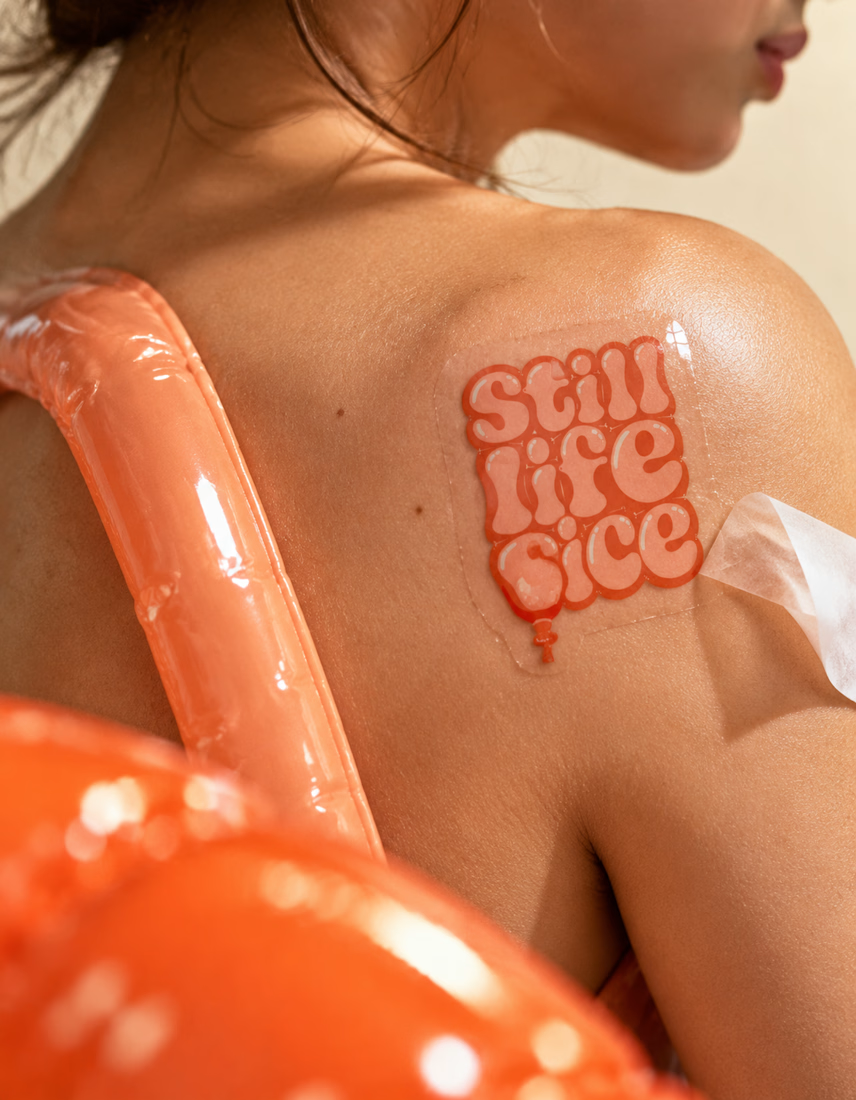

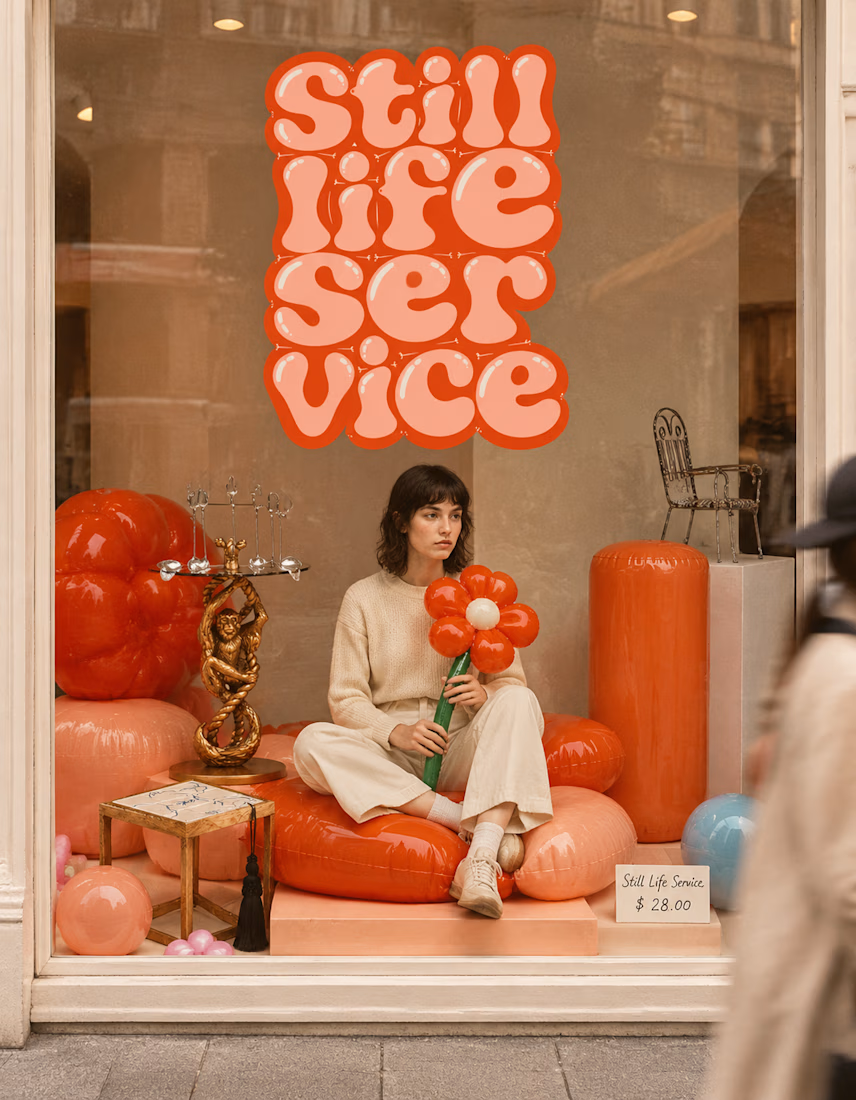

The inflatable flower. Only houseplant I'm guaranteed not to kill. Also, a new object every month is a sneaky good retention hook, people will stay subscribed just to see what's next.


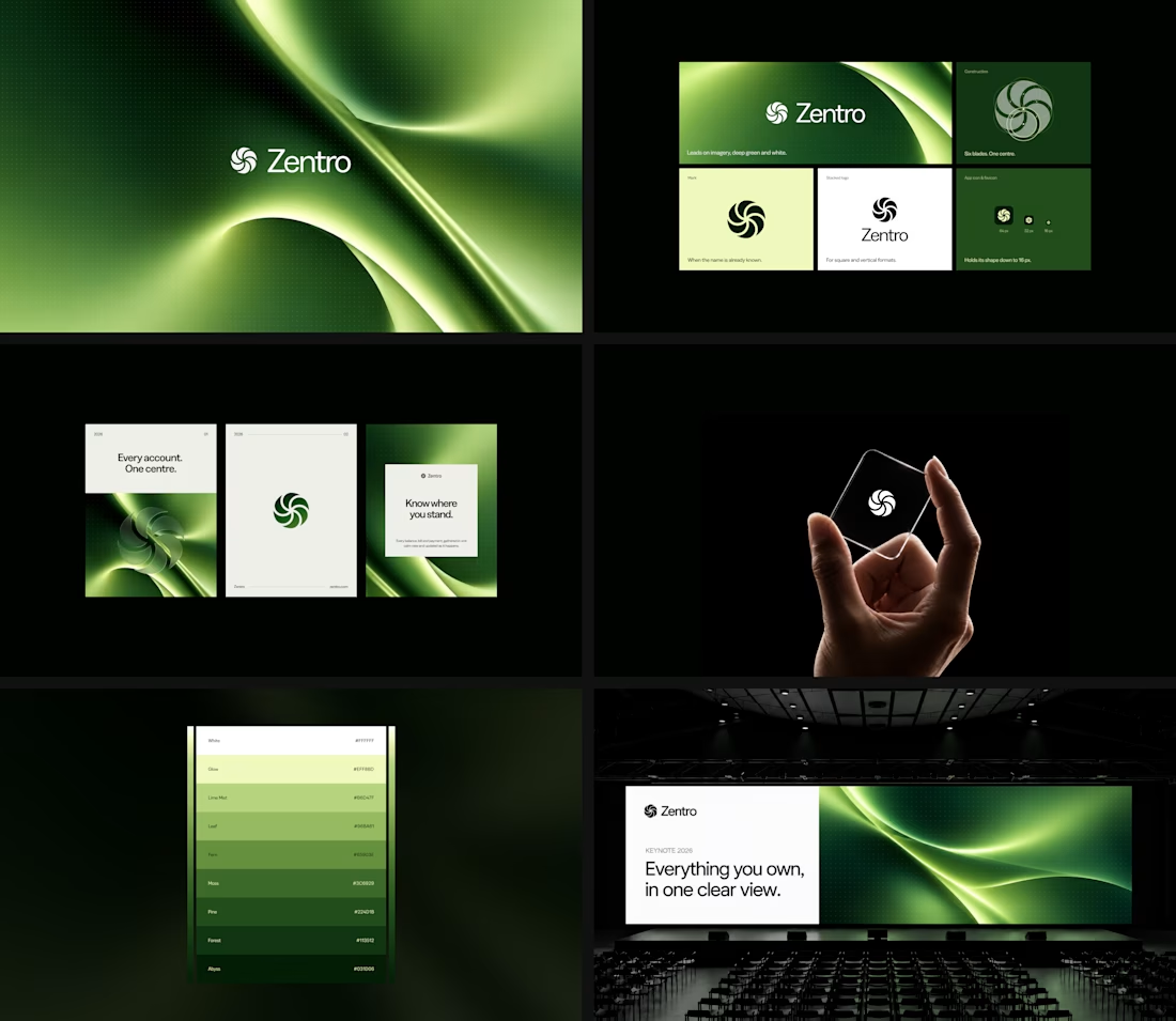

Clean and confident work! The green gradient with the mark feels very modern for fintech - trustworthy but not boring. The app screens look really polished. Curious how you landed on this mark, does it represent growth / movement?

HuroPay Branding for Fintech
We built its identity to feel the same way: fast, clear and human.
Need a branding? DM Now...
#branding #brandidentity #logo
