Projects using Glorify in Mascot
Projects using Glorify in Mascot
Sign Up
Post a job
Sign Up
Log In
Filters
2
Projects
People
Message
19
Jason Lam
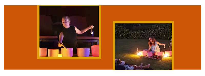
I’O Transformation required a Cover Photo and Flyer for their Soundbath event. I responded with a proposal because for starters, people tend to focus on graphics first before text hence the placement above the proposed text (TBD) and that pictures worth a thousand words. As part of my #avantgarde approach for the cover photo I added proportionally sized white graphic elements while preserving the original proportions of each image. As you would also imagine, the context calls upon a warm colour such as the orange tone utilised in the major graphical element spanning much of the cover photo. While I am for intricate patterns, I would like to adhere to theme of simplicity by clouding the viewer's thoughts unnecessarily but ensuring it should be viewable by anyone visually impaired or otherwise as part of #accessibilityforall.
19
152
Message
14
Jason Lam
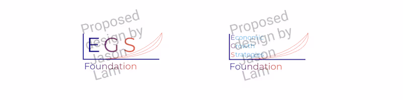
Economic Growth Strategies is a non-profit organisation that was seeking a new logo design with their full branding as well as the compact form with the EGS abbreviation. #avantgarde is one of my design philosophies and an application of this concept in my proposed design is via the triple curve design of different gradients with the same endpoint. This is not just a mathematical expression but to communicate visually that eventually that no matter the pace, there should be a similar optimal outcome for all involved. Additionally, I experimented with a more contemporary appearance commensurate to illustrate a more forward outlook. Another one of my design philosophies is #accessibilityforall and to implement it accordingly I blended visual accessibility for all with precisely defined colours of the EGS branding as required.
14
111
Message
11
Jason Lam
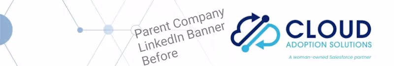
Cloud Adoption Solutions has acquired Retentional and so they would like a new LinkedIn banner. I wanted to retain some semblance of the network-like line elements present in the parent company background banner design in some form and mesh it (no pun intended) with my take via my proposed design. Invoking the Retention branding was a priority by introducing letter R-themed line elements was my way of implementing #avantgarde as one of my design philosophies. I designed these triple letter R-themed line elements to appear as though they are captured as a snapshot at a point in time of them scrolling vertically as if they were in motion. As #accessibilityforall being another one of my design philosophies, I made sure that it would not matter whether someone is vision impaired or not to clearly see the banner background elements.
11
124
Message
12
Jason Lam
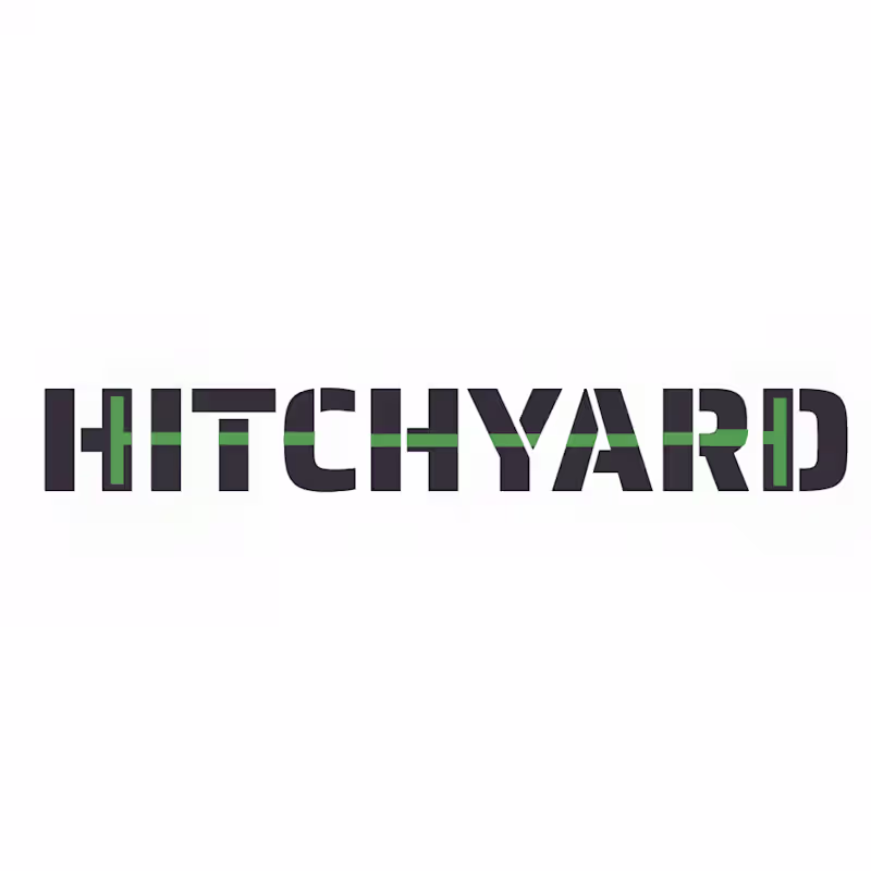
Hitchyard requested a proposal for a minimalist logo design for a Freight Tech Startup with two distinct colours. My proposal: Freight should be vehicle-independent hence why I avoided design cues that resemble specific vehicles such as a truck or road train specifically. #avantgarde is one of my design philosophies in this approach hence the C-elements on opposite sides flanking a line that may represent encompassing arbitrary goods. While #accessibilityforall is also one of my design philosophies, it is understandable that selected and distinct brand colours take precedence for a more specific range of customers here. As part of consolidation for conformance to the Hitchyard brand identity, the Hitchyard logo should be recognisable regardless of scale whether it is an app icon or a full-size logo on your invoices and vehicles.
12
179
Explore projects