



Digital Product Design for SaaS & Tech Companies
Digital Product Design for SaaS & Tech Companies


We Build High-Quality Design for Global Brands to Grow
- $25k+
- Earned
- 7x
- Hired
- 14
- Followers
We Build High-Quality Design for Global Brands to Grow
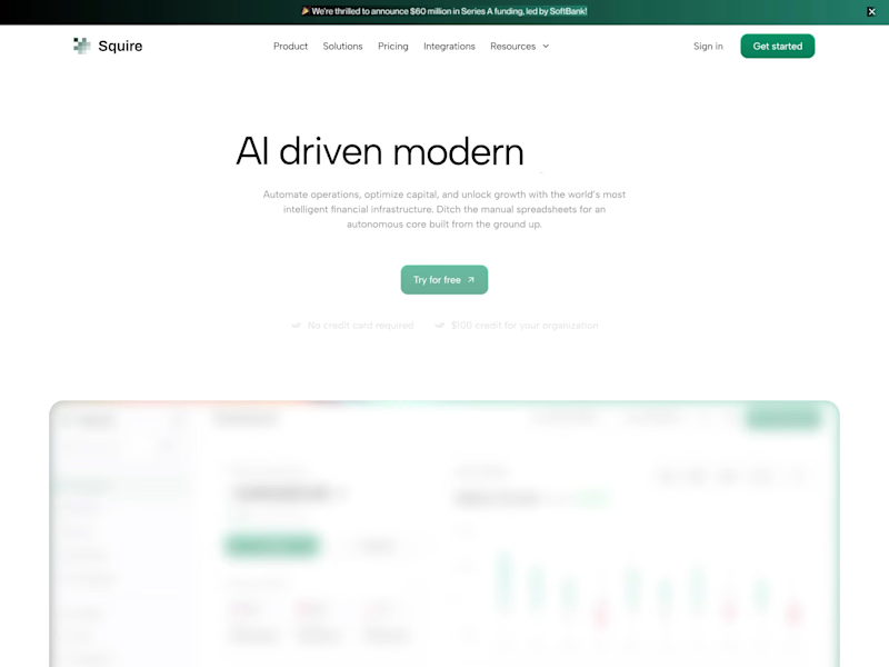
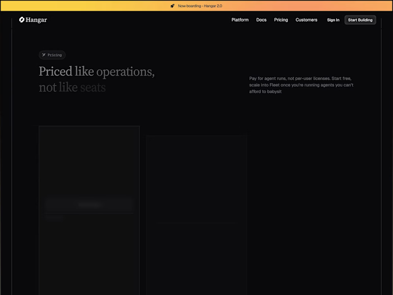
Squire - Finance AI - Pricing
Here’s the pricing page we designed for Squire, built around a flexible usage-based model instead of fixed seats. We kept the plans simple to compare while making the Pro option stand out without adding too much visual noise. Would this pricing model feel clearer for an AI finance product?
0
21
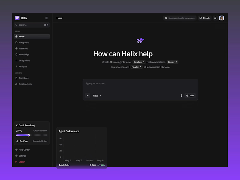
Helix - AI Dashboard - Test Runs
A closer look at the Test Runs experience we designed for Helix shows how teams can test AI voice agents, track pass rates, and review performance in one place. We kept the layout simple so results and failed cases are straightforward to spot. Would the experience give you enough confidence before going live?
0
19
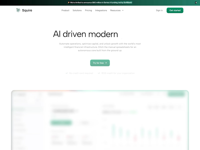
Squire - Finance AI - Homepage
Hey everyone!
Sharing the homepage we designed for Squire, a finance AI platform built to make financial operations feel clearer and more connected. We kept the layout clean and used focused dashboard previews to make the product feel approachable while still showing depth. What catches your eye first?
0
20
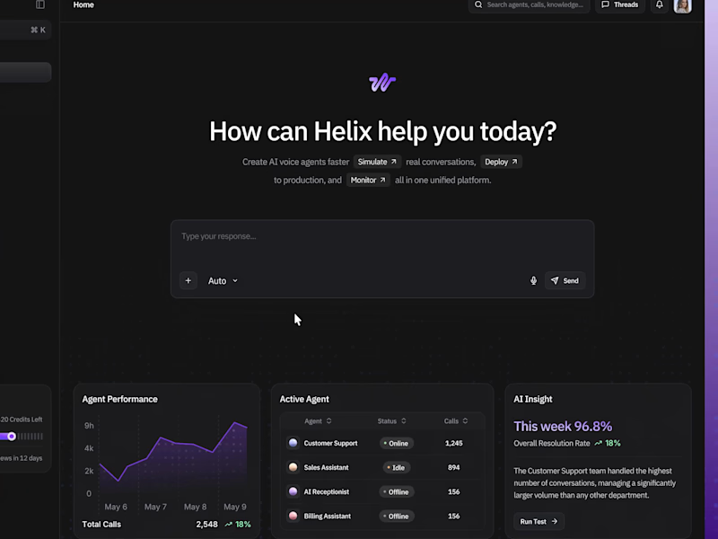
Helix - AI Dashboard - Homepage
A look at the homepage we designed for Helix, an AI dashboard built to make data, insights, and key actions feel more connected in one workspace. We kept the layout clean and structured so the experience feels focused while still giving the product enough depth. What’s the first thing you’d want to explore on a dashboard like this?
0
21

Brand Identity Designer
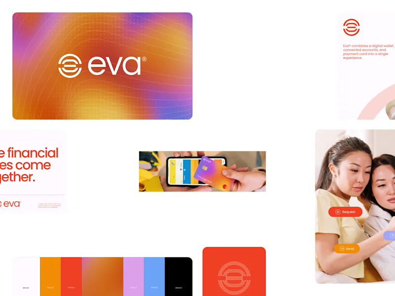
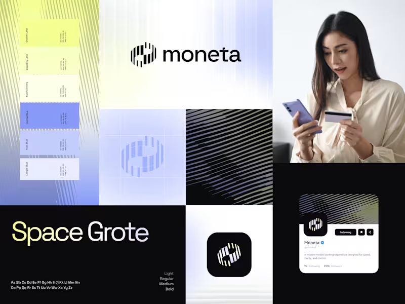
Introducing EVA, a digital wallet and payment ecosystem designed to make money movement feel effortless. The logo concept explores connection, simplicity, and fluidity through a minimal geometric symbol built for a modern financial experience.
Money, connected.
3
3
323


UI/UX | Webflow & Framer
UI/UX | Webflow & Framer
Fuel your day with goodness. 🥣
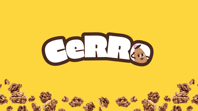
Introducing CERRO, a granola cereal brand we designed to make everyday breakfast more delicious, nutritious, and fun.
CERRO pairs wholesome oats, nuts, and seeds with high-protein nutrition and no added sugar. We built the identity around that same energy: a chunky rounded "CeRRo" wordmark, a playful retro-cartoon mascot that replaces the "o", and a bold yellow hero color.
Each flavor gets its own color code, with pink for Strawberry, brown for Chocolate, and yellow for Banana. That keeps the range easy to read on the shelf while staying consistent as a system. The work covers the logo, packaging, posters, merchandise, and a billboard campaign.
See the full project on Behance:
www.behance.net/gallery/Cerro-Granola-Branding-Packaging-Design (https://www.behance.net/gallery/Cerro-Granola-Branding-Packaging-Design)
What's your go-to breakfast? 👇
#BrandIdentity #PackagingDesign #Branding #FoodPackaging #VisualIdentity #GraphicDesign #Illustration
0
10
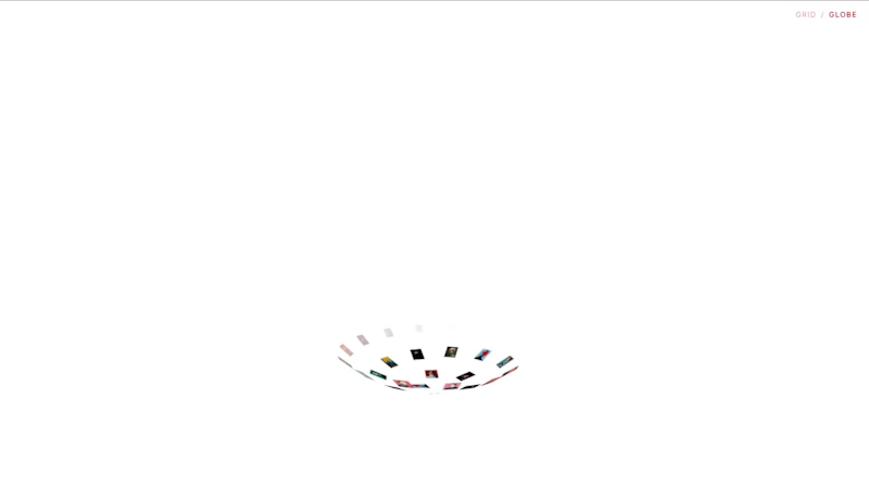
Geodesic Gallery is an interactive image gallery component for Framer that combines a clean grid layout with an immersive globe view. #framerComponent check here (https://www.framer.com/marketplace/components/geodesic-gallery/)
0
23

Introducing Nora — a refined agency portfolio Webflow template designed for studios that value clarity, structure, and timeless design.
Preview : https://nora-portfolio-template.webflow.io/
Explore → https://8am.design
0
57

CineVault is a cinematic Webflow template crafted for filmmakers who want their work to shine. Designed to feel like a digital film festival, it lets directors, editors, and creators showcase reels, projects, and behind-the-scenes stories in a bold, immersive way. Now shared with the Contra community, it gives filmmakers a powerful home to present their craft and land new opportunities.
Full preview https://cinevault-film-maker.webflow.io/
0
66

UI/UX Design & Webflow Expert for SaaS & Startups

UI/UX Design & Webflow Expert for SaaS & Startups


Graphic Designer | Logo, Pitchdeck, Branding
Graphic Designer | Logo, Pitchdeck, Branding


