

Creating simple, clear, and modern 3D work


3D Artist | Crafting Visually Stunning Worlds.


View more →

Brand & Design Studio for premium visual experience
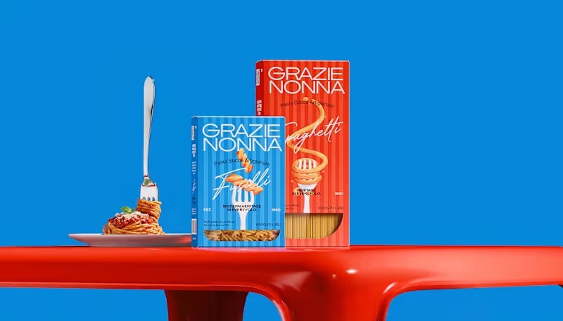
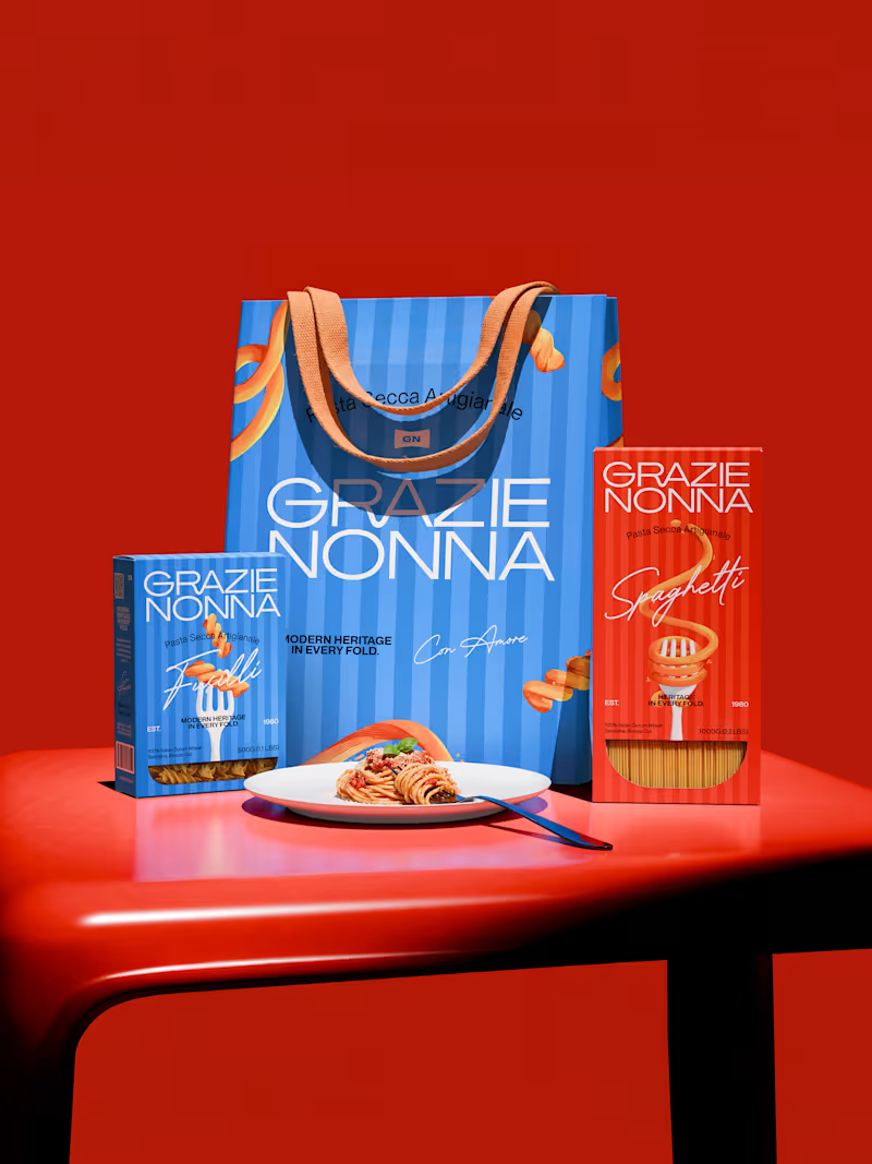
Grazie Nonna is a modern pasta brand inspired by the warmth, craft, and authenticity of handmade family recipes.
The challenge was to create a brand identity and packaging system that could celebrate Italian heritage without falling into the familiar visual language of traditional pasta brands.
Instead of looking backward, the identity brings nonna's heritage into a contemporary world: bold, expressive, colorful, and unmistakably Italian. The result is a visual identity built around one central idea: Tradition, reframed for a new generation.
4
3
151

Versatile Designer: 3D, UI & Graphic Solutions
Versatile Designer: 3D, UI & Graphic Solutions


View more →

Pitch Deck Designer & Jitter Expert

Pitch Deck Designer & Jitter Expert

Modern presentation direction I’ve been playing with lately.
Would love to hear your thoughts :)
5
8
1.4K



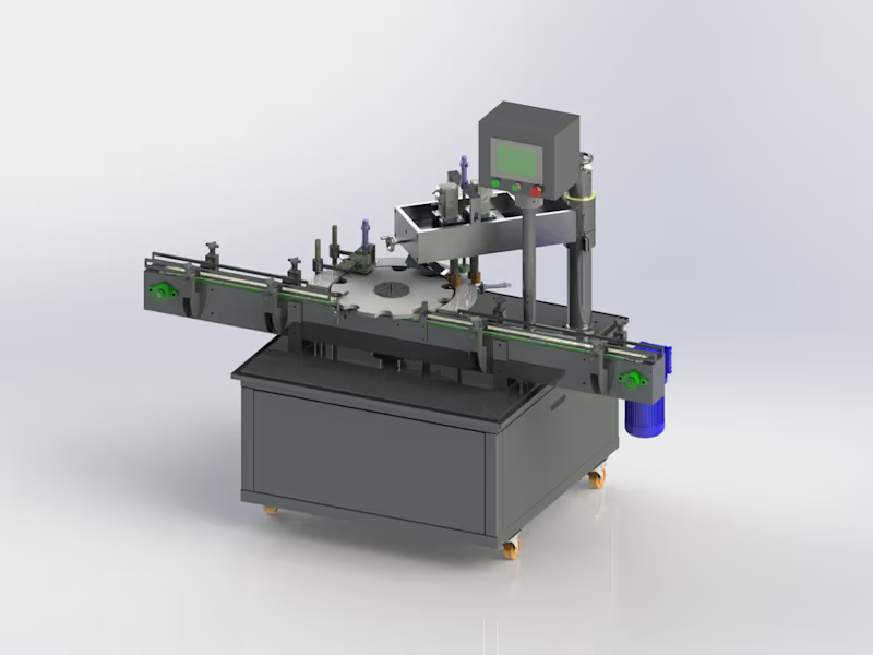
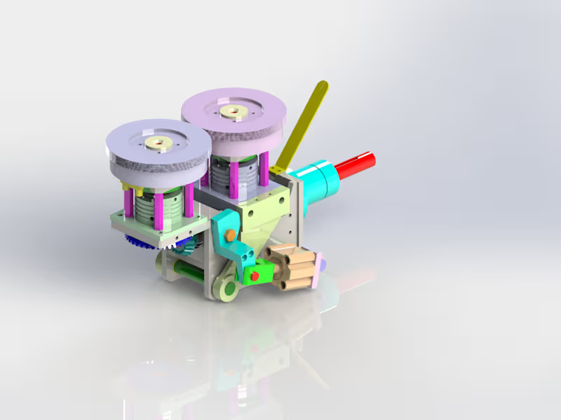
3D Modeling & CAD Engineer | SolidWorks Expert



Superfast Copywriting & Design with Unlimited Revisions
Superfast Copywriting & Design with Unlimited Revisions


