Low-Code/No-Code Development Projects in MaharashtraLow-Code/No-Code Development Projects in MaharashtraI wanted to share an internal dashboard I just wrapped up using the new Retool App Builder.
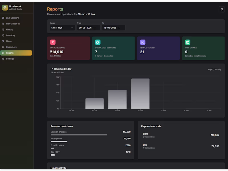
The project targets a unique niche: Art Cafes & DIY Craft Studios.
These businesses operate on a "Time-as-a-Service" model where customers book a 2-hour window, get basic supplies and a complimentary drink, but get charged for regular cafe snacks, premium canvases, or extra time.
Standard POS platforms don’t natively track live table occupancy time or handle mixed complimentary/paid item orders smoothly. I built this custom portal to handle the heavy lifting.
Here is a quick video walkthrough of the operational flows, live floor tracking, and dashboard settings:
https://www.loom.com/share/7f8c823309ec4a24a392c5d427f21035
Key features built completely in Retool:
Live Studio Floor/Dashboard:
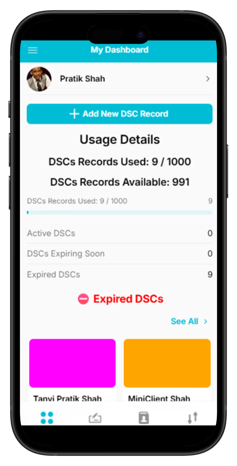
A clean grid layout displaying currently occupied tables, dynamically tracking group size, and color-coded status pills (Active, Completed, Unpaid).
Contextual Orders (Modals):
Clicking any active card triggers a popup modal form allowing front-desk staff to instantly append food items or premium inventory directly to that specific customer's active session tab.
Back-Office Configuration & Reports:
Dedicated tabs for the store owner to track key metrics (Active Sessions, Total Profits, Unpaid Orders), manage global inventory logs, and edit customer profile records.
I’d love some feedback from the community:
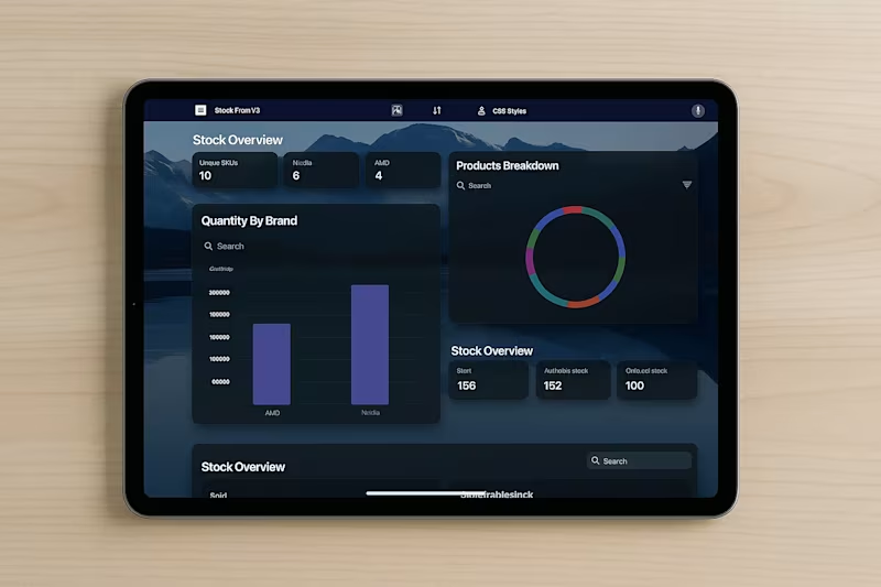
Drop your thoughts below or let me know if you want a breakdown of any specific component setups! We’re experimenting with Apple-style “glass” to make our Glide ( (https://www.linkedin.com/company/glideapps/)glideapps.com (http://glideapps.com)) (https://www.linkedin.com/company/glideapps/) calmer and easier to scan.
Not trying to be fancy.. just clearer.
What we’re learning about the glass look:
It’s not pure transparency. It’s a soft blur + a hint of tint so content stays readable.
Depth comes from three gentle layers: background blur, a thin highlight border, and a soft shadow.
Contrast matters. Text should pass accessibility checks, or the “wow” quickly turns to “where?”
How we’re doing it in Glide with a touch of custom CSS:
Frosted cards/nav: light translucent backgrounds, small blur.
Subtle borders: 1px, low-opacity, to define edges.
Rounded corners and roomy spacing to reduce visual noise.
Minimal motion so the content, not the chrome, gets attention.
Tiny snippet that powers a lot of the feel:
.glass {
background: rgba(255,255,255,.08);
backdrop-filter: blur(12px);
border: 1px solid rgba(255,255,255,.18);
border-radius: 16px;
box-shadow: 0 8px 24px rgba(0,0,0,.2);
}