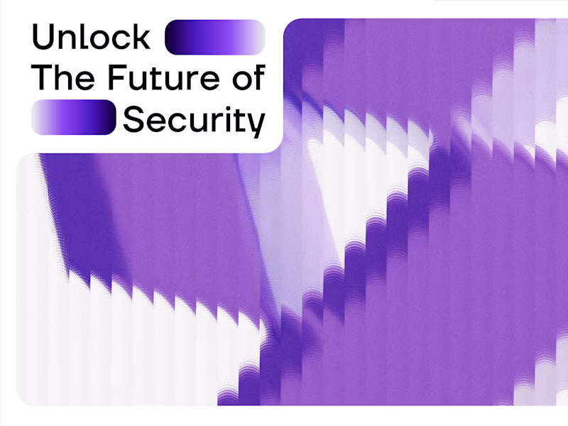
Projects using Adobe Illustrator in Las Palmas de Gran CanariaProjects using Adobe Illustrator in Las Palmas de Gran CanariaCASE STUDY
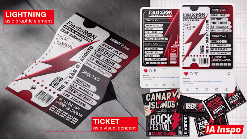
FiestoRon needed new promotional materials for one of Gran Canaria’s most renowned rock festivals. The project included short- and long-form audiovisual content, posters, billboards, and bus wraps, maintaining the visual essence of previous campaigns while incorporating new creative concepts.
The main challenge was to quickly understand a brand we had not worked with before and translate its identity into multiple communication formats. Drawing on signature elements such as the lightning bolt and the red color palette, we developed new graphic solutions, including the incorporation of the visual concept of a ticket across various promotional materials.
The result was a cohesive campaign adaptable to various media, reinforcing the festival’s identity and introducing new creative perspectives that were very well received by the client.
PROJECT SUMMARY
Design of a promotional campaign for FiestoRon, including audiovisuals, posters, billboards, and urban signage, combining brand continuity with new visual concepts to reinforce the festival’s identity. CASE STUDY
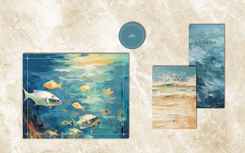
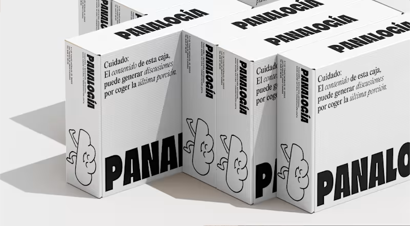
This brand of jams and fruit-based products was born with a strong emotional and family-oriented focus. Its name, inherited from the founder’s father, became the starting point for building a visual identity capable of conveying tradition, authenticity, and approachability, while standing out in a highly competitive market.
The challenge was to develop a cohesive brand that would reflect the artisanal quality of the products and make it easy to identify each fruit variety. To achieve this, a visual identity was created based on a color palette directly inspired by natural ingredients, using colors associated with each fruit to reinforce the perception of freshness and flavor.
The project included the design of the logo, the labeling system, and various packaging elements. Beyond the main applications, specific details were designed for the metal lid and the tamper-evident seal located between the lid and the neck of the container, transforming functional components into additional carriers of brand identity. This strategy helped reinforce the product’s visual recognition across multiple touchpoints.
The result was a consistent, attractive, and easily scalable branding system capable of communicating the brand’s family heritage while highlighting the freshness and quality of its products at the point of sale.
PROJECT SUMMARY
Comprehensive branding and packaging development for a brand of jams and fruit products, combining family heritage, visual freshness, and an identity system applied from the labels to the packaging’s security and closure elements. CASE STUDY
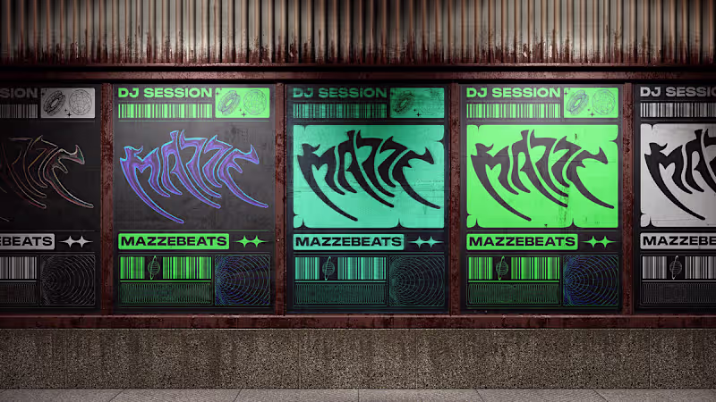
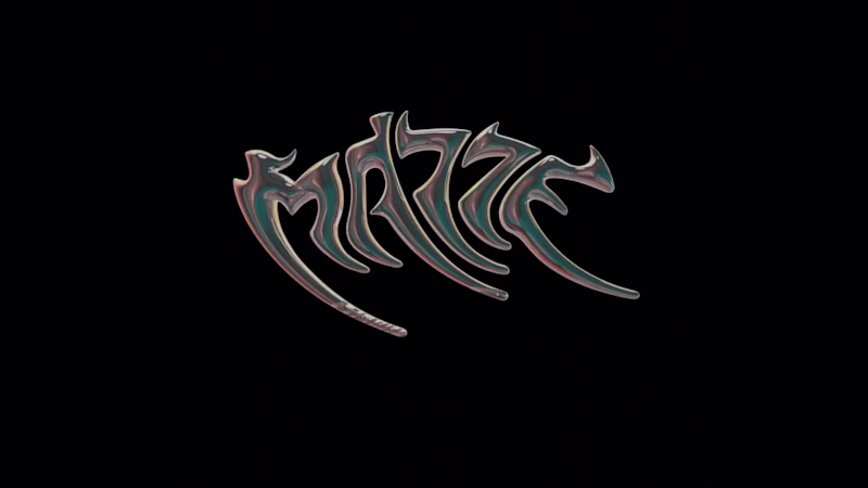
MAZZE was looking for a visual identity capable of representing seemingly contradictory concepts: delicacy and strength, fragility and resilience, nature and energy. Inspired by phenomena such as Rupert’s Tears, the challenge was to condense these ideas into a single, recognizable symbol for his career as a DJ and music producer.
The solution was to develop a completely custom lettering-based logo, built around an organic and fluid structure. The visual concept drew inspiration from molten metal, creating a three-dimensional aesthetic that conveys transformation, movement, and intensity. The curves lend a sense of naturalness and sensitivity, while the sharp edges introduce tension, character, and visual strength.
Each letter was carefully adjusted to achieve formal coherence and structural balance, allowing the whole to function as a single, distinctive piece. The result is an identity capable of communicating both the energy of electronic music and the conceptual complexity behind the artistic project.
PROJECT SUMMARY
Custom logo design for DJ and producer MAZZE, developed from a lettering system inspired by molten metal, combining organic forms, energy, delicacy, and strength within a unique and memorable visual identity.