Projects using Midjourney in LahoreProjects using Midjourney in LahoreThis was supposed to be a sample.
The client wanted to see what their brand would look like as a real commercial before committing to anything. Just a direction, a mood, something to react to. The kind of thing you usually keep rough because it's going to get torn apart in feedback anyway.
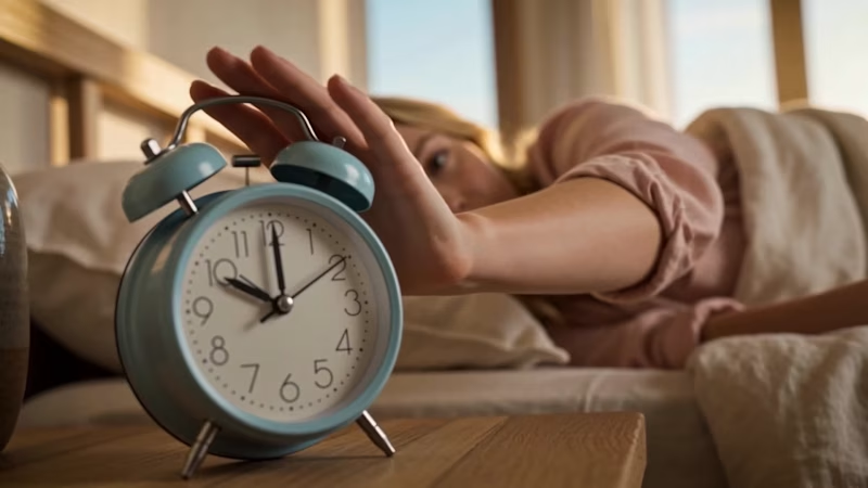
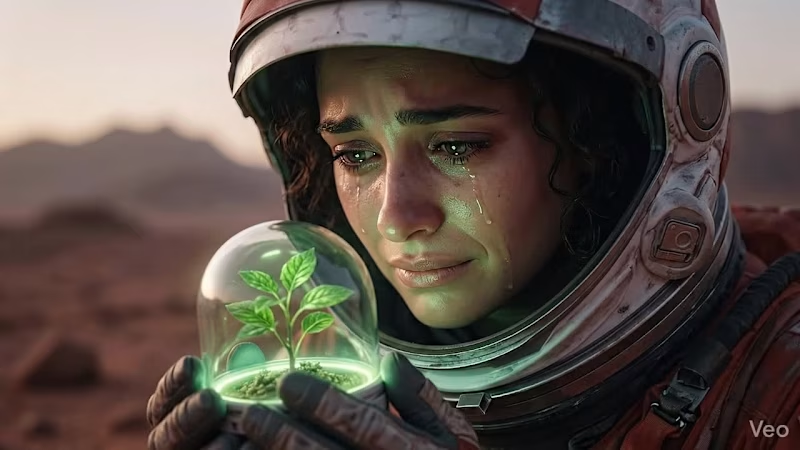
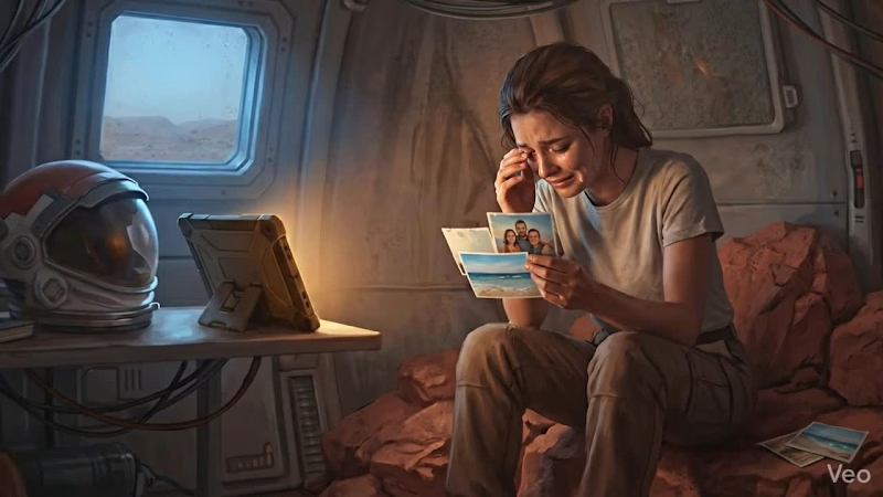
I didn't do it that way. I built the full 30 seconds like it was already approved. Wrote the shot list properly. Sat with the lighting until the golden hour felt like actual morning light and not a filter. Held one color palette across every frame. Recorded the voiceover. Added the jingle at the end.
They watched it once and said they didn't need a second concept. The sample became the ad. ☕🔥
The lesson I keep coming back to is that nobody can tell the difference between a sample and a final if you refuse to treat them differently. The moment you decide something is "just a draft," you've already lowered the ceiling on it. Clients feel that, even when they can't name it.
So now I don't send drafts. I send the best version I can make, every time, and let them tell me if it needs to change.
Has this happened to you? That moment where the throwaway version turned out to be the one? I'd love to hear how it went, because I think a lot of us are undercharging for work we're already doing at full effort.
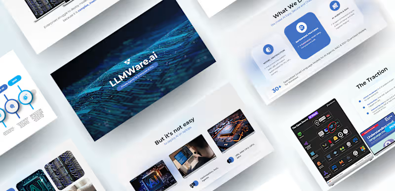
Concept, shot planning, prompt engineering, AI video generation, voiceover script, and sound design were all handled in house.
Let me know what you think of the final look! 🚀 Behind every polished aesthetic is a mountain of rough drafts, late-night edits, and a whole lot of creative chaos. 🤫✨ Lately, I’ve been deep in the trenches bringing a few new visual concepts to life balancing client work, refining brand assets, and experimenting with dynamic new ways to make products pop on screen.
Whether it's dialing in the exact color grading, tweaking packaging details, or staging the ultimate golden-hour shot, the process is just as rewarding as the final output. If you’ve ever wondered what goes on behind the grid, it’s mostly coffee, endless iterations, and chasing that one perfect frame. ☕️🎨
What project are you pouring your energy into this week? Let’s talk about it in the comments! 👇 Stop wasting budget on traditional video shoots. Ad fatigue will kill your margins anyway.
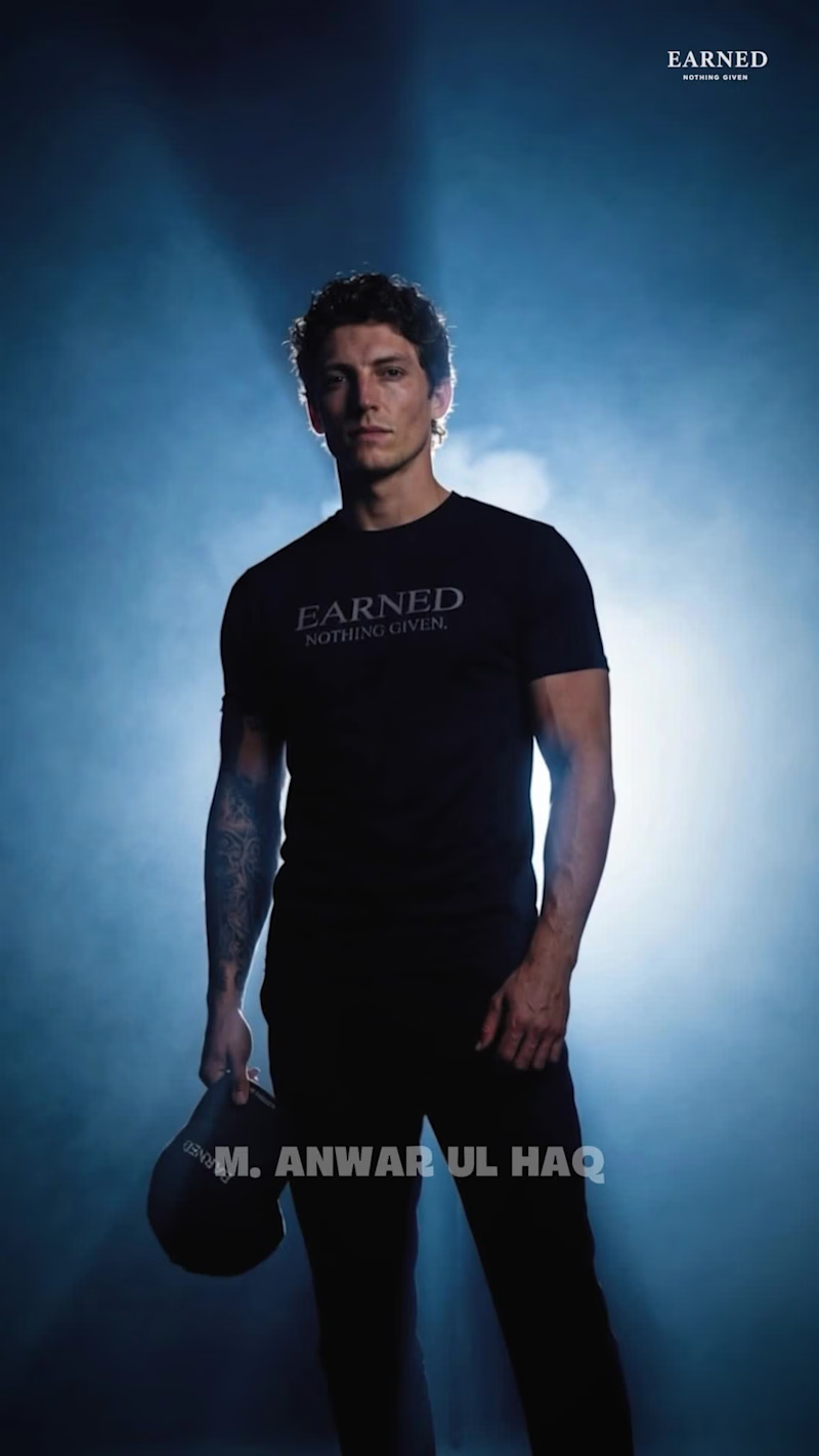
I cooked up this AI native commercial for an apparel brand called EARNED. Instead of spending thousands booking a studio, models, and a crew, I built this entire cinematic vibe digitally. The strategy here relies on raw psychology. I focused on internal drive and discipline to hook the viewer instantly and drive direct to consumer sales.
The Production Stack
Midjourney and Nano banana for realistic asset generation, exact clothing textures, and strict character consistency
Seedance 2.0 and Veo to control the heavy motion, the ice bath physics, and training sequences
Adobe Premiere Pro and Adobe After Effects for the final premium color grade and high energy pacing
The Growth Mechanics
Temporal Character Consistency: Maintaining the exact same male model and matching his arm tattoos across different shots solves the biggest limitation in AI advertising, making the brand feel premium and cohesive.
The 3 second scroll stop: High contrast silhouette lighting mixed with low frequency audio breaks the standard feed pattern instantly.
Infinite scaling: I can completely swap the lines, models, or environments within 48 hours without rescheduling a physical set.
DTC founders, let's be real. Are you seeing better conversion rates from raw UGC or highly stylized AI creatives this quarter? Let's discuss in the comments. AI Art Direction & Product Campaign — Hair & Body Care
I explored how a single beauty-product line could be translated into a series of premium campaign visuals without losing its visual identity.
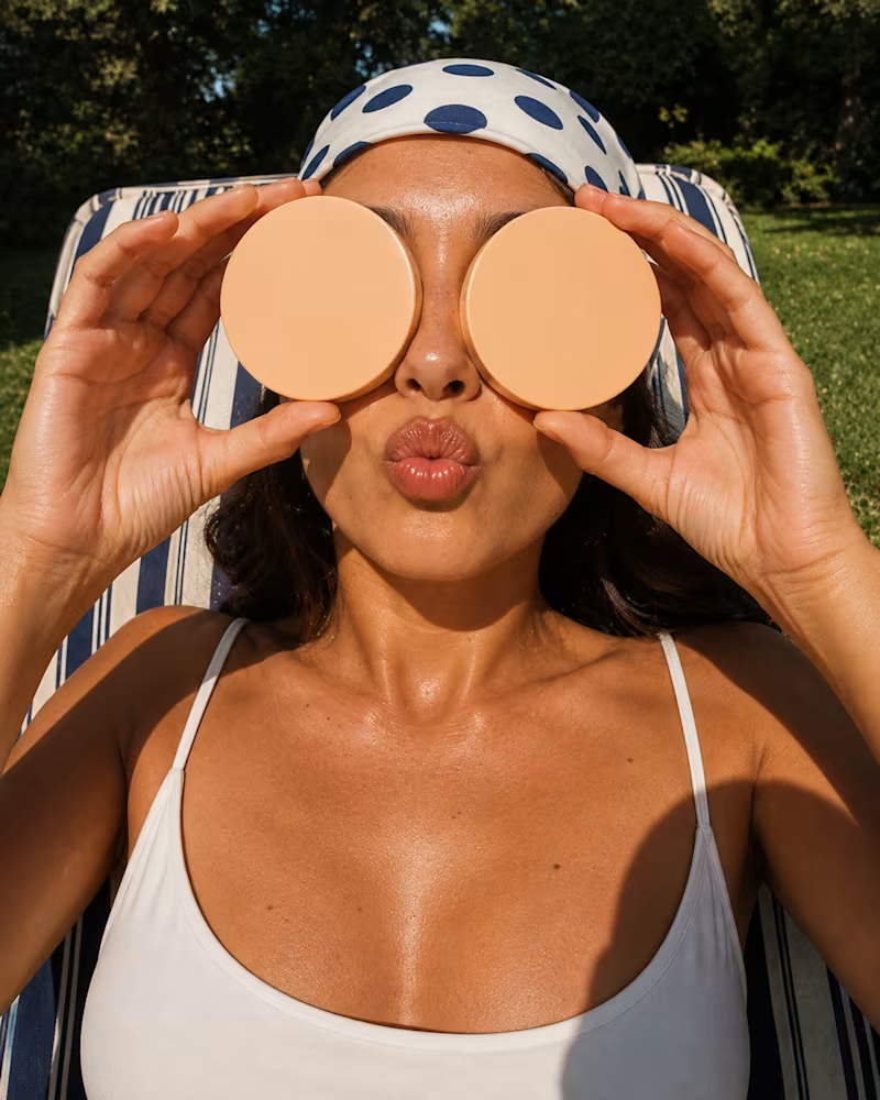
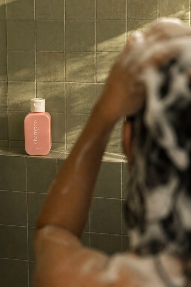
The project focused on AI-assisted product photography and art direction, placing the products into different lifestyle environments, from a warm, sunlit bathroom and tropical poolside setting to a playful retro-inspired composition and a close-up beauty portrait.
The main challenge was maintaining consistent product packaging, proportions, colours, typography and brandingwhile changing the entire environment, lighting and photographic language around it.
I treated each image like a real commercial shoot: defining the composition, camera perspective, lighting, colour palette, depth of field, styling and supporting elements before generating the final visuals.
The result is a cohesive visual campaign that explores how the same product can feel editorial, nostalgic, luxurious and contemporary depending on the art direction.