UX/UI Designer and AI Automation Expert
- $5k+
- Earned
- 2x
- Hired
- 5.0
- Rating
- 18
- Followers
UX/UI Designer and AI Automation Expert



Product & Web Design
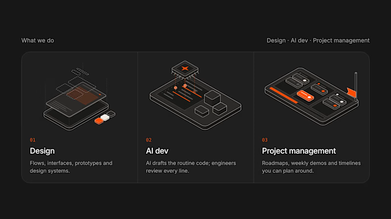

Yesterday, I decided to audit my own website, Designify, from the perspective of someone visiting it for the first time.
Not as the designer who built it, but as the user who has no context about how it works.
That immediately exposed several small UX gaps.
One of them was in the pricing flow.
The pricing section sits at the bottom of the page. Once a user reached it, there was no obvious way to get back to the top without manually scrolling through the entire page.
The solution was simple:
→ The “Plan” button takes the user directly to pricing.
→ Once there, it transforms into “Back to top.”
→ Clicking it brings the user straight back to the beginning.
Nothing groundbreaking. Just removing unnecessary friction.
This was a good reminder that good UX isn't always about adding more.
Sometimes, it's about noticing the small moments where you're asking the user to do more work than necessary and eliminating them.
2
2
133
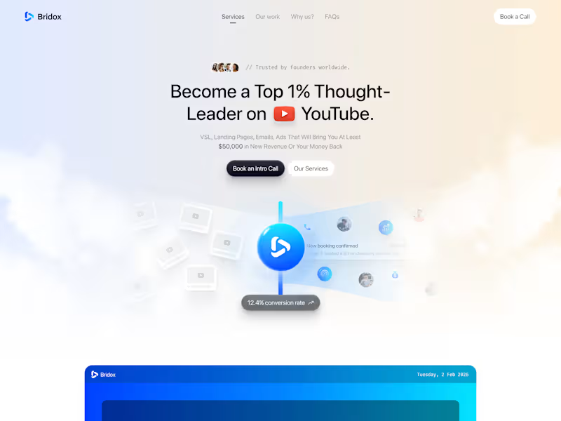


Conversion-focused design & dev for B2B SaaS and AI startups

Conversion-focused design & dev for B2B SaaS and AI startups


Branding | UI/UX | Webflow & Framer | Product & Web Design
Branding | UI/UX | Webflow & Framer | Product & Web Design


Your One-Stop Solution to Digital Success
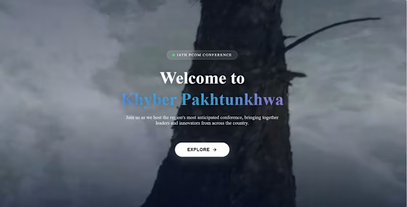
PCOM Conference Website
Designed, developed, and deployed the official PCOM Conference website using HTML, CSS, JavaScript, PHP, and MySQL. Built a responsive, user-friendly platform featuring conference information, online registration, abstract submission, user authentication, and an admin panel for managing participants and conference content. Configured the MySQL database, deployed the application via cPanel, and ensured reliable performance, security, and seamless functionality on the live server.
pcom.org.pk (http://pcom.org.pk)
0
31




Framer expert, mobile/web app designs and more
Framer expert, mobile/web app designs and more
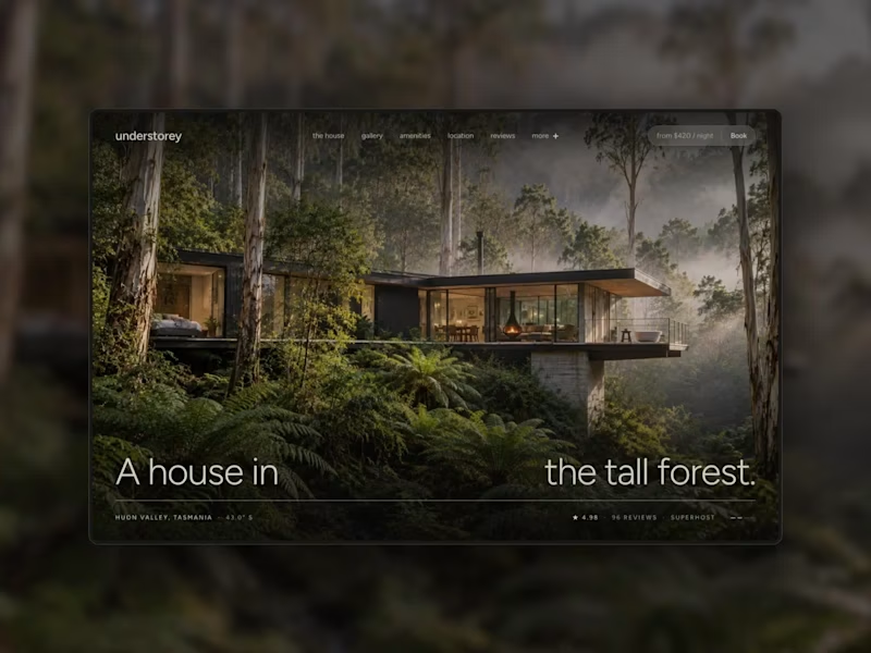
Understorey, my third Framer template, was built to solve a single-property owner's struggle with showcasing their house the best possible way.
Airbnb and other platforms give you cookie-cutter layouts that, more often than not, wont do your house justice. Understorey isn't disconnected from your listing on these platforms. Instead, It embeds them into its structure and is built around them.
https://www.framer.com/marketplace/templates/understorey/
2
1
59
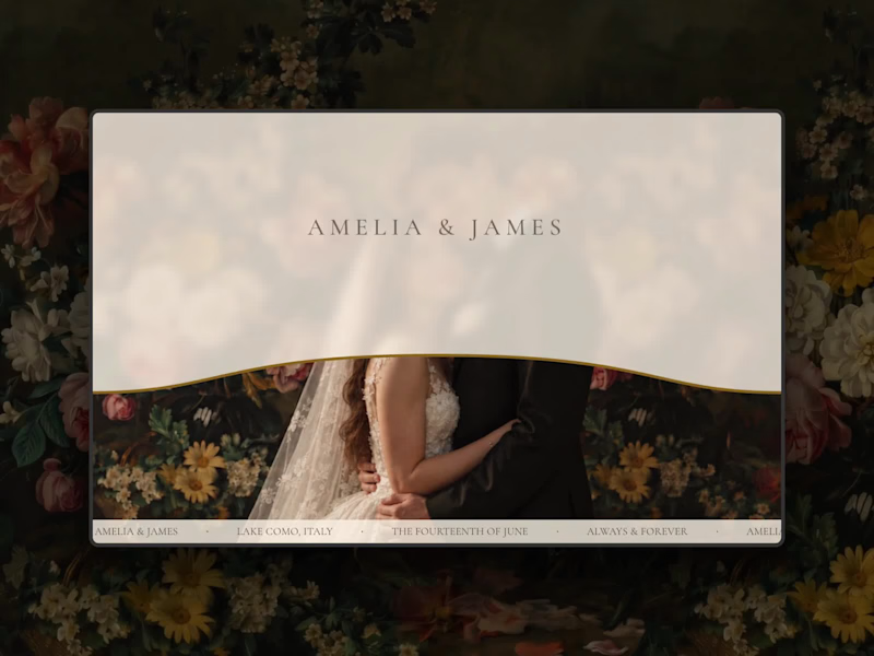
Introducing Wedding Book, a new Framer template
Most wedding websites are made for before the day: RSVPs, schedules, registries. Wedding Book is for after. It turns the photos and memories into a story told in chapters, like a printed book, on one page couples can share with everyone in a single link.
Typography sits at the heart of it: a timeless serif, handwritten script, story columns balanced like a printed page, and a pencil sketch for every chapter.
For photographers, it’s a beautiful way to deliver a wedding: more than a gallery link, a story website for your couples.
Now live on the Framer Marketplace
https://www.framer.com/marketplace/templates/wedding-book/
0
67
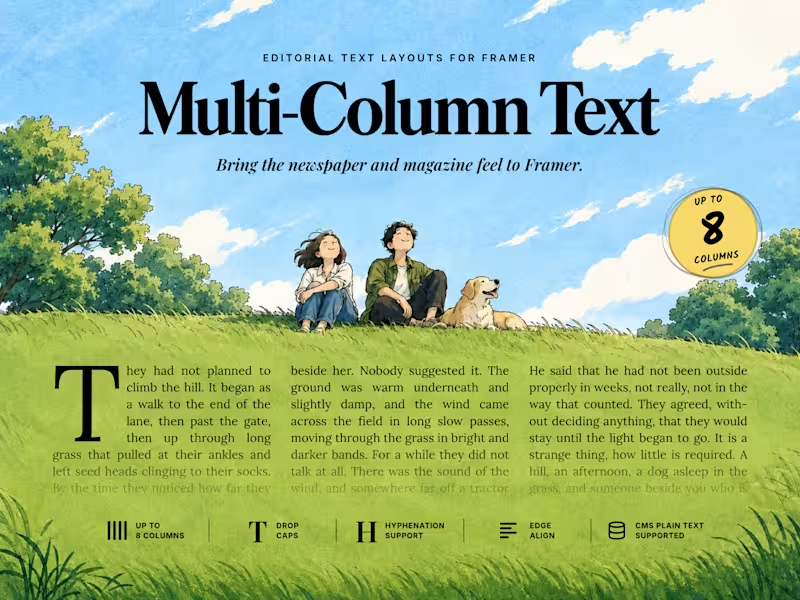
Beyond excited to release our next component: Multi-Column Text.
As avid typography fans, we have always felt the need for a robust mechanism to divide text blocks into beautiful, editorial columns - reminiscent of newspapers and magazines. Until now, we've used manual text blocks to create this effect.
With Multi-Column Text component, you can now achieve much more in just a few seconds. The best part is - it supports CMS. Currently the component only supports plain text but we are actively pursuing support for rich text.
Have a look and take it for a spin!
0
137


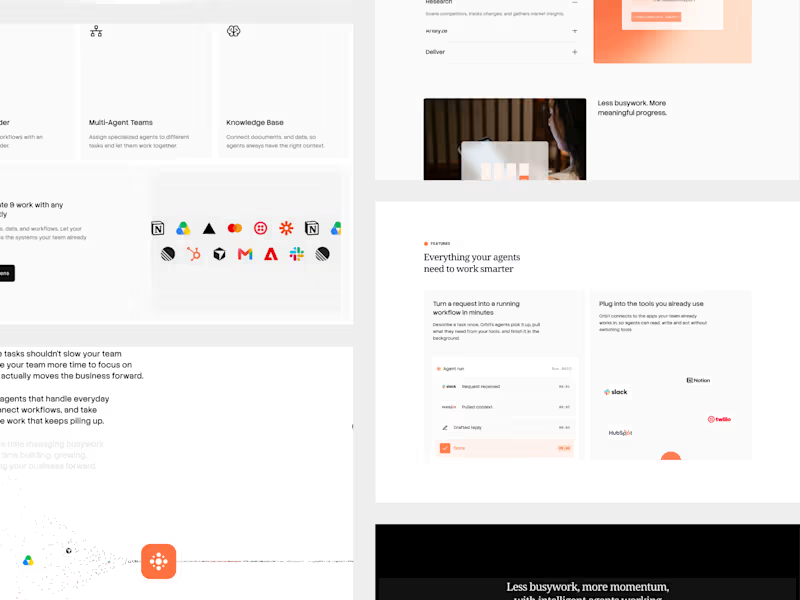



Fully Custom Million Dollar Framer Sites
- $1k+
- Earned
- 2x
- Hired
- 5.0
- Rating
- 16
- Followers
Fully Custom Million Dollar Framer Sites