
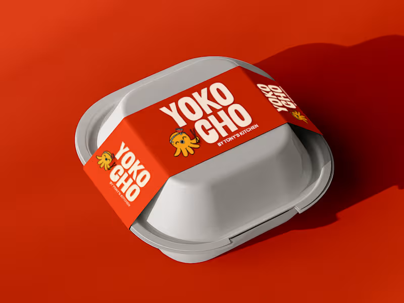
Inspired by the Japanese word "Yokocho (横丁)", meaning the lively side streets lined with small eateries and hidden food spots, this identity was designed to capture the warmth, energy, and charm of Asian street food culture.
The visual identity combines bold typography, a playful octopus mascot with a ramen bowl hat, and vibrant colors to create a brand that's approachable, memorable, and full of personality.
Every element was crafted to make Yokocho feel like more than just a place to eat, it's an experience that brings people together over comforting food and bold flavors.
5
4
544
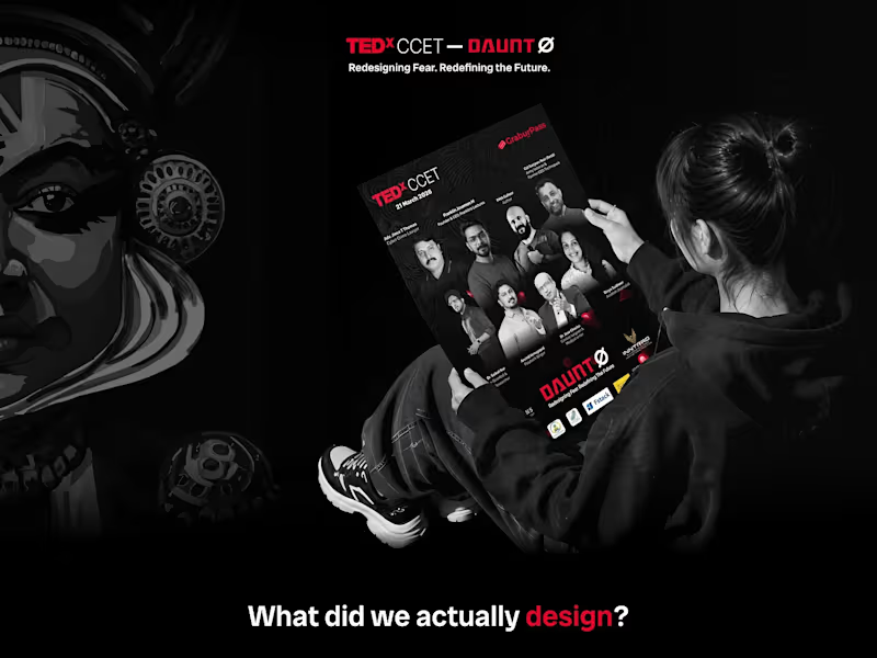
As the Design Lead for TEDxCCET – DAUNT, I led the visual design direction for the event and developed a cohesive identity across its digital and physical touchpoints. The work included UI design, promotional campaigns, event creatives, merchandise, social media content, and other branded materials, unified through a bold black, white, and red visual system.
2
169





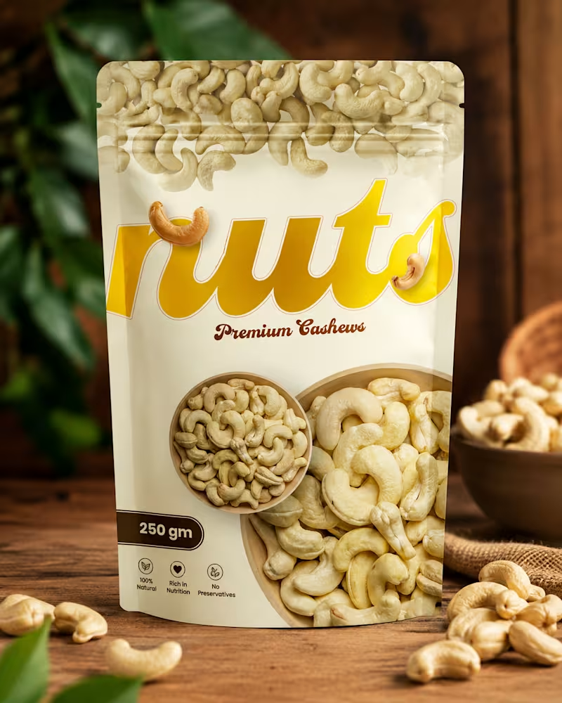
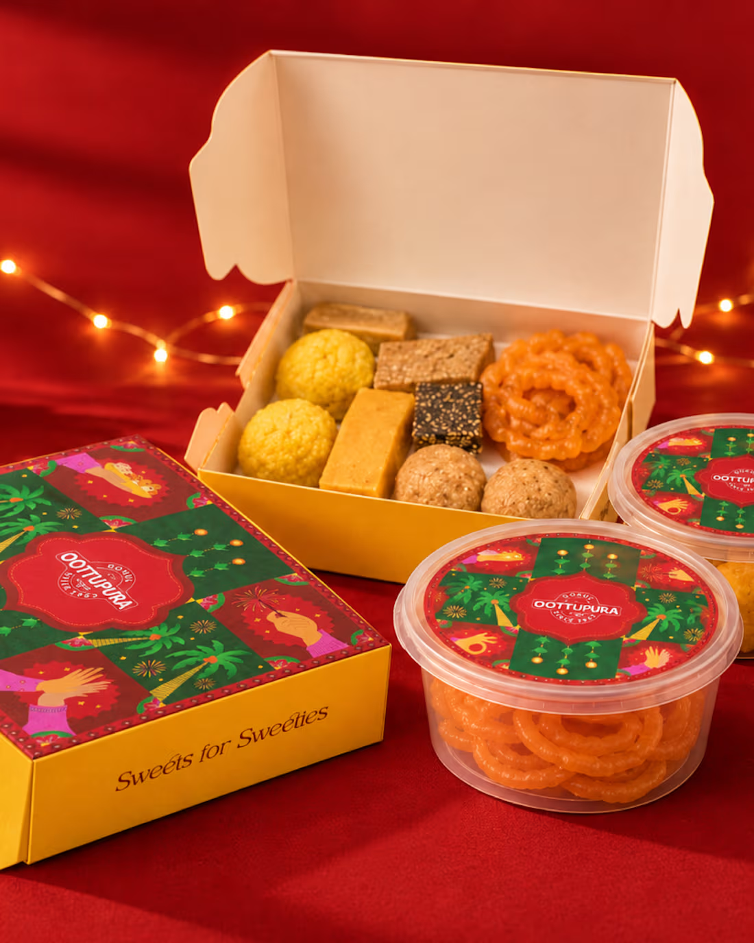
Packaging Design — From Concept to Shelf
Creating packaging that not only looks good, but also communicates the product and connects with the right audience.
This project focused on visual direction, typography, colors, layout, and print-ready packaging artwork, bringing the brand together into a clean and memorable package.
Designed with a balance of creativity, functionality, and brand personality.
#PackagingDesign #Packaging #GraphicDesign #Branding #BrandIdentity #ProductDesign #VisualDesign #CreativeDesign #PrintDesign #PackagingArtwork #Designer #GraphicDesigner #DesignPortfolio #ContraDesigner #Pixa9
0
52