Projects using Blender in KarnatakaProjects using Blender in KarnatakaDesigned a complete brand identity system for a chain-abstracted crypto wallet - from logomark and color system to merchandise, co-branding, and digital touchpoints.
The Brief:
Astra Wallet set out to simplify the multi-chain crypto experience with a single, unified balance across all networks. The product promise - "All Chains, One Balance" - needed a brand identity that could match: accessible enough to onboard newcomers, sharp enough to earn credibility with crypto-native users.
I was tasked with developing the full brand identity system from the ground up - logo, color palette, typography, brand applications, and co-branding frameworks.
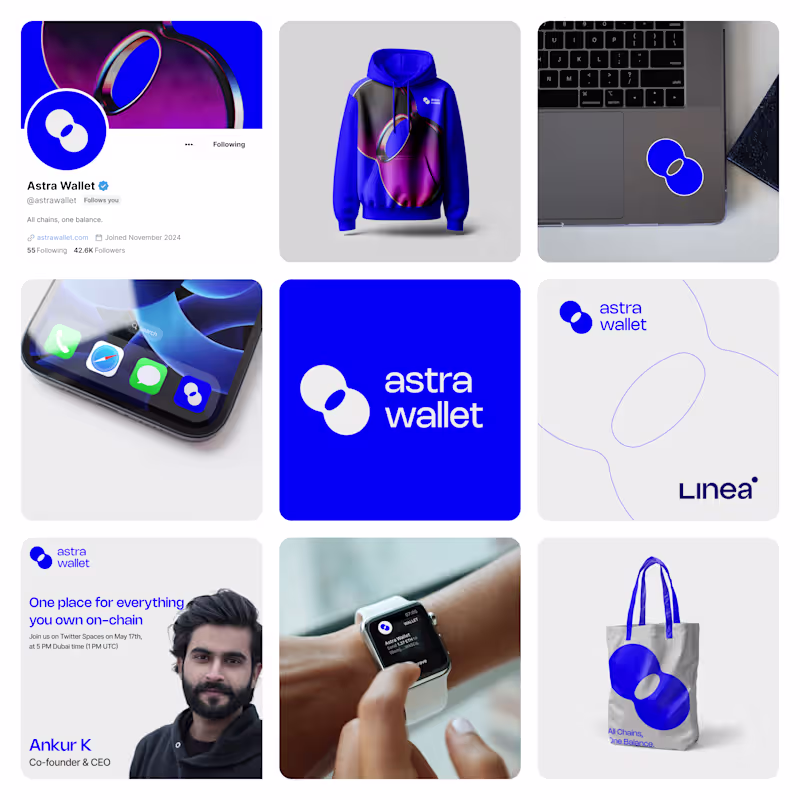
Direction A - "Signal" (Blue)
Concept: The logomark is built around a speech-bubble-meets-portal form - a shape that suggests both communication and movement between worlds (chains). The cutout within the mark hints at a keyhole or passage, reinforcing the idea of access and entry.
Color System: A bold, saturated blue (#0038FF range) anchors the identity, giving it instant recognition and a confident, institutional feel without being corporate. The palette pairs with deep gradients (violet to magenta) for editorial and social moments.
Typography: Clean, lowercase sans-serif wordmark. The all-lowercase treatment keeps the tone approachable and modern - no shouting, just clarity.
Applications designed:
Social media profile and header system (Twitter/X)
Branded merchandise - hoodie, tote bag
App icon and smartwatch UI
Laptop sticker and device mockups
Co-branding lockup with ecosystem partner
Twitter Spaces event promotional asset
Editorial/blog cover system
Why this direction works: It's instantly ownable. The blue is aggressive in the best way - it cuts through the noise of the typical Web3 visual landscape (dark themes, neon gradients). The logomark scales beautifully from a favicon to a tote bag.
Direction B - "Terrain" (Teal & Green)
Concept: This direction takes a different posture - quieter, more editorial, with a nod to sustainability and groundedness. The logomark is a folded flag or ribbon shape, suggesting movement and signaling without being loud.
Color System: Deep teal (#0D4D4D range) paired with a bright mint/green accent. The combination feels fresh and distinct - almost no one in Web3 owns this palette. A soft lavender is used as a secondary accent for editorial content.
Typography: Bolder, more expressive type treatment with mixed-weight pairings. The editorial moments (like "Inside the System: Chain Abstraction") lean into magazine-style layouts.
Applications designed:
Editorial/blog cover with photography integration
Branded merchandise - t-shirt, tote bag, sticker pack in sealed packaging
App icon and mobile device mockup
Co-branding lockup with ecosystem partner
Conference/event branding
Twitter Spaces event promotional asset
Social media profile system
Why this direction works: It carves out a completely different lane. Where most wallets go loud and techy, this direction feels like a lifestyle brand that happens to be in crypto. The editorial system is especially strong - it could power a content-driven growth strategy naturally.
Across Both Directions
Each direction was developed as a complete system, not just a logo. The goal was to demonstrate how the brand would live across every touchpoint a crypto wallet actually needs - from the app icon someone sees 50 times a day, to the merch a community member wears to a conference, to the co-branding moment with an L2 partner.
Key deliverables across both:
Primary logomark + wordmark lockup
Color system (primary, secondary, accent)
Typography system
Social media templates
Merchandise design (apparel, accessories, stickers)
Device and app mockups
Co-branding/partnership framework
Event and editorial content templates
Outcome
Two fully realized brand directions presented as competing visions - each viable, each with a distinct strategic rationale. The project demonstrates end-to-end brand thinking: from a product truth ("All Chains, One Balance") through to the tote bag someone carries at events.