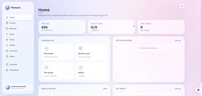
Planova — personal planning dashboard concept.
Right now I'm working on my original project Planova, which is a year-planning and productivity web app designed to help users organize their goals, habits, finances, notes, calendar, and daily priorities in one calm workspace.
I focused on creating a soft, modern dashboard experience with a clear sidebar navigation, card-based layouts, progress tracking, goal categories, habit streaks, budget overview, monthly planning, notes, templates, and quick jump-in sections.
The goal was to make planning feel less overwhelming and more visual, organized, and easy to return to every day.
Key features:
Annual, monthly, and daily planning views
Goal tracking with progress cards
Habit tracker and habit streaks
Finance and budget overview
Notes and calendar sections
Templates for faster planning
Soft gradient interface with clean dashboard cards
Simple navigation and polished web app UI
Designed by Amirsina Mirheydari.
3
205

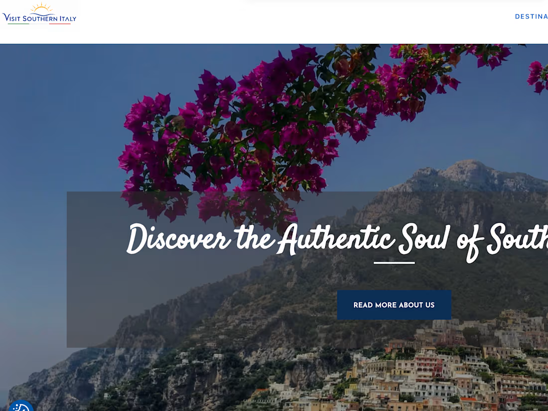
A bespoke website built entirely from scratch in code — no templates,
no page builders — for a wellness consultant specializing in doTERRA
essential oils. The goal was to turn her one-to-one consulting and
signature detox program into a calm, trustworthy online presence that
guides visitors toward booking.
I handled the whole project end to end: UI/UX design and front-end
development, hand-coded in HTML, CSS and JavaScript. Building every
section by hand kept the site light, fast and pixel-perfect across
devices. The design leans into a warm, natural aesthetic that mirrors
the brand's wellness identity, with clear calls to action around her
detox program and consultations.
The result is a fast, fully custom site — unique to her brand, with none
of the bloat of off-the-shelf themes — that helps her stand out, build
trust and turn visitors into clients.
4
6
337
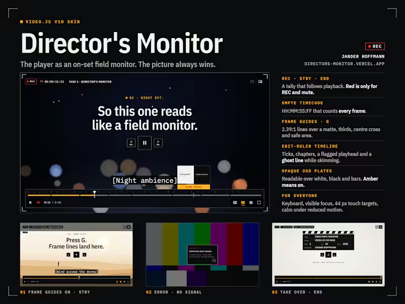
Director's Monitor is my entry for the Video.js Skins Design Challenge: a Video.js v10 skin that turns the player into the on-set field monitor a director judges a take on.
The picture always wins. Controls sit on small opaque OSD plates instead of full-width gradients, so the frame stays clean and every label stays readable over overexposed whites, night blacks and colour bars. The details come straight from the camera: a REC / STBY / END tally, SMPTE timecode that counts every frame, crop marks, 2.39:1 frame guides on the G key, an edit-ruler timeline with chapters, a segmented audio meter for volume, and a NO SIGNAL error state over bars.
One colour rule keeps it calm: amber means on, and red is reserved for REC and mute. Every control works from the keyboard with a visible focus ring, touch targets grow to 44 px on phones, and motion stops under reduced motion.
The demo film, "Take 1", was made for the skin and is hosted on Mux. It alternates bright and dark scenes to prove the OSD holds up, with captions, chapters and a 24 fps cut the timecode counts frame for frame.
Live: https://directors-monitor.vercel.app
(https://directors-monitor.vercel.app)Mux playback ID: 01W93wbTkYDNrO4bcZz01e3kl00FB01okOmc4p02NosFfpmg
Design and build: Jander Hoffmann · Method: AION Creative Studio OS
5
3
1.1K