
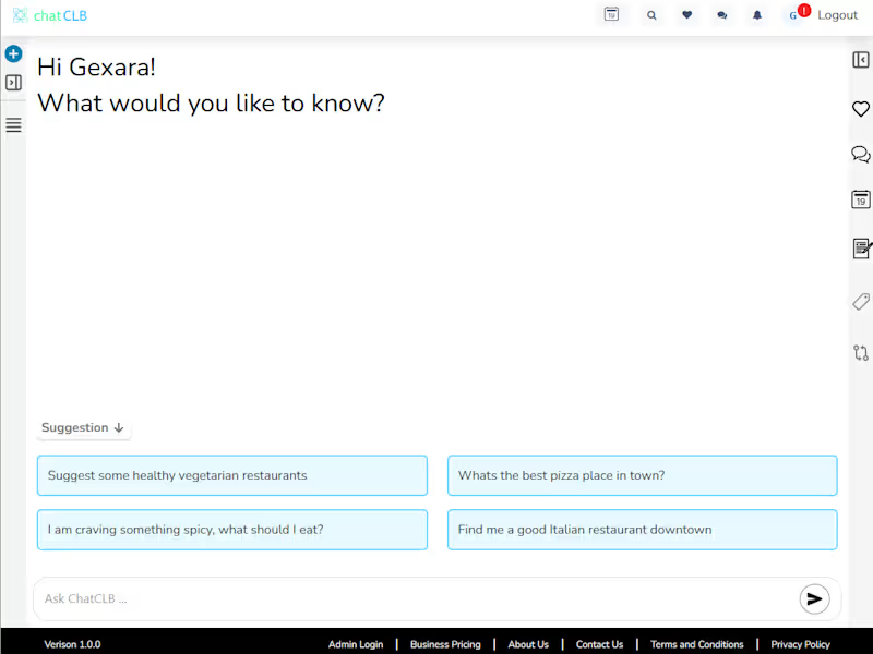
ChatCLB — Secure SaaS Platform Built with .NET, React & AWS
ChatCLB is an ongoing cloud-hosted SaaS platform where I lead development across ASP.NET (http://ASP.NET) Core services, React frontend, PostgreSQL, secure authentication, third-party integrations, AWS Kubernetes deployment, and production support. I continue to work on new features, integrations, architecture improvements, and operational reliability.
1
294
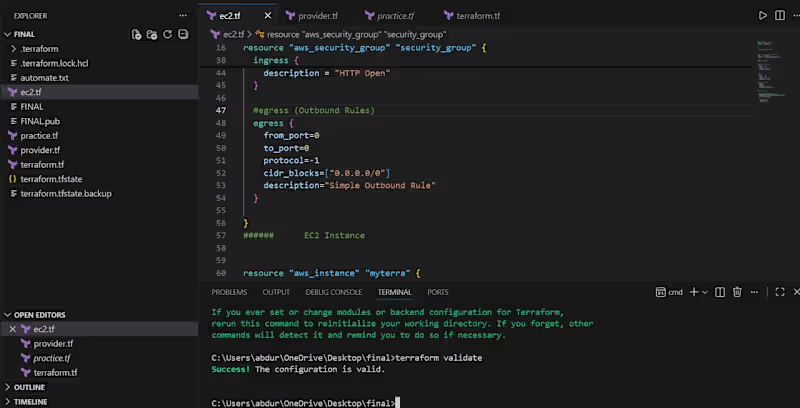
Just finished diving into Terraform and hands-on building infrastructure as code. Learned a lot along the way, including:
Setting up resources and variables
Using outputs to see what’s happening in my infra
Playing with interpolation, for_each, and conditional logic
Debugging and figuring out why things break
I’ve been building small projects to get comfortable with writing clean, reusable Terraform code. Feels good to see everything come together and actually work in AWS.
Excited to keep leveling up and move into more advanced Terraform stuff like modules, remote backends, and production ready infrastructure.
Github Link:https://github.com/abdur-rehman-tech/terraform-complete
#Terraform (https://www.linkedin.com/search/results/all/?keywords=%23terraform&origin=HASH_TAG_FROM_FEED) #DevOps (https://www.linkedin.com/search/results/all/?keywords=%23devops&origin=HASH_TAG_FROM_FEED) #InfrastructureAsCode (https://www.linkedin.com/search/results/all/?keywords=%23infrastructureascode&origin=HASH_TAG_FROM_FEED) #AWS (https://www.linkedin.com/search/results/all/?keywords=%23aws&origin=HASH_TAG_FROM_FEED) #Cloud (https://www.linkedin.com/search/results/all/?keywords=%23cloud&origin=HASH_TAG_FROM_FEED) #LearningByDoing (https://www.linkedin.com/search/results/all/?keywords=%23learningbydoing&origin=HASH_TAG_FROM_FEED)
0
97
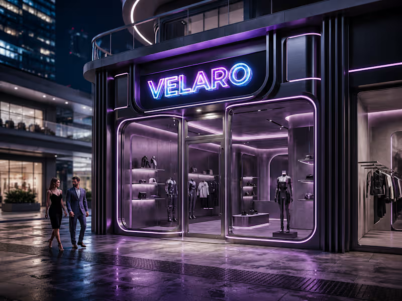
🖤 Velaro — Technical Architecture
🔗 Live Website
https://saif-velaro-clothing-brand.netlify.app
📌 Overview
Velaro is a single-page application (SPA) for a fashion/clothing brand, built with React + TypeScript, bundled by Vite, and styled with Tailwind CSS. The entire UI renders on one HTML page and updates dynamically as the user scrolls, searches, or interacts with the cart — no full page reloads.
The architecture follows a standard modern frontend pattern: a single entry point boots the app, a root App component composes independent section components, and a global context manages shared state (the shopping cart) across all of them.
⚙️ Build & Tooling Layer
These files configure how the project compiles, lints, and runs — they aren't part of the visible website, but control everything behind it.
vite.config.ts — Configures Vite, the build tool/dev server. Defines how .tsx/.ts files are compiled, how the dev server runs (npm run dev), and how the production bundle is generated (npm run build).
tsconfig.json — Root TypeScript config — points to the two more specific configs below via project references.
tsconfig.app (http://tsconfig.app).json — TypeScript rules specifically for the application code in src/ (JSX handling, module resolution, strictness, the @/ path alias).
tsconfig.node.json — TypeScript rules for Node-context files (like vite.config.ts itself), since those run outside the browser.
tailwind.config.js — Configures Tailwind CSS — defines the design system (colors, spacing, fonts) and which files Tailwind scans to generate only the CSS classes actually used.
postcss.config.js — Configures PostCSS, the tool that processes Tailwind's output and applies vendor prefixing/optimization during build.
eslint.config.js — Defines linting rules — catches code-quality issues, unused variables, and React/TypeScript best-practice violations during development.
package.json — Lists all dependencies (React, Vite, Tailwind, etc.) and defines the npm scripts (dev, build, preview).
package-lock.json — Locks exact dependency versions so the build is reproducible across machines.
.gitignore — Tells Git which files/folders to exclude from version control (e.g. node_modules, dist).
index.html — The single real HTML file. Contains a root <div> that React mounts into — everything else is injected by JavaScript.
dist/ — Auto-generated production build output (plain HTML/CSS/JS) created by npm run build. This is the folder actually deployed to Netlify.
node_modules/ — Auto-generated folder holding all installed dependencies (created by npm install, never edited manually).
🚪 Application Entry & Root
src/main.tsx — The true entry point of the app. Imports React, imports App.tsx, and mounts it into the <div> inside index.html. This is the first application code that runs.
src/App.tsx — The root component. Doesn't contain page content itself — instead it imports and arranges every section component (Navbar, Hero, About, etc.) in order, and wraps everything in the CartProvider so cart state is available app-wide.
src/index.css — Global stylesheet — imports Tailwind's base/utility layers, applied once at the root so every component can use Tailwind classes.
src/vite-env.d.ts — TypeScript type declarations for Vite-specific features (like importing images/CSS as modules) — lets TypeScript understand syntax that isn't standard JavaScript.
🛒 State Management
src/cart.tsx — Implements the CartProvider, a React Context that holds global cart state (items, quantities, totals) and exposes functions to add/remove items. Any component wrapped inside it (via App.tsx) can read or update the cart without prop-drilling.
src/data.ts — Static data module — likely product listings, collection info, or other content consumed by components like FeaturedCollection and Showcase, kept separate from UI logic.
🧱 Component Layer (src/components/)
Each file is a self-contained, single-responsibility UI section. App.tsx stacks them vertically to form the full page.
Navbar.tsx — Persistent top navigation — branding, menu links, and likely triggers for search/cart.
Hero.tsx — The primary landing banner — headline, tagline, and call-to-action (e.g. "Shop Collection").
HeroCanvas.tsx — A visual/animated layer paired with Hero.tsx — likely a canvas-based or decorative background effect behind the hero text.
FeaturedCollection.tsx — Renders a curated set of products, pulling structured data from data.ts.
About.tsx — Brand-story section — static content describing the label's identity.
Lookbook.tsx — A style/editorial gallery — visually presents outfits or campaign imagery.
Showcase.tsx — An additional highlight section, likely for a specific collection, drop, or promotional content.
Testimonials.tsx — Displays customer reviews/social proof.
Newsletter.tsx — Email capture form/section for marketing signups.
SearchOverlay.tsx — A modal/overlay component for in-site product search, toggled from the Navbar.
CartDrawer.tsx — A slide-out panel UI that reads from the CartProvider (cart.tsx) to display current cart items and totals.
Footer.tsx — Bottom-of-page section — links, contact details, social icons.
🔄 How It All Connects (Data Flow)
The browser loads index.html, which pulls in the compiled JS bundle.
main.tsx runs first and mounts App.tsx into the page.
App.tsx wraps all sections in CartProvider, so cart state is shared without passing props down manually through every component.
Each section component renders independently — some are purely static/presentational (About, Footer), while others are interactive and tied into shared state (CartDrawer, SearchOverlay).
Tailwind classes used throughout every component are compiled once into index.css based on what's scanned via tailwind.config.js.
On npm run build, Vite compiles and bundles all of this into optimized static files inside dist/ — which is what gets deployed to Netlify and served to visitors.
🧠 Why This Structure Works
Separation of concerns — each component owns one visual section; layout composition happens only in App.tsx.
Centralized state — cart logic lives in one file (cart.tsx) instead of being duplicated across components.
Data/UI separation — data.ts keeps content separate from rendering logic, making it easy to update products without touching component code.
Type safety — TypeScript configs enforce consistent typing across the whole src/ folder, catching errors before runtime.
Optimized output — the dev-only tooling (Vite, Tailwind, ESLint, TS configs) never ships to production; only the final compiled dist/ bundle is deployed.
0
89
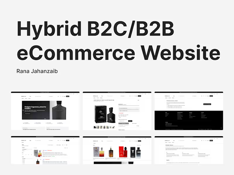
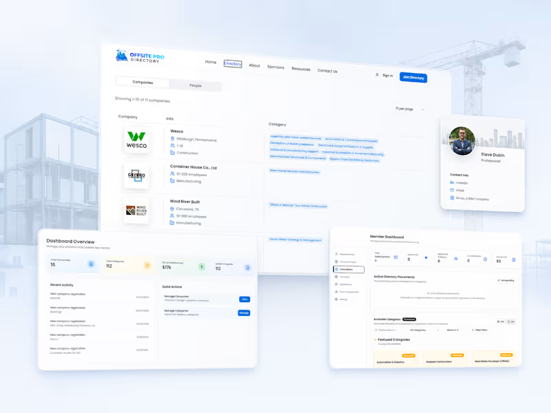
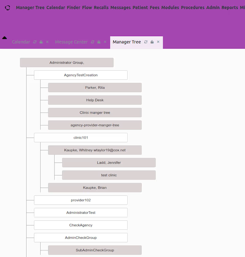

Eugene Photography – Portfolio Photography Website
Developed a modern and visually engaging photography portfolio website for Eugene using Next.js, focused on showcasing photography work with a clean, elegant, and responsive design. The website was built to deliver a smooth browsing experience while highlighting high-quality visual content and professional branding.
Key highlights of the project include:
• Responsive and premium portfolio design
• Optimized image loading and performance
• Modern UI/UX for photography presentation
• SEO-friendly Next.js architecture
• Fast and scalable deployment on Vercel
• Smooth navigation and mobile-friendly experience
The project was successfully deployed on Vercel with performance optimization and scalable frontend architecture.
Live URL: https://eugene-photography.vercel.app
0
43