Typography Projects in IslamabadTypography Projects in Islamabad🏷️ Brand Identity & Strategy: Meridian
💼 What They Do
Meridian is a digital wealth platform helping the next generation of inheritors manage, grow, and understand the wealth they’ve received — blending intelligent automation with real financial guidance.
🎯 Mission
To make inherited wealth feel less intimidating and more empowering — giving young wealth-holders clarity and control through smart, transparent technology.
👁️ Vision
A future where managing significant wealth doesn't require decades of experience — just the right platform.
👥 Target Audience
Next-gen inheritors (roughly 25–40): Individuals who have come into wealth (via family money, business sales, or inheritance) but weren't necessarily raised managing it. They are digital-natives, skeptical of stuffy old private banks, and desire a platform that feels modern yet deeply serious.
✨ Brand Personality
Clear — No jargon, no intimidation
Modern — Feels like a 2026 tech product, not a 1980s bank
Grounded — Trustworthy and secure (it's their family's money)
Empowering — Makes them feel in control, not lost
📍 Positioning Statement
For next-gen wealth inheritors who feel overwhelmed by managing money they didn't build themselves, Meridian is the wealth platform that turns confusion into clarity — unlike traditional private banks that speak in jargon and assume decades of experience.
🎨 Creative Directions
🏛️ Direction A — Modern Minimal
Palette: Deep navy, ivory, slate gray, muted gold
Brand Mark: A quiet, understated mark — thin ring with a single gold accent point.
Vibe: Feels like a private members' club, but digital. Best if leaning into "quiet confidence" over "flashy tech."
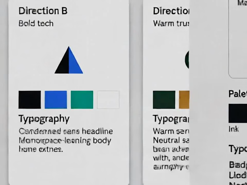
⚡ Direction B — Bold Tech
Palette: Ink black, electric blue, teal, ice white
Brand Mark: Angular, geometric mark — sharp overlapping shapes.
Vibe: Feels like a fintech product first, wealth platform second. Best to stand out from stuffy private banks entirely.
🌿 Direction C — Warm Trust
Palette: Forest green, warm gold, cream, charcoal
Brand Mark: Rounded, organic overlapping mark — feels human and approachable.
Vibe: Prioritizes the "empowering, not intimidating" side of the brand personality.
🔀 The Hybrid Direction (Blend of B & C)
This custom blend balances Direction B's structure with Direction C's warmth — sharp shapes softened by rounded edges, cool ink/teal grounded by warm gold and cream so it never feels cold or purely "fintech."
🎨 Locked-In Color Palette (5 Colors)
Ink (Deep Dark Base)
Teal (Modern Tech Accent)
Warm Gold (Elevated & Grounded)
Cream (Soft, Approachable Canvas)
Warm Gray (Neutral Balance)
📐 3 Mark Directions to Choose From
A triangle softened by an intersecting circle.
Two overlapping squares (one sharp corner + one rounded corner).
A simple two-bar mark (one straight bar + one rounded bar).
✍️ Typography Pairing
Headlines: Geometric Sans (Structure & Modernity)
Body Text: Neutral Sans (Readability & Clarity)
Quotes / Taglines: Warm Serif (The Human Touch)
📐 Logo Lockups & System
Primary Lockup: For most core use cases (Website header, pitch decks, business cards)
Stacked Lockup: Optimized for square and compact formats (App icon, social profile avatars)
Reversed Version: High-contrast variant for dark backgrounds, presentation decks, or dark-mode app UI
🎴 Real-World Application: Business Card
Front & Back Layout: Built using the exact palette and lockup rules — serving as proof that the visual system translates seamlessly beyond a logo on a white background into tactile, premium media.
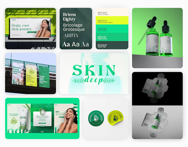
📩 If you like my project, DM for interactive designs of your brands! (Part 1) We’re thrilled to share our full rebranding journey for Skin Deep, a conscious skincare brand that celebrates authenticity, balance, and beauty beneath the surface.
Part 1: Branding, Colors, Fonts, Logo
We started by redefining what Skin Deep stands for, more than skincare, it’s self-care with substance.
The new identity reflects purity, warmth, and confidence, captured through a minimalist design system. Editorial Design, Corporate Brochure & Print Publication
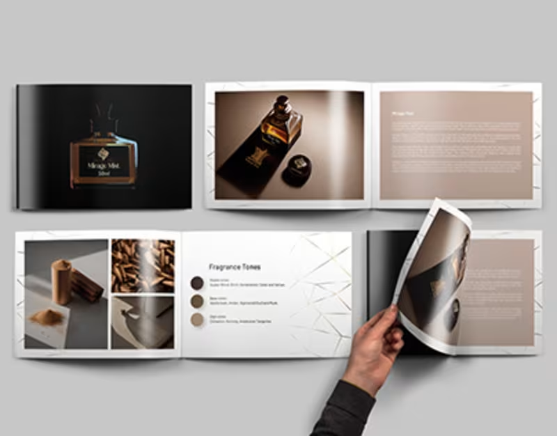
I designed a collection of premium editorial layouts and corporate marketing publications that transform complex information into visually engaging, professionally structured print experiences. The objective was to create modern, brand-focused publications that communicate key messages with clarity while strengthening visual identity across every page.
Each publication was carefully crafted using editorial grid systems, refined typography, balanced white space, and strategic visual hierarchy to improve readability and elevate the overall user experience. From corporate brochures and company profiles to product catalogs, annual reports, and marketing booklets, every layout was designed to present content in a clean, compelling, and memorable way.
The project combines creative storytelling with functional design, ensuring every publication reflects the client's brand while maintaining consistency across print and digital formats. Every page was optimized for professional printing, making the designs production-ready while delivering a premium look and feel.
This project demonstrates my expertise in editorial design, brochure design, publication design, corporate branding, print design, layout design, typography, and creating high-impact marketing collateral that helps businesses communicate effectively and build stronger brand recognition.
Key Highlights
• Premium editorial and publication design
• Corporate brochure and company profile design
• Annual reports, product catalogs, and marketing booklets
• Professional editorial layouts with structured grid systems
• Modern typography and clear visual hierarchy
• Print-ready artwork with production specifications
• Brand-consistent layouts across multi-page publications
• Creative storytelling through editorial design
• High-end marketing collateral for businesses
• Adobe Creative Suite workflow with scalable design systems
• Clean, modern layouts optimized for readability
• Premium presentation materials that strengthen brand identity