Freelance 3D Animators in IslamabadFreelance 3D Animators in Islamabad
Web Developer | UI/UX| 3D Product Animation |
8
Followers
Web Developer | UI/UX| 3D Product Animation |
Cover image for Behind the Design: The Ember
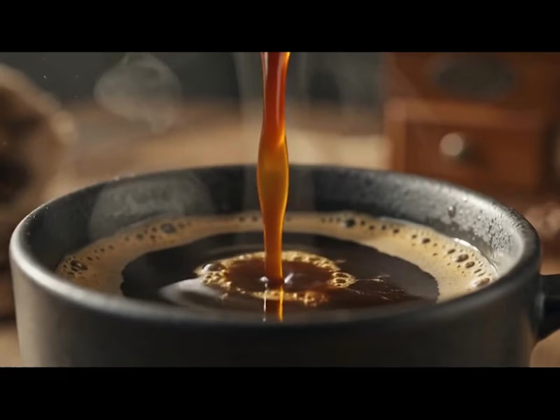
Behind the Design: The Ember Roastery Commercial Ever wondered how a warm, sensory coffee commercial transitions from initial concept to a photorealistic CGI masterpiece? Here is the complete A-to-Z breakdown of how this project was crafted using industry-standard 3D and CAD software tools. How It Was Created (A to Z Workflow) Precision CAD Modeling & Blueprinting: AutoCAD was used to draft accurate 2D structural dimensions and technical proportions for the ceramic mug, pour-over cone, and vintage coffee grinder. SolidWorks and CATIA were utilized for parametric engineering, ensuring every physical asset—from the custom "Ember Roastery" logo depth to the precise ceramic wall thickness and mechanical grinder parts—was modeled with real-world precision. Asset Refining, Fluid Physics & Scene Setup: The precise CAD assets were imported into Blender to assemble a full 3D model scene. Blender was used to simulate realistic liquid physics (the coffee pour and surface ripples), dynamic steam/smoke micro-particles, and subtle atmospheric dust floats illuminated by warm sunlight. Lighting, Shading & Photorealistic Rendering: Natural window lighting, depth of field, and rich ceramic textures (matte black mug, polished glaze drip cone, raw wooden table) were configured to evoke a cozy morning atmosphere. A high-performance 3D renderer was used to calculate photorealistic ray tracing—capturing complex light refractions in the coffee liquid droplets, glossy surface highlights, and realistic fluid physics across every frame. Want to bring your product vision to life with cinematic quality? Whether you need hyper-realistic food and beverage simulations, 3D mechanical models, or high-converting promotional commercials for your brand, let’s collaborate. 📩 Send me a direct message today to elevate your product visualization!
0
79
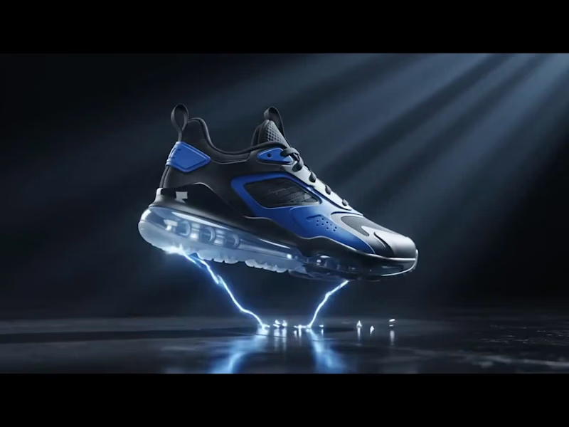
Cover image for Behind the Design: Next-Gen 3D
Behind the Design: Next-Gen 3D Footwear Visuals Ever wondered how a high-performance sneaker transitions from a CAD blueprint into a photorealistic, dynamic CGI commercial? Here is the complete breakdown of how this project was brought to life from A to Z using industry-standard 3D tools. How It Was Created (A to Z Workflow) Precision CAD Modeling & Drafting: AutoCAD was used to establish the exact layout schematics and proportion blueprints for the sole unit, air cushioning chambers, and upper panels. SolidWorks and CATIA were utilized for parametric mechanical modeling, ensuring structural components—like the clear air-cushion sole, tread patterns, and TPU eyelets—were engineered with real-world, production-grade precision. 3D Asset Refining & FX Integration: The precise CAD geometry was brought into Blender to assemble a high-detail 3D model ready for animation. Custom textures were developed for the matte leather, breathable mesh, and transparent air unit. Volumetric smoke, particle shockwaves, and luminous energy VFX were added around the shoe to give it an explosive, high-energy reveal. Lighting, Motion & Rendering: Cinematic volumetric lighting and dynamic camera motion were orchestrated to capture every angle—from the detailed sole traction to the glossy side panels. Using a high-performance 3D renderer, realistic ray tracing was calculated to process complex reflections, glowing particle interactions, and transparent light refractions across every single frame. Ready to elevate your product line with high-impact visual content? Whether you need photorealistic product visualization, precision CAD modeling, or cinematic 3D commercials for your e-commerce brand, I’m here to turn your vision into reality. 📩 DM me today to transform your product visuals into high-converting CGI experiences!
0
81
Cover image for 🖤 Velaro — Technical Architecture
🔗
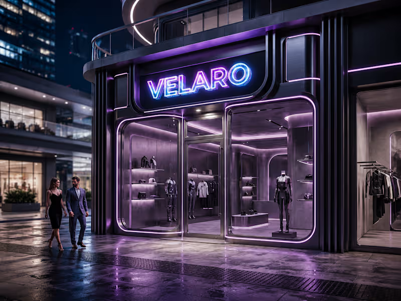
🖤 Velaro — Technical Architecture 🔗 Live Website https://saif-velaro-clothing-brand.netlify.app 📌 Overview Velaro is a single-page application (SPA) for a fashion/clothing brand, built with React + TypeScript, bundled by Vite, and styled with Tailwind CSS. The entire UI renders on one HTML page and updates dynamically as the user scrolls, searches, or interacts with the cart — no full page reloads. The architecture follows a standard modern frontend pattern: a single entry point boots the app, a root App component composes independent section components, and a global context manages shared state (the shopping cart) across all of them. ⚙️ Build & Tooling Layer These files configure how the project compiles, lints, and runs — they aren't part of the visible website, but control everything behind it. vite.config.ts — Configures Vite, the build tool/dev server. Defines how .tsx/.ts files are compiled, how the dev server runs (npm run dev), and how the production bundle is generated (npm run build). tsconfig.json — Root TypeScript config — points to the two more specific configs below via project references. tsconfig.app (http://tsconfig.app).json — TypeScript rules specifically for the application code in src/ (JSX handling, module resolution, strictness, the @/ path alias). tsconfig.node.json — TypeScript rules for Node-context files (like vite.config.ts itself), since those run outside the browser. tailwind.config.js — Configures Tailwind CSS — defines the design system (colors, spacing, fonts) and which files Tailwind scans to generate only the CSS classes actually used. postcss.config.js — Configures PostCSS, the tool that processes Tailwind's output and applies vendor prefixing/optimization during build. eslint.config.js — Defines linting rules — catches code-quality issues, unused variables, and React/TypeScript best-practice violations during development. package.json — Lists all dependencies (React, Vite, Tailwind, etc.) and defines the npm scripts (dev, build, preview). package-lock.json — Locks exact dependency versions so the build is reproducible across machines. .gitignore — Tells Git which files/folders to exclude from version control (e.g. node_modules, dist). index.html — The single real HTML file. Contains a root <div> that React mounts into — everything else is injected by JavaScript. dist/ — Auto-generated production build output (plain HTML/CSS/JS) created by npm run build. This is the folder actually deployed to Netlify. node_modules/ — Auto-generated folder holding all installed dependencies (created by npm install, never edited manually). 🚪 Application Entry & Root src/main.tsx — The true entry point of the app. Imports React, imports App.tsx, and mounts it into the <div> inside index.html. This is the first application code that runs. src/App.tsx — The root component. Doesn't contain page content itself — instead it imports and arranges every section component (Navbar, Hero, About, etc.) in order, and wraps everything in the CartProvider so cart state is available app-wide. src/index.css — Global stylesheet — imports Tailwind's base/utility layers, applied once at the root so every component can use Tailwind classes. src/vite-env.d.ts — TypeScript type declarations for Vite-specific features (like importing images/CSS as modules) — lets TypeScript understand syntax that isn't standard JavaScript. 🛒 State Management src/cart.tsx — Implements the CartProvider, a React Context that holds global cart state (items, quantities, totals) and exposes functions to add/remove items. Any component wrapped inside it (via App.tsx) can read or update the cart without prop-drilling. src/data.ts — Static data module — likely product listings, collection info, or other content consumed by components like FeaturedCollection and Showcase, kept separate from UI logic. 🧱 Component Layer (src/components/) Each file is a self-contained, single-responsibility UI section. App.tsx stacks them vertically to form the full page. Navbar.tsx — Persistent top navigation — branding, menu links, and likely triggers for search/cart. Hero.tsx — The primary landing banner — headline, tagline, and call-to-action (e.g. "Shop Collection"). HeroCanvas.tsx — A visual/animated layer paired with Hero.tsx — likely a canvas-based or decorative background effect behind the hero text. FeaturedCollection.tsx — Renders a curated set of products, pulling structured data from data.ts. About.tsx — Brand-story section — static content describing the label's identity. Lookbook.tsx — A style/editorial gallery — visually presents outfits or campaign imagery. Showcase.tsx — An additional highlight section, likely for a specific collection, drop, or promotional content. Testimonials.tsx — Displays customer reviews/social proof. Newsletter.tsx — Email capture form/section for marketing signups. SearchOverlay.tsx — A modal/overlay component for in-site product search, toggled from the Navbar. CartDrawer.tsx — A slide-out panel UI that reads from the CartProvider (cart.tsx) to display current cart items and totals. Footer.tsx — Bottom-of-page section — links, contact details, social icons. 🔄 How It All Connects (Data Flow) The browser loads index.html, which pulls in the compiled JS bundle. main.tsx runs first and mounts App.tsx into the page. App.tsx wraps all sections in CartProvider, so cart state is shared without passing props down manually through every component. Each section component renders independently — some are purely static/presentational (About, Footer), while others are interactive and tied into shared state (CartDrawer, SearchOverlay). Tailwind classes used throughout every component are compiled once into index.css based on what's scanned via tailwind.config.js. On npm run build, Vite compiles and bundles all of this into optimized static files inside dist/ — which is what gets deployed to Netlify and served to visitors. 🧠 Why This Structure Works Separation of concerns — each component owns one visual section; layout composition happens only in App.tsx. Centralized state — cart logic lives in one file (cart.tsx) instead of being duplicated across components. Data/UI separation — data.ts keeps content separate from rendering logic, making it easy to update products without touching component code. Type safety — TypeScript configs enforce consistent typing across the whole src/ folder, catching errors before runtime. Optimized output — the dev-only tooling (Vite, Tailwind, ESLint, TS configs) never ships to production; only the final compiled dist/ bundle is deployed.
0
20
Product & Brand Visuals, Video Editing, CGI
17
Followers
Product & Brand Visuals, Video Editing, CGI
SketchUp Specialist || Architectural Animation || Landscape
Experienced 3D animator specializing in product visuals
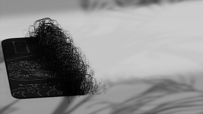
🎨 3D Generalist & VFX Artist with 8 years' experience
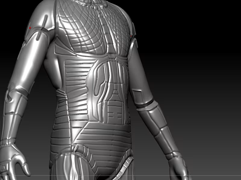
High-Converting SaaS Explainer & Demo Video Specialist
New to Contra
High-Converting SaaS Explainer & Demo Video Specialist