
Web Dev & UX Copywriter
Web Dev & UX Copywriter


User-Centric UI/UX Designer & Copywriter
User-Centric UI/UX Designer & Copywriter


UI/UX wizard 🧙♂️
UI/UX wizard 🧙♂️


Crafting premium UI/UX and web experiences for brands.
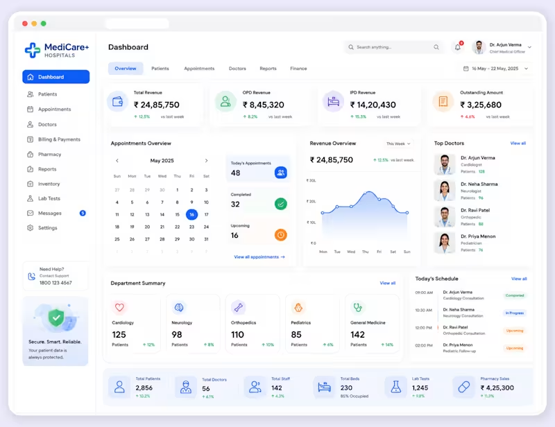
Hospital Management Dashboard UI Design | Healthcare Admin Panel | Zywra Studio (https://zywra.com/)
Designed a clean, modern, and user-friendly Hospital Management Dashboard UI focused on streamlining healthcare operations. The dashboard enables administrators and medical staff to efficiently monitor patients, appointments, doctors, revenue, reports, and hospital activities from one centralized interface.
Built with a clean visual hierarchy, intuitive navigation, data-rich analytics, and responsive layouts to improve operational efficiency and decision-making.
Designed by Zywra Studio (https://zywra.com/).
Services : UI/UX Design, Dashboard Design, Healthcare UI Design, Admin Panel Design, Web Application Design, Data Visualization, Design System, Responsive Design
Tools Used: Figma, Adobe Illustrator
Category: Healthcare • Hospital Management • SaaS • Dashboard • Admin Panel
Skills: UI Design, UX Design, Dashboard Design, Healthcare Design, Admin Dashboard, SaaS Design, Web App Design, Information Architecture, User Experience, Figma, Wireframing, Prototyping, Design Systems, Responsive Design
3
175

Modern CRM Dashboard UI Design in Figma | Sales Management | SaaS Dashboard by Zywra Studio (https://zywra.com/)
Designed a clean, modern, and intuitive CRM Dashboard UI in Figma focused on helping sales teams manage leads, track customer interactions, monitor campaign performance, and improve conversion rates from a single dashboard.
✨ Project Highlights: Modern CRM Dashboard UI, Sales Pipeline Management, Lead Tracking & Customer Profiles, Campaign Analytics, SaaS Web Application, Dashboard Design, Minimal & Clean UI, Auto Layout & Components, Responsive Dashboard Concept, Designed in Figma
Designed by Zywra Studio (https://zywra.com/).
1
52

Modern Invoice Dashboard UI Design | Finora Finance Dashboard | SaaS Web App UI by Zywra Studio (https://zywra.com/)
A modern Finance Dashboard UI designed in Figma for managing invoices, customer accounts, subscriptions, payments, and financial reports in one intuitive workspace.
Designed by Zywra Studio. (https://zywra.com/)
✨ Features: Invoice Management Dashboard, Customer Profile & Account Overview, Payment Tracking, Subscription Management, Finance Analytics, Clean Dashboard UI, Modern SaaS Design,Figma UI Design, UX-Focused Layout, Responsive Dashboard Concept
Follow Zywra Studio (https://zywra.com/) for more UI/UX design inspiration, dashboard concepts, mobile apps, landing pages, and web application designs.
1
130

Modern Finance Dashboard UI Design | Personal Finance & Fintech Dashboard | Zywra Studio (https://zywra.com/)
Designed a clean, modern, and intuitive Finance Dashboard UI focused on helping users manage personal finances, monitor income and expenses, track budgets, analyze spending, and access banking insights from one centralized interface. by Zywra Studio (https://zywra.com/)
Services: UI/UX Design, Finance Dashboard Design, Fintech Product Design, SaaS Dashboard Design, Admin Panel Design, Personal Finance App Design, Data Visualization, Responsive Web Application Design
Tools Used: Figma, Adobe Illustrator
Category: Fintech • Personal Finance • Banking • SaaS • Dashboard • Admin Panel
2
128

UI/UX Designer for SaaS & Conversion-Focused Web Design
- 5.0
- Rating
- 17
- Followers
UI/UX Designer for SaaS & Conversion-Focused Web Design
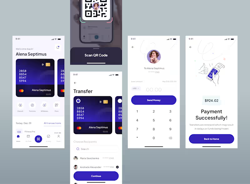
Building a FinTech startup or upgrading your existing mobile app?
Let’s transform your idea into a seamless digital product.
Portfolio: https://rinkeshchopada.com/projects/
(https://rinkeshchopada.com/projects/)Book a free consultation: https://t.co/fTwlcN1t8z
DM!
0
147
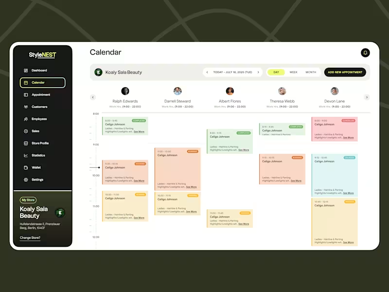

Product Designer & Framer Expert

Your business doesn't just need a website. it needs an identity.
we build brands and sites that stop feeling like line items and start working like real assets.
1
132

Pick a Feature is a solid SaaS for mobile devs
gave the hero a facelift: bigger type, one clear promise, product still front and center on the right.
if you're a founder and your hero is doing too much or hiding the product, this is usually the first fix.
happy to take a quick look at your site — drop the link. 🔗
1
141

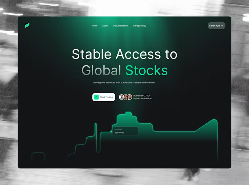

UI/UX Designer


Vibe coder who builds your vision—no brief, just vibes!
Vibe coder who builds your vision—no brief, just vibes!


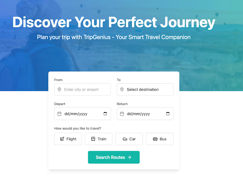

View more →