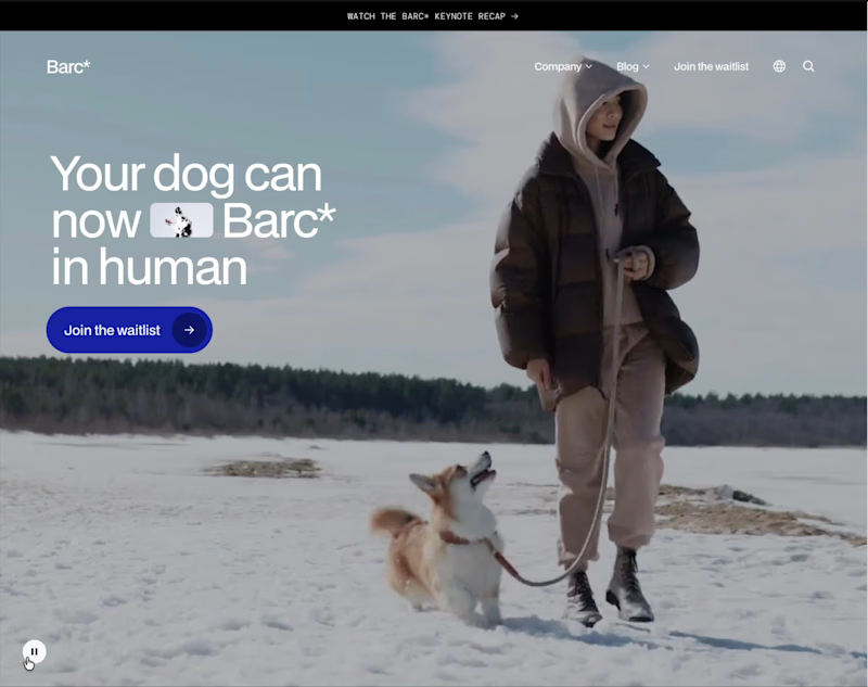
This website is a playful, high-concept landing page for Barc* – a fictional wearable that translates your dog’s barks into human language. The whole experience leans into humor and satire, treating the product like a serious tech launch while constantly undercutting it with jokes, from lines like “Barc* to the future” to questions about whether your dog’s 2am barks are for a man in the house or just existential dread.
The page is structured like a polished SaaS or hardware startup site: a bold hero section, clear value propositions, a simple three-step “how it works” flow, feature highlights, specs, and tiered membership pricing. Microcopy does most of the storytelling—benefits such as understanding your dog better, enhancing your bond, increasing safety, and extending your dog’s life are all delivered with a wink. Elements like 250+ celebrity voices, “no support for small dogs” on cheaper tiers, and tongue-in-cheek FAQs reinforce the comedic tone.
Visually and structurally, it feels like a real brand: multiple CTAs to join the waitlist, repeated sections for emphasis, and a clean layout that reads quickly. Only near the end does the site reveal that Barc* isn’t a real product but a concept from a Framer course, making the whole experience a smart parody of modern product marketing while still showcasing strong UX, copy, and visual design skills.
0
258




A while back, I designed a website for an architecture studio.
The studio was fictional. The thinking behind it wasn't.
I started with one question.
What does someone need to see
before they trust a studio with their home?
Not just the finished rooms.
The decisions behind them.
So every project became a short story.
The site. The challenge. The solution. The result.
A team page, so you know who does the work.
A process page, so the first call doesn't feel like a leap.
That's how I like to work.
Start with what the client needs to feel.
Then let the layout follow.
If your studio needs a site that shows how you think,
I'd love to help.
1
2
63


