UX Design Projects in Haryana
UX Design Projects in Haryana
Sign Up
Post a job
Sign Up
Log In
Filters
2
Projects
People
Message
1
Hardik Dewra
pro
Used MagicPath to create 35+ Interactive ✨ Analytics 📊Dashboards KIT! 🥳 🎨 Feel free to check it out here for quick reference! 💹 https://www.magicpath.ai/projects/329039127834148864?token=90f49d54cdd0a2a32c590112af7aeb380ec54bf1e1529da0ee9c54f404dd3c9b
1
521
Message
13
Shantanu Kumar
Kom Boo Cha - Brand Identity Design
13
616
Message
0
Ishu Saharan
pro
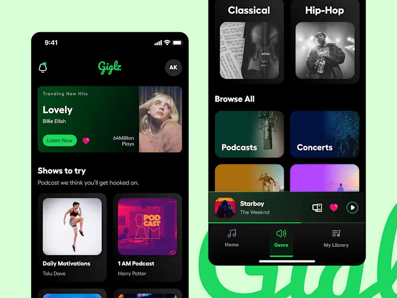
Your vibe. Your beats. Your music world. 🎵 🎶 From trending hits to hidden gems, dive into non-stop music magic. Build playlists, explore moods, and turn up the volume on your day — wherever you go. ✨ Key Features: 🎧 Unlimited Streaming — Access millions of songs anytime, anywhere 🔍 Smart Discovery — Get personalized recommendations based on your taste 🎵 Curated Playlists — Mood-based and genre-specific playlists, updated daily 📥 Offline Mode — Download tracks and listen without internet 🎛️ Custom Equalizer — Fine-tune your sound just the way you like it 👥 Social Sharing — Share your favorite songs and playlists with friends
0
160
Message
0
Aryan Chauhan
pro
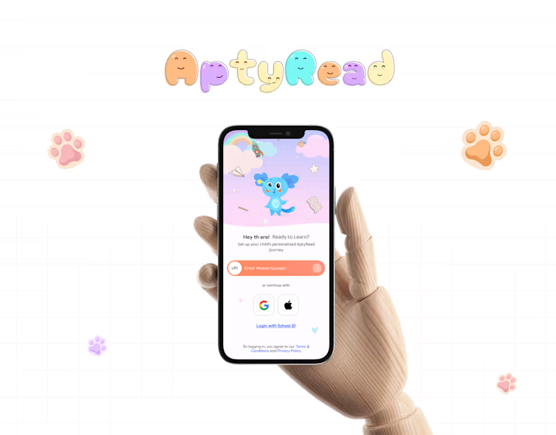
Cute & Engaging Education App + Website for Kids
0
22
Message
2
Aman Batra
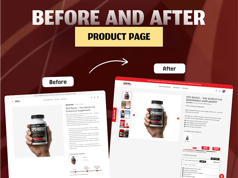
From Scroll to Sale —> A CRO-Focused Product Page Redesign Redesigned the product page with a conversion-first approach to improve user engagement, trust, and purchase intent. Instead of focusing only on visual improvements, every design decision was made to reduce friction in the buying journey and guide users toward checkout. =======What I Improved=========== ✅ Enhanced product gallery for better product exploration. ✅ Stronger visual hierarchy to make key information instantly visible. ✅ Added trust-building elements like ratings, reviews, and social proof. ✅ Improved readability with concise, benefit-focused content. ✅ Optimized quantity selector and pricing layout for faster decision-making. ✅ Highlighted subscription savings and best-value offer to increase AOV. ✅ Clearer CTA placement with stronger purchase visibility. ✅ Mobile-first optimization for a smoother shopping experience. ✅ Reduced cognitive load by organizing content into easy-to-scan sections. ========CRO Goal========== The redesign was focused on increasing: -Conversion Rate (CVR) -Add-to-Cart Rate -User Trust -Product Engagement -Average Order Value (AOV) -Overall Mobile Shopping Experience #CRO #ConversionRateOptimization #UXDesign #UIDesign #Ecommerce #Shopify #ProductPage #LandingPage #WebDesign #Figma #UserExperience #UIUX #DigitalDesign #EcommerceDesign #MobileDesign #ConversionDesign #CaseStudy #Portfolio #UXResearch #DesignThinking
2
2
187
Message
1
Shubham Vashishtha
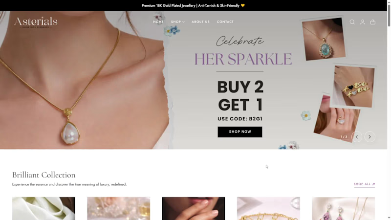
Asterials :- Shopify Store Redesign for Better Conversions😊
1
1
309
Message
0
Varun Jhariya
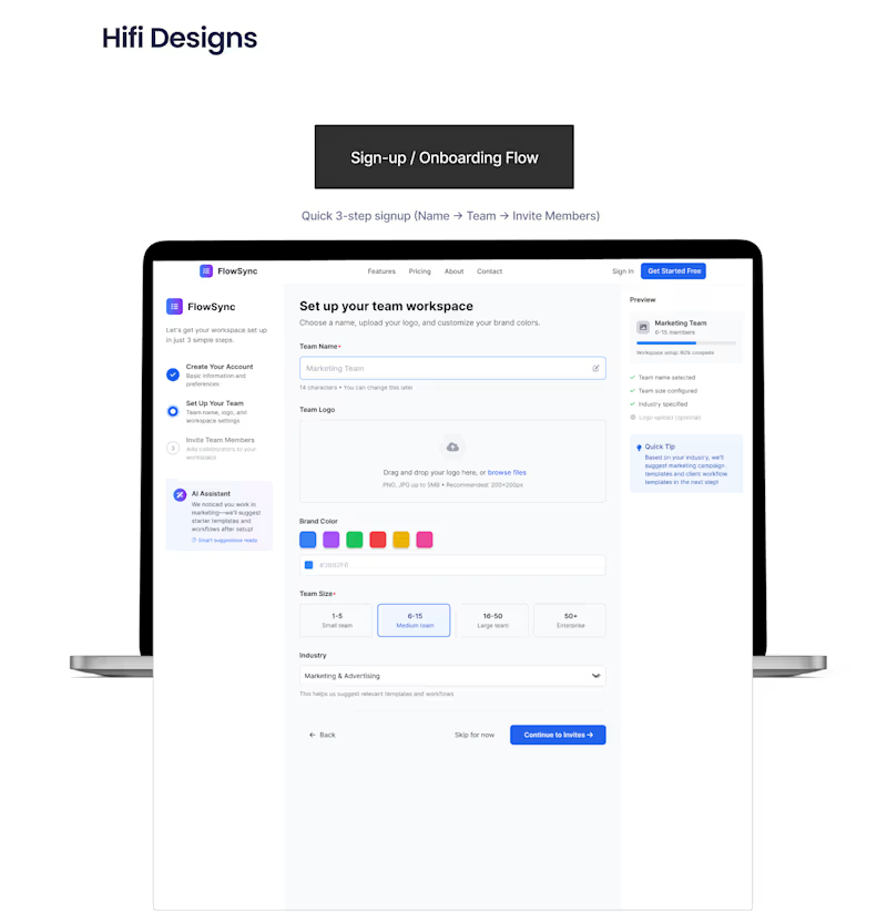
FlowSync - SaaS Platform Design
0
95
Message
2
Khushal Dewra (KDX Studios)
pro
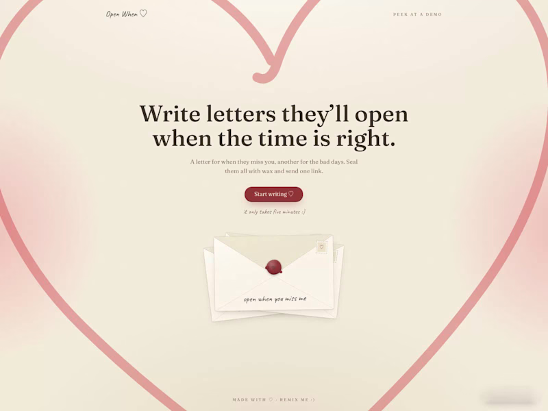
Open When ♡ is my Replit Buildathon entry. Sealed letters for the moments you can't be there. The old tradition of "open when" envelopes, rebuilt as a tiny web app. You write letters for someone you love, seal each one with wax, and send a single link. They open each envelope only when its moment actually arrives. What's inside: A letter builder with preset moments (open when you miss me, open when you can't sleep) plus any moment you invent A cute pic step, taken right in the browser inside a heart shaped frame Wax seals in six colors that crack apart when a letter is finally opened An honor system pause before every reveal, asking if the moment is real Read receipts for the sender, you see the exact minute each seal broke A hand drawn heart, blushing gradients, and a full keepsake stationery design system Zero setup for remixing, no accounts, no API keys, Replit's built-in database with a SQLite fallback It works for couples, long distance friendships, a parent writing ahead for a kid's big days, or a time capsule to your future self. Try the demo bundle, one seal is already cracked so you can see both states openwhen--thekhushaldewra.replit.app/to/demo (http://openwhen--thekhushaldewra.replit.app/to/demo) Write your own in five minutes openwhen--thekhushaldewra.replit.app (http://openwhen--thekhushaldewra.replit.app) Built on one belief: the best time to say something isn't always now. #ReplitBuildathon
2
170
Message
0
Keshav
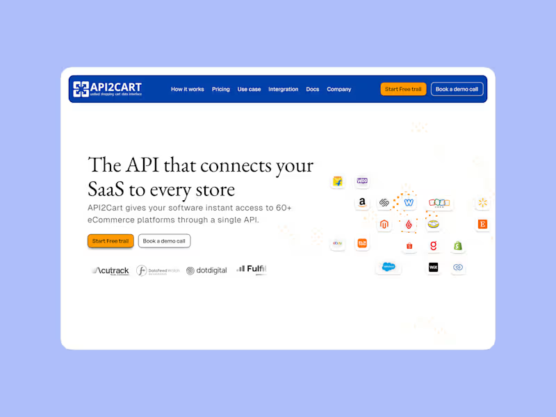
Hero Section Redesign for API2Cart
0
8
Message
1
Anubhav Saxena
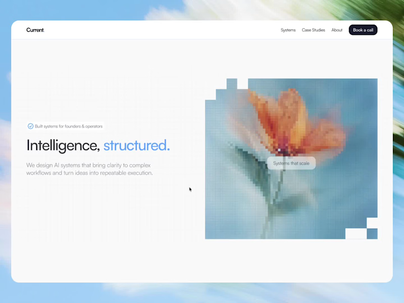
Current is live. a systems-focused growth agency that helps businesses turn scattered marketing and operations into structured, repeatable workflows.
1
187
Message
0
Parveen rawat
pro
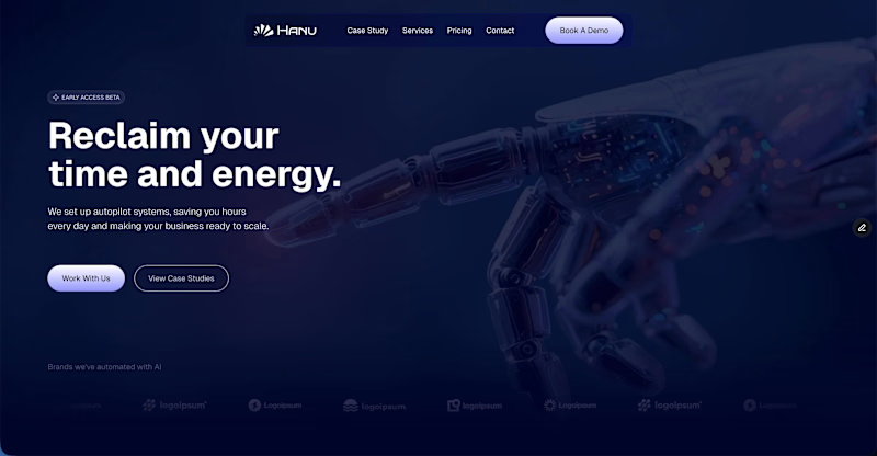
One of my recent Framer project, Hanu Built for an AI automation agency ⚡️
0
38
Message
0
Kanishk Goel
pro
Built a creator-led learning platform where users can discover and learn skills through structured video courses, expert content, and progress tracking. Built with Next.js, React, TypeScript, Node.js, PostgreSQL, and Tailwind CSS.
0
73
Message
0
Vansh Sharma.
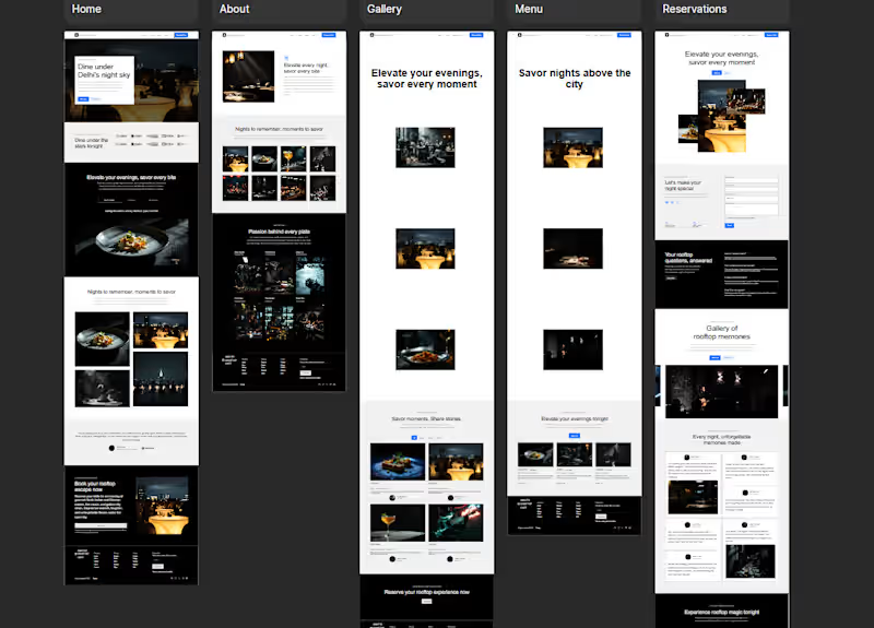
Luxury Rooftop Restaurant Website Design | Elegant Dining Experience UI
0
120
Message
0
vikash boora
Head Spa: Rejuvenate Your Mind, Body, and Soul
0
10
Message
0
Calidig IT Solutions LLP
pro
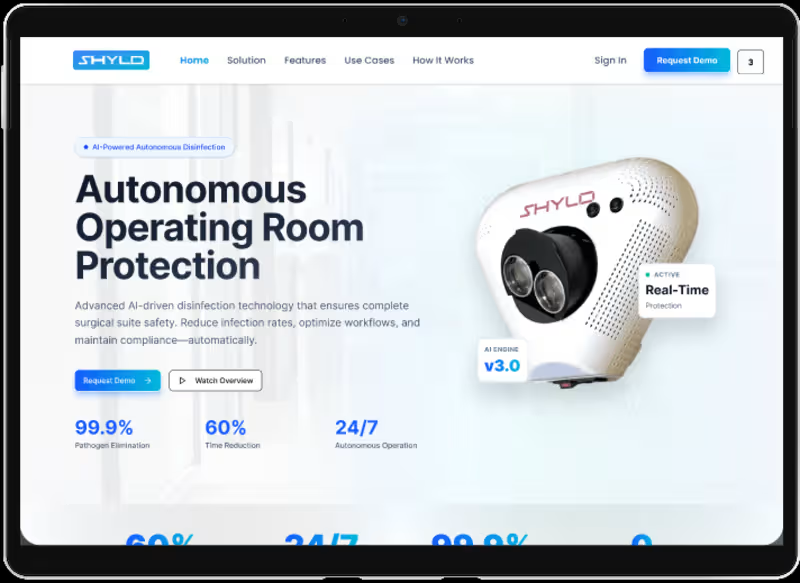
SHYLD Website Design – Autonomous Infection Control & Healthcare Technology Platform - Project Overview SHYLD is an innovative healthcare technology platform focused on autonomous infection prevention and operating room protection. The project involved designing a modern, enterprise-grade website that communicates complex healthcare technology in a clear, visually engaging, and conversion-focused manner. The design highlights SHYLD's AI-powered disinfection solution while emphasizing product innovation, clinical efficiency, and healthcare safety. Figma Prototype: https://www.figma.com/proto/gxP8rueorgUoW43Xczp6HR/Shyld-_-Landing-Page Style Guide: https://www.figma.com/proto/gxP8rueorgUoW43Xczp6HR/Shyld-_-Landing-Page?page-id=30%3A7345 - Design Goal The objective was to create a professional healthcare technology website that effectively showcases SHYLD's autonomous infection control solution, educates healthcare professionals about its benefits, and drives product demonstrations through a clear and engaging user journey. - Design Process The project started with information architecture planning, user journey mapping, and content hierarchy definition to simplify complex technical messaging. Multiple design explorations were created, including light and dark theme variations, allowing stakeholders to evaluate different visual directions before finalizing the user experience and interface design. - UI/UX Approach The design combines modern SaaS design principles with healthcare-focused visual language. Large typography, product-focused hero sections, data-driven content blocks, and strategic call-to-action placement were used to communicate trust, innovation, and clinical effectiveness. Special attention was given to readability, visual hierarchy, and conversion optimization throughout the website. - Design Deliverables Information Architecture User Flow Design Low-Fidelity Wireframes High-Fidelity UI Design Interactive Prototypes Responsive Website Design Design System & Component Library Light & Dark Theme Exploration Landing Page Experience Design - Tools & Skills Figma, UI Design, UX Design, Wireframing, Prototyping, Information Architecture, User Flow Design, Responsive Web Design, Design Systems, Interaction Design, Visual Design, Landing Page Design, SaaS Website Design, Conversion Optimization. - Project Summary The SHYLD website demonstrates a modern approach to healthcare technology design by combining strong visual storytelling, product-focused experiences, and conversion-driven user journeys. Through thoughtful UX strategy, scalable design systems, and polished interface design, the platform effectively communicates advanced infection control technology while maintaining clarity, trust, and usability for healthcare professionals.
0
47
Message
5
Diya Kanwar
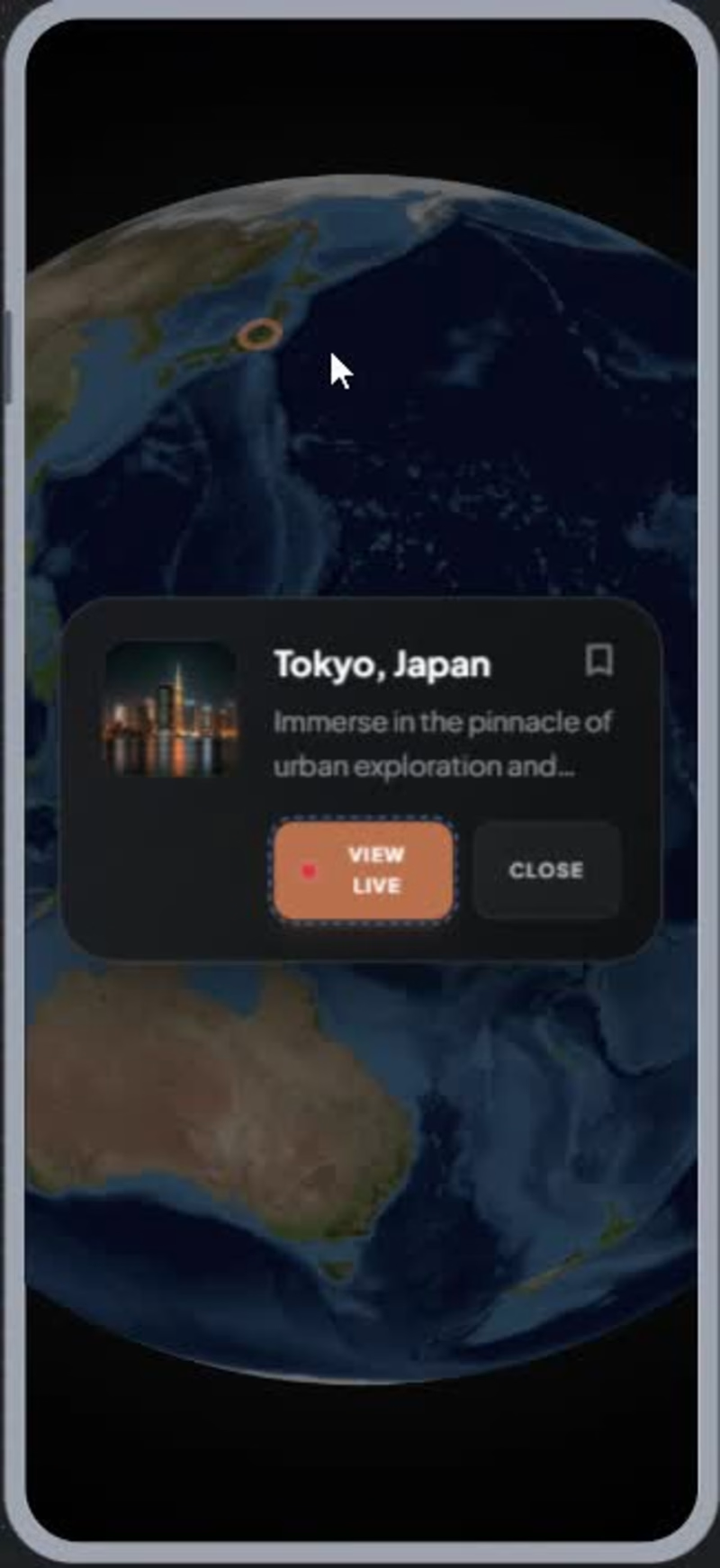
1. What I Built 🚀 [View Prototype (https://stitch.withgoogle.com/preview/3287339507041852410?node-id=7c6307b733b04eb1bccc21b2295c204a)] Digitour (https://stitch.withgoogle.com/preview/3287339507041852410?node-id=7c6307b733b04eb1bccc21b2295c204a) 🚀 Digitour is an immersive virtual travel application that allows users to explore destinations worldwide through a 3D interactive globe, live destination discovery, and virtual exploration experiences. The app includes destination search, saved journeys, user profiles, and real-time travel exploration features within a premium, adventure-inspired interface. 2. How I Used Stitch 🔥 I started with low-fidelity wireframes and a predefined color palette that established the visual direction of the product. Using Stitch, I generated the initial design system and screen layouts based on these inputs. Through multiple iterations with the Stitch agent, I refined the navigation, visual hierarchy, interactions, and overall user experience. Stitch helped rapidly generate new screens while maintaining consistency across the entire application, making it easy to create a connected, interactive prototype. 3. Feedback on Using Stitch 💯 My experience with Stitch was very positive. The platform significantly reduced the time required to move from wireframes to a high-fidelity prototype. The AI agent was particularly helpful in generating consistent screens, maintaining design patterns, and quickly iterating on ideas through prompts. Navigation flows and screen transitions were easy to establish, allowing rapid prototyping and testing of the user experience. The biggest advantage was the ability to explore and refine multiple design directions without manually rebuilding screens from scratch. 🎉 Fun creative and learning experience 🎉
5
5
197
Explore projects