Brands built from idea to launch, with brains & personality.


Brands built from idea to launch, with brains & personality.

Part 2 of REFORMR expands the concept further into physical and digital applications; exploring how the identity moves across space, interaction, and membership experiences.
This phase focuses on building a more connected brand system through:
• app and booking flow concepts
• membership and access design
• environmental and spatial visuals
• campaign-style compositions
• tactile print explorations
The direction continues to balance structure and softness through a restrained palette, bold typography, and calm interface design; creating a system that feels both functional and atmospheric.
Full case study coming soon ✦
7
29
1K

REFORMR is a reformer pilates studio concept built around structure, control, and intentional movement.
The direction combines softened athletic energy with a more refined and atmospheric visual identity system; balancing performance with restraint across both physical and digital touchpoints.
For this first presentation, I explored:
• identity direction
• visual language
• tactile brand elements
• digital applications
• spatial and editorial-inspired compositions
Built to feel calm, recognizable, and structured without losing warmth.
Part 2 + full case study coming soon ✦
4
10
640
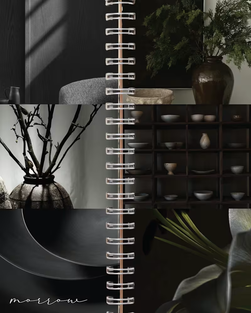
MORROW | Brand Identity & Art Direction
MORROW is a self-directed homeware brand concept built around a slower approach to living. Thoughtful objects, natural materials and a sense of permanence, brought together through a brand designed to feel as considered as the pieces it represents.
The visual direction combines deep greens, warm browns and soft ivory, balancing rustic character with understated luxury. The goal was to create an identity that feels collected rather than overly polished, with a quiet sense of permanence running through every detail.
From the visual identity to the overall art direction, I developed the branding from start to finish, building a cohesive visual world around the idea of slow-made living.
MORROW. Design made to stay.
47
109
4.3K
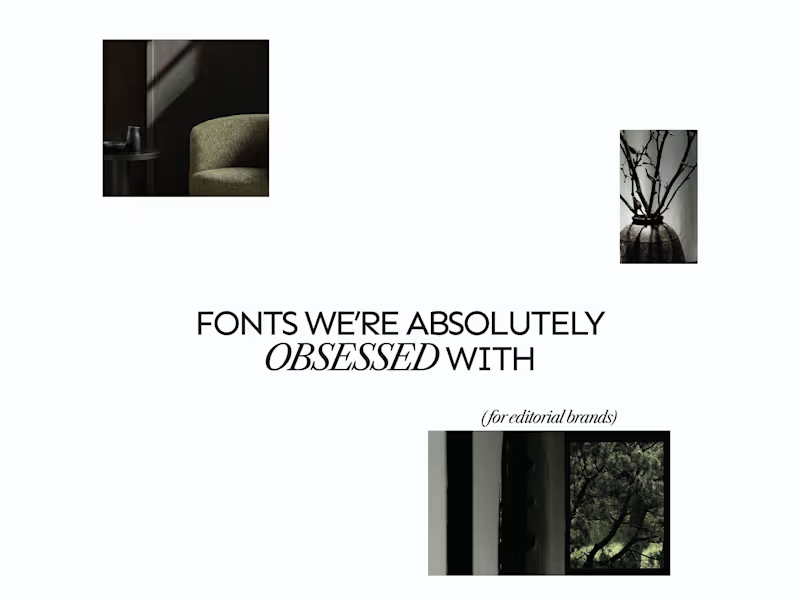
A few editorial typefaces we’re absolutely obsessed with right now.
These are some of the fonts we keep coming back to at Studio Mayze when we want a brand to feel considered, distinctive and a little more editorial without pushing the design too far.
Good type can do a lot of the heavy lifting. The right one can completely change how a brand feels before you’ve even added anything else.
Each slide shows the typeface in use at the top, with the font name underneath, so you can see how it could look in context rather than just as a specimen.
These are three of our favourites at the moment. Want to see the full selection? We’ve shared all of our favourites over on Instagram (https://www.instagram.com/p/Dewd73IkcWw/?img_index=1).
Which one would you pick? 👀
6
21
803

AI UGC and performance video ads for apps and DTC brands
New to Contra
AI UGC and performance video ads for apps and DTC brands