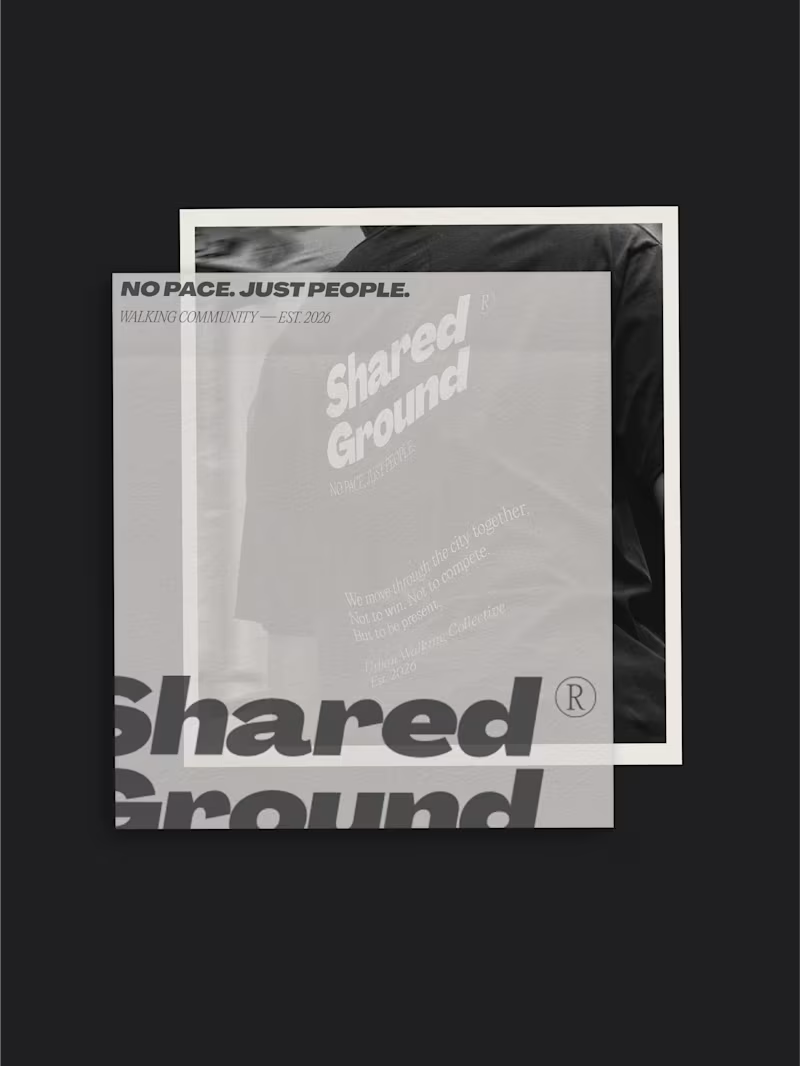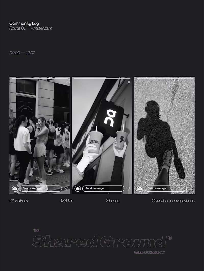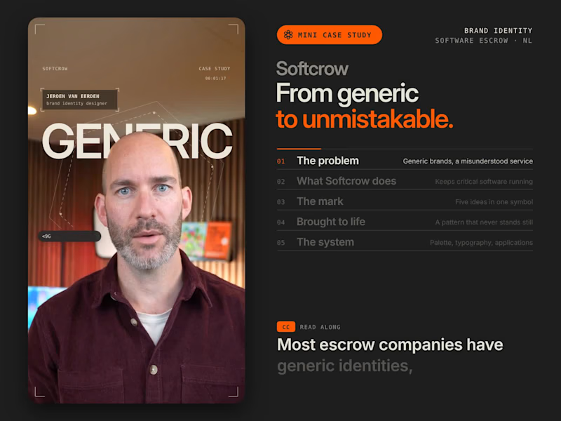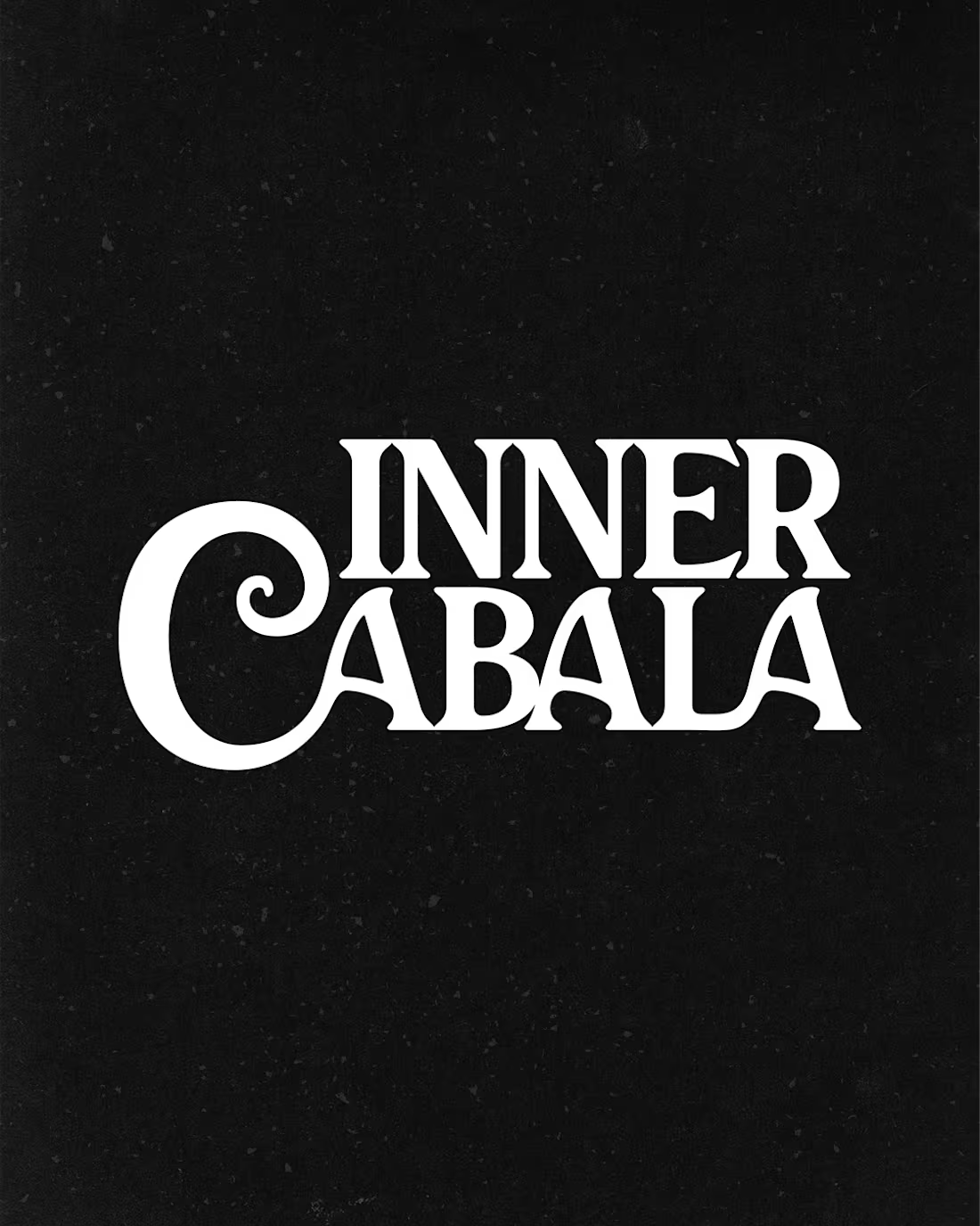
A few editorial typefaces we’re absolutely obsessed with right now.
These are some of the fonts we keep coming back to at Studio Mayze when we want a brand to feel considered, distinctive and a little more editorial without pushing the design too far.
Good type can do a lot of the heavy lifting. The right one can completely change how a brand feels before you’ve even added anything else.
Each slide shows the typeface in use at the top, with the font name underneath, so you can see how it could look in context rather than just as a specimen.
These are three of our favourites at the moment. Want to see the full selection? We’ve shared all of our favourites over on Instagram (https://www.instagram.com/p/Dewd73IkcWw/?img_index=1).
Which one would you pick? 👀
6
21
810

A small curated selection of logomarks for the Instagram Logoarchive wave.
Over two decades of logo and brand identity work leaves you with a lot of forms. Some became the foundation of a company. Some never made it past a sketchbook. All of them taught me something.
What I keep coming back to is simplicity with intent. A mark that works because every decision in it had a reason. That’s the thread running through everything here.
4
21
313