Projects using HTML5 in Greater NoidaProjects using HTML5 in Greater NoidaPolicybazaar UAE – Insurance Platform & Quote Journey UI
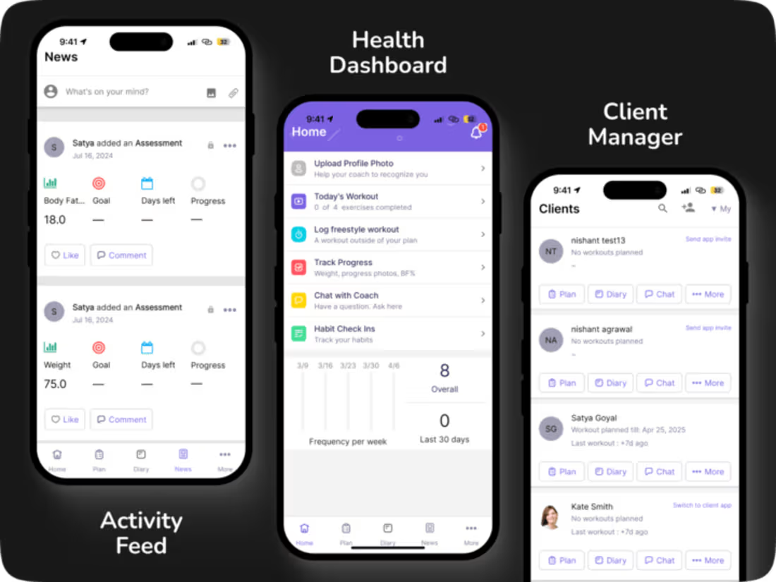
Developed responsive Web UI for Policybazaar UAE’s insurance platform using HTML5, CSS3, Bootstrap and SCSS within a React-based application.
Built responsive UI for the insurance landing page, including insurance category cards, promotional sections, banners, navigation and supporting content modules.
Implemented reusable insurance product/category components for multiple insurance types including Health, Car, Life, Travel, Investment and other insurance products.
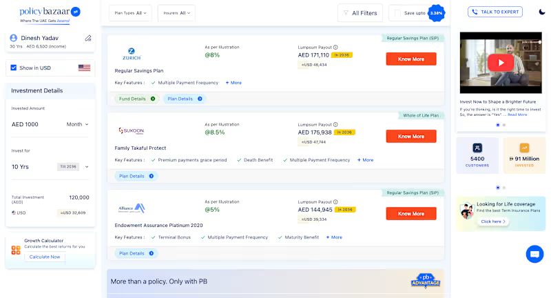
Developed the quote listing interface displayed after users select an insurance product and complete the required details.
Built reusable and modular insurance plan cards with conditional rendering for different plan types, insurers, pricing/payout information, key features and CTA states.
Implemented UI for filters, plan-type selectors, insurer selectors, sorting/filter controls and responsive quote-listing layouts.
Developed supporting UI components such as plan details, fund details, comparison-related actions, investment details, calculators, promotional cards and expert-contact sections.
Worked on multi-step insurance user journeys from product selection → customer details → quote results → plan details / comparison interactions.
Created reusable components and conditional UI patterns so the same component structure could support different insurance products, plans and dynamic data.
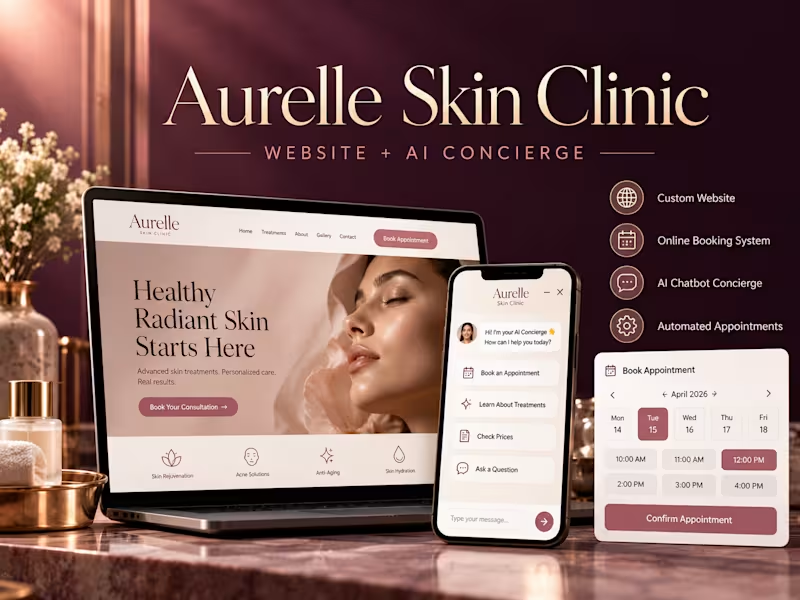
Focused on responsive Web/mWeb layouts, pixel-accurate UI implementation, reusable CSS/SCSS architecture and cross-browser compatibility. Aesthetic clinics sell a feeling before they sell a treatment, and most of their websites undercut that on arrival — stock gradients, hidden prices, a contact form that answers on Tuesday. Aurelle is my answer to what a premium aesthetic clinic's site should feel like, and what should happen when a visitor has a question at midnight.
The brief I set myself
Build a site that looks like the clinic charges what it charges, and that still does the unglamorous commercial work: state prices, show the doctors, answer the awkward questions, take the booking.
Design approach
Restraint over hard-sell. The palette is deep plum with muted rose and pearl — no clinical white, no neon gradients. Italiana for display type against Outfit for body copy: editorial rather than medical. Everything sits on generous spacing, because whitespace is what reads as expensive.
A video hero, treated properly. The page opens on full-bleed treatment-room footage under a directional gradient, so the headline stays readable across the frame instead of fighting the video. The source clip was compressed from 28MB to under 1MB — a hero that takes eight seconds to load is worse than no hero at all. It respects reduced-motion and data-saver settings, falling back to a still.
Prices stated, not hidden. Six treatments, each with its own photograph and a real starting price — anti-wrinkle from AED 1,200, HydraFacial from AED 750, laser from AED 300 per area. Aesthetic clinics hide prices out of fear; hiding them is what sends a nervous first-timer to whichever competitor answers the question.
The people, before the procedures. Two named doctors with credentials and a stated philosophy, because in aesthetics the practitioner is the product.
A three-step first visit. "No pressure, no upselling" is the section's opening line, written to defuse the single biggest reason people don't book a first aesthetic consultation.
The AI concierge
An assistant embedded in the page, trained on the clinic's own treatments, prices, downtime and hours. It handles the questions people are too embarrassed to phone about — does Botox hurt, what does laser actually cost, are you open Friday — and ends the conversation by offering a consultation slot with a named doctor. Anything medical gets routed to the team rather than answered. That boundary is deliberate: an AI that guesses about a patient's skin is a liability, not a feature.
Honest-demo conventions
The build carries a visible banner marking it as a Kavora Digital demo of a fictional clinic, the reviews are labelled as samples, and search indexing is off. A portfolio piece that could be mistaken for a real practice isn't a portfolio piece — it's a problem.
Stack
Hand-coded HTML and CSS · custom scripted assistant · ffmpeg for video optimisation · Google Fonts (Italiana, Outfit) · IntersectionObserver scroll reveals, CSS conic-gradient animated borders, cursor-tracked lighting
What this demonstrates
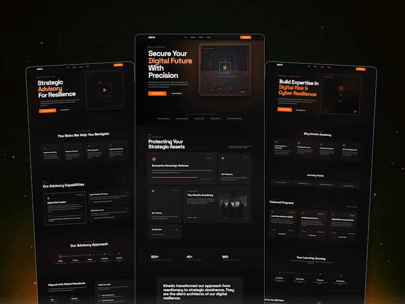
A clinic site can look editorial and still be a conversion instrument. The whole thing is one self-contained page — fast, mobile-first, no CMS to maintain — with an assistant layer that can sit on top of a clinic's existing website without rebuilding it. Designed a high-impact cybersecurity SaaS experience focused on translating complex, technical offerings into a clear, structured, and conversion-driven interface.
Leveraged a strong visual hierarchy, modular component system, and a refined dark UI with strategic orange accents to guide user attention, improve scannability, and reinforce a sense of trust and precision.
The outcome is a scalable, system-driven design that balances depth of information with clarity — enabling users to navigate, understand, and act with minimal friction.