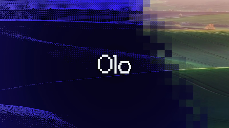
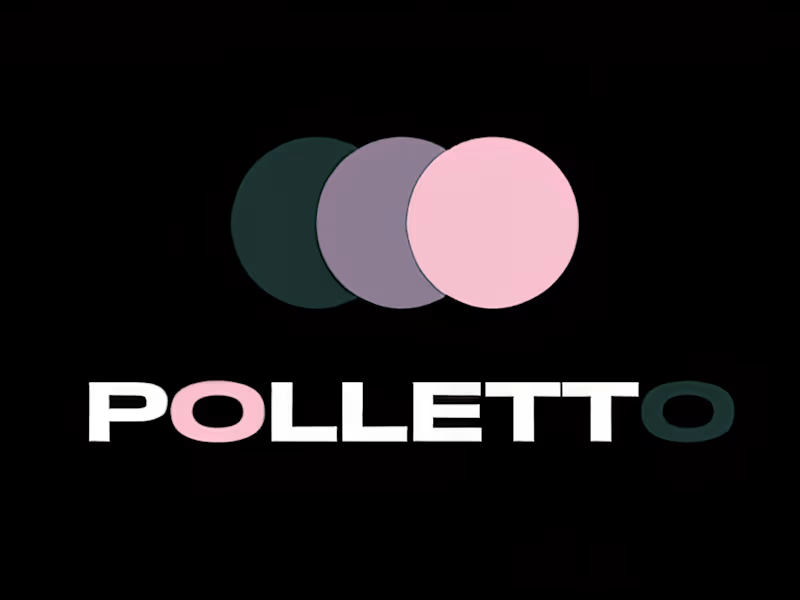
Freelance Brand Designers in GhentFreelance Brand Designers in GhentFor the Contra x Envato Challenge, 'Human by Design', we built a brand identity and animated a promo video for 'Olo', an accessible crypto-trading platform.
To us, the core of this challenge wasn't about creating more content with AI, but about maintaining one clear creative direction. When drawing from a massive library of separate AI generations, stock footage, fonts, and music, a project can easily turn into a disjointed visual mess. Envato served as our entire toolkit - from AI-generated audio and assets to stock templates and typography.
But every asset still had to answer one crucial question: 'Does this truly feel like Olo'? Guided by the brand promise of making crypto trading accessible for everyone, everywhere, human instinct drove the entire creative process:
1. Curating over generating: Rejecting raw AI outputs that felt flat or out of context and ruthlessly filtering for what actually worked.
2. Building a visual identity: Applying custom effects to transform generic stock footage into a unified aesthetic.
3. Directing the flow: Motion design, precise typography, and timing every single movement to the rhythm of the music in After Effects. Envato Stock and AI tools dramatically accelerate the build process, but it’s the human creator who infuses the soul. It provides the ingredients, but art direction, taste, and instinct define the quality of the final result.
Toolkit: Envato (Envato AI, Stock, Fonts, Audio) + After Effects & Adobe Illustrator. I met Sandy (https://sandyonderdonck.com) through a series of mastermind sessions organised by my business coach. From the beginning, I felt drawn to both her work and her presence. She's a Belgian systemic coach who supports people through emotional overwhelm, grief, trauma, burnout and personal growth, often with horses as honest mirrors in the process.
Before creating her brand identity, I became one of her clients. Partly because I was moving through a grieving process of my own, and partly because I knew that experiencing her work first-hand would help me understand what her future clients needed to feel.
This became an important part of the research for this project. I didn't just design from a questionnaire or a visual brief. I experienced the setting, the pace, the emotional safety, the role of the horses, Sandy’s language and the way she gently but honestly guides people through what is there.
Her previous branding and website no longer reflected who she is and how she works. The visual identity felt cold and impersonal, and the website was difficult for her to update without involving a developer. Because every small change meant extra cost and friction, her offers were not always up to date and the site no longer felt like something she truly owned.
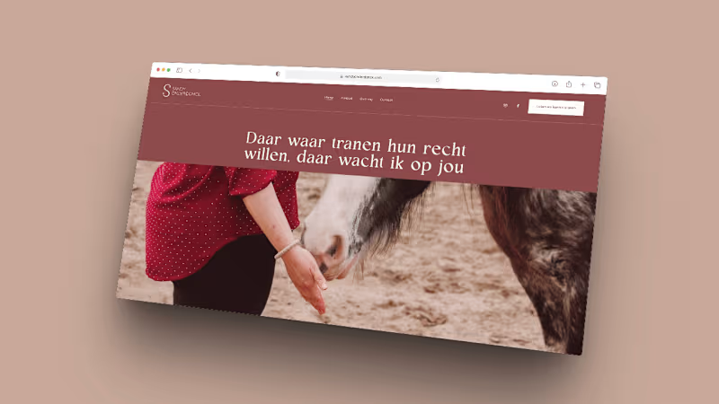
For this project, I created a full rebrand and Squarespace (https://squarespace.com) website that felt more like Sandy herself: soft yet strong, warm but honest, feminine without being fragile. The new brand identity includes strategy, logo design, colours, typography and photography. The horses are present through the photography and atmosphere, but the brand itself centres Sandy as the heart of the work. The website includes a homepage, about page, offerings page, contact page and individual session pages, with testimonials, a contact form and scheduling through TidyCal (https://tidycal.com).
The biggest goal was ownership. Sandy needed a website that didn't just look beautiful, but also felt like something she could understand, update and grow with. Squarespace made that possible.
I used Finish Layer’s (https://pros.squarespace.com/blog/finish-layer) Font Uploads to bring in her custom brand typography without hard-coding, which made the design feel more personal while keeping it easier to maintain. I also used subtle block animations and responsive adjustments to create a calm, gentle experience across desktop and mobile.
The result is a warm, grounded brand and website that better reflect Sandy’s work and presence. When she saw the final website, she was moved to tears. For me, that was the clearest sign that the project had done what it needed to do: give her a digital home that finally felt like hers. 💚
https://sandyonderdonck.com