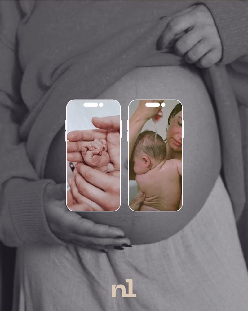
Brand Design Projects in GautengBrand Design Projects in GautengA comprehensive branding and social media identity concept for Noula, a specialized midwifery and pregnancy care center focusing on complex medical and neonatological offerings. The design direction rejects cold, clinical healthcare aesthetics in favor of a warm, human-centric, and premium visual ecosystem. By pairing raw, editorial photography with an elegant typographic hierarchy, the brand identity establishes a deeply comforting and professional presence across digital platforms.
Key Design & Branding Elements
The Typography Strategy: Built around a soft, fluid, lowercase logotype with custom rounded geometry, capturing the natural themes of maternity and care. It features a subtle, floating circular emblem to signify a supportive environment.
Color Palette Architecture: An intentional balance of organic warmth and medical trust. The primary hex tones include:
#F1D3BB: A soft, nourishing peach/cream background skin tone to represent intimacy and comfort.
#C3D5E8: A calming, modern powder blue to inject fresh, reliable medical credibility without looking sterile.
Deep plum/wine tones for high-contrast body copy and secondary iconography layout.
Editorial Art Direction: Utilizes authentic, documentary-style imagery (water births, maternal stretch marks, skin-to-skin touch) treated with soft film grain and desaturated tones. This approach builds instant emotional connection and transparency with expectant mothers.
Multi-Channel Digital Framework
Social Layout Mockups: Designed dynamic mobile frames showing how curated carousel posts bridge the gap between human storytelling and informative pregnancy resources.
Asset Versatility: Developed the "nl" sub-brand monogram system, engineered to scale perfectly down to a smartphone app icon or profile picture while maintaining legible high-end presence.
Brand Presentation Sheets: Asymmetric landscape layouts created to pitch the corporate identity alongside its clinical positioning statement smoothly.