Projects using Adobe After Effects in EindhovenProjects using Adobe After Effects in EindhovenHappy Horizon is a creative marketing company operating across multiple strategic business pillars. One of these pillars focuses on Development & Technology, addressing complex digital challenges through innovation, engineering and scalable solutions. To communicate this expertise within a live event setting, Happy Horizon commissioned the creation of a dedicated showreel.
Brief & Strategic Challenge
The objective of the project was to develop a concise yet expressive showreel that would promote the Development & Technology pillar within a limited runtime of 1 minute and 10 seconds. The animation was intended for continuous playback on a large-scale LED screen (5 × 3 metres) as part of a branded event stand. As audio could not be relied upon in this environment, the narrative needed to be fully comprehensible without sound; placing a strong emphasis on visual clarity, rhythm and hierarchy.
Concept Development & Script Structuring
The process began with a collaborative brainstorming session alongside the marketing team. Together, we defined the core narrative and messaging framework of the showreel. Based on this session, a high-level script structure was shaped and subsequently finalized. This phase marked the primary point of collaboration within the project.
Visual Translation & Storyboarding
Following script approval, the responsibility for translating the narrative into a visual language lay entirely with me. I developed a dedicated sub-style that aligned with Happy Horizon’s existing brand identity while distinctly supporting the Development & Technology pillar. This included the full visual concept, compositional logic and a detailed storyboard that defined sequencing, rhythm and visual hierarchy throughout the showreel.
Animation & Final Production
Based on the approved storyboard, I started animating the complete showreel. The animation focuses on dynamic motion, fluid transitions and carefully structured compositions to express guidance, progress and technological clarity. Through abstract visual metaphors and directional movement, the showreel positions Happy Horizon as a partner capable of navigating complexity and creating a clear horizon for its clients. The final result functions as both an aesthetic statement and a highly legible brand asset optimized for repeated, soundless viewing. Remedica is a health-education organization dedicated to delivering scientifically grounded, accessible and empathetic guidance across a diverse healthcare landscape. Following an in-depth strategic session with the founders, I was commissioned to develop a renewed brand identity, a certification mark, and an extensive suite of communication assets. This included materials for digital channels, print applications and a dedicated event campaign celebrating Remedica’s 40-year anniversary. The new identity needed to express reliability, clarity and warmth; while establishing a distinctive presence within an increasingly homogenized healthcare sector.
Strategic Foundation
Audience and value mapping revealed five core brand pillars. Together they form the brand’s narrative, its visual language and its behavioral cues.
- Guidance
Helping people navigate an increasingly complex healthcare system.
- Inspiration Across Generations
Encouraging informed decision-making for all ages.
- Operational Relief
Supporting healthcare professionals by taking over the educational burden.
- Reliable Product Recommendations
Transparent, evidence-based curation supported by a proprietary certification mark.
- Scientific Integrity
Every piece of communication is validated by domain experts and current research.
Audience Architecture
Remedica serves three interconnected audiences: commissioning parties (B2B), intermediary professionals (B2P), and the general public (B2C).
A comprehensive audience architecture was developed to understand the full spectrum of Remedica’s stakeholders. Through qualitative analysis, behavioral mapping and value-based segmentation, each audience group was examined in detail: their motivations, expectations, pain points, and communication preferences. This included healthcare professionals, patients and caregivers, corporate partners, and the broader public seeking trustworthy medical information.
By identifying what resonates with each group — and equally, what disengages them — clear behavioral patterns and emotional drivers emerged. From this, I distilled the shared denominators across all segments: a need for clarity without oversimplification, authority without arrogance, accessibility without losing scientific rigour, and emotional reassurance grounded in factual accuracy.
This cross-audience overlap formed the strategic backbone of the identity. It ensured that the visual and verbal system could flex across diverse contexts while maintaining a consistent sense of trust, empathy and expertise.
Market Positioning
The healthcare communication sector is dominated by rounded forms, soft pastels and predictable blue–pink palettes. While accessible, these styles often blend into one another, making visual distinction increasingly difficult.
Recognizing this saturation created a strategic opening for Remedica: an identity that preserves the trustworthiness expected within healthcare, yet advances it through a more contemporary and human-centered expression. The resulting positioning balances scientific rigour with empathy, allowing the brand to stand apart without stepping outside the boundaries of credibility within the healthcare industry.
Visual identity System
The final colour palette was constructed around a refreshed version of Remedica’s existing skin-tone hue, previously too muted to stand out. This updated Human Tint became the emotional cornerstone of the palette: warm, inclusive and grounded in Remedica’s personal approach. Around this tint, I developed a set of interlocking colors with distinct functional and symbolic roles.
The photography framework is built around three complementary pillars that together express Remedica’s human-centered philosophy. Imagery of healthcare specialists is captured in authentic working environments, using clean compositions and gentle depth of field to convey warmth, expertise and approachability. A second pillar focuses on workshops, emphasising participation and real interaction through dynamic angles and atmospheric depth, resulting in visuals that feel lived-in rather than staged. The product-focused imagery situates certified items in realistic, human contexts, using soft lighting and warm tones to communicate care, quality and trust across audiences.
The typographic system pairs a modern, highly legible sans serif for body copy with a bold, contemporary display type for titles and statements. The primary typeface offers clarity, balance and a subtly human warmth, ensuring readability across both digital and printed educational materials. The secondary typeface introduces confident geometry softened by rounded details, projecting authority without harshness. Together, they form a cohesive hierarchy that reinforces Remedica’s commitment to professionalism, accessibility and human-centered communication.
Behavioral & Psychological Foundations
The redesign is grounded in behavioral and psychological principles that influence how audiences process healthcare information. By establishing consistency in tone, form and narrative structure, the identity creates a stable cognitive environment—one in which users can intuitively recognize expertise and feel supported by it.
Drawing on research into patient perception, professional trust-building and educational communication, the system employs deliberate sensory cues: softened geometric forms to reduce perceived rigidity, human-centered colour values to signal empathy, and documentary-style photography to reinforce authenticity and credibility.
Together, these elements construct a visual language that is not only aesthetically cohesive but psychologically attuned—evoking reliability, warmth and professional assurance across all audience groups.
Outcome
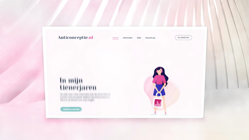
The resulting rebrand positions Remedica as a credible, contemporary and empathetic authority within the healthcare education landscape. The identity reinforces confidence among major pharmaceutical partners, supports healthcare professionals in their day-to-day practice, and makes health information more accessible for the general public; without compromising scientific integrity. Organon is a global healthcare company with a strong focus on women’s health. One of its flagship public-facing initiatives is Anticonceptie.nl (http://Anticonceptie.nl), the Netherlands’ most widely consulted online platform for information on contraception. The platform functions as an authoritative and accessible resource, offering evidence-based guidance on contraceptive methods, effectiveness, side effects and decision-making support.
Scope & Roll
For the redesign of Anticonceptie.nl (http://Anticonceptie.nl), Organon commissioned Happy horizon to develop a completely renewed website, including its visual identity and digital experience. Within this multidisciplinary team, my role was to translate complex medical and educational content into a coherent visual language through illustration and animation.
Visual System & Motion Design
The illustrations were developed to clarify and humanize a wide range of sensitive and information-dense topics across the platform. Following positive client feedback on the static visuals, I proposed extending the system into motion by introducing short, looping animations. This approach was adopted across the site, allowing all illustrations to be animated in a subtle and functional manner. The resulting motion design enhances comprehension, adds rhythm to the interface and contributes to a more engaging, contemporary user experience without detracting from the platform’s informational credibility. Costa del Son is a summer festival that blends electronic music with Mediterranean heritage and a distinctly refined aesthetic.
Strategic Foundations
The development of Costa del Son’s brand identity commenced with a series of in-depth strategic conversations. These sessions were aimed at articulating the client’s ambitions, cultural references and long-term positioning goals. By consolidating these insights, a research-driven foundation was established to guide the visual and conceptual direction of the festival.
From the outset, the identity was intended to reflect Spanish culture, embedded directly in the name Costa del Son. Rather than referencing sol alone, son points to both musical rhythm and the specific location where the festival takes place. This linguistic nuance set the tone for a concept that balances place, sound and atmosphere.
Extensive visual and historical research followed, with particular focus on the work of Antoni Gaudí and the broader Art Nouveau movement. Within this field, Catalan Modernism emerged as the most relevant stylistic framework: a design language characterised by organic forms, expressive typography, ornamental detailing and a vibrant yet earthy colour palette.
Cultural & Visual Research
Catalan Modernism provided a rich visual vocabulary aligned with the festival’s desired atmosphere. Typical colour associations such as turquoise, golden yellow, terracotta and warm orange are deeply rooted in Gaudí’s architectural work and Mediterranean culture. Equally important were the movement’s playful imperfection, hand-crafted qualities and mosaic structures, which introduce a sense of tactility, fantasy and subtle surrealism.
While these references informed the visual language, not all extremes of organic expression were adopted. A deliberate balance was sought between expressiveness and refinement, allowing the identity to feel artistic and festive while retaining a sense of elegance.
Concept Development & Direction
Based on the research outcomes, two distinct visual directions were developed and presented through visual moodboards and concepts. This approach allowed for informed decision-making while creating space for dialogue around preference, resonance and brand fit.
The client selected the direction titled Gaudí Chique. This concept forms the visual backbone of Costa del Son and translates Gaudí’s rich visual world into a more refined, contemporary festival identity. Where the alternative direction aligned more closely with conventional festival aesthetics, Gaudí Chique offered a differentiated expression that combines luxury, warmth and celebration.
The inclusion of warm yellow tones reinforces the symbolic importance of the sun as a central festival element, while the slightly more restrained forms support the ‘chique’ aspect without sacrificing energy or vibrancy.
Market Positioning
Within the contemporary festival landscape, particularly in summer and electronic music contexts; visual identities often converge around colorful gradients, geometric sans-serif typography and digitally polished aesthetics. While effective, this approach frequently results in limited distinction.
Costa del Son consciously diverges from this pattern. By drawing from Gaudí’s ornamental language and investing in a sustainable, recognizable visual system, the festival positions itself as distinctive, stylish and culturally rooted within an otherwise uniform market.
Festivals such as Solar Weekend, Wildeburg, Into the Woods and Down The Rabbit Hole demonstrate that a strong and consistent visual identity can endure for years without relying on short-lived trends. Costa del Son follows this same philosophy: an identity designed to last, requiring only subtle refinement over time rather than complete reinvention.
Visual Identity System
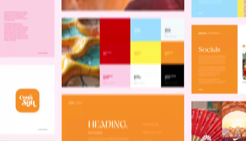
The colour palette was developed to express warmth, rhythm and Mediterranean richness while maintaining versatility across applications. Core colors include Sangeria Sol (red), Flamenco Blush (light pink), Ocean Breeze (light blue), Golden Siesta (yellow) and Saffron Beat (orange), balanced by neutral tones such as White Rhythm (white), White Palma (off-white) and Andalusian Night (black). Together, these colors create a dynamic yet harmonious system that reflects both festivity and culture.
Typographically, the system balances clarity and character. A modern sans-serif typeface is used for functional communication, ensuring readability across digital and print environments. This is complemented by a decorative secondary typeface inspired by Art Nouveau, applied selectively in headlines and editorial accents to evoke Gaudí’s expressive spirit without overwhelming the layout.
Logo Design & Symbolism
The Costa del Son logo is constructed from four conceptual pillars: Spain, festival culture, Gaudí and chique refinement. Typography and illustration merge into a single system, with custom-drawn letterforms reinforcing the handcrafted quality of the identity.
Visual elements within the logo include a semi-circular form referencing a Spanish fan or the sun; a flowing underline that represents music and festival movement; a salamander or dragon symbolising Gaudí’s architectural motifs; and a typographic ligature that conveys elegance and cohesion. The logo system was delivered in three variations: a primary illustrated logo, a secondary wordmark and a tertiary sticker-style version for flexible application.
Brand Assets & Applications
Beyond the core identity, a comprehensive suite of brand assets was developed. These include social media templates for DJ announcements, animated feed and story formats for ticket sales and sell-out updates, as well as a modular set of graphic elements.
Additional assets such as Spanish tile patterns, ornamental mosaics and a reusable arched frame further extend the identity across different touch points. Together, these elements ensure visual consistency while allowing creative freedom across communication channels.
Outcome
The resulting brand identity positions Costa del Son as a culturally grounded yet contemporary festival brand. By translating Catalan Modernism into a refined, festive visual system, the identity establishes long-term recognizability, emotional resonance and stylistic distinction, allowing Costa del Son to function not merely as an event, but as a brand with its own enduring visual language.
Niche Group is a collective of established, authentic agencies that, until now, operated without a unifying identity. The goal was to bring them together under a single name without erasing their individuality. Unlike traditional agency collectives that homogenize their members, Niche preserves the freedom, character, and independent decision-making of each label within the group.
Meaning and Positioning
The name Niche reflects precisely what the collective represents: a defined, intentional space within a broader market; a domain where specialists, makers, and thinkers distinguish themselves by addressing highly specific needs with depth, clarity, and craftsmanship. It is where unique perspectives and specialized services thrive away from the noise of the mainstream. This definition formed the conceptual backbone of the brand identity: a collective of independent agencies that stand out by daring to remain distinct, yet stronger together.
Audience Analysis
Niche primarily serves brand-driven decision-makers who value clarity, pace, and strategic depth. This audience has typically worked with multiple agencies and seeks partners who combine conceptual depth with a fast, unbureaucratic way of working. They prioritize authenticity and high-quality creative output. They expect transparent communication and a team that thinks with them rather than for them. What they appreciate in Niche is the direct access to specialists, the absence of unnecessary hierarchy, and a creative attitude that is confident, distinctive, and intellectually grounded.
Strategic pillars
Authenticity
In a market where agencies visually mirror one another, Niche intentionally breaks the pattern. No project managers, no corporate gloss: just specialists working directly with clients. Bold, self-assured, and unapologetically distinct.
Flexibility
The group embraces agility, adapts quickly, and deals confidently with unexpected changes; key traits for modern creative partnerships.
Freedom
Every agency within the collective retains its own personality, visual style, and operational independence. Niche is a home for individuality, not uniformity.
Visual identity
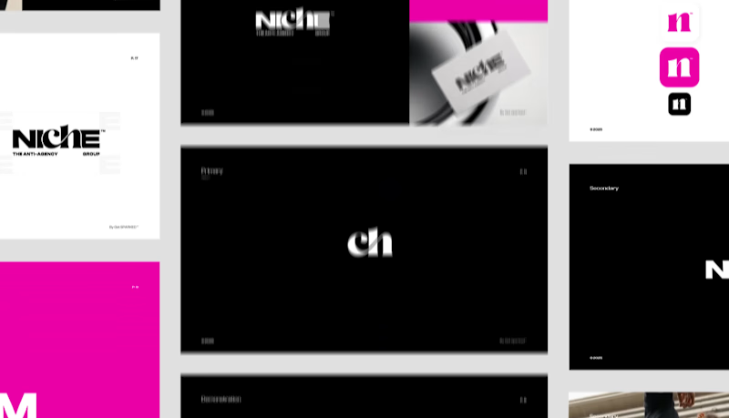
To translate this strategy into a tangible identity, two visual routes were presented: SINGLED OUT and AGAINST THE GRID. The founders chose the latter: a direction rooted in contrast, disruption, and character.
The final wordmark embodies the group’s essence:
Bold Capitals: A strong, self-assured foundation reflecting the collective’s confidence and directness.
A Disruptive Ligature: Breaking uniformity intentionally; introducing unexpected elegance and symbolizing flexibility.
Extended Letterspacing: Creating deliberate tension and visual attitude, echoing the freedom enjoyed by each agency within the collective.
Black, bright pink, and grey tones form the core palette.
Where competitors rely on predictable colors like: yellow, purple and black, Niche introduces a striking accent color that does not appear elsewhere in the corporate agency landscape.
The typographic system combines a clean, highly legible primary typeface with an expressive secondary display style. The primary font provides clarity and digital reliability, while the secondary adds a subtle tension through its experimental forms. Together, they balance functionality with individuality, reinforcing Niche’s bold and unconventional identity.
UI Design Homepage
In addition to the identity, Get sparked was asked to design a homepage concept, complete with subtle motion elements. Its primary purpose is to spotlight the individual agencies, rather than serve as an acquisition tool. Users are directed to the specific agency websites for further engagement, reinforcing the collective’s philosophy: unity without uniformity. Each agency is given the stage it deserves; as a separate entity within a shared collective.
Outcome
The brand identity for Niche Group reflects a collective that dares to break from convention while giving its labels the freedom to remain distinctly themselves. It is a visual and strategic system built on authenticity, independence, and confidence. All perfectly aligned with their character and future ambition. BENGglas is an innovative glass supplier, recognized for delivering high-quality insulating glass products. After years of steady growth, the brand reached a point where its visual presence no longer reflected its technical maturity, reliability, and future-oriented ambitions.
They approached me to develop a refined strategy and visual identity: a comprehensive rebranding designed to articulate their expertise, innovation, and established position within the industry.
Strategic Brand Session
We began with a strategic brand session aimed at redefining the organization’s core values and clarifying the foundation of the brand. Through an interactive workshop, we explored the company’s deeper purpose, the principles guiding their daily operations, and the value they aim to deliver in the long term. This process also created space to discuss preferences, aspirations, and practical challenges. For BENGglas, the founders emphasized a clear ambition: to elevate the brand and align its visual presence with the quality of its product offering.
Research & Strategy
The process continued with extensive research into the glass industry, particularly within the vacuum-glass segment. One striking conclusion emerged: despite the highly technical nature of the field, visual branding across the sector is remarkably outdated. Most competitors invest minimally in design, resulting in uninspired wordmarks or overly literal logos featuring gradients, shadows, and illustrated glass panes.
This lack of strong visual competition revealed a significant opportunity. A well-structured, recognizable, and modern identity would allow BENGglas to stand out immediately: especially by conveying innovation and professionalism.
Colour choices in the market also follow predictable patterns:
Blue for reliability and professionalism.
Grey and white for a clean, glass aesthetic.
Green for sustainability narratives
Occasional outliers aiming for exaggerated luxury or iridescent light-reflection effects
Audience research showed that the target group values clarity and functionality above all. They expect a logo to create a clear connection to the product without relying on literal imagery. Subtle abstraction is perceived as more professional, more timeless, and thus more trustworthy.
Strategic Direction
For BENGglas, we adopted an approach that embraces the technical character of the industry while ensuring a distinct, contemporary, and recognisable identity. Subtle references to glass are integrated through colour, geometry, and structure, without resorting to clichés.
Where many brands rely on predictable blue-grey palettes, we explored modern variations that maintain sector familiarity while giving BENGglas a unique, ownable presence. The resulting identity is visually refined and highly practical across all applications, from brochures and trade-show materials to online communication and installation documentation.
Persona Development
To accurately represent the primary audience, a persona was established: Mark, the Glass Installer.
Profile
Age: 30–55 (with an upper range to 70)
Profession: Experienced glass installer (independent or working within a company)
Experience: 15+ years in construction
Personality: Practical, solution-oriented, no-nonsense
Meet Mark
Mark is a seasoned craftsman who values durability, clear information, and efficient installation. He works according to the latest insulation standards (BENG-norms) and relies on accurate specifications. He prioritises materials he can trust and suppliers who communicate clearly and deliver on time.
What does he look for in a supplier?
Glass that meets legal and technical requirements
Fast delivery and transparent communication
Straightforward installation with no complications
How do we speak to him?
The communication strategy reflects Mark’s mindset: direct, functional, and without unnecessary decoration. He appreciates clarity, recognizable industry terminology, and an honest tone. No vague marketing promises; only concrete benefits and straight facts.
Market & Behavioural Psychology
The rebranding is grounded in behavioural insights showing that clarity, structure, and recognizability strongly influence trust in technical industries. The visual system uses geometric forms that evoke construction and glass, supported by colour cues that signal strength, precision, and accessibility. A minimalist, structured design enhances credibility, while consistent application across all materials strengthens brand memory and reinforces long-term trust.
Tone of Voice
Clear. Direct. Uncompromisingly honest.
The communication style mirrors the audience: straightforward, confident, and factual. No marketing jargon. No inflated claims. No unnecessary embellishment.
Imagery System
The imagery system is built around three pillars; People, Product, and Placement. People photography, focusses on authentic situations: real glass installers in real working environments, captured with high contrast, deep saturation, and natural textures to emphasize craftsmanship. Product images highlight material quality through sharp details, realistic reflections, and controlled light that conveys precision and innovation. Placement imagery shows BENGglas products installed in real contexts, such as heritage buildings, with subtle turquoise reflections that unify the entire visual identity. Across all three pillars, the imagery balances technical authority with human realism.
Three Strategic Pillars
Reliability & Trust
Communicated through consistent application, geometric precision, and a structured visual system that conveys stability while rounded edges ensure accessibility.
Technical Excellence & Quality
Expressed through honest, factual communication and visual clarity that emphasises performance, durability, and engineering integrity.
Professionalism & Innovation
Positioning BENGglas as a contemporary leader in a visually stagnant sector, with an identity that reflects its advanced technology and elevated service level.
Visual Identity
The typography is deliberately squared yet softened with rounded edges to preserve a human, approachable character. The logo mark literally symbolises vacuum glass without resorting to clichés common in the industry. Opposing arrows represent the directional pressure applied during vacuum installation, while the central rectangle signifies the titanium-based vacuum glass. Together, they form a stylised rounded-corner window; instantly recognizable and directly tied to the product.
The colour palette draws inspiration from authentic glass tints. It is built around the signature blue from the previous identity to maintain continuity, complemented by a deeper royal blue that signals technical authority with a subtle turquoise-green hue inspired on natural glass edges. A bright accent colour provides energy and emphasis for call-to-action elements.
Outcome
The final identity combines technical quality, professionalism, and trustworthiness. In a market where visual investment is rare, BENGglas now differentiates itself by communicating at the level of its expertise.
The service has matured, the products have evolved, and the brand now visually embodies that progression. This rebranding positions BENGglas as a modern, credible, and technically advanced market leader; precisely where it belongs. Acknowledge ICT is a forward-thinking technology partner known for its innovative digital solutions and human-centred approach. As the company entered a new phase marked by a complete rebranding, they sought a compelling way to introduce their renewed identity to the market. To support this transition, I was commissioned to design and animate a series of brand-reveal assets tailored for their digital launch.
Project scope
The initial brief focused on creating animation concepts to highlight the evolution of the brand, while emphasizing Acknowledge ICT's core pillars. Produced in three formats suitable for multiple digital platforms. These variations ensured flexibility across social feeds, stories, and widescreen displays.
Concept Development
Concept 1. Transition From Old to New
The first animation concept visualised the transformation by showing the old logo seamlessly evolving into the new. This narrative underscored the continuity of the brand while signalling progress and refinement. After the transition, each organisational pillar was showcased through dynamic motion, forming a strong introduction to the renewed brand identity.
Concept 2. Immediate Brand Confidence
The second concept adopted a more direct approach. It focuses on the new logo and brand mark, immediately establishing the updated brand presence. Sequential highlights of the core pillars follow, supported by a strong motion system that reinforced attention and remembrance.
Visual Style & Motion System
The visual style of the animations is grounded in the newly developed brand identity, matching to the updated colour palette, typography, and geometric forms defined in the brand documentation. At the client’s request, the visual system should aim to elevate beyond what is presented in the new brand manual, adding more dynamism, depth, and visual impact appropriate for a brand-reveal moment.
A central element in this elevation is the use of the brandmark; internally known as the “Ackie.” Within the animation, the Ackie moves fluidly through the composition, at times even in a therefore created 3D form, leaving behind a recognizable visual trail. This motion reinforces the brand’s technical expertise while generating a sense of momentum and transformation.
Because a brand reveal must instantly capture attention, the animation is designed to make an impact within the first three seconds. The introduction is concise and direct, immediately drawing the viewer in before transitioning into smoother, fully eased movements of the Ackie and the supporting pillars. All shapes follow a motion system rooted in fluidity, precision, and digital finesse; reflecting both the renewed visual identity and the technological strength of Acknowledge ICT.
Emotion & Motion Language
The emotional tone of the animation was designed to reflect the inherently digital nature of Acknowledge ICT. Movements are fast, smooth, and deliberately catchy; mirroring the efficiency, agility, and technical sharpness of the services the company provides. The motion system leverages clean accelerations, decisive transitions, and rhythmic visual pacing to create an energetic yet coherent flow.
By developing the brand mark into a refined 3D asset, the animations gain depth and dimensionality. One recurring sequence features the signature brand shape sweeping dynamically over the previous logo, giving rise to the new mark in a fluid, almost swoosh-like gesture. This not only symbolises progression but also maximises the forward thinking mindset of the brand.
Sound Design
Alongside the visuals, I developed the full sound design to enhance the impact of the brand reveal. The audio direction aligns with the highly digital character of Acknowledge ICT: sharp glitches, rapid electronic textures, and impactful transitions support the sensation of technological precision. The composition remains intentionally bold and bombastic, appropriate for announcing something monumental and new.
To reinforce brand recognition, a custom outro jingle was created. Its melody is built from tonal “bleeps” shaped around the phonetic sound of “Á”, the first audible element in the brand name ''Acknowledge''. This sonic signature introduces a memorable, ownable sound identity, ensuring continuity across future communication touchpoints.
Formats & Deliverables
Each concept was delivered in the three required formats: 1080×1350, 1080×1920, and 1920×1080 pixels. Optimised for performance across Instagram, Snapchat, LinkedIn, and widescreen channels. This ensured a cohesive brand reveal across every touchpoint, regardless of device or platform.
Outcome
The final animations offered Acknowledge ICT a polished and compelling launch asset for their rebranding. By pairing strategic storytelling with refined motion design, the brand reveal successfully communicated both continuity and evolution, positioning Acknowledge ICT as a confident, modern leader within the ICT landscape.