Freelance Animators in Eindhoven
Sign Up
Post a job
Sign Up
Log In
Filters
2
Projects
People
Timo Meijs
's-Hertogenbosch, Netherlands
Motion designer making brands, stories and interfaces move
30
Followers
Follow
Message
Motion designer making brands, stories and interfaces move
3
Doccle Animated Explainer
3
5
2
Transforming Crypto Concepts into Animation for Falcon Finance
2
6
2
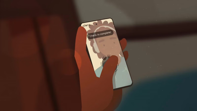
Alone App Launch Video Animation
2
7
2
Novades Animated Explainer
2
19
Animator
(4)
Follow
Message
Get Sparked Studio
Eindhoven, Netherlands
Visual & Motion Brand Designer
New to Contra
Follow
Message
Visual & Motion Brand Designer
1
Happy Horizon is a creative marketing company operating across multiple strategic business pillars. One of these pillars focuses on Development & Technology, addressing complex digital challenges through innovation, engineering and scalable solutions. To communicate this expertise within a live event setting, Happy Horizon commissioned the creation of a dedicated showreel. Brief & Strategic Challenge The objective of the project was to develop a concise yet expressive showreel that would promote the Development & Technology pillar within a limited runtime of 1 minute and 10 seconds. The animation was intended for continuous playback on a large-scale LED screen (5 × 3 metres) as part of a branded event stand. As audio could not be relied upon in this environment, the narrative needed to be fully comprehensible without sound; placing a strong emphasis on visual clarity, rhythm and hierarchy. Concept Development & Script Structuring The process began with a collaborative brainstorming session alongside the marketing team. Together, we defined the core narrative and messaging framework of the showreel. Based on this session, a high-level script structure was shaped and subsequently finalized. This phase marked the primary point of collaboration within the project. Visual Translation & Storyboarding Following script approval, the responsibility for translating the narrative into a visual language lay entirely with me. I developed a dedicated sub-style that aligned with Happy Horizon’s existing brand identity while distinctly supporting the Development & Technology pillar. This included the full visual concept, compositional logic and a detailed storyboard that defined sequencing, rhythm and visual hierarchy throughout the showreel. Animation & Final Production Based on the approved storyboard, I started animating the complete showreel. The animation focuses on dynamic motion, fluid transitions and carefully structured compositions to express guidance, progress and technological clarity. Through abstract visual metaphors and directional movement, the showreel positions Happy Horizon as a partner capable of navigating complexity and creating a clear horizon for its clients. The final result functions as both an aesthetic statement and a highly legible brand asset optimized for repeated, soundless viewing.
1
33
1
Acknowledge ICT is a forward-thinking technology partner known for its innovative digital solutions and human-centred approach. As the company entered a new phase marked by a complete rebranding, they sought a compelling way to introduce their renewed identity to the market. To support this transition, I was commissioned to design and animate a series of brand-reveal assets tailored for their digital launch. Project scope The initial brief focused on creating animation concepts to highlight the evolution of the brand, while emphasizing Acknowledge ICT's core pillars. Produced in three formats suitable for multiple digital platforms. These variations ensured flexibility across social feeds, stories, and widescreen displays. Concept Development Concept 1. Transition From Old to New The first animation concept visualised the transformation by showing the old logo seamlessly evolving into the new. This narrative underscored the continuity of the brand while signalling progress and refinement. After the transition, each organisational pillar was showcased through dynamic motion, forming a strong introduction to the renewed brand identity. Concept 2. Immediate Brand Confidence The second concept adopted a more direct approach. It focuses on the new logo and brand mark, immediately establishing the updated brand presence. Sequential highlights of the core pillars follow, supported by a strong motion system that reinforced attention and remembrance. Visual Style & Motion System The visual style of the animations is grounded in the newly developed brand identity, matching to the updated colour palette, typography, and geometric forms defined in the brand documentation. At the client’s request, the visual system should aim to elevate beyond what is presented in the new brand manual, adding more dynamism, depth, and visual impact appropriate for a brand-reveal moment. A central element in this elevation is the use of the brandmark; internally known as the “Ackie.” Within the animation, the Ackie moves fluidly through the composition, at times even in a therefore created 3D form, leaving behind a recognizable visual trail. This motion reinforces the brand’s technical expertise while generating a sense of momentum and transformation. Because a brand reveal must instantly capture attention, the animation is designed to make an impact within the first three seconds. The introduction is concise and direct, immediately drawing the viewer in before transitioning into smoother, fully eased movements of the Ackie and the supporting pillars. All shapes follow a motion system rooted in fluidity, precision, and digital finesse; reflecting both the renewed visual identity and the technological strength of Acknowledge ICT. Emotion & Motion Language The emotional tone of the animation was designed to reflect the inherently digital nature of Acknowledge ICT. Movements are fast, smooth, and deliberately catchy; mirroring the efficiency, agility, and technical sharpness of the services the company provides. The motion system leverages clean accelerations, decisive transitions, and rhythmic visual pacing to create an energetic yet coherent flow. By developing the brand mark into a refined 3D asset, the animations gain depth and dimensionality. One recurring sequence features the signature brand shape sweeping dynamically over the previous logo, giving rise to the new mark in a fluid, almost swoosh-like gesture. This not only symbolises progression but also maximises the forward thinking mindset of the brand. Sound Design Alongside the visuals, I developed the full sound design to enhance the impact of the brand reveal. The audio direction aligns with the highly digital character of Acknowledge ICT: sharp glitches, rapid electronic textures, and impactful transitions support the sensation of technological precision. The composition remains intentionally bold and bombastic, appropriate for announcing something monumental and new. To reinforce brand recognition, a custom outro jingle was created. Its melody is built from tonal “bleeps” shaped around the phonetic sound of “Á”, the first audible element in the brand name ''Acknowledge''. This sonic signature introduces a memorable, ownable sound identity, ensuring continuity across future communication touchpoints. Formats & Deliverables Each concept was delivered in the three required formats: 1080×1350, 1080×1920, and 1920×1080 pixels. Optimised for performance across Instagram, Snapchat, LinkedIn, and widescreen channels. This ensured a cohesive brand reveal across every touchpoint, regardless of device or platform. Outcome The final animations offered Acknowledge ICT a polished and compelling launch asset for their rebranding. By pairing strategic storytelling with refined motion design, the brand reveal successfully communicated both continuity and evolution, positioning Acknowledge ICT as a confident, modern leader within the ICT landscape.
1
47
2
Four+One is a modern HR recruitment and consultancy agency that connects highly educated professionals with organizations in both permanent and interim roles. Their approach goes far beyond matching skills to vacancies; they focus on creating meaningful, long-term connections between people and companies. They approached me to develop a premium brand identity that would reflect this deeply human-centred philosophy. Brand naming & Concept We started with a collaborative naming session. The founders were struggling to land on a name that captured both their collective strength and their ambition to go beyond the conventional. They wanted something numerical; a reference to the five founders. I proposed Four+One: a name that represents the group of five while emphasising the “+one” as the step further they consistently take for both clients and candidates. Coincidentally, one of the founders had only that morning decided to officially join the team, making the name feel not only fitting but profoundly meaningful. That moment solidified the identity of Four+One, and set the foundation for everything that followed. Research & Strategy The process began with market and audience research within the HR and consultancy landscape, specifically targeting the highly educated segment. It quickly became clear that most competitors relied on overly generic visuals, predictable stock imagery and a tone of voice lacking emotional depth or differentiation. Resulting in brands that felt interchangeable rather than intentional. Four+One, however, speaks to two complementary audiences: highly skilled professionals on one side, and forward-thinking organizations investing in long-term growth on the other. While these audiences share ambition, expertise and the desire to make meaningful connections, each requires a tailored approach within one coherent visual system. By identifying the overlapping values between them, we arrived at a core triad of humanity, professionalism and energy. This combination of reliability, intellectual sharpness and visual refinement resonates strongly with both groups. With a tone of voice that is both confident and accessible, and a visual style that communicates calmness as well as distinction, Four+One positions itself as a recruitment partner of the highest calibre. Four+One’s overarching brand strategy centred on a unique balance of warmth, softness and confident boldness, positioning the brand as deeply human while also distinctly uplifting. Three strategic pillars shaped the foundation: Warm & Soft: celebrating the human element, personal interaction and authentic connection. Bold & Confident: reflecting the ambition and forward-thinking mindset of highly skilled professionals and organizations. Energy & Uplifting: ensuring the identity feels modern, memorable and energetic, while maintaining an approachable softness. Visual Identity The logo system is constructed from five geometric human figures; more precisely, five bodies sharing a single face. This symbolic form represents the five founders and their collaborative pact: five individuals, one unified entity. Together, these shapes create a singular character that expresses the bridge-building role Four+One plays between employers and candidates. The logomark is filled with a semi-soft gradient that conveys both powerful energy and human warmth. The colour palette draws inspiration from a natural sunset captured by one of the founders at his second home in Portugal; a warm orange dissolving into deep bluish-purple. These hues became the foundation of the identity: warm tones to emphasise humanity and connection, and cool tones to represent professionalism, clarity and precision. Typography and layout follow a clean, timeless structure that balances sophistication with approachability, strengthening credibility without losing warmth. Other Applications Beyond the core identity, I also developed their recruitment proposal as well as the look and feel for their homepage. The homepage concept communicates both the emotional warmth behind the brand and its confident professionalism, translating the visual identity into a modern, intuitive digital experience. The recruitment proposal was developed as a scalable template, built with visual calm, clarity and refinement. Outcome Four+One’s brand identity merges emotional humanity with sharp professionalism. It redefines how recruitment agencies can present themselves: warm, energetic, confident and deeply rooted in the power of genuine human connection.
1
2
109
1
ProFusion is a high-end padel clinic concept that positions sport as a strategic instrument for professional growth. Operating at the intersection of athletic performance and business development, ProFusion designs curated padel experiences for technology-driven organizations, with a deliberate focus on collaboration, leadership and connection across hierarchical levels. Strategic Foundation and Brand Essence At its core, ProFusion is built on the belief that sustainable performance is never purely individual. In both sport and business, excellence emerges through alignment, trust and shared strategy. The brand name itself reflects this philosophy: a fusion of professional ambition and collective energy, translating the dynamics of padel into a business-relevant context. Rather than positioning its clinics as recreational off-sites, ProFusion frames them as transformative environments. Participants are temporarily removed from the rigidity of the office setting and immersed in an experience where anticipation, communication and adaptability become tangible. The clinics are designed to strengthen interpersonal dynamics, stimulate strategic thinking and ultimately enable teams to perform at a higher level together. Target Audience ProFusion primarily addresses organizations within the technology sector, where innovation, speed and collaboration are essential to success. The clinics are intentionally structured around mixed seniority participation: each company is represented by both junior and senior professionals. This dual-level approach serves a strategic purpose. Juniors bring fresh perspectives, agility and curiosity, while seniors contribute experience, decision-making authority and long-term vision. Through shared physical activity and informal interaction, traditional hierarchies soften, enabling authentic dialogue and mutual understanding. Value Proposition and Key Differentiators ProFusion distinguishes itself through a carefully curated, high-end experience that extends beyond the court. Key brand pillars include: Premium padel clinics with a strong focus on quality and professionalism Structured networking moments that facilitate meaningful B2B connections Thought-provoking speakers who bridge sport and business strategy A deliberate mix of junior and senior participants to stimulate cross-level interaction Together, these elements position ProFusion as both a learning environment and a networking platform, where performance, play and professional development converge. Market Analysis and Positioning An exploratory analysis of existing padel clubs, clinics and related events revealed a highly saturated visual landscape. Most competitors rely on literal, illustrative identities featuring direct representations of padel rackets and balls. While functional, these identities often appear dated, interchangeable and lacking in professional credibility. Given padel’s rapid growth and contemporary appeal, this visual conservatism presents a clear opportunity. For ProFusion, the strategic choice was to avoid illustrative clichés and instead develop a refined, abstract visual language that aligns with the expectations of a corporate, technology-oriented audience. Concept Development and Moodboard Phase As part of the brand strategy process, a dedicated moodboard phase was conducted to align vision and expectations. Two distinct stylistic directions were presented to the founders. The first explored a more abstract interpretation of connection and play, while the second maintained a clearer reference to padel without resorting to literal imagery. This phase functioned not only as a visual exploration, but also as a strategic dialogue. It created space to articulate preferences, boundaries and long-term ambition. Ultimately, the founders selected the direction that subtly references padel while preserving a strong sense of professionalism and clarity. Logo Design & Symbolism The Costa del Son logo is constructed from four conceptual pillars: Spain, festival culture, Gaudí and chique refinement. Typography and illustration merge into a single system, with custom-drawn letterforms reinforcing the handcrafted quality of the identity. Visual elements within the logo include a semi-circular form referencing a Spanish fan or the sun; a flowing underline that represents music and festival movement; a salamander or dragon symbolising Gaudí’s architectural motifs; and a typographic ligature that conveys elegance and cohesion. The logo system was delivered in three variations: a primary illustrated logo, a secondary wordmark and a tertiary sticker-style version for flexible application. Graphic Language and Structure The final visual identity is highly graphic and built from fundamental geometric shapes. Both the wordmark and symbol are derived from circles and modular forms inspired by the ball and racket, abstracted to avoid direct illustration. The coming together of four forms symbolizes the dynamics of padel as well as collaboration, exchange and shared momentum. Network structures and directional elements are integrated throughout the system to prevent visual stagnation and to reflect speed, interaction and progression. The colour palette reinforces the balance between professionalism and energy. Deep, grounded tones establish authority and trust, while vibrant accents inject movement and vitality. Together, they mirror the dual nature of ProFusion: strategic and composed, yet dynamic and competitive. Each colour is contributing to a hierarchy that supports both clarity and contrast across applications. Typography plays a central role in reinforcing coherence and tone. The primary typeface is rooted in geometric construction, closely aligning with the modular logic of the logo. Its balanced proportions and open forms ensure legibility across both digital and print contexts, making it highly suitable for body text and functional communication. The secondary typeface introduces a refined layer of character. Its bold, geometric, rounded structure, creates a controlled sense of playfulness without compromising professionalism. This typeface is primarily deployed in headlines and accent elements, reinforcing distinction and hierarchy within the visual system. The logo is composed of four circular forms arranged in a square configuration. Each circle is extended with a triangular element, abstractly referencing padel rackets while simultaneously symbolizing interaction and convergence. The use of multiple colours within the symbol reinforces diversity, collaboration and movement. Within the wordmark, several typographic interventions add conceptual depth. The modified tail of the letter P subtly resembles a speech bubble, referencing dialogue and networking. The adapted F introduces curved segments that emphasize speed and flow. The vivid green dot on the I stands apart from the otherwise restrained wordmark, functioning as a visual metaphor for the ball and a focal point within the composition. Brand Extensions and Applications To ensure consistency and scalability, the identity was extended across a comprehensive range of assets. These include graphic patterns, modular visual elements, social media templates, flags, branded cups and custom padel rackets. Each application reinforces the core system while allowing for variation and adaptability across physical and digital touch points. Outcome The ProFusion brand identity translates an abstract strategic concept into a coherent visual system. By avoiding literal sports symbolism and focusing instead on structure, rhythm and interaction, the identity positions ProFusion as a credible, future-oriented platform for professional connection through sport.
1
33
Animator
(3)
Follow
Message
Veronika
Eindhoven, Netherlands
Motion graphic designer
Follow
Message
Motion graphic designer
1
Logo animation for hopshop.ru
1
5
0
Infinity
0
10
0
Retro singer
0
9
View more →
Animator
(1)
Follow
Message
Explore people