Brand Designer & Strategist


Brand & Visual Identity Designer
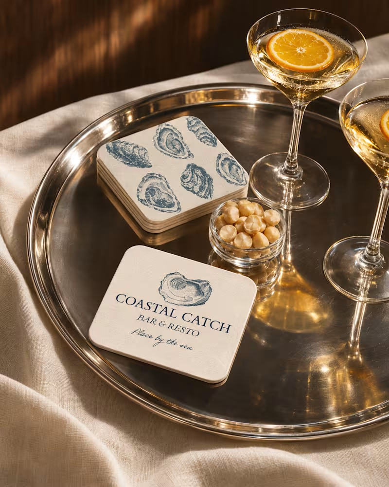
INSPIRED BY THE COAST
The identity draws inspiration from the natural textures of the sea, the timeless character of vintage oyster illustrations, and the understated elegance of coastal living. Every detail reflects a balance between sophistication and simplicity.
1
115
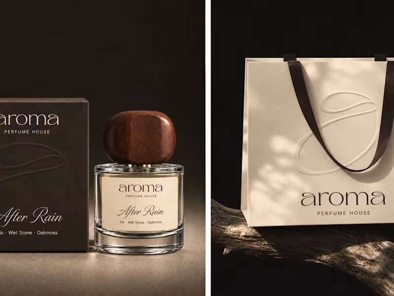
aroma Perfume House — Visual Identity & Packaging
For aroma, I wanted to give shape to the trace a fragrance leaves on skin. I started with the lowercase a that opens and closes the wordmark. Its fine loop became the signature of the identity, from the curve of a paper scent strip to a raised line that runs across three fragrance boxes when they sit side by side.
Espresso brown and warm ivory carry through the packaging, campaign imagery, and digital storefront. On the cartons, the curve catches the light before you feel it under your fingertips. A peel-away label becomes a scent strip and reveals the words Close to skin. Opening the box becomes the first part of trying the fragrance.
2
1
128
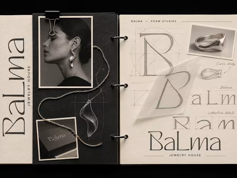
BALMA Jewelry House | Brand Identity
BALMA | Jewelry House Where jewelry meets art, and elegance becomes a statement. BALMA’s visual identity is built around the concept of quiet luxury, timeless elegance, and artistic expression. Inspired by sculptural forms and organic curves, the identity reflects a jewelry house where every piece is more than an accessory — it is a work of art. The custom-inspired serif wordmark embodies sophistication and femininity through delicate proportions and refined typography. A palette of deep black, warm ivory, and metallic silver creates a distinctive visual language that balances boldness with softness. From the editorial photography to the minimal compositions and carefully curated details, every element celebrates the beauty of craftsmanship and the art of wearing jewelry. BALMA — Sculpted to be worn. Visual Identity & Art Direction by me.
2
3
156

Brand identity & Framer websites for startups
- 1x
- Hired
- 23
- Followers
Brand identity & Framer websites for startups

UI/UX & Brand Designer | Framer • Webflow • Shopify
UI/UX & Brand Designer | Framer • Webflow • Shopify

Corporate Visual Artist & Designer
Corporate Visual Artist & Designer


Art Director: Digital/Print, Motion, UI, Branding
Art Director: Digital/Print, Motion, UI, Branding


View more →

14+ Years Crafting Minimalist Logos & Brands ✨
14+ Years Crafting Minimalist Logos & Brands ✨


Experienced Logo, Branding & UI Designer
Experienced Logo, Branding & UI Designer