Webflow Development Projects in Dhaka DivisionWebflow Development Projects in Dhaka DivisionFlower Library | Astera Flower Shop
Webflow, Handly template + Custom design
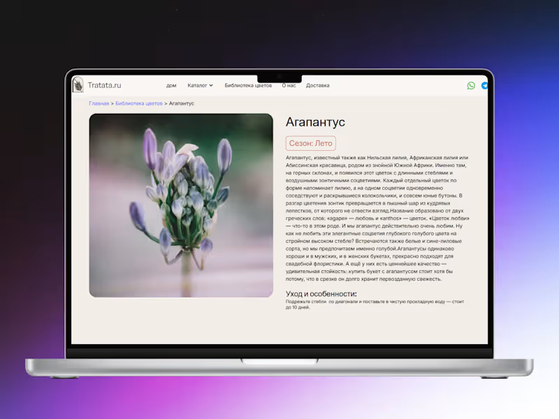
This project is a single-page Flower Gallery built in Webflow for a Russian flower shop, designed as an alphabetically organized flower library with a strong focus on structure, navigation, and content scalability. The page includes a sticky alphabetical navigation system that allows users to quickly jump between sections, improving usability for a large dataset. A CMS collection of 143 flowers powers the entire library, with each entry dynamically generated from structured data including names, descriptions, and images. A dedicated CMS template was also created for individual flower detail pages, ensuring consistent design and dynamic content rendering across all items. The final result is a highly organized, fast, and scalable system that makes browsing a large flower database intuitive and efficient. AI can generate a design. But it can't make your customer FEEL premium.
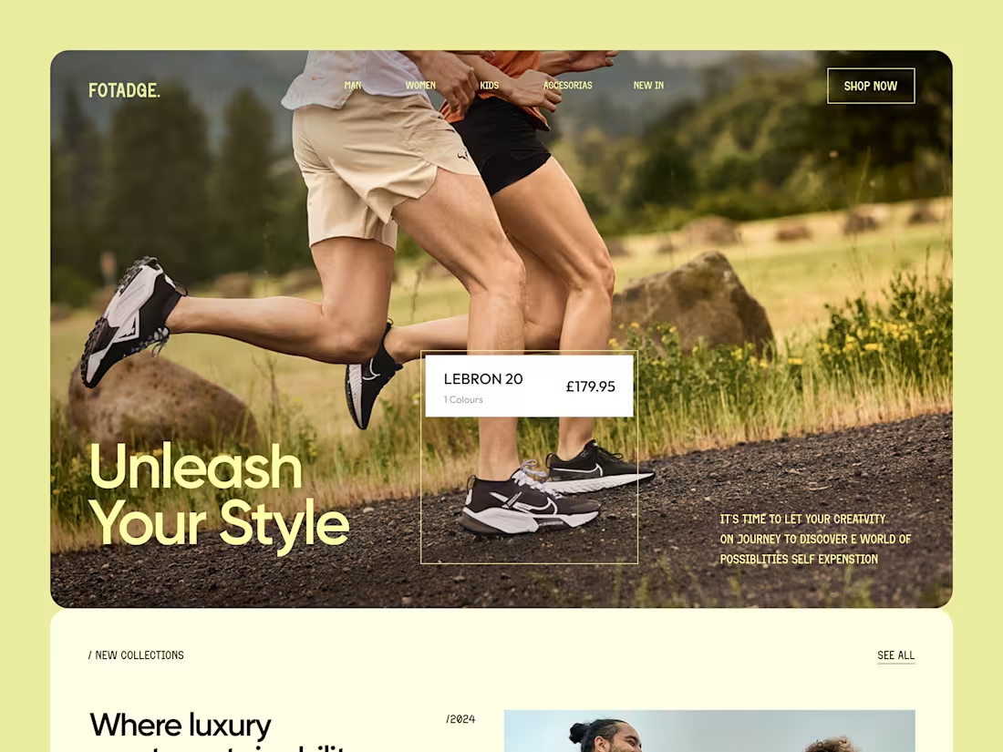
AI is great for quick ideas and rough prototypes but when it comes to clean, modern, conversion-focused design? That still takes a human touch.
Human-made design doesn't just look good. It builds trust, communicates credibility, attracts premium clients, and turns casual visitors into loyal buyers.
Think about it when you land on a website that looks polished, organized, and intentional, you instantly trust that brand more.
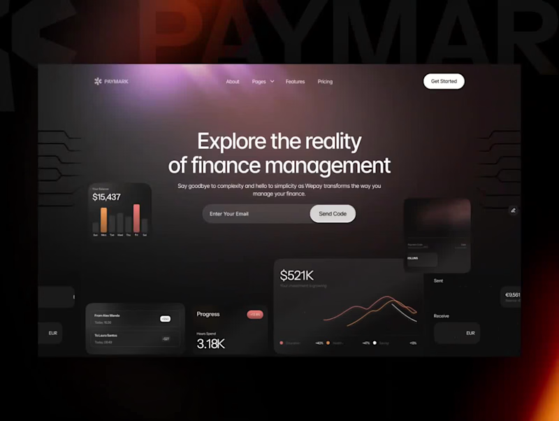
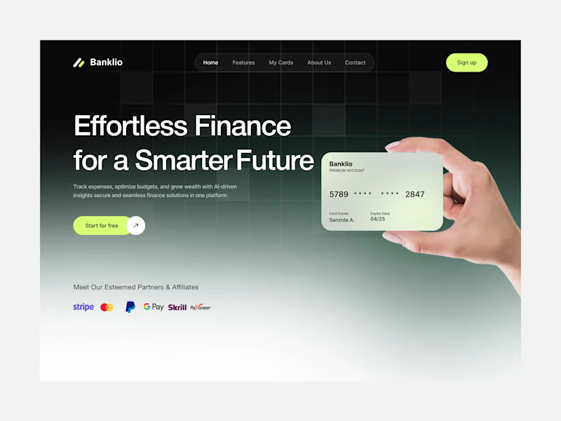
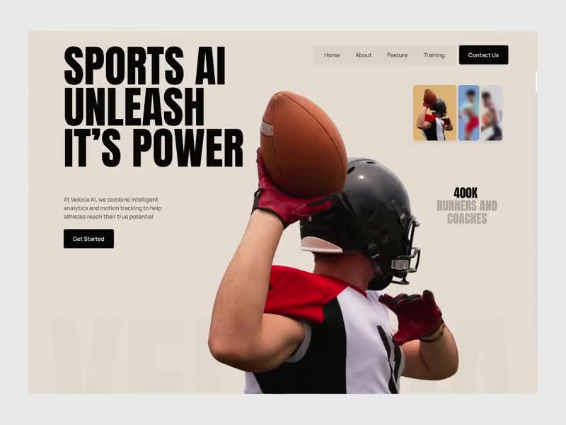
If your website, app, or digital product still looks outdated or "AI-generated" you're leaving money on the table. Your competitors aren't.
Your brand deserves better than average.
✦ Clean. Organized. Premium. Professional.
We help businesses transform their websites, apps, and digital products into premium, visual appealing and modern that actually sell not just exist.
Ready to upgrade? Let's talk. 👇 Case Study: Turning a Client’s Webflow Website Into a Cleaner, More Responsive & User-Friendly Experience
Sometimes a project does not start with a full rebuild.
Sometimes it starts with one simple question from a client:
“Can you review my current website and tell me how it can be improved? (https://www.woma.health/)”
That is precisely how this project began.
The client reached out to me because she already had a website, but it was not looking or performing the way she wanted. She shared the existing website link with me, and after reviewing it carefully, I noticed that the site was built in Webflow.
Since Webflow is one of the platforms I work with confidently, I explained that we did not need to start everything from zero. Instead, we could improve the current structure, optimize the layout, make the design more polished, and create a better experience for visitors.
After that, the client asked me how I would improve it.
So, I reviewed the website in more detail and shared my thoughts about the layout, section structure, responsiveness, and overall user journey. During that discussion, she mentioned that she had already created a Figma design for the updated version of the website.
She shared the Figma file with me, and I went through the full design carefully. Some sections were already well thought out by the client, while a few areas needed improvement. I suggested updates where needed, and she also refined some parts based on the information she wanted to present to her visitors.
Once the website access was shared, I checked the Webflow structure properly. The client had started working on some sections herself, especially the blog area, but there were a few technical and layout-related issues that needed to be addressed.
After we finalized the project scope and budget, I started the development work.
The goal was not to make the website overly animated or visually complicated. The client wanted the website to feel clean, balanced, informative, and easy to navigate. Her visitors needed to understand the content clearly, so the focus was on readability, spacing, mobile responsiveness, and a smooth browsing experience.
One of the most important parts of this project was making sure the design looked great across different devices.
The desktop version had to feel polished, but the mobile version was equally important. I carefully adjusted the spacing, typography, layout behavior, and responsive structure so users could easily read and interact with the website from any screen size.
Another key part of the project was the blog page.
At one point, the client wanted to organize the blog content in a better way. She asked if we could add a filtering system so visitors could browse posts based on specific categories.
I suggested a category-based filtering system, where users could click on a category and instantly see only the relevant posts. This made the blog page much easier to use and helped visitors find the content they were looking for faster.
To make the idea clear, I first created a sample version inside the website and showed it to the client. She really liked the concept. After that, she created another Figma design for the blog page, and we refined it together with a few additional suggestions.
The final blog page became simple, clean, and user-friendly — exactly what the website needed.
This project was a true collaboration between the client’s creative direction and my Webflow development expertise.
The client had a clear vision for how she wanted to communicate with her audience. My role was to bring that vision into Webflow properly, make the layout responsive, improve the technical structure, and ensure the website felt balanced and professional.
The result was a much cleaner, more polished, and more user-friendly website.
What I really enjoyed about this project was the collaboration. The client was involved in the creative process, open to suggestions, and focused on creating something meaningful for her visitors.
Even after completing the main work, she continues to reach out whenever she needs help or updates. That kind of long-term client relationship is always valuable to me because it shows trust, communication, and satisfaction with the work.
Project Highlights:
✅ Existing Webflow website review
✅ Figma design implementation
✅ Layout and section improvements
✅ Mobile responsiveness optimization
✅ Blog page restructuring
✅ Category-based blog filtering system
✅ Clean, balanced, and user-friendly design
✅ Ongoing client support and collaboration
This project is a great example of how a website does not always need to be rebuilt from scratch.
Sometimes, with the right strategy, clean execution, and thoughtful improvements, an existing website can be transformed into something much more professional, functional, and aligned with the client’s goals.