
Creative 3D Web & AI Eng. Breaking Browser's Absolute Limits
- 5.0
- Rating
- 33
- Followers
Creative 3D Web & AI Eng. Breaking Browser's Absolute Limits
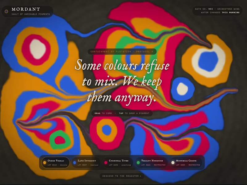
MORDANT: Vault of Unmixable Pigments (https://samincollection2.netlify.app/mordant)
Colours that refuse to mix, combed on water in a stone trough. The Mordant Vault guards colours that refuse to blend. Float them on water. Comb them. Never, under any circumstance, stir.
I built this project to test Colours that refuse to mix, combed on water in a stone trough. The Mordant Vault guards colours that refuse to blend. Float them on water. Comb them. Never, under any circumstance, stir. The core engineering challenge was sustaining uncompromised 60 FPS rendering using WebGL / GLSL Shaders while handling continuous user interaction without framework overhead.
WHAT I WAS TESTING:
I focused on two core engineering benchmarks:
Precision implementation of shader marbling under continuous interactive user input
Sustained 60 FPS render performance and zero-dependency browser execution
THE TECHNICAL SIDE:
Engineered directly in the browser with WebGL / GLSL Shaders, Canvas2D, Shader marbling. The application runs without third-party frameworks or build-step dependencies, using hardware-accelerated rendering and custom event loops to achieve zero-latency response.
Everything executes in the browser using WebGL / GLSL Shaders, Canvas2D, Shader marbling. No third-party frameworks, no heavy runtime bundles, and zero external tracking.
WHAT I LEARNED:
Balancing the mathematical rigors of shader marbling with tactile browser interaction required tuning event throttling and memory allocation to eliminate all garbage collection stutters.
Finding the sweet spot between mathematical precision and frame budget took careful profiling, but the result runs at a steady 60 FPS even on modest hardware.
TRY IT YOURSELF:
(https://samincollection2.netlify.app/mordant)The live build is deployed on Netlify. Open it in your browser, test the controls, and observe the render response times.
If you are building high-performance 3D, physics, or creative web systems and want to collaborate, reach out here on Contra.
16
21
3.9K
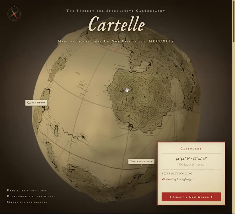
CARTELLE: The Society for Speculative Cartography.
(https://samincollection2.netlify.app/cartelle)"High-Performance Creative Web Exploration"
Drag a procedurally inked globe of places that don't exist. An archive of maps of places that do not exist. The Society for Speculative Cartography charts imaginary worlds with scholarly rigor and unreasonable devotion.
I built this project to test Drag a procedurally inked globe of places that don't exist. An archive of maps of places that do not exist. The Society for Speculative Cartography charts imaginary worlds with scholarly rigor and unreasonable devotion. The core engineering challenge was sustaining uncompromised 60 FPS rendering using Three.js (GLB 3D) while handling continuous user interaction without framework overhead.
WHAT I WAS TESTING:
I focused on two core engineering benchmarks:
Precision implementation of procedural globe under continuous interactive user input
Sustained 60 FPS render performance and zero-dependency browser execution
THE TECHNICAL SIDE:
Engineered directly in the browser with Three.js (GLB 3D), WebGL / GLSL Shaders, Canvas2D, Procedural globe. The application runs without third-party frameworks or build-step dependencies, using hardware-accelerated rendering and custom event loops to achieve zero-latency response.
Everything executes in the browser using Three.js (GLB 3D), WebGL / GLSL Shaders, Canvas2D, Procedural globe. No third-party frameworks, no heavy runtime bundles, and zero external tracking.
WHAT I LEARNED:
Balancing the mathematical rigors of procedural globe with tactile browser interaction required tuning event throttling and memory allocation to eliminate all garbage collection stutters.
Finding the sweet spot between mathematical precision and frame budget took careful profiling, but the result runs at a steady 60 FPS even on modest hardware.
TRY IT YOURSELF:
(https://samincollection2.netlify.app/cartelle)The live build is deployed on Netlify. Open it in your browser, test the controls, and observe the render response times.
If you are building high-performance 3D, physics, or creative web systems and want to collaborate, reach out here on Contra.
6
17
2K
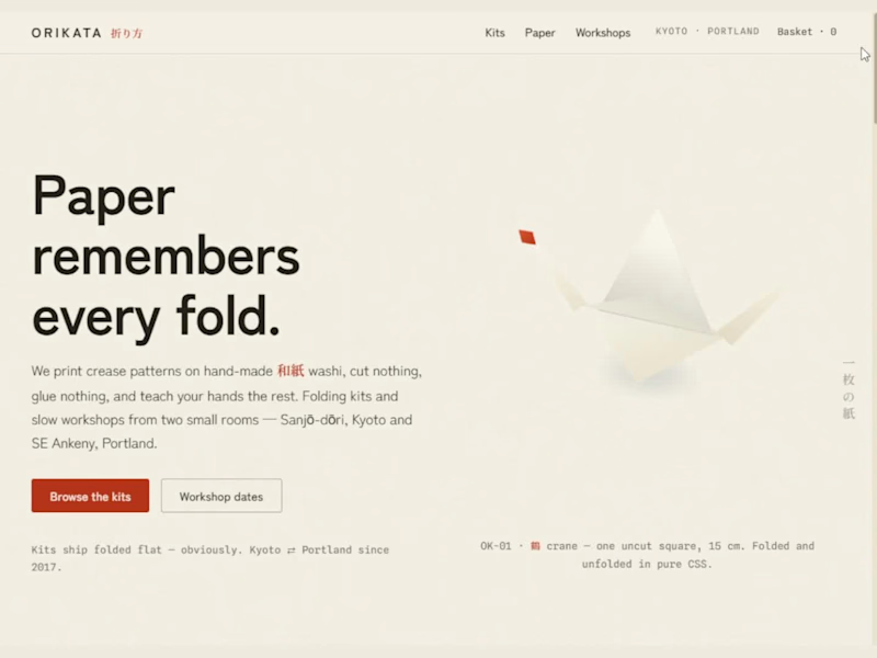
Orikata: Tactile E-Commerce and Pure CSS Origami (https://samincollection.netlify.app/sites/orikata/index.html)
Orikata is an online shop for a paper studio. The studio is based in Kyoto and Portland. The hero section shows a 3D paper craft. The paper folds and opens using pure CSS. It uses flat looking shapes and CSS 3D animations. The site does not load any heavy 3D models or interactions.
The shop sells folding kits and paper crafts. Product cards shows technical diagrams. These cards show folding lines, steps, and difficulties.
Users can add them to a live cart. The cart runs on vanilla JavaScript. The item count updates instantly without a page refresh. Visitors can also check seat openings for in-person experience. The design uses light and cream paper colors with purple/indigo accents.
The CSS fold motion looks cool but took work. The shapes rotate along confusing angles at the start. When all parts folded at the exact same speed, it looked stiff and resembled a poor design. I had to delay the folding animations by a fraction of a second. That small but frustrating delay made the paper movement look premium and natural.😊
14
895
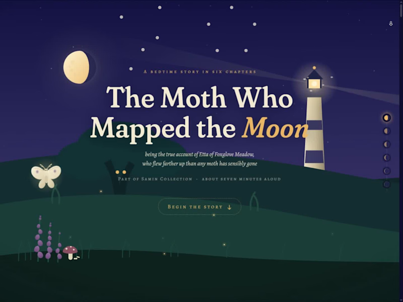
The Moth Who Mapped the Moon: Interactive Scroll Storybook.
(https://samincollection.netlify.app/sites/mothmoon/index.html) "Turning a six chapter bedtime story into a scroll animated journey from a land to the moon"
"The Moth Who Mapped the Moon" is an interactive storybook I built. It is a six chapter bedtime story. Every websites in this modern 2026 era scrolls from top to bottom, but here the scroll moves the camera upper into the sky. The story reader follows a small moth named Etta traveling from land, move past a lighthouse, all the way to the stars and then moon.
Every chapter changes the background as you scroll down. The grass and lighthouse fade away, stars connect with silver lines, and the moon grows larger. A small moon position indicator on the right side of the screen tracks reading progress.
The graphics use vector illustrations and CSS animations, it is connected with a custom JavaScript scrolling. The script calculates Etta's position, wing movements, and background motion based on mouse scrolling. To keep the website responsive and smooth on new and old mobile devices, excessive background details like fireflies, the light from lighthouse, and the owl animate where only necessary.
The main challenge was balancing scroll speed. If the scenery moved too quickly, the text became hard to read. If it moved too slowly, the website felt boring. Placing the typography inside "almost close to" transparent looking cards kept the text readable over the dark sky without feeling gibberish.😊
14
1.2K


3D WebGL Developer & Full-Stack Next.js 14 Engineer
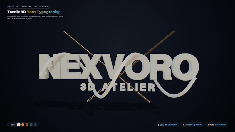
Type meets Tactile Knitwear: Procedural 3D Yarn Typography in WebGL 🧵✨
Tired of flat 2D fonts, we explored what happens when digital letterforms are sculpted directly from physical apparel textures.
Introducing the Nexvoro 3D Yarn Typography experiment—built for the #Typography trend!
✨ Technical Details:
• Procedural V-shaped knit wale loops mapped to 3D extruded geometry
• PBR optical micro-fiber fuzz simulating 100% Cashmere & Merino wool
• Continuous Catmull-Rom 3D spline yarn thread weaving through the letterforms
• Real-time fiber colorway swatches at locked 60 FPS in Three.js & Next.js 14
The intersection of fashion tech, creative coding, and typography.
👉 Test the live interactive 3D type: https://www.nexvoro.tech/demos/yarn-typography
(https://www.nexvoro.tech/demos/yarn-typography)🌐 Studio builds: https://www.nexvoro.tech
Would love to hear your feedback on the texture and depth! What do you think?
#typography #threejs #webgl #creativecoding #digitalfashion #3ddesign
0
39
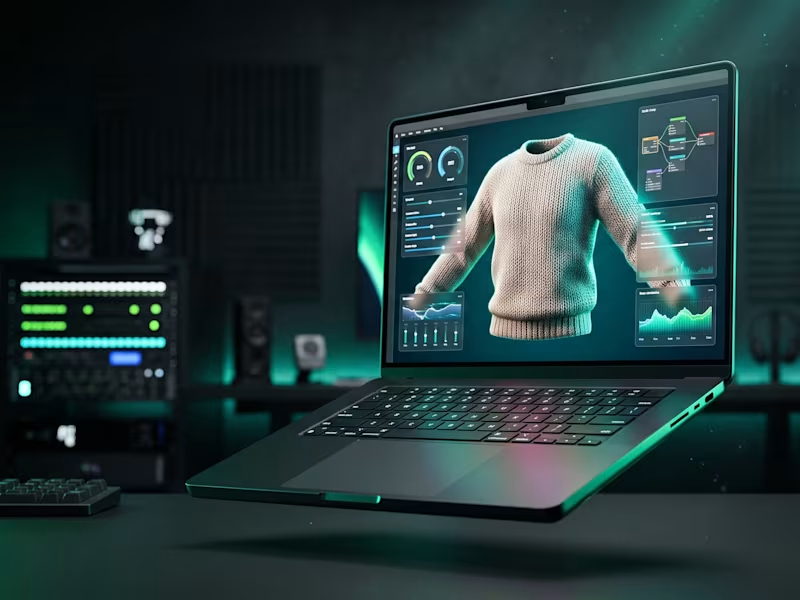
🧵 The future of apparel eCommerce isn’t flat.
Just dropped our new project at Nexvoro Studio: The Spatial 3D Knitwear Atelier.
Built on Three.js & WebGL 2.0 with 22,000+ procedural yarn stitches, real-time Cashmere/Merino fiber switching, and a locked 60 FPS 360° orbit.
👉 Test live: https://www.nexvoro.tech/demos/3d-knit-studio
(https://www.nexvoro.tech/demos/3d-knit-studio)👉 Studio: https://www.nexvoro.tech
Open for bespoke 3D configurators and luxury web builds. Let’s collaborate! ⚡
#threejs #webgl #fashiontech #ecommerce #digitalfashion
0
43

Bringing fine jewelry to life in real-time 3D ✨
Static photos don't cut it for high-ticket pieces. We built an interactive 3D Ring Atelier where buyers can customize diamond cuts, metals, and carats with real-time pricing—running at 60 FPS on mobile.
Average session dwell time jumped from 50s to nearly 4 minutes.
Live demo: https://www.nexvoro.tech/jewelry
Would love your thoughts!
2
0
71
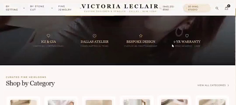
💎 Just launched an ultra-luxury 3D fine jewelry boutique & interactive customizer: Victoria LeClair Atelier.
Static product images are no longer enough for luxury eCommerce. High-ticket buyers want to inspect diamond cuts, test metal karats, and feel the craft before purchasing.
✨ Key Highlights:
• Real-time 3D ring customizer built with Three.js & WebGL
• Dynamic metal swapping (18k Yellow Gold, Rose Gold, Platinum)
• Live gemstone & diamond cut transitions (Pear, Round, Emerald, Radiant)
• Real-time carat pricing calculation & custom engraving preview
• Mobile-optimized at 60 FPS with custom diamond sparkle shaders
• Full luxury boutique storefront with curated collections & seamless checkout
Built with Next.js, Three.js, and Tailwind CSS.
🔗 Experience the live atelier: https://www.nexvoro.tech/jewelry
(https://www.nexvoro.tech/jewelry)Interactive 3D configurator: https://www.nexvoro.tech/demos/custom-ring
Would love to hear your feedback! Are you building 3D eCommerce experiences for your brand? Let’s connect!
9
2
422

Next.js landing pages with interactive product heroes.
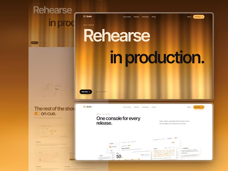
Scrim is a landing page I designed and built for a feature-flag and staged-rollout product.
A scrim is the theatre gauze that hides a set until it's lit from behind. Feature flags do the same with code, so I staged the whole page as a show: a silk curtain opens it and falls closed again at the end.
Some of the moments:
- The curtain is live WebGL silk, backlit from deep umber to pale gold. Its folds part toward your pointer.
- The product console arrives lying flat on the stage floor and hinges up to face you. Keep scrolling and it comes apart into its four cards, at different depths, and stays that way as the section leaves.
- "40 ms" counts down to "0.04 ms" as you scroll, next to a code window in four languages.
- Pricing is a theatre ticket. Drag to your number of users and it reprints itself for the plan that fits.
- Every FAQ answer sits behind its own feature flag. Switch one on and it rolls out to you.
- At the end the same curtain falls closed, with "Break a leg." printed across it.
The product UI is all HTML, CSS and SVG, with no image files. Built with Next.js 16, Tailwind CSS v4 and Lenis.
Live link: https://scrim-seven.vercel.app (https://scrim-seven.vercel.app/)
0
69
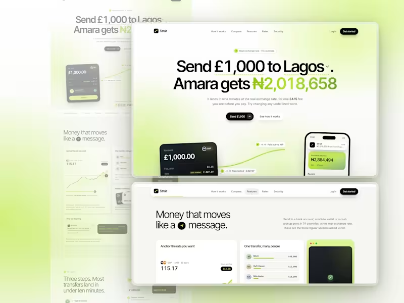
🔥 Strait is a Next.js landing page for a money transfer app, crafted entirely with Claude on high settings. The headline is a working calculator: change the amount, currency or city, and the payout updates. Below it, the money travels from a send card into the recipient's banking app.
It's lime, white and black, smooth on mobile, and built with Next.js 16, Tailwind CSS v4 and TypeScript. There are no image files.
https://strait-tau.vercel.app/
2
178
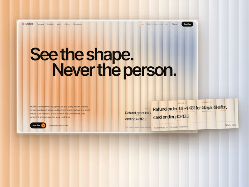
Mullion is a landing page I designed and built for an AI privacy product: a gateway that swaps names, emails and card numbers for tokens before a prompt reaches a model, and puts them back when the answer comes home.
Reeded glass lets the light through and keeps the detail back. You can see someone's shape behind it, never who they are. That's exactly what the product does to a prompt, so the hero is a live pane of reeded glass in daylight, and everything personal on the page sits behind the same ribs.
Live: https://mullion-phi.vercel.app (https://mullion-phi.vercel.app/)
1
5
297
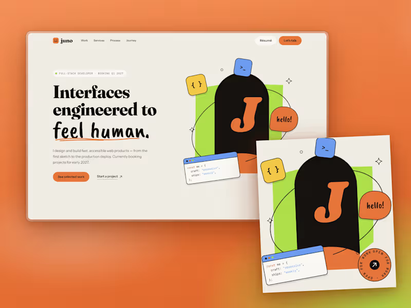
Designing a developer portfolio that doesn't look like a template
The brief
Build a developer portfolio in Next.js and Tailwind. No generic AI-looking hero. Dribbble-level polish.
The starting point
I took a reference site with a warm cream background, a chunky serif, a handwritten accent and a photo cutout over a lime shape. The rule was to take inspiration, not copy: borrow the mood, the type pairing and how elements are placed, then make it a different page.
Decision 1: replace the photo with a composition
A portfolio template can't ship someone's face, so I built the hero from code instead. A lime slab, an ink arch holding your initial, an orbit line that passes behind the arch and in front of it, and floating stickers: a code window, a "hello!" bubble, a spinning "open for work" badge. They sit on separate depth layers and shift with the cursor. If you drop a transparent PNG into public/, the hero swaps your photo in automatically.
Decision 2: type that does the talking
Fraunces at heavy weight for headlines, a brush script for one phrase per section, Instrument Sans for reading, JetBrains Mono for labels. The script is kept rare on purpose. Overuse makes it a gimmick.
Decision 3: contrast before aesthetics
The reference uses white text on orange. At body size, white on that orange fails WCAG AA, so my buttons use ink text instead. It also reads more editorial.
Decision 4: single-column storytelling
My first journey section used two columns and felt sparse on the right. I moved it to one column with a vertical timeline, full-width roles and stack tags.
A mistake worth sharing
My first testimonials section was a horizontal scroller. On a wide monitor the cards sat flush against the left edge, because I'd written an invalid calc() for the padding and the browser silently dropped it. The staggered offsets made it look worse. I replaced it with one featured quote at a time: arrows, dots and a panel that changes colour per person. Simpler, and it reads better.
What I'd do next
Real project screenshots instead of CSS mock-ups, and a case-study page template for each project.
Built with Next.js 16, React 19, Tailwind v4 and TypeScript. No image files, all SVG and CSS.
https://juno-calloway.vercel.app/
7
11
412


Product Engineer · Design-Forward, Scalable Systems


Full-Stack & 3D Web Dev | Node, React, R3F, Three.js,GSAP
Full-Stack & 3D Web Dev | Node, React, R3F, Three.js,GSAP


