Freelancers using Melius in Dhaka
Freelancers using Melius in Dhaka
Sign Up
Post a job
Sign Up
Log In
Filters
2
Projects
People
Zulker Naeen Hamim
pro
Dhaka, Bangladesh
Animation Video Editor & Creative Visual Designer
13
Followers
Follow
Message
Animation Video Editor & Creative Visual Designer
0
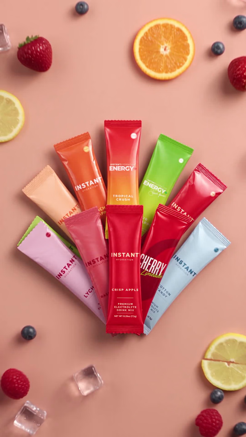
A collection of short vertical spots for product pages, landing pages and paid social. Each brand gets its own mood, but they all share one goal: make the product feel premium, real and impossible to scroll past. ZEST: A dark, premium mood with a matte-glass jar, a brushed-metal timer lid and a foil refill pouch, all floating in slow, controlled motion. Moody lighting and precise pacing make it feel high-end, matching the product’s timed-release idea. Instant Hydration: A bright, playful drink-mix reveal. Flavour sachets fan out across a peach background, then fresh fruit, berries and ice burst in around them. It’s built to stop the scroll and loop cleanly on a landing page. Graymatter: A trust-building spot for a cognitive superfood pouch. Glowing gold shields rise around the product, and a metallic “30 Day Money Back Guarantee” badge lands on the pack. It turns a simple guarantee message into a cinematic, confident moment that pushes viewers toward checkout. GLP-1 / GIP: A clinical, sleek look for a lower-dose injectable. It opens with a backlit silhouette of the vial, cuts to a human close-up for warmth and trust, then settles on a chrome vial with an iridescent finish under cool blue light. Clean, modern and reassuring. All four are 9:16 and 6–15 seconds long. They focus on realistic materials, lighting and smooth product motion, so the product stays the hero from the first frame to the last. Need product animations for your launch, landing page or ads? Let’s create something that sells 👋 #aimotion #aianimation #productanimation #SupplementBranding #Social Media Ads
0
8
0
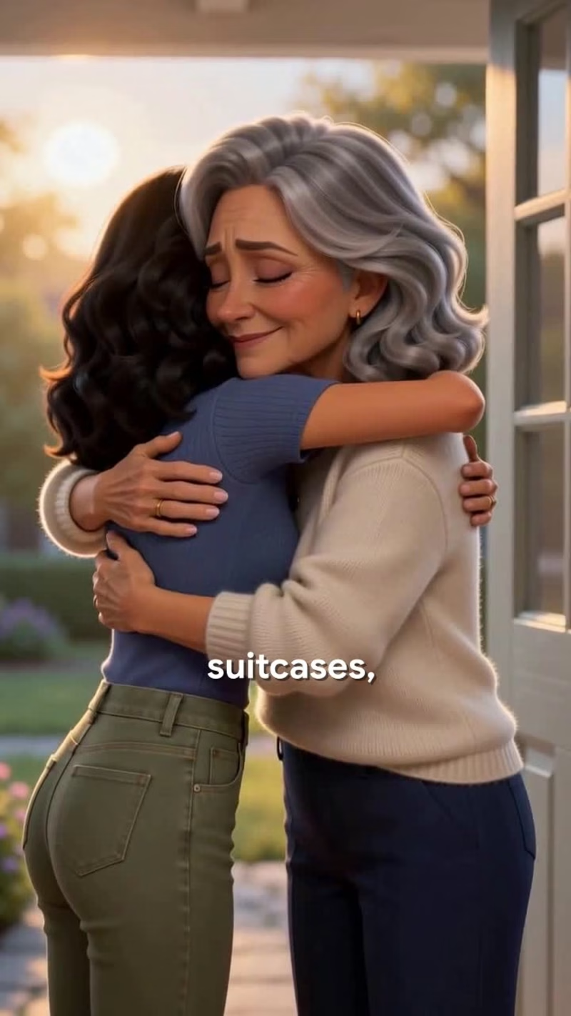
This is a 3-minute vertical animated short in a warm, Pixar-inspired 3D style, made entirely with AI image and video tools. It tells the story of a mother and daughter in the weeks before the daughter moves abroad for a new job. They meet for Saturday coffee, pick outfits together, and the daughter shares her news. The mother is proud but quietly heartbroken, and the film ends with the two of them packing her suitcase together. We wrote an emotional, narration-driven script structured for short-form retention, then designed two consistent lead characters: a gray-haired mother and her dark-haired daughter. Their faces, hair, outfits and body proportions stay identical across more than 60 shots. We built six locations: a suburban street, the family home, a café, a bedroom, a kitchen and a living room. Each has fixed lighting and layout, so the world stays consistent from scene to scene. Every shot started as an approved keyframe and was then animated with leading AI video models such as Seedance, Kling and MiniMax. Expressions and gestures were directed shot by shot, from tears and small smiles to hands held across the kitchen table. Warm golden-hour lighting holds the whole film together. In post-production we added voice-over and music, timed every cut to the narration, and finished with word-by-word animated captions. The final video is a 3:20 vertical MP4 at 1080p, ready for TikTok, Instagram Reels, YouTube Shorts and Facebook.
0
47
0
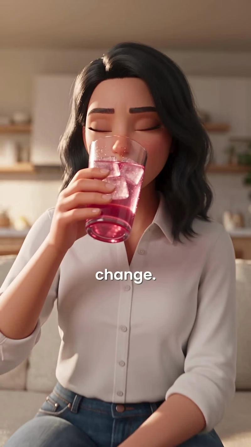
These are two vertical story-driven ads for Instant Hydration, a raspberry electrolyte drink mix with zero sugar. Each ad follows the same 3D-animated character through a relatable problem: the afternoon slump, poor sleep and low energy she blamed on everything else. Then she starts her own Day 1 experiment. A glowing crystal-body visualization shows how the electrolytes work, and her routine shifts until she's glowing. Both ads end on a cinematic product shot and a 50% OFF offer. The two versions test different hooks and narration on the same story, so the brand can see which one performs better on paid social. What I did: -Edited the story and paced it for 9:16 vertical -Created and animated the AI-generated 3D character scenes -Added word-by-word kinetic captions for viewers watching on mute -Designed the product hero shots and the offer end card -Did the sound design and synced it to the voiceover Format: 9:16 · about 70 seconds each · Instagram Reels, TikTok and Facebook
0
59
0
I made three square motion ads for instaheadshots, an AI headshot app. Each one tests a different hook to stop the scroll. Deadline pressure: Your CV is ready, the deadline is tomorrow, and you still have no professional photo. A ticking clock builds the tension, then the app delivers polished headshots in minutes. Product launch: A quick introduction with one clear message: casual photos go in and professional headshots come out. It ends on a "Preview Your Headshots Free" call to action. Social proof: Animated profile cards and notification pings show person after person updating their picture. It makes instaheadshots feel like the tool everyone is already using. All three use kinetic typography, UI-style animation and the brand's green palette. Each grabs attention in the first second and lands on a clear call to action, built for Instagram, LinkedIn and paid social.
0
112
Melius
(3)
Follow
Message
Rasel Alam Jubayed
Dhaka, Bangladesh
UI/UX Designer | Figma → Framer & Elementor
5.0
Rating
162
Followers
expert
Expert
Follow
Message
UI/UX Designer | Figma → Framer & Elementor
2
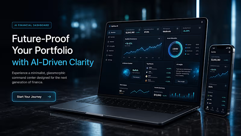
OptiView AI — Financial Dashboard Design System Project Description: OptiView AI is a concept I wished existed — a truly intelligent financial command center that doesn't just show you data, but understands it. Most financial dashboards overwhelm users with numbers. OptiView cuts through the noise with AI-driven insights, predictive market analysis, and a glassmorphism interface that feels calm and premium even when the data is complex. Process Steps: Started with a creative brief node defining the aesthetic direction — minimalist glassmorphism meets cyberpunk fintech Generated 3 dashboard variations using Flux Pro 1.1 Ultra — glassmorphism, holographic cyberpunk, and predictive AI styles Used GPT Image 2 to create additional screens — mobile version, user profile page, and transaction history Generated the final landing page hero visual showing the product in context with cinematic lighting and device mockups Refined the CTA button using iterative prompting to achieve a glassmorphism style that matched the overall aesthetic Feedback on Melius: The node-based canvas workflow is genuinely powerful for creative iteration — being able to branch from one concept into multiple directions simultaneously saved hours of work. The agent understood complex aesthetic briefs without needing to break them down. The ability to mix models (Flux for illustrations, GPT Image 2 for product shots) in one canvas is a huge advantage over single-model tools. https://app.melius.com/projects/85dafaf8-da68-427a-9968-ec75762e7de9/canvas/03c260b9-3de7-459f-804e-5a623a31677c
2
298
1
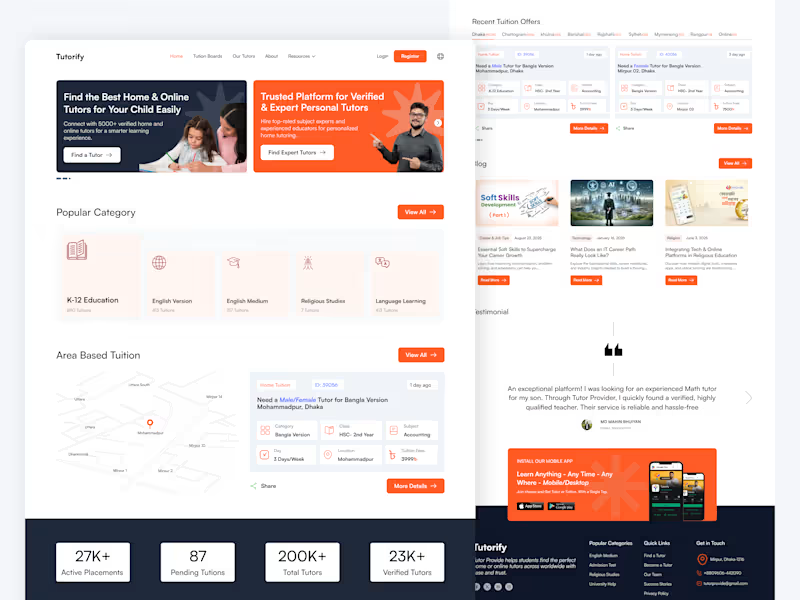
📘 Tutorify — EdTech & Tutor Finder Platform (Case Study) 📌 Project Overview Tutorify is a modern EdTech platform designed to connect parents and students with verified home and online tutors without unnecessary hassle. Instead of forcing users through complex search bars, the platform relies on a browse-first navigation system, allowing users to land on their desired tutoring options within just a few taps or clicks. The design balances visual clarity, local context, and strong trust elements to drive seamless user conversions. 🎯 Core Challenges & Design Objectives Eliminate Friction (No Search Effort): Reduce cognitive load for parents by providing direct, structured category and area choices instead of relying on manual text searches. Dual Audience Engagement: Seamlessly cater to two different user types right above the fold: Parents/Students looking for tutors and Educators looking for tuition posts. Instant Trust & Credibility: Establish high reliability for educational services through clear statistics, verified badges, and authentic testimonials. 💡 Key UI/UX Solutions & Features 1. High-Impact Dual Hero Section: Features a clear split-card layout with distinct calls-to-action (Find a Tutor & Find Expert Tutors), providing an immediate pathway for both target audiences. 2. One-Tap Category Browsing: Organized visual categories (K-12, English Medium, Religious Studies, Language Learning) allow users to explore available tutors with a single click—no typing required. 3. Map-Integrated Area & Location Browsing: A location-focused widget helps parents easily find tutors nearby or filter tuitions based on specific zones (e.g., Mohammadpur, Dhanmondi, Mirpur). 4. Scannable Tuition Cards: Custom-designed tuition cards display crucial details at a glance—Subject, Class, Days per week, Location, and Fees—giving users full transparency before opening the details. 5. Social Proof & Conversion Elements: Live stats counter showing active placements and total verified tutors. Parent testimonials highlighting real-world trust. Dedicated mobile app download banner to drive multi-device engagement. 🛠️ Role & Tools Used Role: UI/UX Design, Information Architecture, Visual Design, Micro-Interactions Tools: Figma, Photoshop
1
159
1
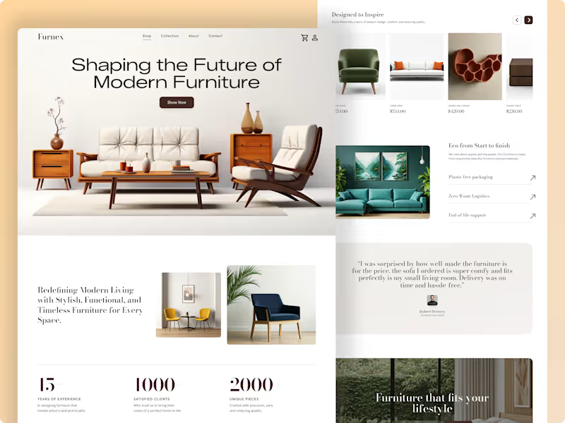
🛋️ Furnex – Luxury & Sustainable E-Commerce Experience Project Overview Furnex is a minimalist, high-end e-commerce landing page concept tailored for modern home decor and sustainable furniture brands. The goal of this design is to blend editorial visual aesthetics with functional UX, turning casual browsers into confident buyers. The layout focuses heavily on clean spatial balance, product storytelling, and effortless navigation, ensuring that high-ticket furniture items are presented with the elegance they deserve. ✨ Key UX & Visual Highlights Editorial Typography & Hierarchy: High-contrast layout pairing modern headers with readable body copy to build a luxury brand tone. Product-First Storytelling: Dynamic product showcases, structured grids, and dedicated sections highlighting eco-friendly manufacturing and zero-waste logistics. Social Proof Integration: Built-in statistics counters, verified customer testimonials, and interactive collection highlights to build immediate buyer trust. Seamless E-Commerce Flow: Clean navigation bar, persistent cart interface, and prominent call-to-action (CTA) buttons for high conversion. 🛠️ Tools & Deliverables Tools Used: Figma Deliverables: High-fidelity desktop web designs, scalable UI components, auto-layout system, and design documentation. 💡 Looking to design an elegant e-commerce experience or elevate your brand's digital store? Let’s collaborate and build something remarkable together. Send a direct message right here on Contra to get started!
1
125
1
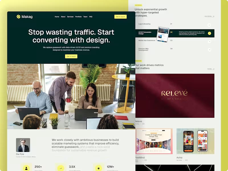
Makag — Premium Agency Website Design with Modern SaaS Aesthetics 📌 Project Overview Makag is a data-driven marketing agency designed to help ambitious businesses maximize their revenue. The core objective of this project was to design a high-converting landing page that breaks away from boring, traditional agency templates. By blending a premium agency framework with modern SaaS design trends (sleek dark overlays, vibrant color accents, and structured grids), the final interface delivers a sophisticated and trust-building user experience entirely crafted in Figma. 🚀 The Challenge Standard agency websites often struggle with low conversion because their layout feels generic or cluttered. For Makag, the core challenges were: SaaS-Inspired Premium Look: Creating a bold, dark-themed aesthetic with sharp visual contrasts to stand out instantly in a crowded market. Conversion-Driven Architecture: Designing a strong, benefit-driven hero section with strategic CTAs ("Get in touch") to turn visitors into high-value leads. Data & Authority Layout: Organizing complex agency metrics (250+ Clients, 3.5X ROI Growth, 12M+ Ad Spend) and multi-niche case studies into a clean, modern grid that feels highly intuitive. 🛠️ My Design Process UX Strategy & Structure: Designed a seamless navigation system (Home, About, Services, Portfolio, Team, FAQ) optimized to build immediate client trust and guide them toward the primary action points. Visual Direction & SaaS Aesthetics: Selected a premium dark forest green paired with an energetic neon yellow accent. The typography, spacing, and clean borders give the agency site a cutting-edge software/SaaS feel. Interactive Services Section: Built a dynamic "Our Services" section showcasing specific capabilities (Branding, UI/UX Conversion, Web Development) using clean hover states and component variations to keep the interface engaging yet minimal. Premium Case Studies Grid: Created a structured showcase grid for the agency's diverse design portfolio (featuring work like Releve, PixeMind, and Avika) across web and mobile layouts. 📦 Key Deliverables Complete High-Fidelity Responsive Landing Page Design (Figma) Reusable UI Component Library & Custom Interactive Hover States Defined Corporate Typography & Color Design Token System Clean, Developer-Ready Asset Tokens for Seamless Handoff 📈 The Outcome The final product perfectly bridges the gap between structured corporate capability and modern design aesthetics. By utilizing tech-forward SaaS visuals, strong social proof metrics, and high-visibility CTAs, the platform is fully engineered to elevate the agency's online presence and successfully capture high-tier international clients.
1
155
Melius
(1)
Follow
Message
Explore people