
Industrial Design | Sketch to Production-Ready Product
- $10k+
- Earned
- 3x
- Hired
- 5.0
- Rating
- 51
- Followers
Industrial Design | Sketch to Production-Ready Product


Branding, Pitch Decks, Web Solutions, and Video Edits ✨
- $•••••
- Earned
- 3x
- Hired
- 5.0
- Rating
- 9
- Followers
Branding, Pitch Decks, Web Solutions, and Video Edits ✨


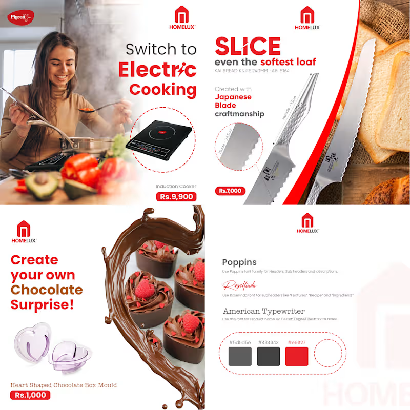


3D Artist | Branding & Product Visuals

Vintage Racing T-Shirt Design | Apparel Branding & Graphic Design
A custom vintage-inspired racing T-shirt concept created with a focus
on bold typography, distressed textures, and classic motorsport
aesthetics. This project includes the complete design presentation—from
artwork creation and print-ready layout to realistic mockups and
lifestyle visualization.
💼 What I worked on:
- Vintage racing-inspired graphic design
- Typography composition
- Distressed texture creation
- Front & back apparel design
- Brand identity direction
- Print-ready artwork
- Product presentation mockups
- Lifestyle visualization
Designed to demonstrate my ability to create apparel graphics that are both visually impactful and production-ready.
2
351

Strawberry Martini Scented Candle 🍓🍸
Spotted a super aesthetic photo of a strawberry-scented martini glass candle online and just had to recreate it in 3D! This project was all about capturing that exact look, crisp lighting, and clean vibe.
I had a blast breaking down the real-world reference to perfectly nail the glass refractions, the wax texture, and the realism of the strawberries. You can see the final result in the render in the end!
I also screen-recorded the whole process from scratch because it was honestly just too much fun not to capture. ✨
3
750
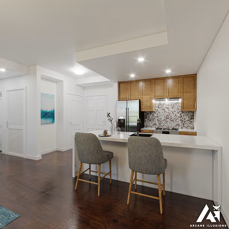
New York Apartment Renovation Visualization 🏙️
Designed and visualized for my client Alex in New York, this renovation project focused on creating a bright, welcoming living space with a balance of modern comfort and timeless character. 🌿☀️
This interior renovation visualization was developed to help the client explore the proposed design before implementation. The goal was to create a clean, inviting living area that maximizes natural light while blending contemporary furnishings with warm textures and materials.
✨ Project Highlights:
• Photorealistic interior visualization
• Natural lighting studies
• Material and furniture presentation
• Design validation before construction
• High-quality client presentation renders
🛠️ Software Used: 3ds Max + Corona Renderer
It was a pleasure helping bring this renovation concept to life and transform the vision into a realistic visual experience. 🌿🎨
5
5
862

Luxury Watercolor Floral Surface Pattern & Fashion Visualization 🌸
Transforming an original watercolor floral pattern into a wearable fashion concept.
This project showcases the complete creative journey from designing a seamless botanical surface pattern to visualizing it on a flowing chiffon maxi dress through high end fashion imagery. Inspired by romantic gardens and luxury resort wear, the collection features soft watercolor florals, elegant pastel tones, and a premium textile aesthetic.
The project demonstrates expertise in:
🎨 Surface Pattern Design
👗 Fashion & Textile Visualization
🌸 Botanical Watercolor Illustration
🧵 Seamless Pattern Creation
📸 Luxury Fashion Art Direction
🤖 AI-Assisted Creative Workflow
The final result illustrates how an original textile pattern can be transformed into a realistic fashion campaign while maintaining authentic fabric behavior, print scale, and premium visual storytelling.
2
459

Hi, I’m Caden.
I design modern high end brands & websites
- 5.0
- Rating
- 7
- Followers
Hi, I’m Caden.
I design modern high end brands & websites
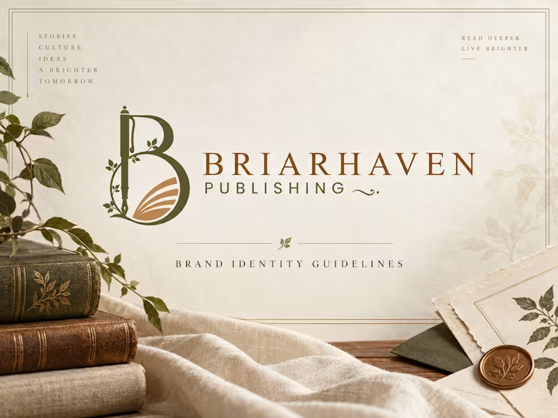
Briarhaven Publishing — Premium Brand Identity & Visual System
A refined, literary-inspired brand identity created for Briarhaven Publishing, designed to feel timeless, intelligent, warm, and deeply connected to storytelling.
The visual direction blends classic editorial elegance with a natural, contemporary sensibility. Rich olive tones, warm copper accents, parchment-inspired neutrals, botanical details, and sophisticated typography come together to create a publishing brand that feels established, thoughtful, and premium.
The existing logo was preserved and developed into a complete visual system that works consistently across both print and digital applications.
The Creative Direction
The identity was built around the idea of stories, culture, ideas, and a brighter tomorrow.
Rather than making the brand feel overly traditional, I created a balance between heritage and modernity. Editorial typography, soft natural textures, botanical elements, book-inspired compositions, and generous spacing give Briarhaven a distinctive visual language that feels both literary and contemporary.
What I Developed
Brand identity direction
Brand guidelines / brand book
Logo usage system
Light and dark logo applications
Clear-space and sizing guidelines
Premium color palette
Typography hierarchy
Editorial layout system
Business card and stationery concepts
Book cover applications
Bookmark design
Tote bag and merchandise direction
Notebook and print collateral
Website visual direction
Digital brand applications
High-end brand mockups Brand Applications The visual identity was extended across multiple touchpoints to demonstrate how the system can grow beyond the logo. From books, stationery, business cards, bookmarks, and journals to website design and branded merchandise, each application follows the same visual principles—creating a cohesive and recognizable experience wherever the audience encounters the brand. Project Outcome The final identity gives Briarhaven Publishing a more polished, credible, and memorable market presence while maintaining the warmth and character expected from a thoughtful publishing house.
The system is flexible enough to support future books, campaigns, digital platforms, editorial content, author communications, and branded experiences without losing consistency.
2
353
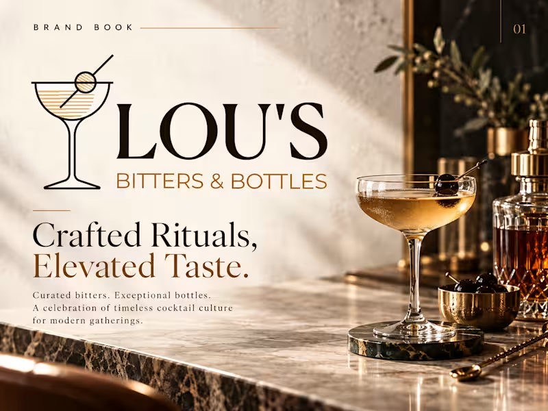
LOU’S Bitters & Bottles — Premium Brand Identity & Brand Book Design
Project Description
I developed a high-end brand identity system and premium brand book for LOU’S Bitters & Bottles, a sophisticated concept built around curated bitters, exceptional bottles, elevated cocktail culture, and timeless hospitality.
The goal was to transform the existing logo into a complete visual world that feels refined, distinctive, warm, and premium while remaining approachable enough for modern hospitality, retail, and lifestyle environments.
The creative direction draws inspiration from the ritual of a beautifully crafted cocktail—combining rich espresso tones, warm gold accents, champagne neutrals, elegant typography, tactile materials, and editorial-style photography. Every element was designed to communicate craftsmanship, quality, exclusivity, and memorable social experiences.
Brand Identity Direction
The visual system balances classic cocktail culture with contemporary luxury. The original LOU’S Bitters & Bottles logo was preserved and used as the foundation of the identity, while the surrounding brand language was expanded into a cohesive system suitable for both physical and digital applications.
A refined color palette of Espresso, Bitters Gold, Champagne, Stone, and Ivory creates a warm and sophisticated atmosphere. Premium serif typography gives the brand an editorial, timeless personality, while clean supporting typography ensures clarity across menus, packaging, marketing, and digital communication.
Brand Book & Visual System
The four-page brand book presents the identity through a carefully art-directed system covering:
Brand introduction and creative direction
Primary logo presentation
Luxury brand color palette
Typography hierarchy and font direction
Brand positioning and messaging
Packaging and bottle applications
Menu and hospitality collateral
Business cards and branded stationery
Coasters, napkins, gift packaging, and retail materials
Premium cocktail photography and lifestyle direction
Brand experience and visual storytelling Creative Direction Crafted Rituals. Elevated Taste. The identity was designed around the idea that LOU’S is more than a bottle or cocktail product—it represents a ritual, atmosphere, and shared experience. Warm lighting, marble textures, glass reflections, premium paper stocks, dark finishes, and metallic accents help create a tactile and immersive visual language. The result feels equally appropriate for a premium cocktail bar, boutique spirits retailer, luxury bitters brand, hospitality concept, or curated gifting experience. Project Outcome The final identity gives LOU’S Bitters & Bottles a cohesive, scalable, and recognizable visual system that can grow across packaging, retail, hospitality, social media, campaigns, printed collateral, and digital platforms. The result is a brand that feels timeless yet contemporary, premium without feeling inaccessible, and deeply connected to the craftsmanship and culture of a well-made drink.
Services Provided - Brand Identity Design · Brand Book Design · Visual Identity · Luxury Branding · Beverage Branding · Spirits Branding · Hospitality Branding · Packaging Direction · Typography · Color System · Art Direction · Brand Applications · Editorial Design · Creative Direction
1
298
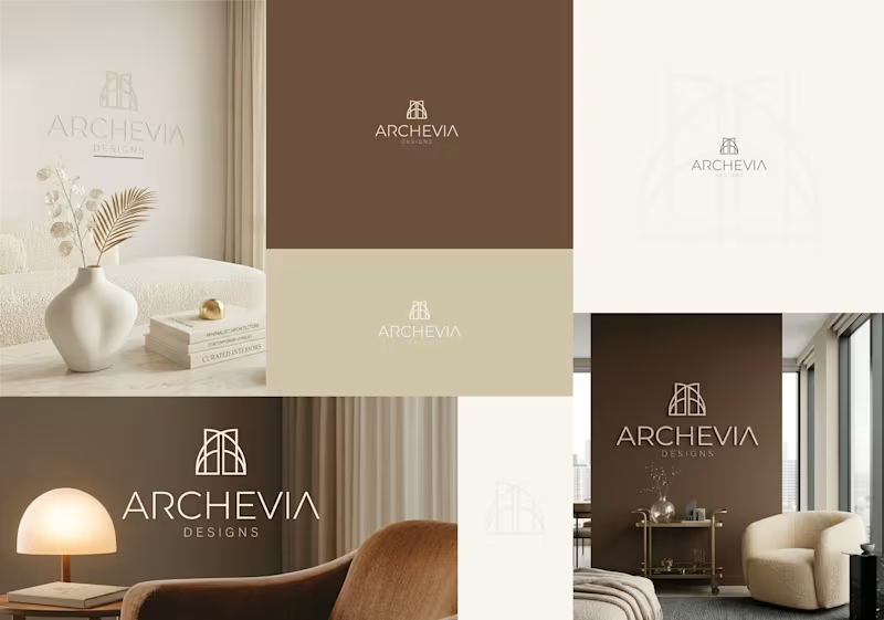
Archevia Designs Luxury Architectural & Interior
The Vision
When a studio designs high-end, bespoke residential spaces, their own brand identity must reflect the exact level of precision, luxury, and tranquility they deliver to their clients. Archevia Designs needed a visual presence that instantly communicated architectural expertise and refined taste to high-net-worth homeowners, setting them apart from standard interior decorating firms.
The Execution
To capture the essence of structural elegance, I designed a minimal, monoline emblem utilizing symmetrical arches. This subtle nod to classical architecture and vaulted ceilings creates a sense of space and balance.
Rather than stark black and white, I anchored the identity in a warm, stone-neutral color palette—utilizing rich earth tones, soft creams, and taupe. This strategic color choice makes the brand feel grounded, organic, and incredibly sophisticated. The icon is paired with a sleek, airy sans-serif wordmark that gives the brand a modern, editorial finish.
The Value
A luxury service requires a luxury facade. This cohesive brand system allows Archevia Designs to present themselves with undeniable authority. Whether embossed on a business card, displayed as 3D wall signage in a studio, or acting as the header of a six-figure design proposal, this identity justifies a premium price point.
Project Scope & Deliverables:
Brand book
Primary Arch Emblem & Minimalist Wordmark
Logo dissections
Logo variations/ lockups
Source files / printable files / SVGs
Website materials
Stationary designs
Email signatures
Table signboard designs
Signboard / bill board designs
Thank you card design
Custom Stone-Neutral Color Palette
Typography System
Photorealistic Environmental Mockups (Interior Signage & Print)
Your high-end services deserve a visual identity to match. If you are ready to position your business for a premium market and attract higher-paying clients, let’s connect and discuss your vision.
- Caden -
2
4
758

Graphic Designer / Brand Identity Designer

"The mission was to build a colony. The reality is a fight for survival. This trailer introduces a sci-fi horror concept where the Artemis III crew discovers a hidden crater and accidentally wakes up an ancient lunar monster. 4 astronauts. 1 mission. No way home."
Why I Created This:
As a designer, I wanted to push the boundaries of "NASA punk" aesthetics. My goal was to use AI to create a high end cinematic teaser that blends technical realism with deep space dread.
The Workflow:
I brought this vision to life using a complete Runway AI pipeline. Every element you see from the detailed character assets and creature designs to the cinematic camera movements and atmospheric lighting was generated and animated entirely through the Runway workflow.
Submitted for the #RunwayBigPitchContest.
0
302


Art Director | Brand & Print Designer | Illustrator
- 49
- Followers
Art Director | Brand & Print Designer | Illustrator
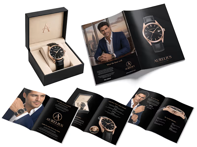
Aurelius — Luxury Watch Brochure Design
An eight-page brochure concept for Aurelius, a luxury watch brand built around the idea “Time, tailored.”
The design brings together a black-and-rose-gold palette, restrained typography, generous space, and product-led layouts. The pages move from the brand story to watch details, lifestyle imagery and a closing brand message.
At the centre is an emblem combining the letter A, a clock hand and the blade of a tailor’s shears—a visual connection between two crafts shaped by precision.
A print-ready brochure design.
1
46
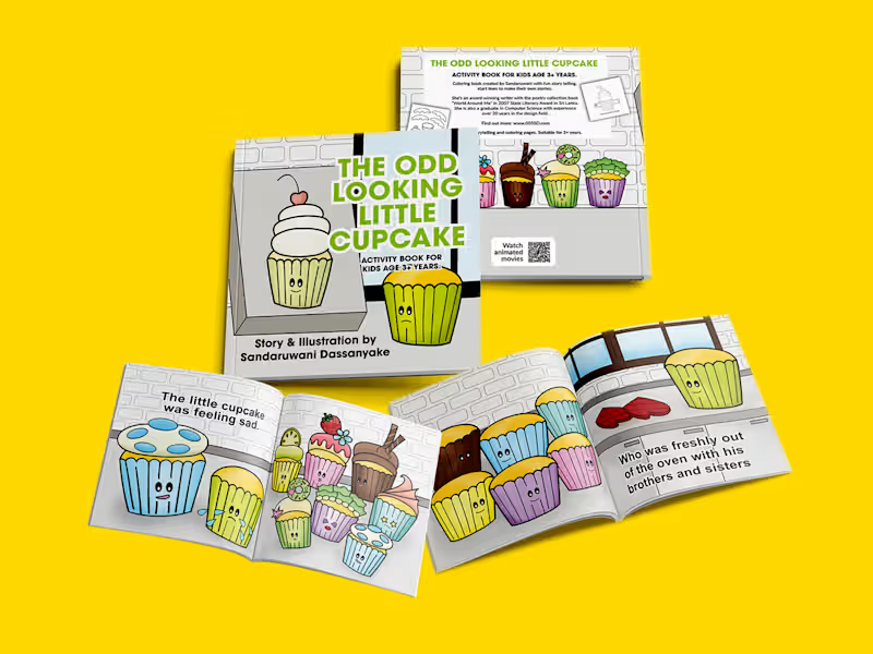
A personal project: This is my first book, created a few years ago. And I spent a few weeks re-writing and illustrating - turning it into a new book.
One thing I learned while doing this project is that I had improved my coloring skills, which had been just flat coloring. Plus I ended up creating some new activities for kids.
1
267
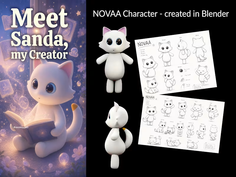
Meet NOVAA: The Voice Behind a Quiet Creator
A mascot can be more than a character. It can become a brand’s voice.
As a quiet creative, I’ve never felt the need to constantly be on camera or make myself the center of everything I create.
But I still have stories, ideas, opinions, and creative thoughts to share.
That’s why I created NOVAA.
NOVAA is my creative alter ego, a character I can use to explore:
- Design and creative direction
- Freelancing and creative work
- Animation and visual storytelling
- Ideas, observations, and everyday moments
- Books and other creative projects
What interests me most is the continuity a mascot can create.
One recognizable character can move across content, animation, books, social media, and brand experiences, giving people something familiar to connect with.
It’s not about hiding behind a character.
It’s about building a creative world around an idea.
Sanda creates.
NOVAA tells the story.
Maybe being a quiet creator means finding a different way to be heard.
You don’t have to be the loudest voice in the room to create something people remember.
#CreativeDirection #ArtDirection #VisualStorytelling #MascotDesign #BrandIdentity #CharacterDesign
* My hand sketch was bad, so I had to get AI to refine it.
0
198
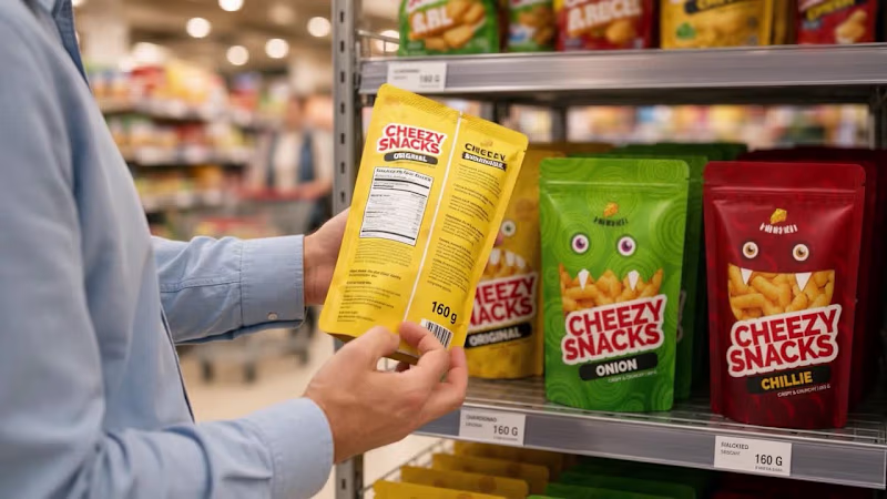
Cheezy Snacks: AI Commercial and Packaging Concept
This is my first AI commercial!
I created a full brand concept for a fun cheese snack, with three flavors and a monster character for each one. I did the packaging design, the art direction, the script, and the edit, and made the video with Grok Imagine.
After 20+ years as an art director, I wanted to see how far I could take a brand idea with AI, and I loved it.
The goal was a bright, playful ad that helps kids and families pick a flavor right on the shelf.
0
100

Pitch Deck & Presentation Designer | $250M+ Raised
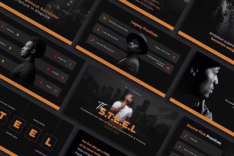
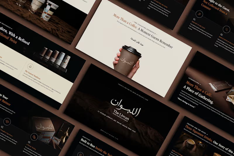
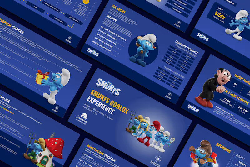
Designing a pitch deck for a brand loved by generations 💙
We designed the “Smurfs Roblox Experience” proposal deck for Magnetik Gameworks, pitching a new Smurfs game on Roblox to Paramount Game Studios.
Pitching a much-loved entertainment brand means the deck has to feel just as fun as the characters, while still presenting a clear plan for content, timelines and marketing.
When you’re pitching to a global entertainment studio, the deck needs to look ready for launch, and this one is.
Game studios, agencies and brands: if your next pitch needs to impress big partners, let’s talk. 💬
#PitchDeck #PresentationDesign #GamingIndustry #Roblox #GameDevelopment #EntertainmentMarketing #BrandPartnership #PowerPointDesign #SlideDesign #VisualStorytelling #GamePitch #DesignStudio
8
3
378
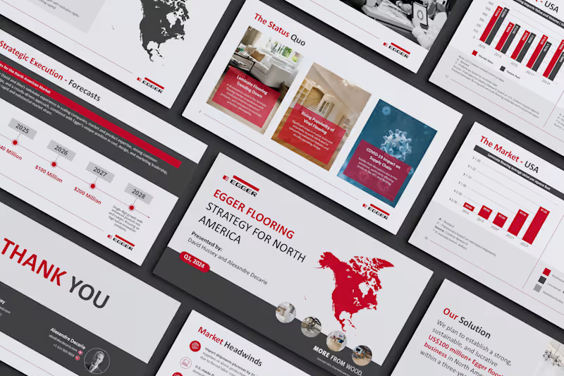
Turning a market-entry strategy into a deck that gets buy-in 📈
We designed the “Egger Flooring Strategy for North America” presentation, a market-entry strategy deck for Egger, the global wood-based materials manufacturer, presented by David Hussey and Alexandre Decarie.
The deck had to make a confident business case: map out the North American flooring market, explain the challenges and opportunities, and present a clear plan to build a US$100 million+ business. Each slide needed to lead the audience step by step to “yes.”
Strategy decks don’t win on data alone. They win when the data tells a story leadership can act on.
Got a strategy, market-entry plan or board presentation coming up? Let’s make it persuasive. 💬
#PresentationDesign #StrategyDeck #BusinessPresentation #PitchDeck #PowerPointDesign #CorporatePresentation #DataVisualization #MarketStrategy #BoardPresentation #VisualStorytelling #SlideDesign #DesignStudio
0
205

Fashion Designer | Digital Artist | Branding Expert


