UI Design Projects in Chittagong Division
UI Design Projects in Chittagong Division
Sign Up
Post a job
Sign Up
Log In
Filters
2
Projects
People
Message
0
Md Ziauddin Bablu
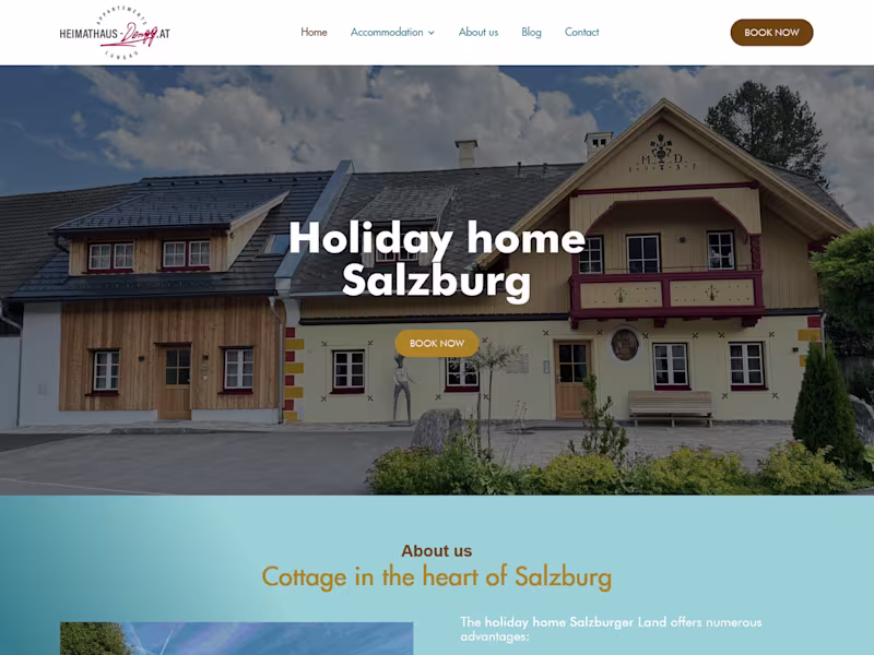
Vacation Rental Website Design & Development
0
8
Message
0
Nivrit S.
pro
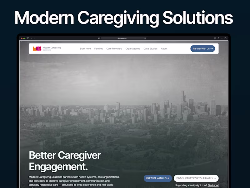
Moderncaregiving Website Redesign
0
2
Message
0
Sharf Ud-deen
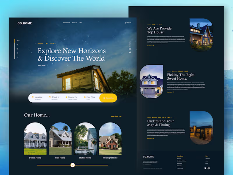
Real Estate Landing Page | Figma
0
11
Message
0
Masuder Rahaman
pro
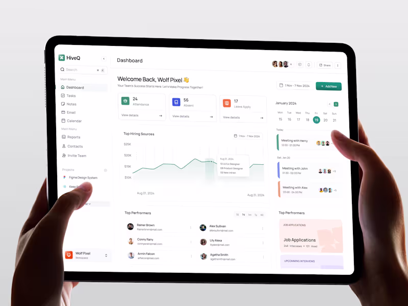
HiveQ | HR Project Management Admin Dashboard UI/UX
0
7
Message
1
Shovon Artistry
MOANA - Brand Identity & UI Design
1
19
Message
2
Md Wahidul Islam Murad
Why real estate apps are STILL in high demand in the U.S. 🇺🇸 • Housing demand never stops: buying, selling, renting, investing • Massive, fragmented market: people need simple digital tools • Convenience wins: search, compare, and tour homes from your phone • Data-driven decisions: pricing, trends, schools, neighbourhoods • High-stakes purchases: users spend more time researching • Tech keeps evolving: AI, virtual tours, smarter recommendations
2
2
122
Message
2
Md Mehdi Hasan
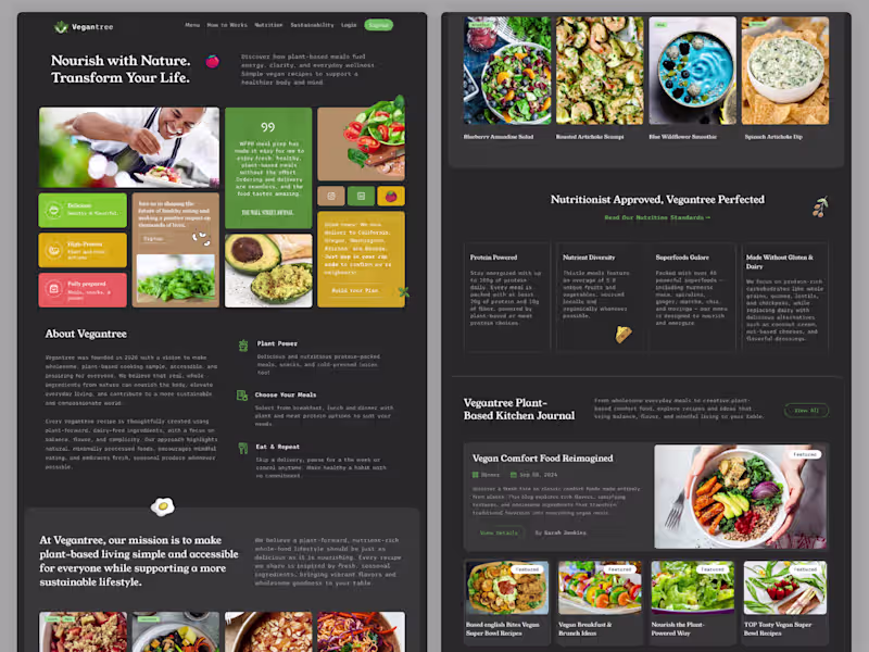
Vegantree Vegan Food & Nutrition Website Figma Template UI Vegantree is a modern and visually engaging plant-based meal and nutrition website Figma template designed for healthy food brands, vegan restaurants, meal prep services, and wellness platforms. Built on a 1440px wide layout, this template offers a balanced and elegant design with a strong focus on lifestyle, sustainability, and nutrition. The layout features a bold hero section, meal showcases, feature highlights, blog/journal section, testimonials, and social media integration—creating a complete user experience for food and wellness businesses. With clean typography, soft color palettes, and high-quality imagery, Vegantree delivers a fresh and organic visual identity. Designed using Auto Layout, the template is fully customizable, well-organized, and ideal for designers and developers looking to create a professional, conversion-focused website in the health and wellness niche.
1
2
221
Message
3
Saif Uddin
pro
AI can’t match this level of detail. If you’re still paying for AI slop… I can’t help you. This is the level of quality I deliver. Projects start at $1200.
3
309
Message
1
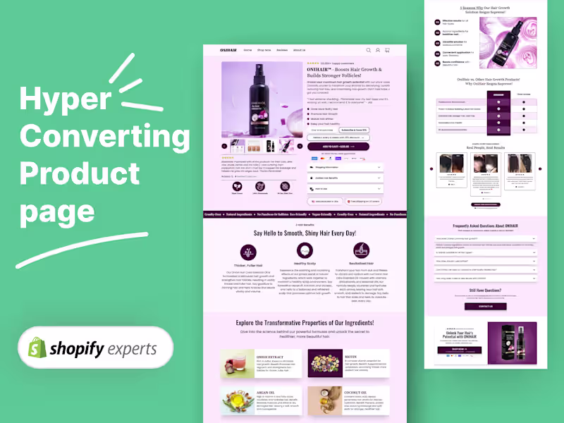
AL Foysal
pro
Shopify Product Page | Built in Replo, Figma Designed
1
3
Message
2
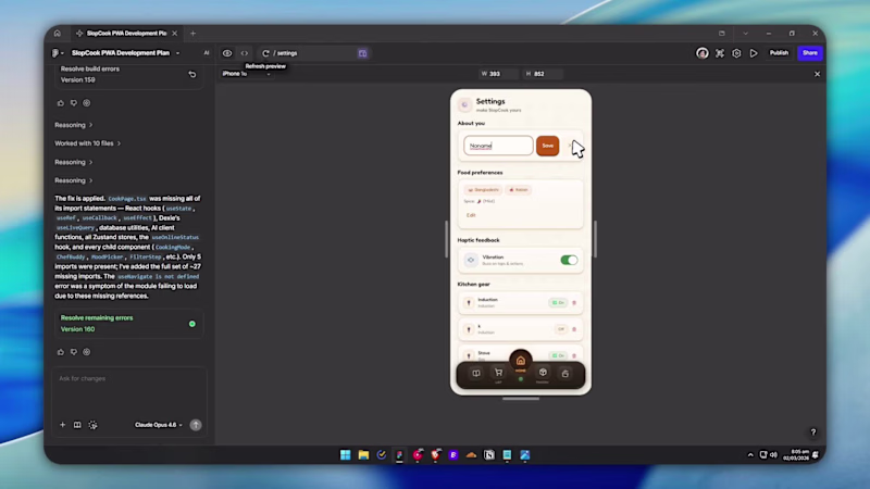
Farhan Mubin @ RenameLayer
Every recipe app asks what you want to cook. I never know that. I know what's in my kitchen. So I built SlopCook (https://slopcook.figma.site). ADD what you have in your kitchen closet. It tells you what you can make based on those. 🧺 The Cooking Page has a fridge with magnets and stickers. Drag things around. Tap a card and watch the fridge open into cooking mode. Oh u can also add your image to put in the fridge if you want. ⏱️ Cooking page is distraction free. Step by step guides. Timer on each step so you don't burn your spices (I used to do that. A LOT) Built as a PWA so it works on any device. Not a programmer. 150+ prompts. Zeroooo tools outside Figma Make. It actually surprised me. How easy the uiux is + superb consistent This is what I wanted to exist. So I made it. Thank you 😃 @Contra HQ @Figma
3
2
132
Message
2
Nadimul Islam
Custom Website design, UI interactions, and transitions for SAAS & Startups. Built for clarity and flow. Thoughts? 💡 Curious to hear your take.
1
2
197
Message
0
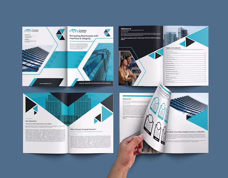
Sohel RANA
Real Estate Portfolio Design | Company Profile Design
0
4
Message
2
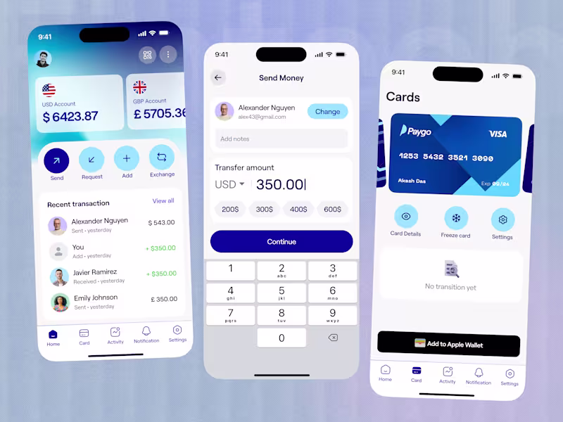
Akash Das
Paygo - Fintech app UI design
3
2
32
Message
0
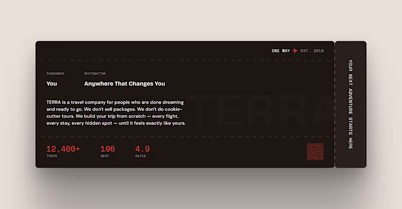
Mahin Rahman
TERRA — Boarding Pass About Section (Framer Component) DESCRIPTION: Every landing page has an about section. Most of them look exactly the same. A headline. A paragraph. Maybe a photo. Nobody reads it. TERRA's about section is a boarding pass. PASSENGER: You DESTINATION: Anywhere That Changes You That one reframe changes everything. Instead of telling users about the company — it puts the user inside the experience before they've even booked. You're already the passenger. The destination is already yours.
0
27
Message
1
Riaz Uddin
Designing a fintech eWallet home screen is not about showing features—it’s about reducing anxiety. When I started this design, my first question was simple: What does a user need to feel confident within the first 3 seconds? That insight shaped every decision. The balance is placed front and center, not buried, because financial clarity builds trust. Primary actions like Withdraw, Transfer, and Pay Bill are surfaced immediately to reduce cognitive load and eliminate hesitation. No scrolling, no guessing. Quick Transfer is intentionally visual. Faces over names reduce decision time and make money movement feel human rather than transactional. Transactions follow a clear hierarchy with color-coded feedback, helping users instantly understand money in vs money out without reading details.
1
130
Message
1
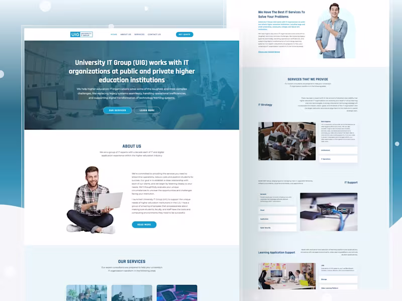
Md Mehedi Hasan
University IT Group (UIG) works with IT organisations at public and private higher education institutions. They help higher education IT organisations solve some of the toughest and most complex challenges, like replacing legacy systems seamlessly, handling operational inefficiencies, and supporting the digital transformation of technology learning systems. I created this design first in Figma, then Covert into Webflow with some micro animations and all device-friendly.
1
84
Explore projects