For this design, I brought the Studio Kalili website to life using Squarespace's Finish Layer by layering in subtle animation across the page to turn a static layout into something that feels considered and dynamic without overwhelming the content.
The most intentional use of Finish Layer is the two-image interaction illustrating the core idea behind the studio's work: closing the gap. One image enters from the left, the other from the right, moving quickly at first and then easing as they meet in the center — fast enough to catch attention, slow enough to let the reader stay with the copy.
From there, hover states on buttons, text, and large images, plus scroll-triggered entrances, guide the eye down the page and give every interactive element a small, deliberate moment of response.
Squarespace's Finish Layer was used to add polished interactions across the website, creating a more dynamic browsing experience. Each interaction supports the overall experience while preserving the calm, editorial character of the Studio Kalili brand.
View the Website design (https://www.studiokalili.com/)
View the LinkedIn social post (https://www.linkedin.com/posts/studiokalili_squarespace-webdesign-squarespacechallenge-activity-7486227627586985984-xTF2?utm_source=share&utm_medium=member_desktop&rcm=ACoAAC0qqAIBrHjQpLqMtnXAZ6GpFg1uZwP7LTs)
14
37
2.2K
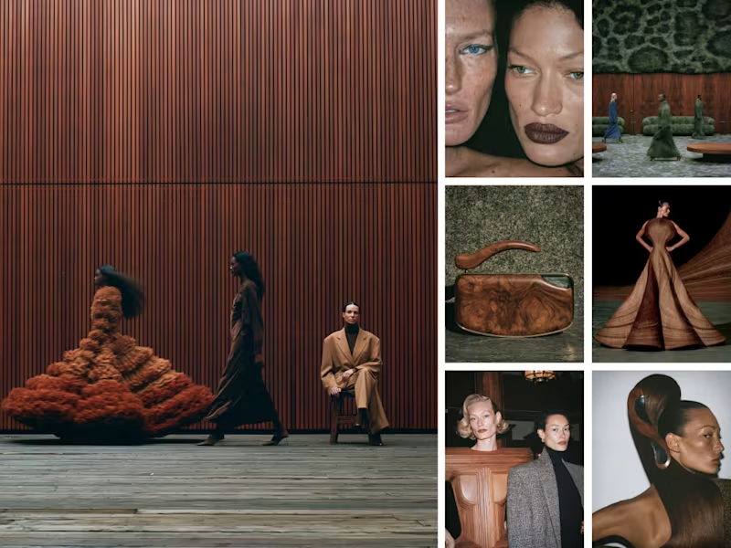
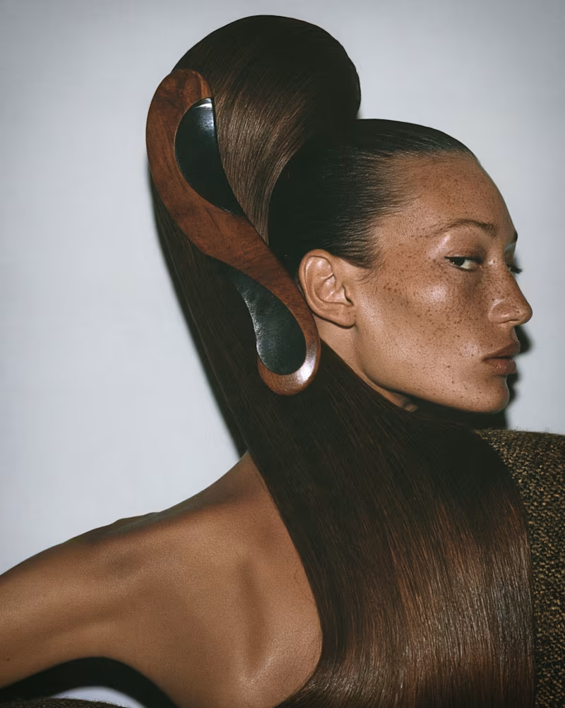
Everyone’s falling for a wicker husband this month. I went a little further into the woods: burl, bentwood, and pleated grain, worn as couture, carved into jewelry, and built into the room itself.
The full Woodgrain editorial is on my profile: Woodgrain (https://contra.com/p/mNbRNMZo-woodgrain?referralExperimentNid=DEFAULT_REFERRAL_PROGRAM&referrerUsername=kelseylaurelcreative)
0
201

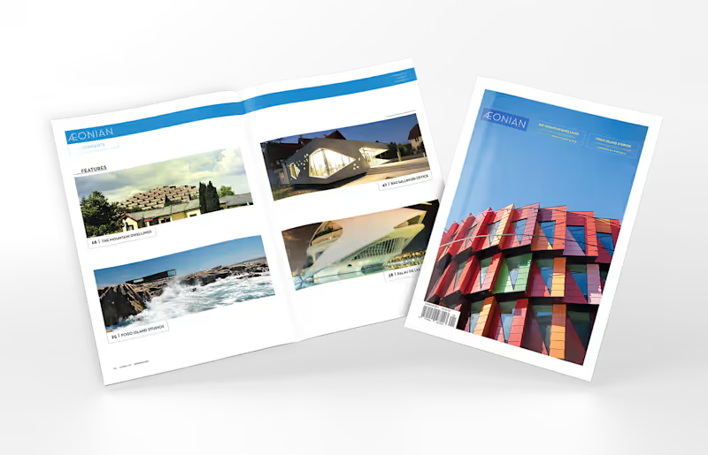


Full editorial issue designed end to end for FIERCE LUXE, a luxury fashion publication concept — cover, masthead, feature spreads, and styled campaign imagery built around a single seasonal theme ("Denim, Elevated"). Every page holds one cohesive visual identity: palette, typography, styling, and mood carried consistently across the entire issue. This piece demonstrates editorial consistency — art-directing a complete, multi-page brand property where every spread feels like part of one world.
1
125