UX Design Projects in ChattogramUX Design Projects in ChattogramASPHALT is a landing page for a street skateboard brand — one long scroll with six sections: hero, the drop, the boards, the numbers, the culture, and a final call to action.
Live: https://asphalt-skate-culture.netlify.app/
The look is raw and bold: paper background, big chunky type, yellow and orange accents, 3D boards in the space. Almost everything moves : a spinning skate-wheel cursor, text that jumps up on scroll, a board that tilts to your mouse, a trick-name ticker, a counting year, and sparks on the last button.
How I used Stitch
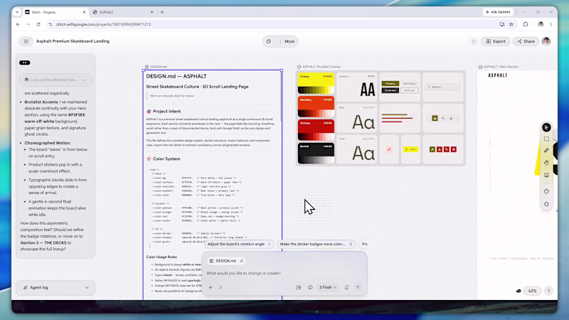
https://stitch.withgoogle.com/projects/768150956399471213
I started with a design system. I wrote a DESIGN.md with the colors, type scale, spacing, and motion rules, then imported that into Stitch as the source of truth. From there Stitch generated each section straight onto the canvas, and because everything ran off the same system, the sections actually matched instead of drifting. The output was HTML-native too, so the motion and hover states were already in there.
Once the sections looked right, I exported the code and used Claude to merge them into one page: combining the duplicated cursor, consolidating the Tailwind config, and wiring up the scroll behavior between sections. Then I shipped it on Netlify.
Platform feedback
Starting from a design system was the best part the DESIGN.md kept all six sections consistent, which is usually the hard bit when you build piece by piece. Fast too, and the motion came baked in.
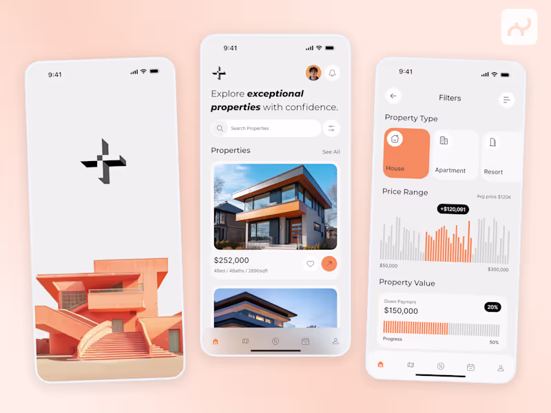
The one pain point was joining sections. Each exports on its own, so making one page meant cleaning up duplicates by hand. A "merge boards into one page" export would fix that. Why real estate apps are STILL in high demand in the U.S. 🇺🇸
• Housing demand never stops: buying, selling, renting, investing
• Massive, fragmented market: people need simple digital tools
• Convenience wins: search, compare, and tour homes from your phone
• Data-driven decisions: pricing, trends, schools, neighbourhoods
• High-stakes purchases: users spend more time researching
• Tech keeps evolving: AI, virtual tours, smarter recommendations