Projects using GIMP in Cape Town
Projects using GIMP in Cape Town
Sign Up
Post a job
Sign Up
Log In
Filters
2
Projects
People
Results that are similar to your search
Similar results
Message
1
Loni Ice
Partnership Landing Page
1
6
Message
0
Supreethsingh Govindaraju
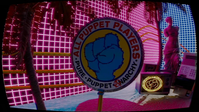
Looping visuals for Bar TVs
0
18
Message
2
Lionel Miele-Herndon
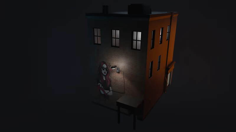
Scarred Mansion
2
19
Message
0
BlakStar Graphix
Graphic Design For Merchandise
0
28
Message
1
Leandro Oliveira
pro
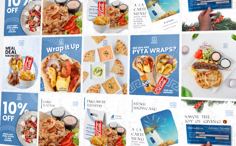
Social Media
1
24
Message
0
Rodrigo Calix
pro
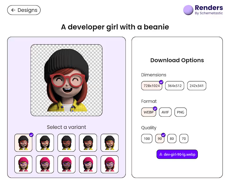
Schemetastic Renders
0
11
Message
3
3d WebGL
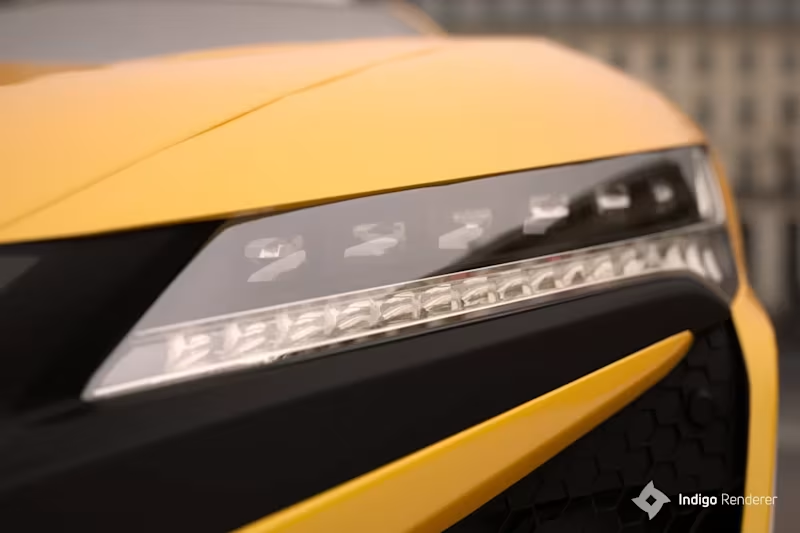
Exterior concept shots for new 3d configurator for automotive 3d project. Little more photographic take with help of Indigo. Mostly about focal, composition and spectral tone mapping.
4
3
462
Message
0
Nikki Eke
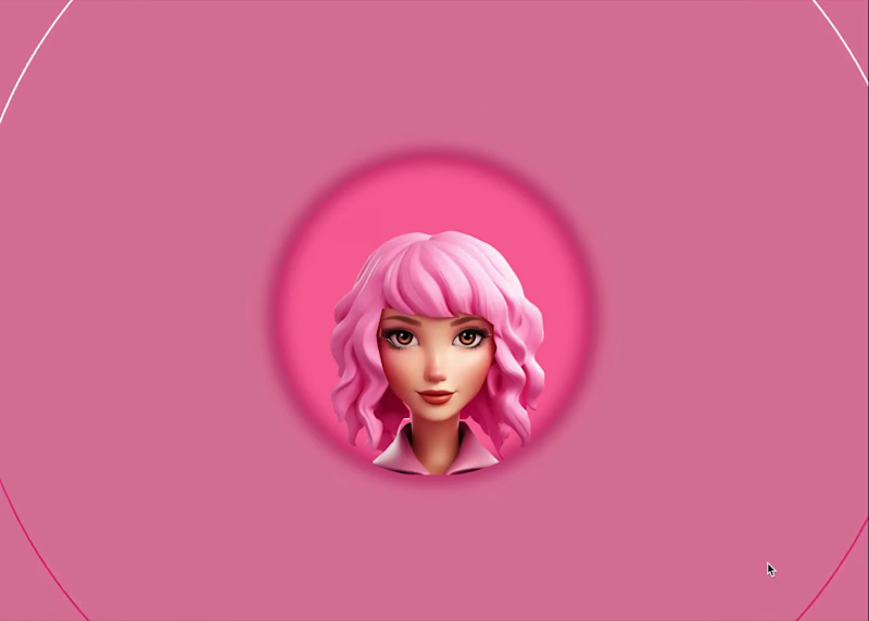
Animated Avatar Project
0
41
Message
0
Digvijay Singh
Meta Ads | Designs | Static Ads | Tool Campaign
0
49
Message
1
John Buck
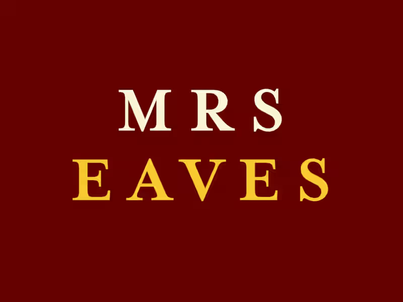
Alternatives to Mrs. Eaves fonts, as seen in the WordPress logo using Google Fonts. The three best open-source and Google Fonts alternatives to the Mrs. Eaves fonts used in the WordPress logo are Libre Baskerville, Baskervville, and Playfair Display. Because Mrs. Eaves is a modern reimagining of the classic 1750s Baskerville typeface, its closest free alternatives are found within the Baskerville family tree. 1.) Libre BaskervilleBest for: Body text and digital reading.Why it matches: It features a wide stance and low contrast. This directly mirrors the spacious, highly legible design of Mrs. Eaves.Where to get it: Available on Google Fonts – Libre Baskerville. 2.) BaskervvilleBest for: Elegant headers and book layouts.Why it matches: Created by the ANRT, this variant captures the traditional, organic curves of the original historical punches. It provides the same classic, literary feel as Mrs. Eaves.Where to get it: Available on Google Fonts – Baskervville. 3.) Playfair DisplayBest for: High-contrast, dramatic book covers or large titles.Why it matches: While more distinct in its contrast, it is a frequent editorial alternative. It mirrors the unique, stylized, and premium look that Mrs. Eaves brings to display text.Where to get it: Available on Google Fonts – Playfair Display. 4.) BenthamBest for: Print and design layouts requiring a traditional touch.Why it matches: It shares the letterform characteristics of historical stonecutters and engravers. This matches the artistic, artisanal vibe of Mrs. Eaves’ ligatures and small caps. https://fonts.google.com
1
65
Message
0
Tamami Persson
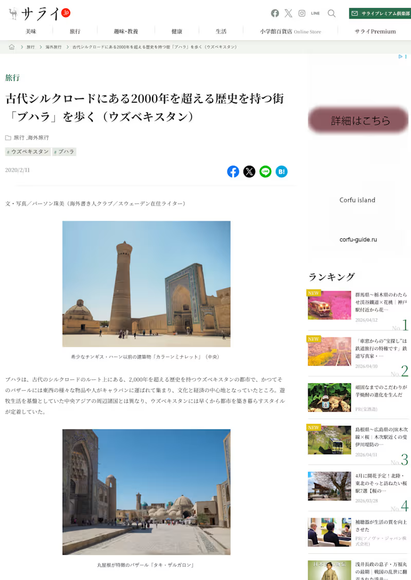
Travel Story for Shogakukan Serai.jp
0
32
Message
0
GILMAR JUNIOR
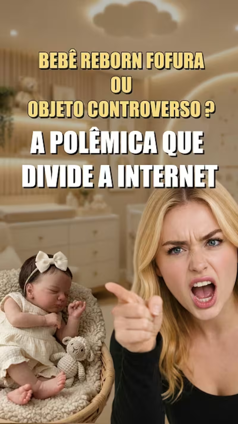
"Portfólio VSL - Teste de Alta Retenção (Nicho: Storytelling / …
0
1
Message
1
Hector Castillo
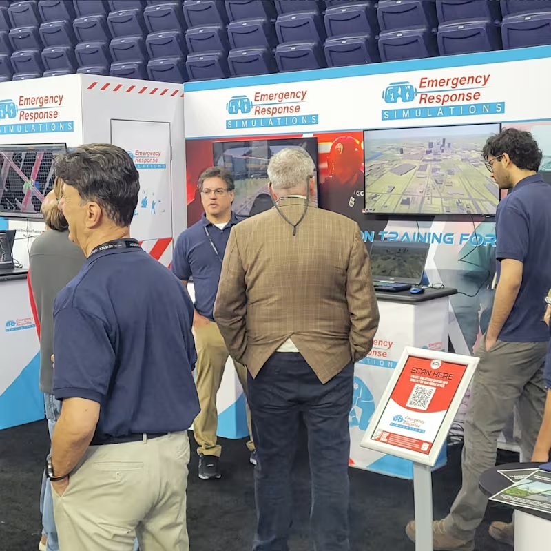
Design for large print format
1
60
Message
2
Marco Mastroeni
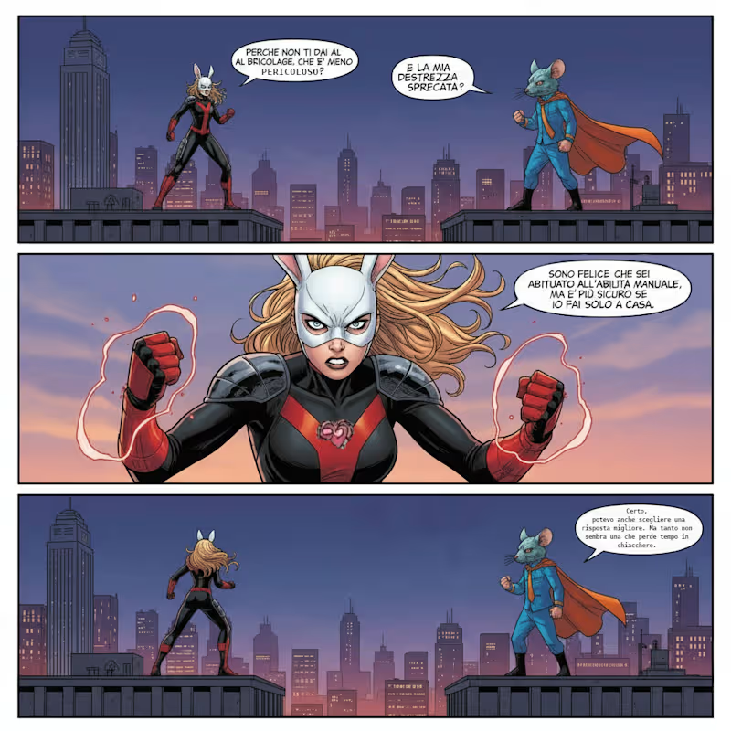
Hello!Just something unrelated to my work. This are panels of a story generated for a (hypothetically) homemade comic. Now, for a long time I feel like this was not interesting, but on the other hand maybe someone could like the style. If you like it, just let me know :) P.S If I recall correctly this was made with Leonardo
2
95
Message
0
Kade Markoux
Who's ready for a night on the town at the Bar?
0
42
Message
0
Charlotte Rogers
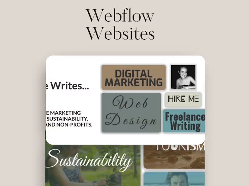
Updated Webflow profile page. had a bit of fun with some bentos and little animations. https://charlottewrites.webflow.io/
0
90
Explore projects