Freelance Copy Strategists in Canonsburg
Sign Up
Post a job
Sign Up
Log In
Filters
2
Projects
People
Joanna Newton
pro
Canonsburg, USA
Kajabi Expert | Course Creation, Funnels, Marketing Strategy
$100k+
Earned
120x
Hired
5.0
Rating
505
Followers
Top
Expert
Follow
Message
Kajabi Expert | Course Creation, Funnels, Marketing Strategy
0
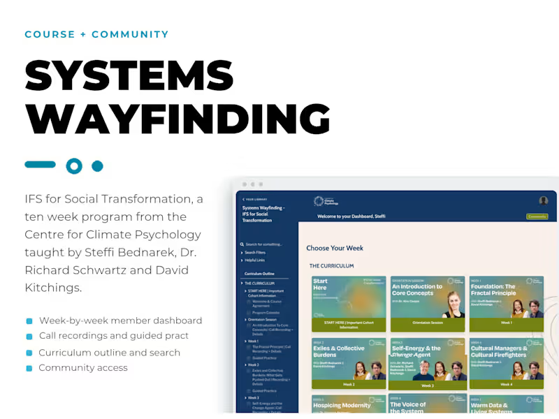
Kajabi Course, Community, and Funnel Set Up
0
6
0
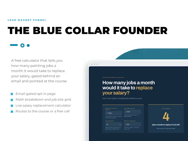
Lead Magnet and Email Strategy Development for Coaching Business
0
3
4
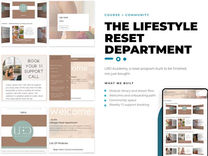
Kajabi Course Redesign for Health & Fitness Brand
4
190
12
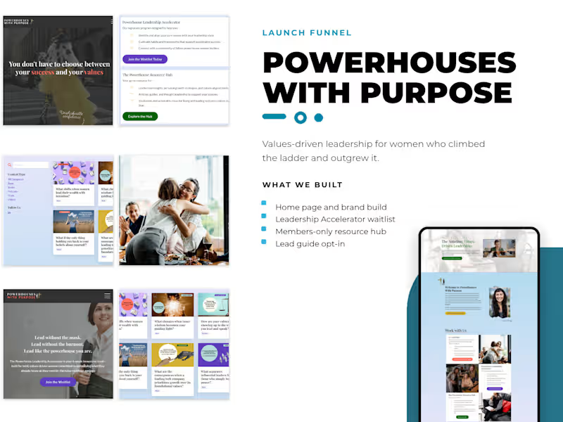
Website Launch for Women’s Empowerment Brand on Kajabi
12
258
Copy Strategist
(1)
Follow
Message
Chris Hornak
pro
Pittsburgh, USA
I craft custom websites and SEO strategies that scale.
1x
Hired
10
Followers
Follow
Message
I craft custom websites and SEO strategies that scale.
1
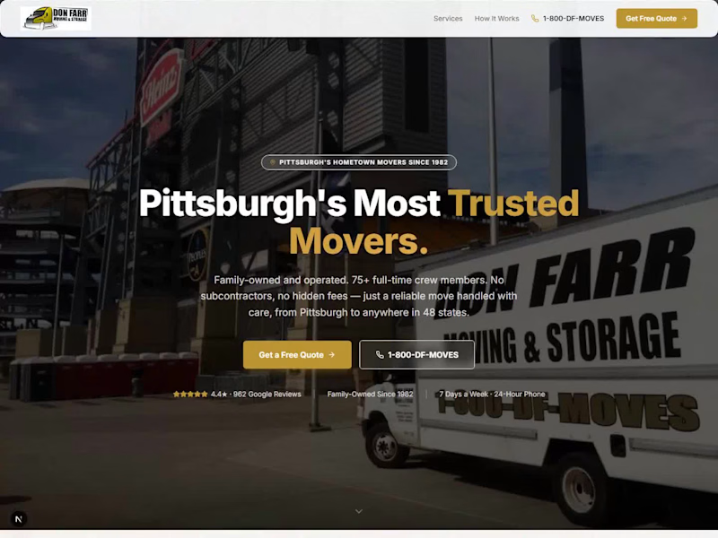
What does a 40-year-old moving company's website need to prove in the first five seconds? Don Farr has been moving Pittsburgh since 1982. Real trucks, real crew, real reviews. None of that showed up on their old site. It read like every other mover's template, buried under text instead of leading with proof. So I rebuilt the landing page from scratch, in Next.js, with one goal. Get the trust signals above the fold instead of at the bottom. The hero does the heavy lifting now. Real photo, real headline, the review count and star rating sitting right under the buttons instead of hidden in a footer. Two calls to action, not five. Call now or get a quote, nothing else competing for the click. Below that, the stats block does what a testimonials page usually tries to do in three paragraphs. Years in business, crew size, fleet size, states served. Four numbers, no copy needed. Services get their own grid instead of a wall of paragraphs. Local, long-distance, commercial, storage, junk removal, packing. Anyone scanning on their phone can find their situation in two seconds. This is a concept rebuild. It's not live on their domain yet, the real site still runs the old design. Swipe through for the full page, or watch the scroll-through video. What's the first thing you look for when you're checking out a local business's site?
1
63
1
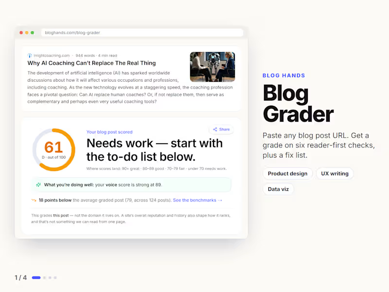
Blog Grader is a free tool I built for Blog Hands. Paste any blog post URL and it grades the post on six checks: Helpful, Findable, Readable, Quotable, Voice and Trustworthy. You get a score, a breakdown and a fix list, biggest wins first. No sign-up and no keyword to type.
1
1
52
1
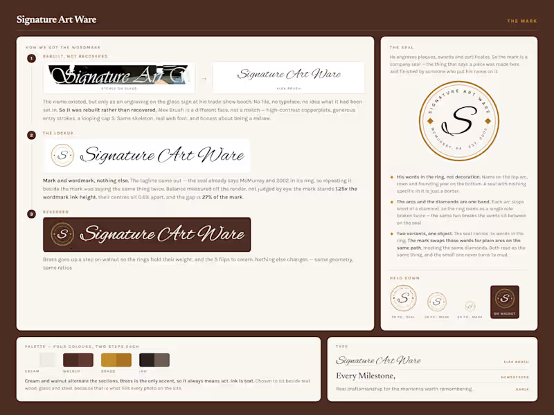
His logo existed in exactly one place. Etched into the glass sign at his trade-show booth. No file. No typeface. So I rebuilt it, and drew him a seal to go with it. His name on the top arc, his town and his year on the bottom. John has engraved keepsakes in McMurray since 2002. On paper that is a trophy shop. It isn't. Look at the portrait he etched into glass. So the work leads and the service list waits. Every photo on the site is something he made. What does your business have that nobody ever sees?
1
63
1
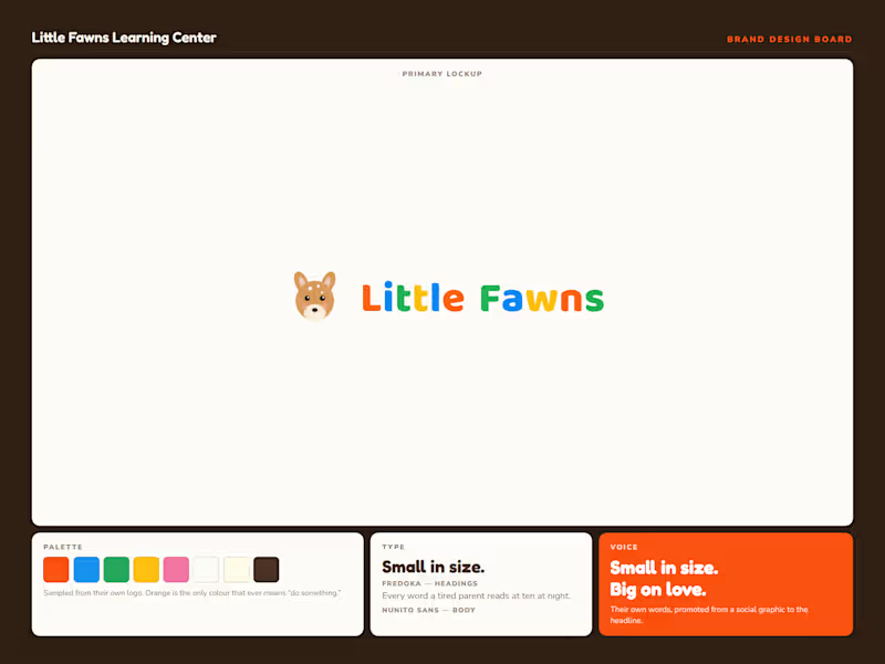
🎉 What do you build when a business has one logo and nothing else? Little Fawns is a licensed home daycare in Canonsburg, PA. Twelve spots, ages six weeks to six years, run by the owner on her own floor. What they had was a clip-art fawn, five rainbow letters, and a phone number baked into the artwork. No palette, no typefaces, no rules for any of it. The hard part wasn't the design though. It was the brief. Big centers feel safe because they're big. Small reads as risky. So "small" had to stop being the apology and start being the argument. That's the whole brand. Twelve spots is the pitch, not the limitation. After that the system was straightforward. I drew a new vector mark and kept the five colors out of their old logo, because families already recognize them. Orange is the only color that ever means "do something." The other four decorate and never ask for anything. Fredoka for headings, Baloo 2 for the wordmark, Nunito Sans for body. Rounded and warm, but properly drawn. Friendly without reading childish. The headline came from them. "Small in size. Big on love." was already sitting on one of their own social graphics. It just needed to be the first thing you read instead of the last. Then it goes to work across thirteen sections. Color banding paces the scroll, one accent carries every action, and each block answers a question a parent actually asks before they call. Every factual claim is logged against a source before it ships. The state license, the 5.0 rating from four reviews, the twenty years of experience. Nothing invented and nothing rounded up. This one's a concept build, so it isn't their live site. Swipe for the design board, the brief, and the build. What's the last brand you saw that turned its smallest feature into its main argument?
1
1
126
Copy Strategist
(1)
Follow
Message
Explore people